Editing Your Website's Footer
Your website footer can be the home for all types of quick links and information your site needs. Learn what you should include in your footer and how to update this section of your design through this tutorial!

Your website footer can be the home for all types of quick links and information your site needs. Learn what you should include in your footer and how to update this section of your design through this tutorial!
IN THIS VIDEO I COVER:
How to make your website look more professional with footer content
Suggestions on what to include in your footer
Show Notes
0:34 Editing footer
0:43 Deleting text box
0:50 Styling the footer
WANT to CREATE
a custom WEBSITE?


How to Rethink Your Creative Process
Everyone’s creative process looks different, but a lot have the same initial phases. Here are a few thoughts on how to streamline yours.
Everyone’s creative process looks different, but a lot have the same initial phases. I find that I start out excited and ready to rumble with the idea. Then I dive into research and planning and looking for inspiration. This is where things sometimes fall apart. I find myself getting overwhelmed by what I need to do to bring this new idea to life.
Are you nodding your head? Here are a few thoughts on how to stop the second-guessing cycle.
No idea is a bad idea
All ideas have to start somewhere. Whatever comes to mind, get it down. You never know where that idea or design can evolve. No matter how silly you may think your initial thought or concept is, allow time for your idea to develop into something powerful. And don’t worry if you’re not the very first person to want to do something. You are the very best person to do it in your exact way. And that’s enough.
Change up your environment
Inspiration can be found in the most random of spaces. Sometimes all you need to do is get out of the office. Visit a coffee shop or local library. Talk to real live people about it. Ya, like offline. This will help you get out of your head and unstuck from your desk.
Unplug
Digital distractions can prolong the process. Put the phone down and get away from a screen if you can. Try a pen and paper first before jumping on your laptop. While checking out other people’s work can be a source of inspiration, it can limit your originality in your ideas. Use your imagination!
Do not set expectations or limitations
Setting expectations on yourself can add a layer of pressure and limit your mindset. This is one of the worst things you can do during the creative process. Don’t close of a potentially great idea because of fear. Limiting yourself would be a real shame. Think of what you could dream up if you just changed your mindset. You have talent, and you need to trust yourself. You can design great things, settle into that instead of fear or doubt!
The main point in all of this is to LET GO. Seriously. Creativity is meant to be fluid and not pinned down to a specific place. Let go and see what you create. It can get a little messy, but that’s the beauty in it.


BRANDING YOUR INSTAGRAM STORIES
There are so many ways to share on Instagram Stories and while the easiest way is to share a quick photo or video selfie, there are some strategies you can implement to add your brand's voice and visuals to your stories timeline.
Since Instagram is such a great place to connect and share socially, I love sharing pieces of my clients' logo process, color palettes I'm creating, and sneak peaks at websites I'm building. There are so many ways to share on Instagram Stories and while the easiest way is to share a quick photo or video selfie, there are some strategies you can implement to add your brand's voice and visuals to your stories timeline.
01. Share what's inspiring you
I love this one because it's so simple, but it's unique and fun. Sharing a little collage or even just one photo of someone you've been following is a great way to share your aesthetic AND connect with your fellow 'grammers. Make sure to tag your story with the handle of the person's photo(s) that you're sharing so that they can engage with you and your followers can also engage with them.


02. Share what you're working on
If you normally share the finished product, try sharing some of the pieces that make up the process in your Instagram Stories. For me, this often looks like the logos that I create that don't get the final go ahead from my client. It's fun to share these designs that otherwise would never be seen! Plus, this gives future dream clients an idea of what it actually looks like to work with you.


03. Promos + marketing
Instagram Stories is a great place to promo something you want to make sure people see! Especially since the stories show up at the top of your audience's news feed, you are more likely to get seen and skip worrying about the newest Instagram algorithm. And there are lots of unique ways you can share and promote without feeling spammy. Take a look at the examples below for inspiration.


04. Share your blog posts
This might be my favorite thing to share on Instagram Stories because you already have the content! All you have to do is jazz it up for Instagram. By creating a few images for each major point of your post, you can share your content and make sure it's getting seen even if someone never visits your blog!

Not too hard, right?
Have another idea for injecting your brand
into your Instagram Stories?


Squarespace SEO: The Basics
Search Engine Optimization is crucial for getting your business at the top of searches and in front of potential clients, customers and more. There are a few basic practices that you can implement starting today to get you start. Most of these steps are pretty straight forward, but we are going to break down why and how you should have these completed on your website.
Search Engine Optimization is crucial for getting your business at the top of searches and in front of potential clients, customers and more. There are a few basic practices that you can implement starting today to get you started. Most of these steps are pretty straight forward, but we are going to break down why and how you should have these completed on your website.
1. Make Your Page Titles SEO Friendly
Don’t have generic page names. Incorporate keywords and phrases that can increase your visibility online! For example, instead of just using ‘About’ for a page title, try ‘About the Designer.’
2. Fill Out Your Business Information
You may have created your website in a rush to just get something up or focused so much on the design elements, you might have neglected this important must-have. Add to your Business Information setting to help with local search ability and increase the use of keywords. Access this through your Squarespace settings menu and select Business Information.
3. Refine Your File Naming System
No more ‘screenshot124.png’ for file names! Optimize files with specific keywords and relevant tags. If you are adding a photo to your web design portfolio make sure it has a strong file name. Something like ‘Web-Design-Creative-Portfolio’ will do great.

4. Spread the Local Love
If you are a local business or storefront, you MUST include your local town or city name throughout your website. You want to have SEO keywords that target your specific geographic area, especially if this a key factor for your business.
5. Get Descriptive
For every product and page that you have on your Squarespace site, double check to make sure that you include rich descriptions to increase your SEO. Product descriptions are available to be written through your shop menu. See an example of one of my product descriptions below! To update your page descriptions, select the gear icon next to your page name in your Squarespace pages menu. There will be a section towards the bottom to update that information!

These are just a few to get you started! Another quick tip before you begin is to develop a list of your business keywords and phrases to reference through each step to help you with the writing process.
Have any questions? Let me know!
The following information was created for use with templates made with Squarespace 7.0.
Stay tuned for more tips and tricks for the new 7.1 platform!
Related Posts


How to Get Your Website Ready to Launch
You’ve done the hard work and prepared a website that you are ready to share with the world. But before you go live, you may want to check out of a few of these things first. Use this guide to get your website ready to launch!
You’ve done the hard work and prepared a website that you are ready to share with the world. But before you take your new, shiny website live, you should run through what I call a “launch list” first. Some of these items may be more necessary than others, but certainly all steps are recommended to to make sure your website is ready to launch!
✴ Step One - Finalize Your Site’s Design + Style
Make sure you have your site title and logo set. Your logo can replace your site title in your website design, but your site title will be important for places like search results.
You can use the Site Style panel underneath the Design menu to get your fonts, colors, headings, spacing, etc. consistent and in line with your business branding.
Another thing to consider is adding in a cookie banner for your visitors, if you think their privacy is valuable to them. It is better to be on the safe than sorry side with this one (especially if you have ANY web visitors in Europe), so I encourage you to add a cookie banner into your final design.
Lastly, upload a favicon to show up in browser tabs for your visitors. This fun little detail shouldn’t be skipped!
✴ Step Two - Wrap Up Your Pages
Set a homepage that represents your brand and style well. Make sure this landing page has all of the major information covered and highlighted for your website visitors. This will be your first impression, so make it a good one!
Double check that your navigation is ordered how you want it. Consider how the user will view the site and make items like your Shop or Services page easily accessible.
Review your content for typos and while you are at it, check for broken links.
Finalize your URL slugs for all of your pages. Have them reflect the content that is available on the page. For example, you don’t want your contact page to have an odd url like /sendmeanote. Google would rather see a URL slug like /contact. In short, keep things simple and straightforward.
For bonus points, a custom 404 page is always a good idea in case visitors end up in the wrong spot. Direct them back to the home page from there.
✴ Step Three - Review Your Images
Check the quality of your images and make sure things are showing up clearly on your website. There is nothing worse than a pixelated image. Keep things crystal clear. Upload thumbnails to your pages and social sharing images that are branded and in line with the content you are sharing.
Make sure you also check images on your phone. Banner images get cropped into a square, so if you’re face is to the right side of your banner image, you may not even show up on mobile!
✴ Step Four - Check Domains and Integrations
If you happen to have more than one domain, make sure all URLs direct to the primary domain you want to use.
Have a friend double check newsletter sign-ups and form submissions to see that everything is running smoothly.
If you have other items integrated like social icon links or third-party codes, check that they direct visitors to the right pages and everything looks correct.
✴ Step Five - Get Your SEO in Check
This is an important one my friends. Do not, I repeat DO NOT, skip over this part. Learn more about SEO through one of my favorite blog posts to date.
✴ Step Six - Make Sure Your Online Shop is Ready for Shoppers
A few different steps for this one so I am going to break it down below. (Don’t have an online shop? Feel free to skip over this part!)
Add your payment processor so you can make that $$$.
Double check the tax rules that will need to be applied to your shop/products.
If you are offering physical products in your shop, you are going to need at least one shipping option available to your customers.
Try out a test order to see how the process looks for the user. From the check out page to email confirmation, see that everything is squared away.
Review your pricing again. Did you set everything at the right price point?
Turn off that test mode so you can start making some real sales!
Also consider a special promo or discount for when your site goes live to promote new shoppers!
✴ Step Seven - Hit Publish
Change your website visibility to LIVE and get ready to start sharing to the world!
Remove any page passwords if you have them, if you have a ‘website coming soon’ page take it down and if you need to invite or remove site contributors such as a copywriter or outsourced help, do so now.
Also do one last check on your mobile device since most visitors will be coming in through their phones or mobile devices!
✴ Step Eight - Celebrate!
Pop the confetti cannons, treat yourself to a happy hour, or leave the office early for the day. Find a way to celebrate and do it! You’ve earned it with all of the hard work you have put in. Congratulations!
BONUS!
To help keep up with everything listed above, I have designed a checklist for you! Print it out and keep it at your desk to make sure you have all of the boxes properly crossed off.
WANT to CREATE
a custom WEBSITE?

SIMPLE TIPS FOR MANAGING YOUR INBOX
When I talk to other creative biz owners, the most common complaint they have at any given time is about their out-of-control inbox. "Who has the time?" they say, or "It's just too overwhelming." And inbox zero? "Impossible!" There are a few major problems with having an inbox that is overflowing...
When I talk to other creative biz owners, the most common complaint they have at any given time is about their out-of-control inbox. "Who has the time?" they say, or "It's just too overwhelming." And inbox zero? "Impossible!" There are a few major problems with having an inbox that is overflowing:
Things get lost. Then tasks get left behind and client projects get delayed.
Clients feel ignored. This is my #1 no-no as a biz owner!
You feel overwhelmed or drained! You don't have time to do what lights you up / what you love.
I promise that this does not have to be the case!
I have some simple tips for managing your inbox that will help you get back to doing what you love.
Touch it once. I admit that I have a hard time with this one, but it's really helpful. The idea is that you only "touch" an email one time, which means that if you read it, respond right away rather than clicking over to the next email or marking it "unread". This helps you respond to the email without letting it linger in your inbox. But what if the email takes a lot of thought or is a revision on a logo...
Add it to your to-do list. If the email is a client asking you for something that you know will take awhile, add it to your to-do list. Do not use your inbox as your to-do list!! Instead, write the client back to confirm you received their email, and let them know when they can expect your response/next round of deliverables.
Canned responses. You guys, canned responses save my sanity. Canned responses are email templates that you can use for different types of emails. I have a canned response for inquiries, client on-boarding, scheduling, confirming calls, and about 15 more. Heres a handy little guide that walks you through how to set them up on Gmail.
Boomerang for Gmail. Sometimes you may want a reminder to follow up with someone after a a few days or if they haven't responded to you (maybe because their inbox is crazy!). In Gmail, you can install Boomerang, which allows you to set follow up reminders on any given email. For example, maybe you sent out a proposal to your dream client and want to make sure to follow up if they haven't responded within a week. Boomerang can push that email back into your inbox after a week has gone by if your dream client hasn't responded! It also allows you to schedule your emails to send out at a later date.
Archive. If you're starting from a point where you have hundreds and hundreds of emails, just start by archiving them. Archived emails are still around (not deleted), and if you just do a simple search, you can easily find them without cluttering up your inbox.
Those are my top 5 tips for managing your inbox! Here's my inbox for proof that it can be done!

Did I leave any out that you've tried? Let me know and feel free to share your cleaned up inboxes with me!
ps- Gmail did not promote this post! This is just my genuine opinion and what works for me but if Gmail wants to throw some $$ my way, I wouldn't be mad at it. Heyyyyyyy Google.

{Design Principles} CONTRAST
Contrast is a design principle that is so crucial to creating beautiful branding and web design. But contrast touches all parts of design, not just color. Put simply, contrast occurs when two elements of the design are different - like REALLY different.
So why the hell should you care? (I get it, you've got a business to run... so let's cut to the chase!)
Contrast is a design principle that is so crucial to creating beautiful branding and web design. When you think of contrast, you may think of color - or maybe black and white photography. The higher the contrast, the darker the blacks appear and the lighter the whites appear with little grey in between.
But contrast touches all parts of design, not just color. Put simply, contrast occurs when two elements of the design are different - like REALLY different.
So why the hell should you care? (I get it, you've got a business to run... so let's cut to the chase!)

01. CONTRAST GRABS ATTENTION. Attention gets your audience engaged. An engaged audience clicks through your website, and eventually, they get in touch with you.
02. CONTRAST CREATES ORGANIZATION. It helps your audience flow seamlessly through your About bio, your Services page and your whole site in general!
03. CONTRAST DEFINES THE FOCAL POINT. Think buttons ("Contact Me!"), header text (your mission statement) and photos. Secretly guiding your audience towards what you want them to see or do is this simple little thing called... yup - contrast! 😉
Below is a breakdown of how to create contrast:

POSITION
front/behind
above/below
centered/off-centered
isolated grouped
in/out
right/left


FORM
simple/complex
whole/broken
symmetry/asymmetry
geometric/organic
hard angles/round


DIRECTION
vertical/horizontal
stability/movement
forward/back
clockwise/counter
convex/concave
serif text/sans serif text/script text


Related Posts

4 Ways to Use the Squarespace Pop-up Form (besides your newsletter)
Pop-up forms are a great way to engage your website visitors in a fresh way. This attention-grabbing feature can be customized far beyond the typical newsletter sign-ups. Use these ideas to figure out the best option for your business!

Pop-up forms are a great way to engage your website visitors in a fresh way. This attention-grabbing feature can be customized far beyond the typical newsletter sign-ups. Use these ideas to figure out the best option for your business!
Connect on social - Direct your website visitors to your social media channels where they can get to know you and your work even better! Get connected with them. Plus, make some new friends!
Terms, policies, consent, cookies - With the General Data Protection Regulation (GDPR) affecting businesses like yours and mine, ensuring you have your bases covered is a must. Integrating your pop-up to feature stuff such as your terms, policies, consent, cookies, etc. is a good idea. Make sure you do your research to determine which items are needed for your website!
Promote an event or launch - Do you have an upcoming calendar item? Share date details and how visitors can learn more through your pop-up. Lead them to a landing page with all of the information or get them signed up for a specific email to get what they need.
Feature a blog post - You’ve worked hard on your content, make sure people read it! Get more eyes to get on your tips and tricks with this type of “alert.” This will also engage visitors to keep exploring throughout your website.
So which pop-up to try first? Incorporate a rotation of all four to beta test which type works best for you.
The following information was created for use with templates made with Squarespace 7.0.
Stay tuned for more tips and tricks for the new 7.1 platform!
Related Posts
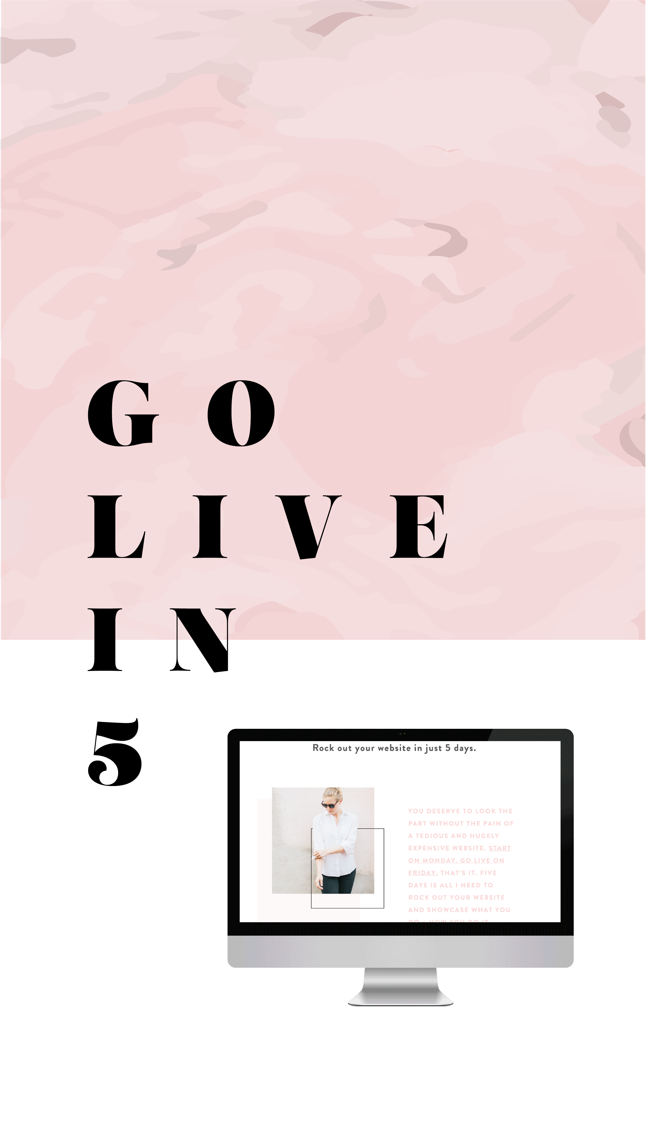
need even more help with squarespace?
Skip the overwhelm and have your website designed and launched in just 5 days (or less)!
LEARN MORE

HOW TO CREATE A RAINBOW TEXT EFFECT ON YOUR WEBSITE
Sometimes it's fun to just add a random, pretty effect to your website, just because. Because who doesn't like rainbows? And since the answer to that is "No one!", why not add some rainbows to your website?

Sometimes it's fun to just add a random, pretty effect to your website, just because. Because who doesn't like rainbows? And since the answer to that is "No one!", why not add some rainbows to your website?
Let's do it.
How to create a rainbow text effect on your website:
First, add a CODE content block to your page.
Then add this snippet of code and change YOUR TEXT GOES HERE to whatever you'd like your text to say:
<style> .rainbowhead { display: block; margin:auto; background: linear-gradient(330deg, #e05252 0%, #99e052 25%, #52e0e0 50%, #9952e0 75%, #e05252 100%); background-clip: text; text-fill-color: transparent; } </style><body> <h1 class="rainbowhead">YOUR TEXT GOES HERE</span></h1> </body>
And that's it! You should now have rainbow text effect on your Heading 1 text! You can change this to any heading or font size you need by changing the "h1" to match the following:
<h1> = Heading 1
<h2> = Heading 2
<h3> = Heading 3
<p> = Normal
And that's it! Isn't it pretty?
The following information was created for use with templates made with Squarespace 7.0.
Stay tuned for more tips and tricks for the new 7.1 platform!
need even more help with squarespace?
Skip the overwhelm and have your website
designed and launched in just 5 days!

Do This 15 Minute Website Audit
I'm the queen of fast and effective over here at June Mango. Heck, I build websites in 5 days or less doncha know. I know we all have businesses to run and kids to parent and shit. to. do.
I'm the queen of fast and effective over here at June Mango. Heck, I build websites in 5 days or less doncha know. I know we all have businesses to run and kids to parent and shit. to. do.
So I have a little web audit that you can do right now (ya, this second!) and it will only take you 15 minutes. So lez go:
STEP 1:
Check for broken links. Using this handy tool, you can find any broken links that might be lurking listed all in once place. Then all you have to do is head to the page where they're "linked from" (it shows you this) and fix 'em!
STEP 2:
Double check that your images have been tagged. In Squarespace, you have the option of entering a custom Filename in the image editor. Add a name that included a key search phrase for that page (ie: web-design-in-5-days.jpg). Rinse and repeat for any images missing tags.
STEP 3:
Update your footer and legal pages. Have you done this lately? Make sure the copyright in your footer is for the current year. Give your legal pages (ie: privacy policy, etc) a quick read through to make sure you haven't missed new service offerings and update that date, too. Psssst... don't have a Privacy Policy? It's illegal not to, so add one!
STEP 4:
Run through your About page. Do you have a current headshot up there? Are you smiling in it? How about your copy - is it more than 4 paragraphs? If so, cut it in half. People don't want to read your life's history - only what's relevant to your biz. Make sure your sharing why your an expert and what it's like to work with you. Add the cutesy info to the very bottom and keep it short (ie: We all love dogs, but we don't need to know more than that you have one and what it's name is).
STEP 5:
Submit your site to Google. Added pages, blog posts or other new content in the last couple months? Google may not know that! Tell Google to go crawl your pages and find all your juicy new content by entering your site
So... did it take more than 15 minutes? Fast and effective... hell ya!
Want a pro web audit to get even more help? We’re here to help.
need even more help with squarespace?
Skip the overwhelm and have your website
designed and launched in just 5 days!

Code & Cookies: How to style your Squarespace cookie notice
Just because the General Data Protection Regulation (GDPR) is causing your online business to feature information like terms, policies, consent, and cookies throughout your website, doesn't mean that it can't look good.
Getting a headache from all then new General Data Protection Regulation (GDPR) requirements? I feel ya. While I'm no expert, I do have one quick tip for you to help stay complient AND on brand. Just because the GDPR is causing your online business to feature information like terms, policies, consent, and cookies throughout your website, doesn't mean that it can't look good.
Check out the steps below to style your SQSP cookie notice in your branding!
There are a few simple code changes to make your notice match your branding colors. Here are the steps:
In the main Squarespace menu, click DESIGN. Then CUSTOM CSS.
Copy and paste the following code. Then change the bolded text to update your colors and fonts to match your branding!
// Cookie Notice
.cookie-notice {
background: #FDF8F8 !important;
border: none !important;
-webkit-border-radius: 12px;
-moz-border-radius: 12px;
border-radius: 0px;
color: black !important;
width: 250px;
font-family: 'Brandon Grotesque', sans-serif !important;
font-size: 85% !important;
letter-spacing: 0.03em;
line-height: 1.6em;
position: fixed !important;
top: auto !important;
bottom: 30px !important;
left: 30px !important;
right: auto !important;
padding: 30px !important;
}
.cookie-notice a {
color: hsl(0, 1%, 45%);
}
.cookie-notice .accept {
width: 100%;
padding: 10px !important;
background: #F6DCDB;
color: #fff;
font-family: 'Brandon Grotesque', sans-serif !important;
text-transform: uppercase;
font-size: 90%;
letter-spacing: 0.3em;
-webkit-border-radius: 5px;
-moz-border-radius: 5px;
border-radius: 0px;
margin-top: 0 !important;
border-top-style: none !important;
border-right-style: none !important;
border-bottom-style: none !important;
border-left-style: none !important;
}
@media only screen and (max-width: 640px) {
.cookie-notice {
width: 150px;
font-size: 70% !important;
top: 10px !important;
bottom: auto !important;
left: 10px !important;
right: auto !important;
padding: 10px !important;
}
}
And there ya go! Done and done!
The following information was created for use with templates made with Squarespace 7.0.
Stay tuned for more tips and tricks for the new 7.1 platform!
need even more help with squarespace?
Skip the overwhelm and have your website
designed and launched in just 5 days!

HOW TO CREATE A SLIDER WITH TEXT BLOCK OVERLAY
Adding a slider can create a lot of dynamic engagement with your content. I think this is a great item to feature on a custom blog layout! You can also add it to the homepage, or anywhere really!

Adding a slider can create a lot of dynamic engagement with your content. I think this is a great item to feature on a custom blog layout! You can also add it to the homepage, or anywhere really!
This quick customization allows you to customize the design of the caption that appears on top of the image. By adding a background box and some pretty text, your audience will definitely get clicking!
Ready to learn how? Let's do it.
How to create a slider with text block overlay
on your Squarespace website:
First, add a Slider content block to your page (Gallery > Slideshow)
Then add this snippet of code below to your Custom CSS (Design > Custom CSS)
To change the color of the text or background box, change the bold parts of the code below.
/* slider with text overlay */
.sqs-block-gallery .sqs-gallery-block-slideshow {
max-height: 500px !important;
.sqs-gallery-design-stacked-slide {
max-height: 500px !important;
overflow: hidden;
img {
transition: all ease-in-out 300ms !important;
}
}
.meta {
background-color: white;
max-width: 60% !important;
transition: all ease-in-out 700ms !important;
-webkit-transition: all ease-in-out 700ms !important;
-moz-transition: all ease-in-out 700ms !important;
-ms-transition: all ease-in-out 700ms !important;
}
.meta-title {
text-align: center;
font-size: 16px;
text-transform: uppercase;
letter-spacing: 2px;
padding: 6px 20px;
color: #042663;
}
.meta-description p {
text-align: center;
color: #9DB0D8;
font-size: 12px;
letter-spacing: 1px;
padding-top: 4px;
max-width: 550px;
}
.meta-description a:link {
color: #9DB0D8;
text-align: center !important;
}
.sqs-gallery-design-stacked-slide:hover {
img {
-webkit-filter: blur(3px);
filter: blur(3px);
}
}
@media (max-width : 667px) {
.meta {
display: block !important;
max-width: 70% !important;
min-width: 70% !important;
left: 50% !important;
}
.meta-title {
font-size: 12px;
}
.meta-description p {
display: none;
}
}
}
You should now have a slider with text block overlay!

All you have to do now is upload your images and add your Title Captions!
(To do this, hover over a slider image and click the gear icon. Then add your title! If you want to add the "Read Post" text, simply add this to the description box and link it to whatever page or post you'd like.)
And that's it!
The following information was created for use with templates made with Squarespace 7.0.
Stay tuned for more tips and tricks for the new 7.1 platform!
need even more help with squarespace?
Skip the overwhelm and have your website
designed and launched in just 5 days!

Using Instant Downloads as an Email Opt-In on Squarespace (+ tutorial)
So you've got your email newsletter software set up and ready to go, but you are missing one crucial tidbit - subscribers! One way to get some sign ups is through an instant download on your website.
So you've got your email newsletter software set up and ready to go, but you are missing one crucial tidbit - subscribers! One way to get some sign ups is through a free opt-in on your website. And one way to do this is to make it an instant download straight from your website.
A benefit of an instant download is that you don't have to worry about software automation with your email subscription service. In laymen's terms, this means you don't have to set anything up in MailChimp, ConvertKit, etc. This is handled straight away through your Squarespace site.
Your instant download can be whatever you like from checklists to stock images, you get to create what is available. Keep in mind, this instant download should give potential customers/clients an awesome resource or provide a solution to an issue they might be facing. That way, they will be more willing to turn over their email address and get to the goods.
To learn more about setting up your own instant download on Squarespace, check out the tutorial below:
Like this tutorial video?
Check out the Squarespace Supply Room - a members-only video tutorial library for Squarespace. Get a year-long membership and start soaking up all that good web knowledge. More details this-a-way!
Recent Posts

HOW TO DISPLAY GALLERY CAPTIONS ON A MOBILE DEVICE
Ever notice how sometimes a perfectly amazing feature set up for a desktop browser doesn't quite translate like you want it to on mobile? I've found a way to modify the gallery caption display so that it will always work no matter what device you're on!
Ever notice how sometimes a perfectly amazing feature set up for a desktop browser doesn't quite translate like you want it to on mobile? It's a bummer and can make you rethink the whole design.
This happened to a client's site recently when I set up a gallery of her art work and displayed the name of each painting as a caption. The default gallery caption option displays the caption when you hover your mouse over the image. Cool! But not so cool on a mobile device where it just doesn't display at all! Womp womp.
So, I've found a way to modify the caption display so that it will always work no matter what device you're on.
First, head into the Design panel.
Click Custom CSS.
Paste in the following code:
/*** DISPLAY GALLERY CAPTION ***/
.yui3-lightbox2 .sqs-lightbox-meta {
opacity: 1 !important;
background: rgba(0, 0, 0, 0.7) !important;
}
@media only screen and (max-width: 1024px){
.yui3-lightbox2 .sqs-lightbox-meta{
bottom: 0px !important;
}
}
And that's it!
You should now be able to view the gallery captions
on both mobile and desktop browsers.
The following information was created for use with templates made with Squarespace 7.0.
Stay tuned for more tips and tricks for the new 7.1 platform!
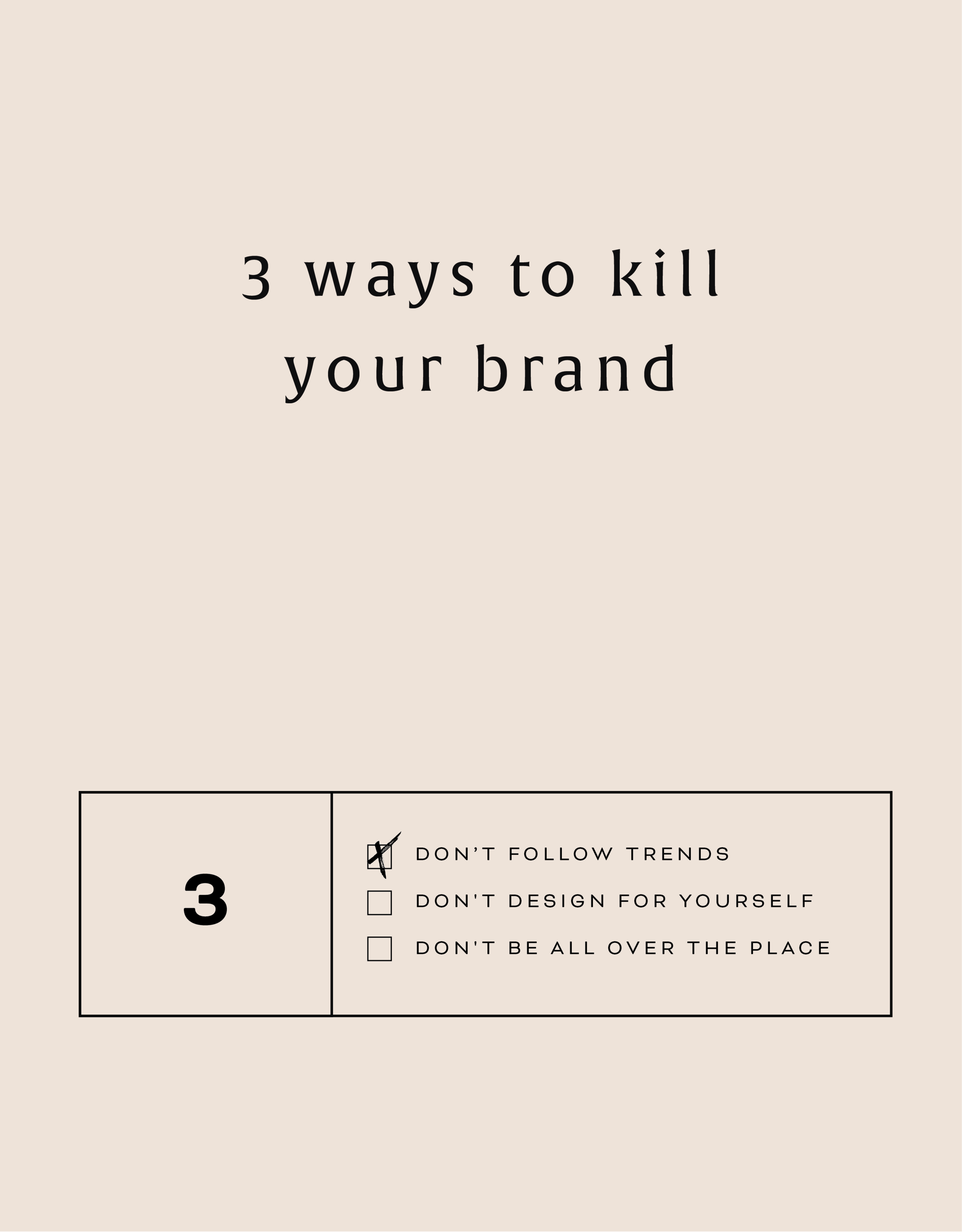
Three Ways to KILL Your Brand
Overlooking these three things in your branding can keep your brand from attracting your dream audience and yes, seriously hurt your brand. Yes you want a beautiful logo, but that logo needs to avoid being these three things first!
That title may feel a little dramatic, but a) I've been watching a lot of angsty teen movies from the 90s lately (She's All That anyone??) so it feels normal... and b) certain approaches to branding can really yield painful results. In fact, overlooking these three things in your branding can keep your brand from attracting your dream audience. Yes you want a beautiful logo, but that logo needs to avoid being these three things:
DON'T FOLLOW THE TRENDS:
You know what happens when you follow (dare I say copy) someone else's logo design? You bore people. Your dream audience takes one glance and moves on. How can you stand out when you look like everyone else?
THE FIX:
Get specific. Be who you are and share that in your brand! How would a former client describe your business? What makes you stand out? What do you deliver differently than others in your industry? Get YOU into your brand!
DON'T DESIGN FOR YOURSELF:
I see this mistake all the time. Just because you like hot pink doesn't mean it's right for your brand. Just because you like handwritten fonts doesn't mean it's right for your business if you want to attract both men and women. Just because you like something, doesn't mean your dream audience will be attracted to it.
THE FIX:
Put your audience first always! Ask yourself these questions as you go through the branding process:
What aspects (type, color, illustration, etc.) of this design will your audience be drawn to and why?
Are there any aspects (type, color, illustration, etc.) of this design that do not fit with what your audience is drawn to? If so, why?
DON'T BE ALL OVER THE PLACE
Once you've nailed down your branding elements, don't use alternate fonts, colors or imagery. It's confusing! Consistency is what builds trust online. If you aren't showing up in a consistent way (because you're using 120,567 different fonts in your Instagram posts, for example), people won't be able to recognize you or trust you.
THE FIX:
Stick with your business vision and just keep fine-tuning it, instead of backpedaling, or starting over again and again. Work with someone you trust to help you create the look or the strategy for your brand if you find yourself too immersed in it to reflect your true style and voice.
Related Posts

HOW TO CREATE A SCROLL EFFECT FOR YOUR WEBSITE MOCKUP
Since Instagram is such a great place to connect and share socially, I love sharing recent Go Live in 5 projects on there! The problem I always have with sharing websites is that it's hard to get a sense of an interactive site in a static square image. So I created a scroll effect and shared it as a video. This give a MUCH better sense of the site when you actually view it online.

Since Instagram is such a great place to connect and share socially, I love sharing recent Go Live in 5 projects on there! The problem I always have with sharing websites is that it's hard to get a sense of an interactive site in a static square image. So I created a scroll effect and shared it as a video. This give a MUCH better sense of the site when you actually view it online.
Since I've been sharing these scrolling website mockups, people just keep asking me: How do you create a scroll effect for your website mockup?? So today, I'm listing out the exact step-by-step process so you can do it, too!
*Tiny note: I use QuickTime and Photoshop for this process (and I have a Mac). This is not a sponsored post, but these are the programs I recommend.
Step 1
01. Open QuickTime
02. Click File > New Screen Recording
03. Click the red record button

04. Adjust the selection tool to crop just the screen

05. Click Start Recording
06. Scroll through the page you want to record
07. Save the recording
Step 2
01. Open Photoshop
02. Add your computer mockup to layer 1
03. Add a shape that covers the computer mockup screen to layer 2
04. Drop in your recorded file (should be mp4 format)
05. Create clipping mask that pulls the recording into the shape you created from step 03
06. Open the Timeline (usually below your art window)
07. In the dropdown that says Create Frame Animation, change that to Create Video Timeline. This will add all your layers to the timeline.
08. Pull each layer in the Timeline to match the length of your video
09. To save, click Export > Render Video
That's it!
BONUS!

Want to download the Photoshop file and save a step?

2 Easy Newsletter Customizations for Squarespace
More customizations for all you Squarespace lovers today! This one changes the standard newsletter block. I find that this can be a dead giveaway that your site is built on Squarespace, so why not jazz it up? These two handy code snippets will allow you to customize your submit buttons as well as the form fields. As always, it's super easy - just copy and paste!
More customizations for all you Squarespace lovers today! This one changes the standard newsletter block. I find that this can be a dead giveaway that your site is built on Squarespace, so why not jazz it up?
These two handy code snippets will allow you to customize your submit buttons as well as the form fields. As always, it's super easy - just copy and paste! Below is the example newsletter with the design changes.
01. Newsletter Button Font
There are a few little code changes you can make to jazz up the plain "Read More" to match your branding colors. Here are the steps:
In the main Squarespace menu, click DESIGN. Then CUSTOM CSS.
Copy and paste the following code:
/*** NEWSLETTER BUTTON - TEXT AND BACKGROUND COLOR ***/
.newsletter-block .newsletter-form-button{
font-family: Kessel !important;
letter-spacing: .2em;
}
The red highlighted text is where you can change your font and background color for the button. Do not edit the other text! (You can also add this code to an individual page if you don’t want it to affect all newsletter buttons on your site).
02. Open Form Fields for the Newsletter
There are a few little code changes you can make to jazz up the plain form fields to match your branding colors and feel more modern. Here are the steps:
In the main Squarespace menu, click DESIGN. Then CUSTOM CSS.
Copy and paste the following code:
/*** NEWSLETTER FORM FIELDS ***/
.newsletter-form-field-element {
background: none !important;
border-top: none !important;
border-left: none !important;
border-right: none !important;
border-bottom: solid 3px #F2CBCB !important;
}
/*** NEWSLETTER BUTTON BORDER ***/
.newsletter-block .newsletter-form-button{
border-bottom: solid 3px #F2CBCB !important;}
The red highlighted text is where you can change your form's line color. You can also make the line thicker or thinner by changing the pixel weight (ie: 1px for thinner and 6px for thicker). Do not edit the other text! (You can also add this code to an individual page if you don’t want it to affect all newsletter form fields on your site).
And that's it!
The following information was created for use with templates made with Squarespace 7.0.
Stay tuned for more tips and tricks for the new 7.1 platform!
NEW!
A templated guide to messaging magic
A plug-and-play website copy template for your four core pages (Home, About, Offerings, Contact). Save yourself hours of stress and get templates, examples, and expert guidance that will benefit your business and your bottom line.
LEARN MORE
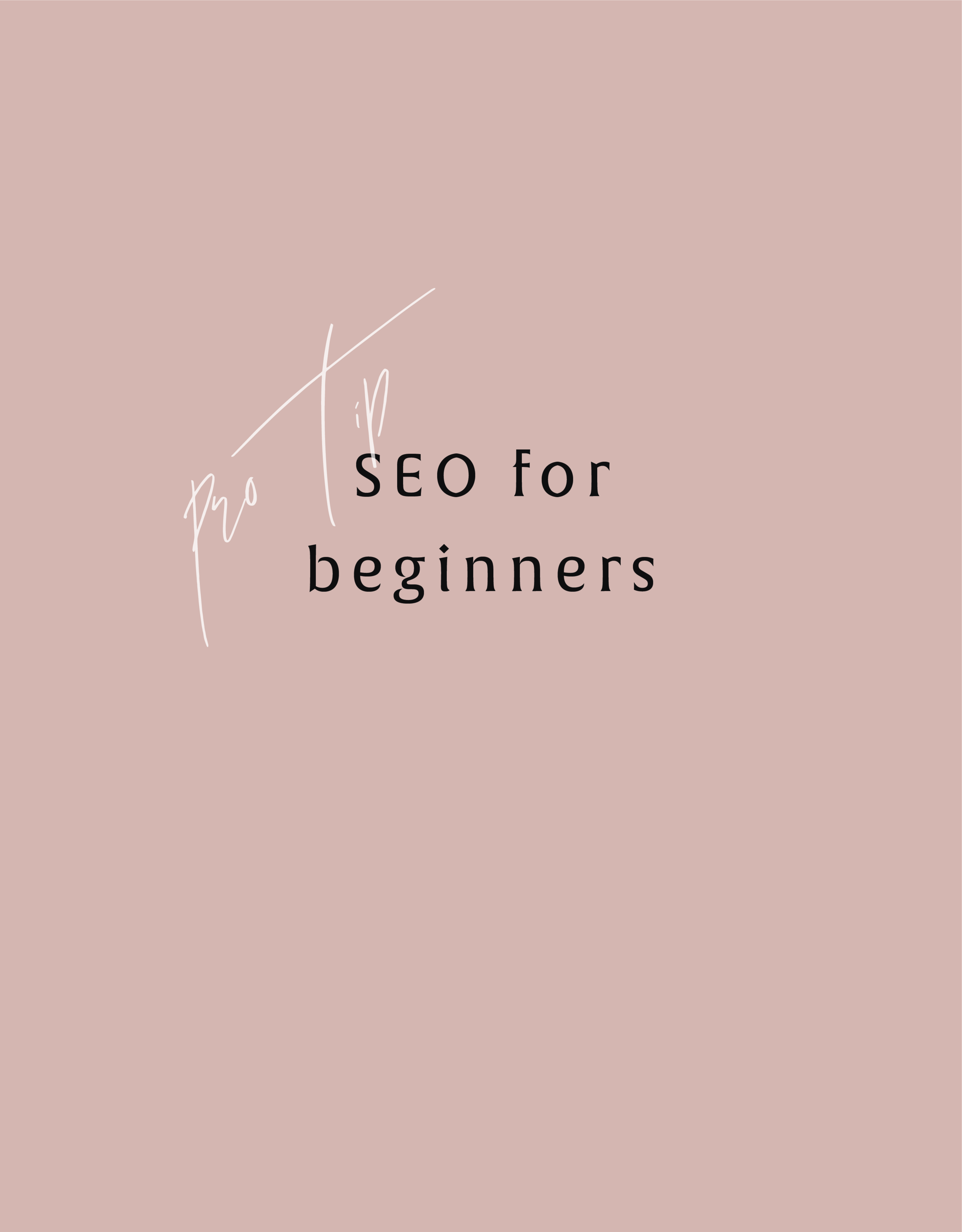
SEO for Beginners
SEO is something everyone wants but no one fully understands.
This is partly because Google is sneaky - always changing its algorithm. It can be hard to keep up with the new rules. But there are actually some really simple tips you can use to make sure your SEO ranking is as high as possible.
SEO is something everyone wants but no one fully understands.
This is partly because Google is sneaky - always changing its algorithm. It can be hard to keep up with the new rules. But there are actually two really simple things you can focus on to make sure your SEO ranking is as high as possible:
Content
Link Building
Content
Content is king. You may have heard that phrase before and it's true for positioning you as an expert, getting hired and for ranking higher with your SEO. Below are four ways to make sure your content is fully optimized.
Blog Posts - Did you know that blog posts should be at least 300 words long? If not all of your posts are this long, no worries. But the more there is to read, the more Google will have to crawl + find your content.
Name Your Images - Give each of your images a keyword-heavy name. Why? Images are an important way of telling search engines what your website is about. Plus, Google Images is not to be forgotten! I clicked through to 100s of sites by looking through Google Images vs. the listed search results. Just make sure to use strategic keywords related to your content, and add dashes in between the words. For example, my image above would be "seo-for-beginners.png" .
Image File Sizes - Large images will reduce site speed; a key metric google uses for indexing sites. Many web platforms (like Squarespace!) automatically resize your images for you, so don't stress. But ideally, try to keep you image resolution at 72 ppi or no more than 2 MB.
Keywords - If there was one takeaway from this section it's this: ADD KEYWORDS EVERYWHERE! Your SEO keywords are the key words and phrases in your web content that make it possible for people to find your site via search engines. A website that is well optimized for search engines "speaks the same language" as its potential visitor base with keywords for SEO that help connect searchers to your site. Pages, blogs, titles, tag lines, literally everywhere. Keywords are the words clients will type into google to find you. For example, if I am adding keywords to this post, I would probably add "SEO for beginners". So I would add that to my title, 2-3 times in my actual post content, tag my images with those keywords, etc.
Link Building
Now before we dive into Link Building (aka: the process of getting external pages to link to a page on your website), I want to note that this really does take time. So don't stress if you don't have all or even any of these items set up. They are something you can work towards over time. Ok, PSA over! So let's talk link building.
Get Social - Being on several social platforms does wonders for SEO. Frankly, Google goes gaga for this. Basically, it simply means you are findable. It also lets you add your website's link with ‘high authority’ websites like Twitter and Instagram. Bonus: Add these social networks to your site to encourage that social sharing and cross-platform collaboration.
Invite Sharing - Encourage your audience to share your shit. Add easy Tweetable text with Click to Tweets, add a custom Pin It button to your images, and add sharing buttons below blog posts to encourage audience-inspired promotion.
Partnerships - Call your business bestie and ask if you can collaborate. Maybe writing a guest post for her or asking her to link out to your website as a resource are two examples of ways you can collaborate in a non-slimy way that will help you with link building. Aim for brands/businesses that have similar customer groups and find ways that each part can add value to the other. Two brands are stronger than one and the bonus is that having another person or business linking to you also positions you as an expert!
apply all of the above to increase your SEO
on your Squarespace site specifically!
Download the guide here.
need even more help with squarespace?
Skip the overwhelm and have your website designed and launched in just 5 days (or less)!
LEARN MORE
Related Posts
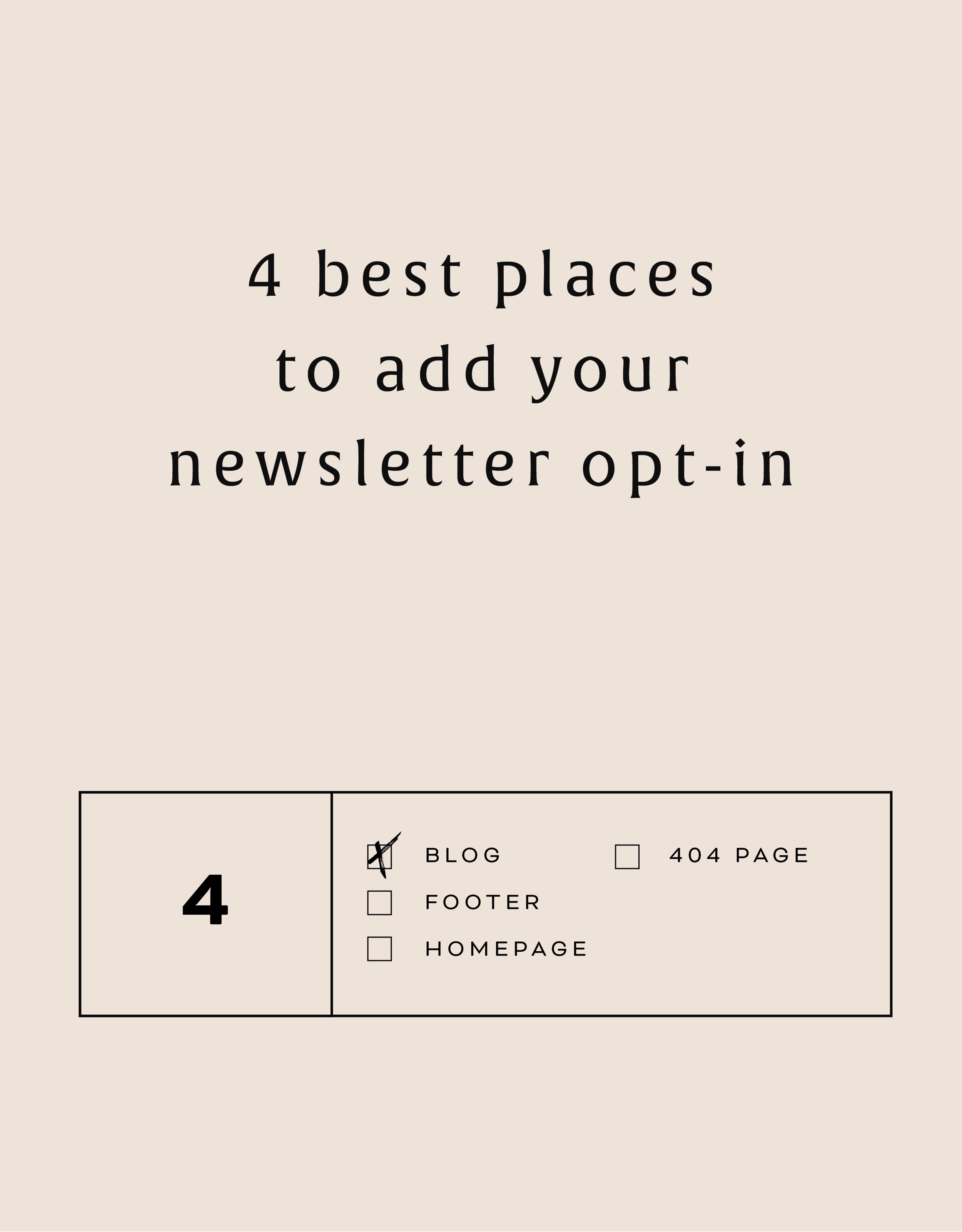
The 4 best places to add your newsletter opt-in
Growing your newsletter list is so important when you run an online business. It can help you keep in touch with your dream clients, build trust with your audience and promote new offerings. But the question my web clients always ask is: Where is the best place to add my newsletter opt-in or sign up form?
Growing your newsletter list is so important when you run an online business. It can help you keep in touch with your dream clients, build trust with your audience and promote new offerings. But the question my web clients always ask is: Where is the best place to add my newsletter opt-in or sign up form?
There are 4 places I ALWAYS add the newsletter opt-in forms on any website.
Blog
Adding the newsletter opt-in to your blog allows you to capture people who are already interested in what you have to say. They are on your blog reading all of your juicy content, so why not try to get them onto your newsletter list where you have even juicier content! I like to make sure this opt-in is specific, and maybe different from other sign up forms elsewhere on the site. For example, it should incentivize them to sign up with the promise of sharing your expertise for free with a worksheet, guide, etc. Adding this opt-in to the sidebar of your blog is one of my favorite places to engage newsletter subscribers on your site.
Footer
It's the one place people will see no matter what page of your website they land on (or click to!). So make it work for you by adding a newsletter sign up form. Repetition of views will also increase the chance that people will sign up. I like to keep this one more generic with a description of what you typically send out vs. a specific freebie or promo.
Homepage
You probably guessed this one, right? But do you know where on the homepage you should add your opt-in? The rule of thumb is above the fold
(aka: the amount of the webpage a user sees before needing to scroll down).
Ideally, you will still be able to communicate your mission statement (who you are, what you do, and who you do it for) before the newsletter. No one is going to sign up for a newsletter if they don't know who the heck you are yet! But grabbing their attention before they scroll down the page is a great way to ensure they get on your list.
404 Page
Have you given much thought to your 404 page? It's a handy little page that pops up when someone clicks a broken link or types a URL wrong. It has so much potential to be interesting and engaging, which is important for keeping your audience on your site! Besides giving them a link back to your homepage, you can also sneak in a newsletter opt-in here! It's an unexpected place to get that person to sign up.
You can add your newsletter opt-in to all four of these places or just pick and choose. Have another spot you think would be great? Let me know!
Related Posts

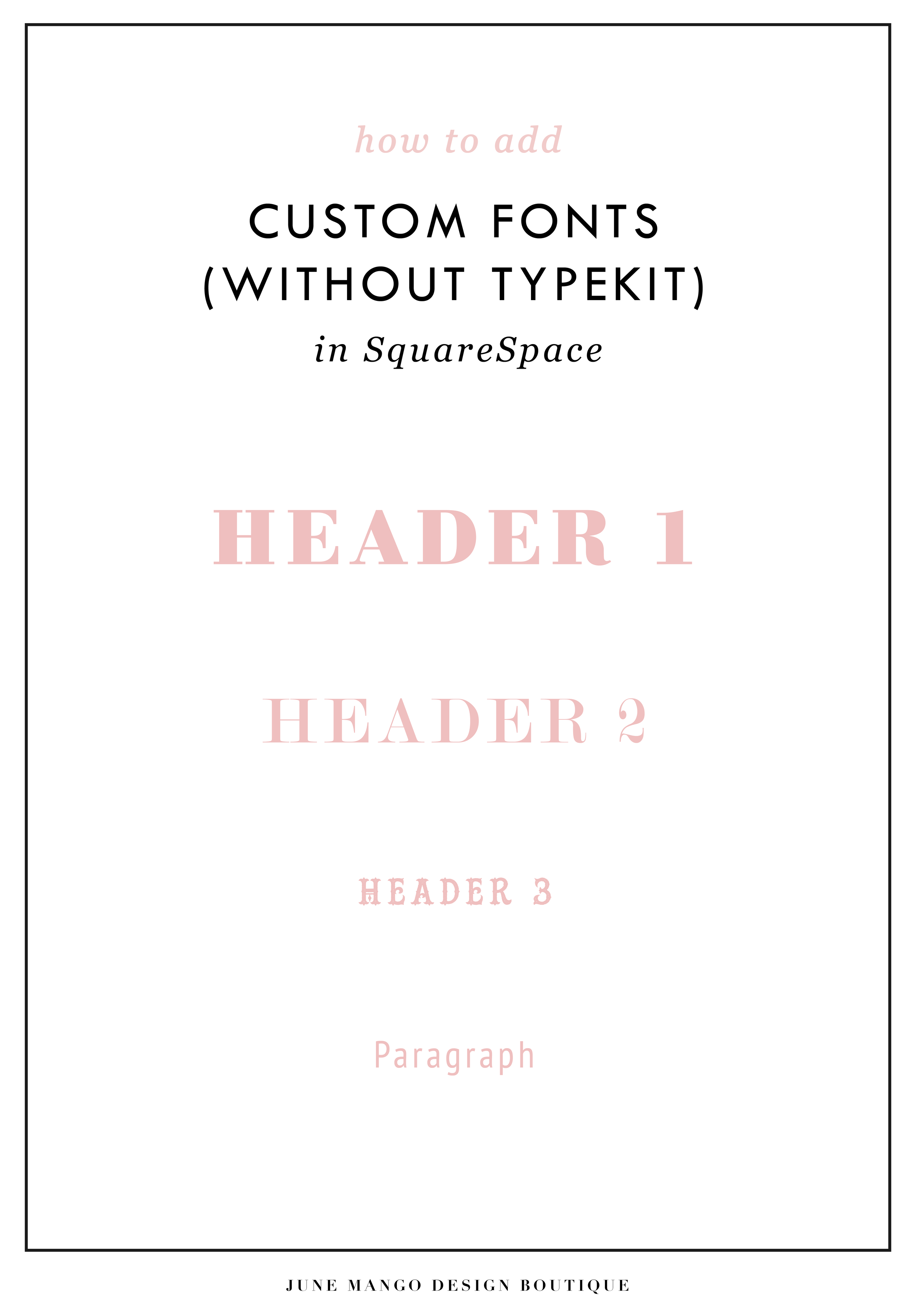
Easily Add Custom Fonts To Your Squarespace Website Design (WITHOUT TYPEKIT)
So you've just been given a beautiful new branding package from your designer full of brand new fonts and everything else. But now you're stumped as to how to add these custom branded fonts to your Squarespace site. But I've gotcher back with a Squarespace hack for you that will bring those branded fonts to life online!
So you've just been given a beautiful new branding package from your designer full of brand new fonts and everything else. But now you're stumped as to how to add these custom fonts to Squarespace. But I've got your back with a Squarespace hack for you that will bring those branded fonts to life online! This little Squarespace hack took me a long time to discover (*covers eyes in shame*)... which is crazy because it's actually pretty simple! It just takes a few simple steps and a little custom code. But anyone can do it! I promise.
Read on for the full tutorials to learn how to add custom font to Squarespace 7.0 and 7.1.
HERE ARE THE STEPS for 7.0:
In the main Squarespace menu, click DESIGN. Then CUSTOM CSS.
Below the CSS editor, click MANAGE CUSTOM FILES.
Then upload your font file (this is a file with an extension of .ttf or .otf)

Copy and paste the following code into the CSS editor:
@font-face {
font-family: 'FONT NAME';
src: url('FONT GOES HERE');}
Change the text that says FONT NAME to the name of your custom font
Highlight the text that says FONT GOES HERE. Then click MANAGE CUSTOM FILES and click on the font you uploaded in the steps above. FONT GOES HERE should now be replaced with a url.

Repeat this step with all of your custom fonts.
Once you have all of your fonts uploaded and added to the CSS code, it's time to make them replace the default Squarespace fonts. To do this, copy and paste the code below into the CSS editor:
h1{ font-family: 'FONT NAME' !important;}
h2{font-family: 'FONT NAME' !important;}
h3{font-family: 'FONT NAME' !important;}
p{font-family: 'FONT NAME' !important;}
You can still adjust the settings of each font in the regular style editor (ie: font size, letter spacing, etc). Make sure to click Save at the top of the Custom CSS page. That’s how to add custom fonts to Squarespace 7.0.
Huzzah!
HERE ARE THE STEPS for 7.1:
Repeat the steps above with all of your custom fonts.
(Because Squarespace 7.1 has 8 different font and heading sizes, you have a couple of additional optional lines of CSS to add depending on which size font you want use to add your custom font to Squarespace.)
Once you have all of your fonts uploaded and added to the CSS code, it's time to make them replace the default Squarespace fonts. To do this, copy and paste the code below into the CSS editor:
h1{ font-family: 'FONT NAME' !important;}
h2{font-family: 'FONT NAME' !important;}
h3{font-family: 'FONT NAME' !important;}
h4{font-family: 'FONT NAME' !important;}
p1{font-family: 'FONT NAME' !important;}
p2{font-family: 'FONT NAME' !important;}
p3{font-family: 'FONT NAME' !important;}
p4{font-family: 'FONT NAME' !important;}
You can still adjust the settings of each font in the regular style editor (ie: font size, letter spacing, etc). Make sure to click Save at the top of the Custom CSS page. That’s how to add custom fonts to Squarespace 7.1.
Don’t forget to refresh your website design and test out the new fonts.
Once you have added the custom fonts to your Squarespace website design, you can begin to test out the new look. Refresh any areas of your site that feature text and check for font rendering issues – if everything looks good, then congratulations – you have successfully added custom fonts to your Squarespace site!
need even more help with squarespace?
Skip the overwhelm and have your website
designed and launched in just 5 days!