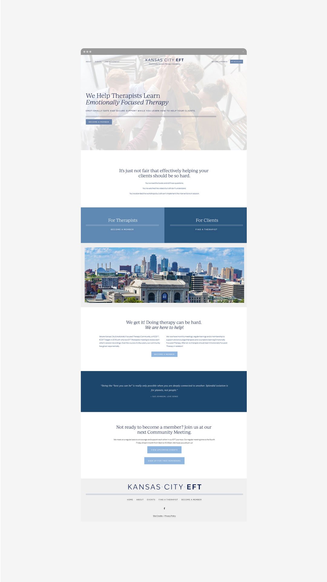
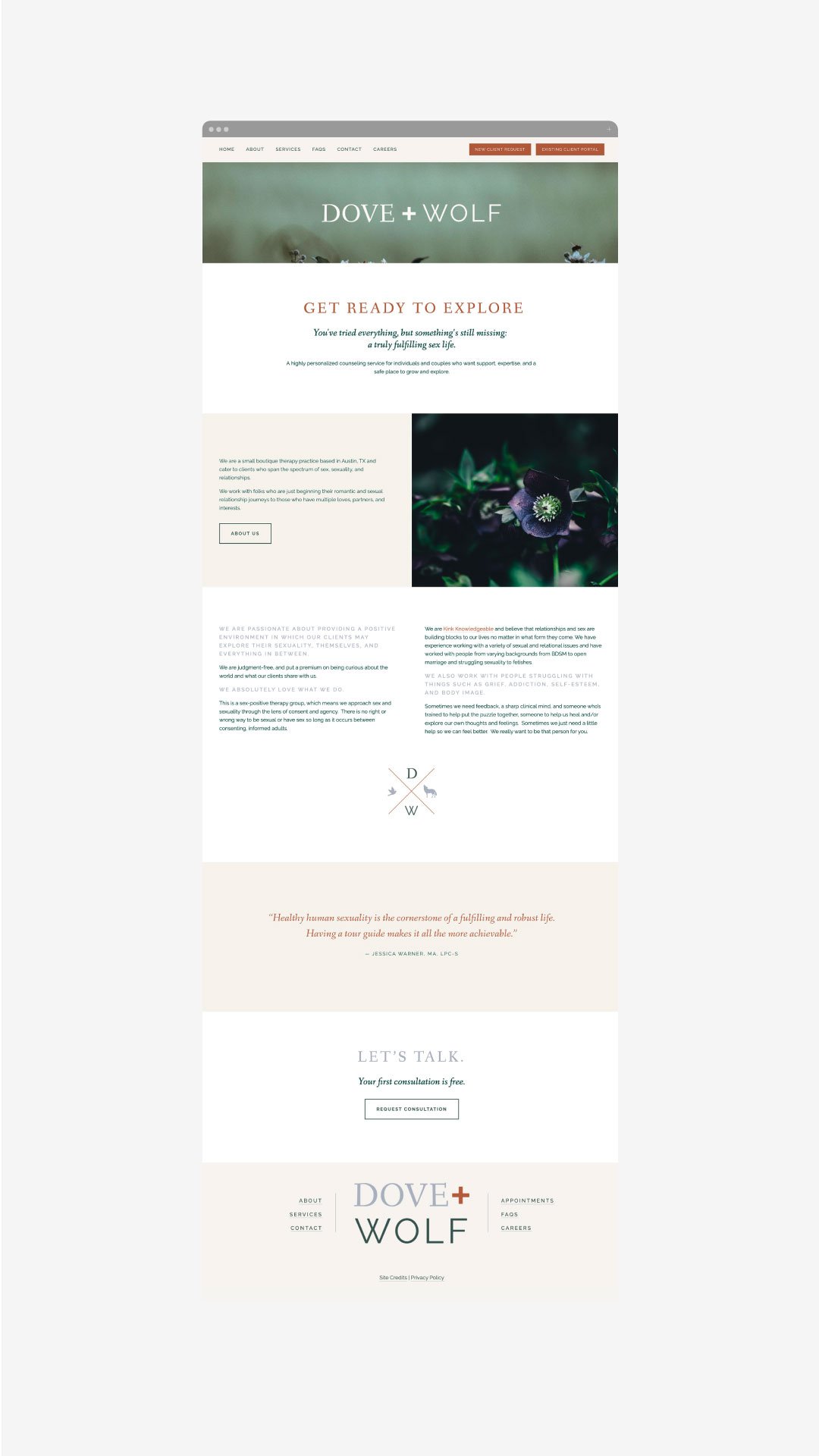
Essential Tips for Creating a Successful Private Practice Website Design
A professional private practice website is an essential part of attracting new clients and building relationships with existing ones. In today's digital world, it is important to design a website that provides an exceptional user experience and highlights the services you provide. Follow this guide to learn the key elements of creating a successful, customer-friendly private practice website.
Understand Your Goals and Focus on User Experience.
When designing a website for your private practice, you should first consider your goals. Think about the types of clients you want to attract, and focus on providing an exceptional user experience. Your website is like your online office; it should reflect what a client would feel if they stepped into your office for an IRL session. Make sure the navigation is intuitive and every page loads quickly. Consider adding customer reviews, engaging visuals, and informative content that positions you as an authority in your field. Above all else, remember to prioritize customer needs and keep the design simple yet effective!
Craft an Eye-Catching Home Page Design that Fits Your Practice’s Brand.
The homepage of your website should be the most compelling page as it’s the first page visitors will see. Make sure to create an eye-catching yet professional design by using visuals and concise descriptions that stay true to your practice’s branding. Keep in mind that the homepage should provide a brief overview of what you specialize in and how you can help potential clients, so make sure all elements are branded and organized for maximum impact. Additionally, add calls-to-action to help direct visitors through the website. (A call-to-action is a fancy word for a button, link or ‘next step’ for the person visiting your website).
Be Clear About Your Services, Fees and Contact Information.
Key pillars for a successful private practice website include displaying your services, contact information, fees and scheduling capabilities in a clear and concise manner. This will allow visitors to get the answers to questions they may have about your practice as soon as possible. Additionally, consider integrating with third-party platforms to allow for easy appointment booking on the same page. Lastly, make sure any important contact information is visible and easily accessible from any page on the website
Optimize your Site for Mobile Viewing.
Mobile optimization is crucial for creating a successful private practice website. Many potential clients are likely to access your site from mobile devices such as iPads, iPhones, Android phones and tablets. To ensure that these visitors don't become frustrated with load times or the design of your website on their device, make sure that your template is responsive and optimized for different screen sizes. This will ensure that visitors are able to navigate and access all relevant information quickly and easily on their device of choice.
Make Sure the Site is Secure and Accessible to All Users.
Private practice websites must be secure for potential clients to use — after all, there are likely sensitive topics discussed on your site, and so it's important that all information shared is kept private between the clinician and client. Also, ensure that all aspects of the website are accessible to visitors. For example, make sure images have descriptive alt text for those who can't see them; links don’t just indicate “click here” but rather say what they go to; and visitors with motor difficulties can access content without relying on a mouse. (You can pop over to this post for more on this topic!). This way you can broaden the scope of your reach and attract more different types of patients.
Attracting new clients to your private practice is easy if you prioritize their user experience! You’ve got this.
need even more help with your website?
Skip the overwhelm and have your website
designed and launched in just 5 days!


