The 10 Best Website Designs for Therapists: 2023 Edition
Missing out on potential leads? Learn how to improve your search engine ranking and increase traffic to your website with tailored SEO tips for therapists.
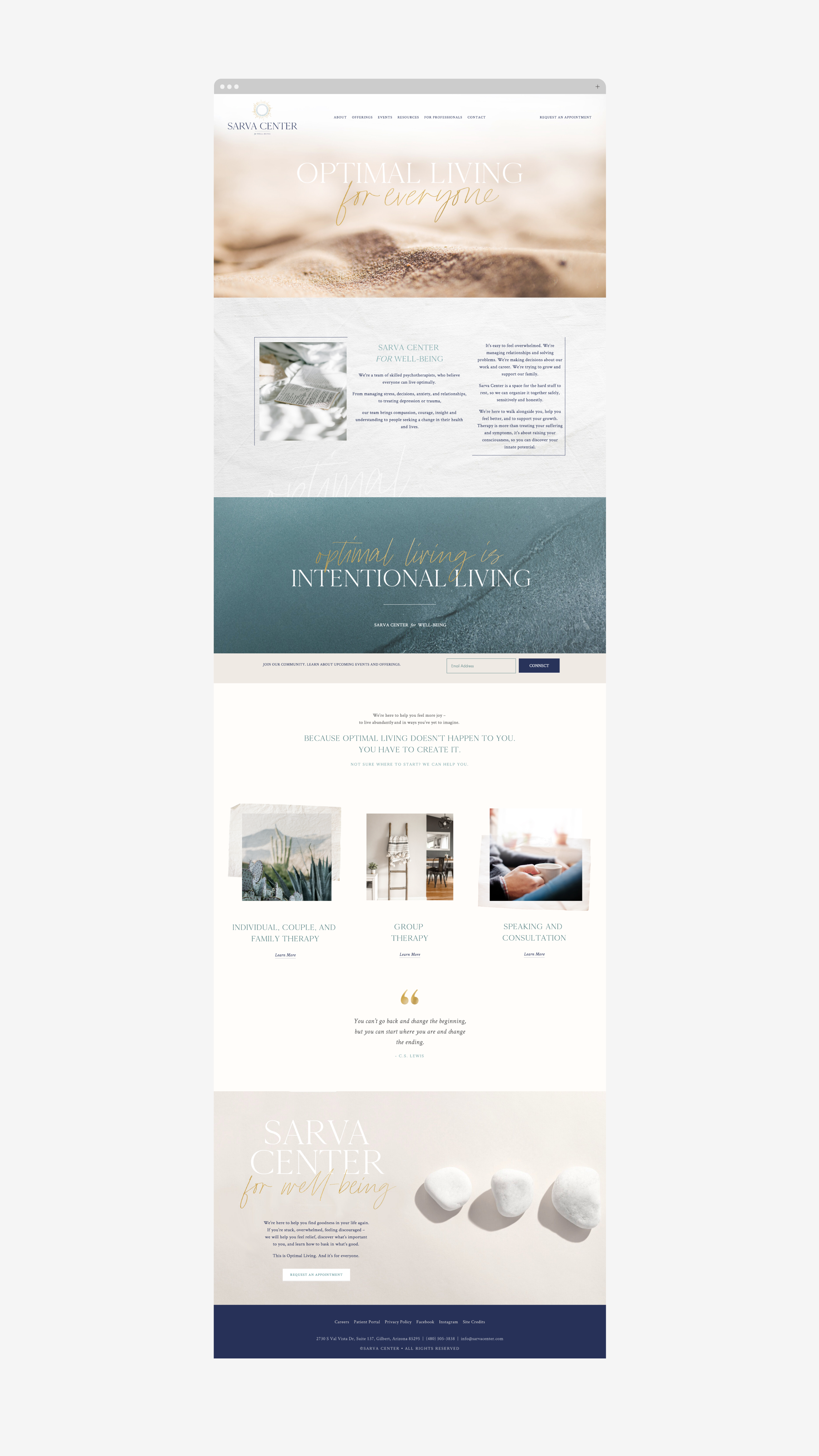
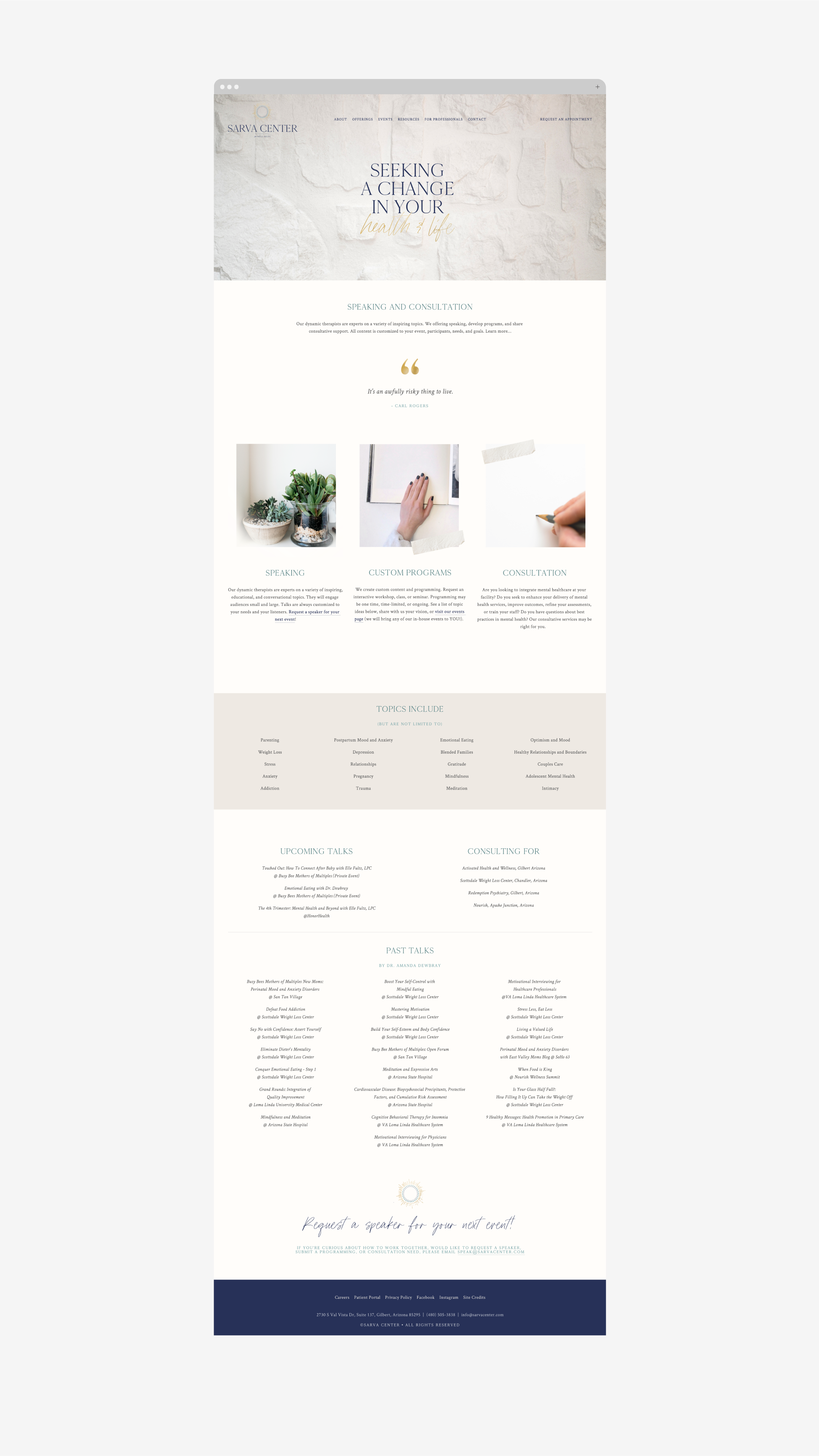
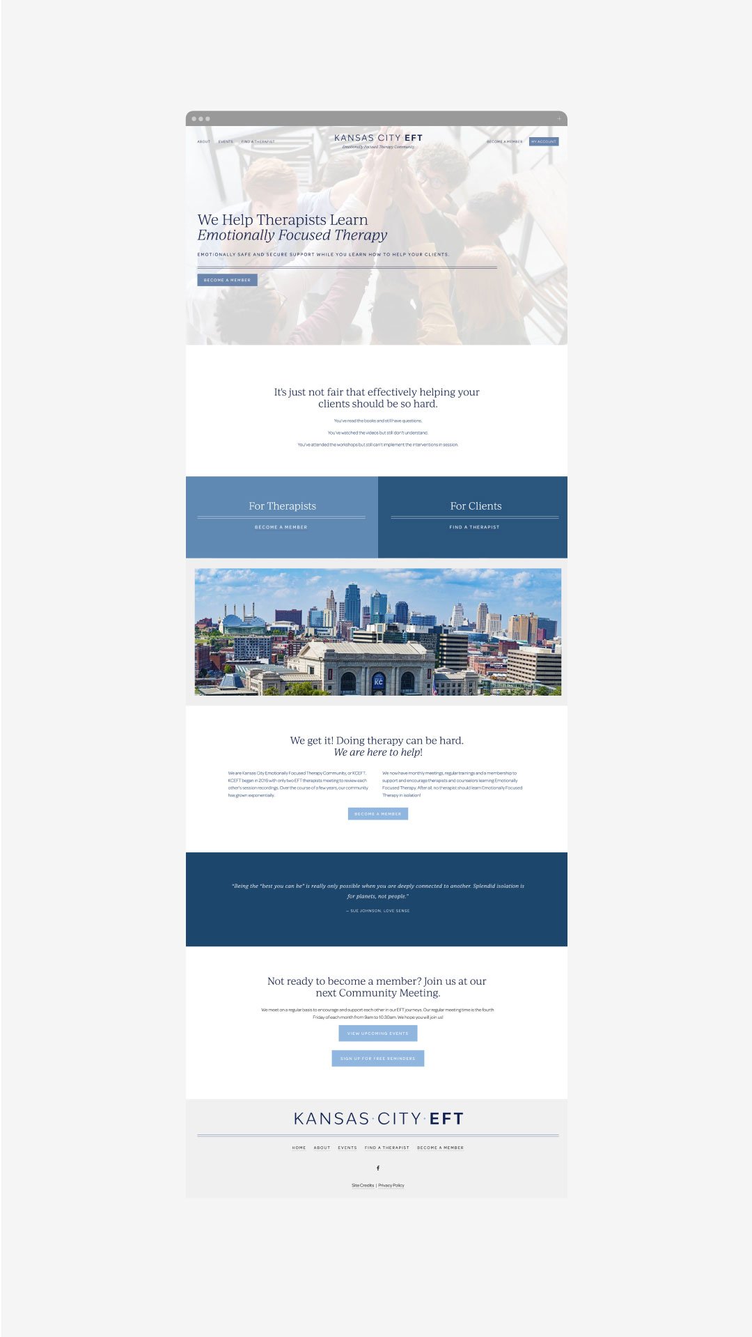
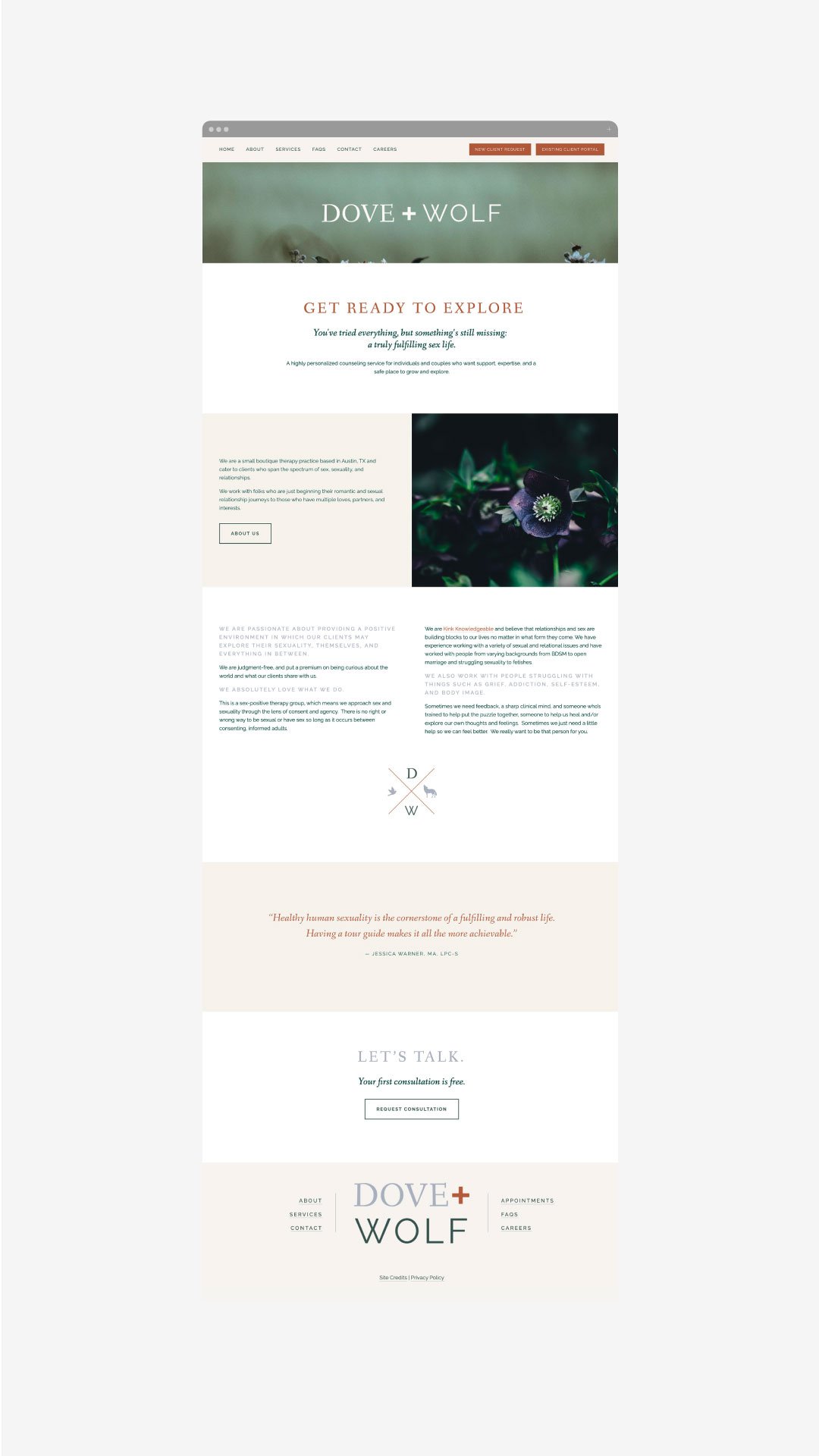
For a therapist just starting your private practice, a website can be a huge marketing machine for your growing business. You can let the designs and vibe speak for you before you ever have that initial call with a potential new client. Website designs for therapists can have a range of styles, so below we’ve rounded up our favorited designs from 2023 that were made specifically with a therapist’s website needs in mind!
The Therapy Group
The Therapy Group’s website instantly gives a sense of calm with its soft, inviting colors and beautiful textured backgrounds. We love how the brand elements are incorporated into every section without feeling overbearing.
Website: The Therapy Group
Buffalo Roam Therapy
Buffalo Roam Therapy’s website stands out from the crowd with a warm, inviting color scheme. We love the consistent use of brand elements throughout the site - it really portrays the vibe of their Kansas location!
Website: Buffalo Roam Therapy
Rebecca Newton Therapy
Sometimes less is more. Rebecca Newton Therapy’s website has simple, clean layouts - making the process of working her feel just as simple. We love the soft colors and stunning photography.
Website: Rebecca Newton Therapy
Oak & Stone Therapy
Soft colors, hand-drawn elements and unique layouts - what’s not to love! Oak and Stone Therapy has a unique and easy-to-use navigation with line elements that are carried throughout the website. We also love that the engaging copy that really speaks to who they are as therapists and what they offer.
Website: Oak & Stone Therapy
Elizabeth Rubio, LCSW
While most therapists take a light, airy feel to their website, we love that Elizabeth Rubio did not stray from color. Her website makes therapy feel fun and inviting, all while clearly conveying her offerings.
Website: Elizabeth Rubio, LCSW
NEW!
a templated guide to
messaging magic
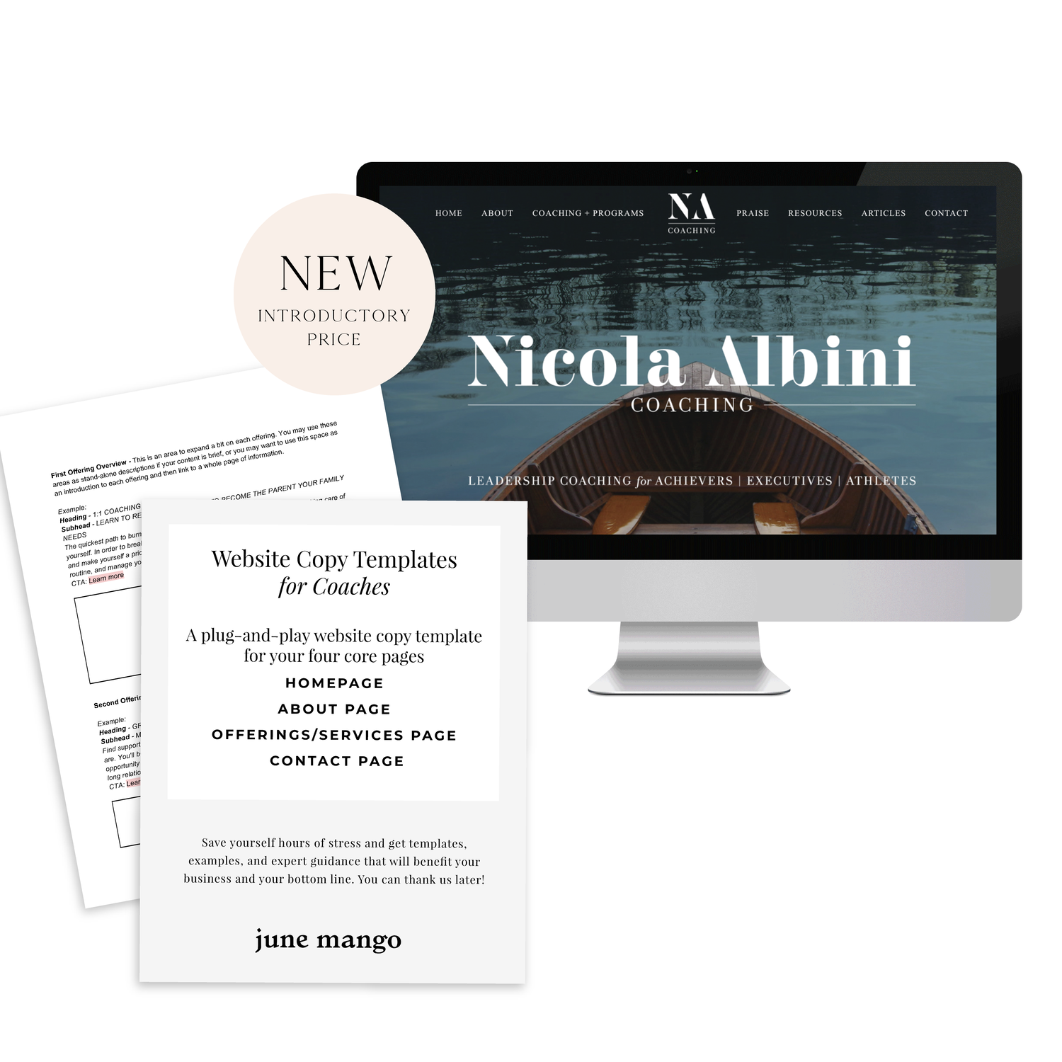
A plug-and-play website copy template for your four core pages (Home, About, Offerings, Contact). Save yourself hours of stress and get templates, examples, and expert guidance that will benefit your business and your bottom line.
get your template now >
Jessica Pavelka Counseling
We were initially drawn to Jessica’s unique photos and use of brand elements. Her website makes it clear who she is and what she offers from the second you land on the homepage - always a win!
Website: Jessica Pavelka Counseling
Dr. Tess Browne
Dr. Tess uses the soft tones of many therapists but adds in a splash of color and unique textured backgrounds. Her website does a great job of establishing her credibility and professionalism, while still feeling like a welcoming, safe space.
Website: Dr. Tess Browne
Dr. Ramona Burrage
Dr. Ramona’s therapy website is clean, quick-to-the-point and absolutely beautiful! We love the full header image, simple layouts and branded elements. It feels both sophisticated and approachable.
Website: Dr. Ramona Burrage
Dr. Nicole Z
This website incorporates nice textured and colored backgrounds that soften the vibe of the pages. It helps the page feel warmer and more welcoming - which is perfect for a therapist! We also love the beautiful logo and how it’s incorporated throughout different parts of the site.
Website: Dr. Nicole Z
Dr. Cassidy Freitas
This website just screams happy to us! We love the use of pink and arch shapes. Another piece that pulls her website together is how on-brand her images are, making the whole website feel cohesive.
Website: Dr. Cassidy Freitas
Looking for a custom website design for your therapy practice?
Skip the overwhelm and have your website
designed and launched in just 5 days!
A Guide to SEO for Therapists
Missing out on potential leads? Learn how to improve your search engine ranking and increase traffic to your website with tailored SEO tips for therapists.
If you’re a therapist, having effective SEO can help you stand out in the crowded online marketplace and attract potential leads who are looking for services. Where do you start if you’ve never done SEO before? Optimizing your website and content with tailored SEO tips is essential if you want to improve your search engine ranking and drive more traffic to your website. If you’ve never done any SEO before, you’re in the right place - start here!
Understand Search Engine Usage and Optimization Strategies.
Start by understanding how to use search engine optimization (SEO) effectively. This includes knowing which keywords and phrases to use in your pages and blog posts to improve your visibility. You should also be familiar with common SEO practices such as optimizing page titles, meta descriptions, and the structure of URLs for maximum visibility. Furthermore, set up quality link-building campaigns on social media or other related websites to drive more traffic to your website.
Create Quality Content That Showcases Your Specialty Areas.
Publishing quality content is essential for successful SEO. Relevant keywords and content tailored to what potential clients are searching for will help to increase your visibility in search engine results. Additionally, you should tailor the content to include specialty areas that you specialize in as a therapist. This ensures that your site has more chances of appearing at the top of search engine results pages whenever someone searches for a specific condition or concern.
Clearly Define Keywords and Identify Long-Tail Keywords.
Keywords are the foundation of effective SEO, and as a therapist, you’ll need to identify words and phrases that serve as important search terms for your target audience. For example, you would be better off with a keyword like “EMDR for car accidents” rather than “EMDR therapy”. The more specific, the higher likelihood you will be seen on search results. Once you’ve done that, you can optimize content in order to rank higher on SERPs (search engine results pages). Additionally, by identifying long-tail keywords relevant to your specialty practice, you can ensure better visibility when people search for specific services or types of therapy.
Optimize your Site for Mobile Viewing.
Mobile optimization is crucial for creating a successful therapy website. So many people (and potential clients!) are using phones and tablets to browse the web and look for a therapist. To ensure that these visitors don't become frustrated with load times or the design of your website on their device, make sure that your web design is responsive (aka: it scales to a smaller screens size) and optimized for different devices. This will ensure that potential clients are able to navigate and access all relevant information quickly and easily on their device of choice!
Optimize Your Website With Structured Data, Schema Markup, and Meta Descriptions & Tags.
A little jargony… I know but stick with me! Structured data, schema markup, and meta descriptions & tags are the technical foundations of Search Engine Optimization. For example, schema markups allow you to identify your content and make it easier for search engines to accurately categorize your website when people are searching for specific topics. Similarly, optimizing your meta titles and descriptions can help potential clients quickly identify whether your website offers the services they’re looking for — making it easier for them to access valuable resources. Additionally, optimizing URLs can increase click-through rates from SERPs (search engine result pages), meaning that more people have a chance of discovering the site on Google or other popular search engines. This does start to get into the weeds and this is usually where I’d recommend chatting with a web designer who knows how to easily set these data points up for your website.
Track Results With Analytics & Use Information to Effectively Monitor Progress Over Time.
In order to track the success of your SEO efforts, you should take advantage of analytics tools such as Google Analytics. It can provide valuable insights into how visitors interact with your website and how people are finding your site in the first place. It’s important to review this data regularly, so that you can make changes to your website’s design and content based on what is actually working for you. Tracking progress over time can allow you to identify where improvements could be made, allowing you to refine marketing strategies and optimize exposure. If you’re not sure how to set up Google Analytics, your web designer can help point you in the right direction!
Don’t miss out on potential leads! You can improve your search engine ranking and increase traffic to your website with a little planning and these tailored SEO tips specifically for therapists! You’ve got this.
need even more help with your website?
Skip the overwhelm and have your website
designed and launched in just 5 days!
Essential Tips for Creating a Successful Private Practice Website Design
Build an effective website for your private practice - find out how! This guide contains valuable advice for creating a website that meets all necessary requirements, helps you grow your business and attract new clients to your private practice!
A professional private practice website is an essential part of attracting new clients and building relationships with existing ones. In today's digital world, it is important to design a website that provides an exceptional user experience and highlights the services you provide. Follow this guide to learn the key elements of creating a successful, customer-friendly private practice website.
Understand Your Goals and Focus on User Experience.
When designing a website for your private practice, you should first consider your goals. Think about the types of clients you want to attract, and focus on providing an exceptional user experience. Your website is like your online office; it should reflect what a client would feel if they stepped into your office for an IRL session. Make sure the navigation is intuitive and every page loads quickly. Consider adding customer reviews, engaging visuals, and informative content that positions you as an authority in your field. Above all else, remember to prioritize customer needs and keep the design simple yet effective!
Craft an Eye-Catching Home Page Design that Fits Your Practice’s Brand.
The homepage of your website should be the most compelling page as it’s the first page visitors will see. Make sure to create an eye-catching yet professional design by using visuals and concise descriptions that stay true to your practice’s branding. Keep in mind that the homepage should provide a brief overview of what you specialize in and how you can help potential clients, so make sure all elements are branded and organized for maximum impact. Additionally, add calls-to-action to help direct visitors through the website. (A call-to-action is a fancy word for a button, link or ‘next step’ for the person visiting your website).
Be Clear About Your Services, Fees and Contact Information.
Key pillars for a successful private practice website include displaying your services, contact information, fees and scheduling capabilities in a clear and concise manner. This will allow visitors to get the answers to questions they may have about your practice as soon as possible. Additionally, consider integrating with third-party platforms to allow for easy appointment booking on the same page. Lastly, make sure any important contact information is visible and easily accessible from any page on the website
Optimize your Site for Mobile Viewing.
Mobile optimization is crucial for creating a successful private practice website. Many potential clients are likely to access your site from mobile devices such as iPads, iPhones, Android phones and tablets. To ensure that these visitors don't become frustrated with load times or the design of your website on their device, make sure that your template is responsive and optimized for different screen sizes. This will ensure that visitors are able to navigate and access all relevant information quickly and easily on their device of choice.
Make Sure the Site is Secure and Accessible to All Users.
Private practice websites must be secure for potential clients to use — after all, there are likely sensitive topics discussed on your site, and so it's important that all information shared is kept private between the clinician and client. Also, ensure that all aspects of the website are accessible to visitors. For example, make sure images have descriptive alt text for those who can't see them; links don’t just indicate “click here” but rather say what they go to; and visitors with motor difficulties can access content without relying on a mouse. (You can pop over to this post for more on this topic!). This way you can broaden the scope of your reach and attract more different types of patients.
Attracting new clients to your private practice is easy if you prioritize their user experience! You’ve got this.
need even more help with your website?
Skip the overwhelm and have your website
designed and launched in just 5 days!
Easily Add Custom Fonts To Your Squarespace Website Design (WITHOUT TYPEKIT)
So you've just been given a beautiful new branding package from your designer full of brand new fonts and everything else. But now you're stumped as to how to add these custom branded fonts to your Squarespace site. But I've gotcher back with a Squarespace hack for you that will bring those branded fonts to life online!
So you've just been given a beautiful new branding package from your designer full of brand new fonts and everything else. But now you're stumped as to how to add these custom fonts to Squarespace. But I've got your back with a Squarespace hack for you that will bring those branded fonts to life online! This little Squarespace hack took me a long time to discover (*covers eyes in shame*)... which is crazy because it's actually pretty simple! It just takes a few simple steps and a little custom code. But anyone can do it! I promise.
Read on for the full tutorials to learn how to add custom font to Squarespace 7.0 and 7.1.
HERE ARE THE STEPS for 7.0:
In the main Squarespace menu, click DESIGN. Then CUSTOM CSS.
Below the CSS editor, click MANAGE CUSTOM FILES.
Then upload your font file (this is a file with an extension of .ttf or .otf)
Copy and paste the following code into the CSS editor:
@font-face {
font-family: 'FONT NAME';
src: url('FONT GOES HERE');}
Change the text that says FONT NAME to the name of your custom font
Highlight the text that says FONT GOES HERE. Then click MANAGE CUSTOM FILES and click on the font you uploaded in the steps above. FONT GOES HERE should now be replaced with a url.
Repeat this step with all of your custom fonts.
Once you have all of your fonts uploaded and added to the CSS code, it's time to make them replace the default Squarespace fonts. To do this, copy and paste the code below into the CSS editor:
h1{ font-family: 'FONT NAME' !important;}
h2{font-family: 'FONT NAME' !important;}
h3{font-family: 'FONT NAME' !important;}
p{font-family: 'FONT NAME' !important;}
You can still adjust the settings of each font in the regular style editor (ie: font size, letter spacing, etc). Make sure to click Save at the top of the Custom CSS page. That’s how to add custom fonts to Squarespace 7.0.
Huzzah!
HERE ARE THE STEPS for 7.1:
Repeat the steps above with all of your custom fonts.
(Because Squarespace 7.1 has 8 different font and heading sizes, you have a couple of additional optional lines of CSS to add depending on which size font you want use to add your custom font to Squarespace.)
Once you have all of your fonts uploaded and added to the CSS code, it's time to make them replace the default Squarespace fonts. To do this, copy and paste the code below into the CSS editor:
h1{ font-family: 'FONT NAME' !important;}
h2{font-family: 'FONT NAME' !important;}
h3{font-family: 'FONT NAME' !important;}
h4{font-family: 'FONT NAME' !important;}
p1{font-family: 'FONT NAME' !important;}
p2{font-family: 'FONT NAME' !important;}
p3{font-family: 'FONT NAME' !important;}
p4{font-family: 'FONT NAME' !important;}
You can still adjust the settings of each font in the regular style editor (ie: font size, letter spacing, etc). Make sure to click Save at the top of the Custom CSS page. That’s how to add custom fonts to Squarespace 7.1.
Don’t forget to refresh your website design and test out the new fonts.
Once you have added the custom fonts to your Squarespace website design, you can begin to test out the new look. Refresh any areas of your site that feature text and check for font rendering issues – if everything looks good, then congratulations – you have successfully added custom fonts to your Squarespace site!
need even more help with squarespace?
Skip the overwhelm and have your website
designed and launched in just 5 days!


