The 10 Best Website Designs for Therapists: 2023 Edition
For a therapist just starting your private practice, a website can be a huge marketing machine for your growing business. You can let the designs and vibe speak for you before you ever have that initial call with a potential new client. Website designs for therapists can have a range of styles, so below we’ve rounded up our favorited designs from 2023 that were made specifically with a therapist’s website needs in mind!
The Therapy Group
The Therapy Group’s website instantly gives a sense of calm with its soft, inviting colors and beautiful textured backgrounds. We love how the brand elements are incorporated into every section without feeling overbearing.
Website: The Therapy Group
Buffalo Roam Therapy
Buffalo Roam Therapy’s website stands out from the crowd with a warm, inviting color scheme. We love the consistent use of brand elements throughout the site - it really portrays the vibe of their Kansas location!
Website: Buffalo Roam Therapy
Rebecca Newton Therapy
Sometimes less is more. Rebecca Newton Therapy’s website has simple, clean layouts - making the process of working her feel just as simple. We love the soft colors and stunning photography.
Website: Rebecca Newton Therapy
Oak & Stone Therapy
Soft colors, hand-drawn elements and unique layouts - what’s not to love! Oak and Stone Therapy has a unique and easy-to-use navigation with line elements that are carried throughout the website. We also love that the engaging copy that really speaks to who they are as therapists and what they offer.
Website: Oak & Stone Therapy
Elizabeth Rubio, LCSW
While most therapists take a light, airy feel to their website, we love that Elizabeth Rubio did not stray from color. Her website makes therapy feel fun and inviting, all while clearly conveying her offerings.
Website: Elizabeth Rubio, LCSW
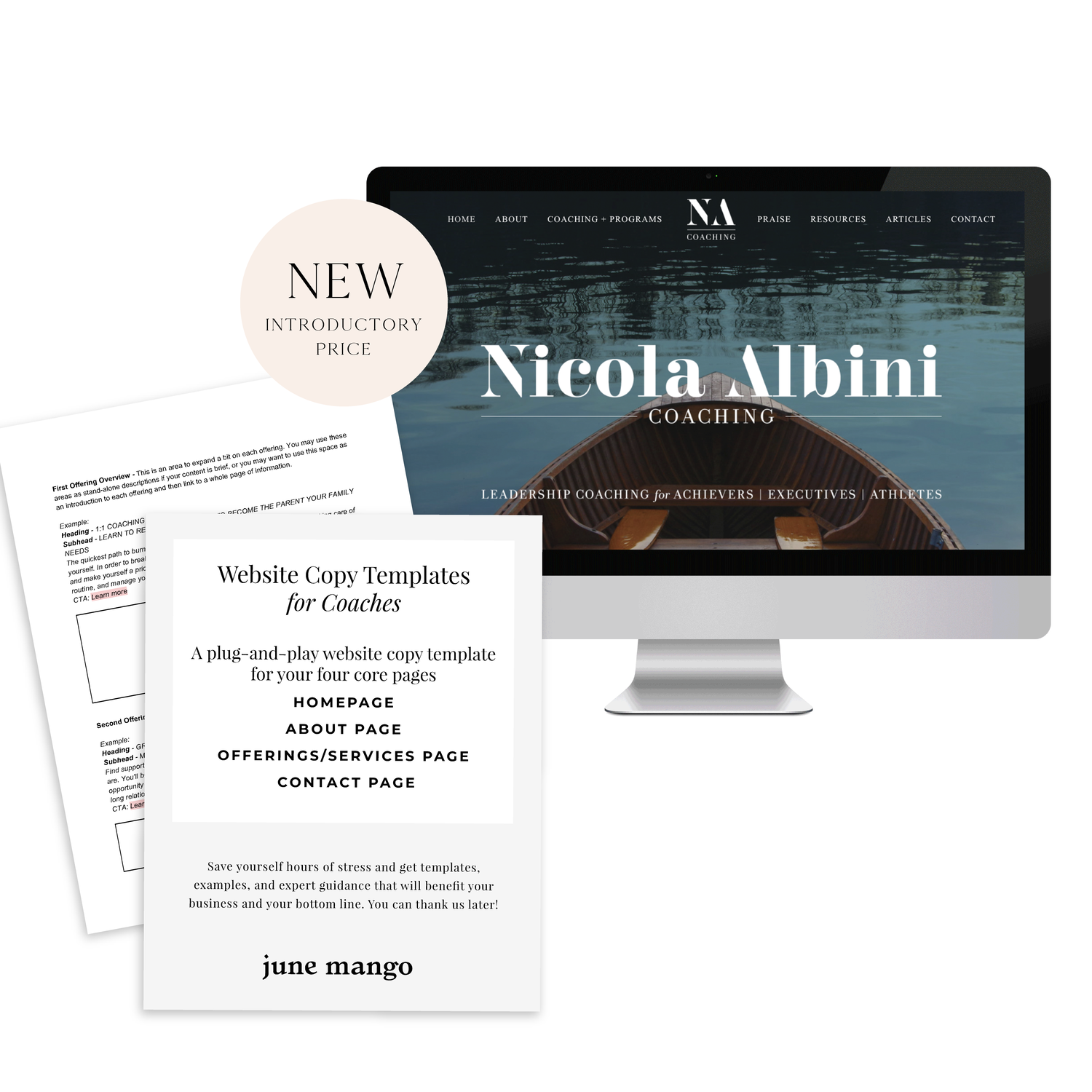
NEW!
a templated guide to
messaging magic

A plug-and-play website copy template for your four core pages (Home, About, Offerings, Contact). Save yourself hours of stress and get templates, examples, and expert guidance that will benefit your business and your bottom line.
get your template now >
Jessica Pavelka Counseling
We were initially drawn to Jessica’s unique photos and use of brand elements. Her website makes it clear who she is and what she offers from the second you land on the homepage - always a win!
Website: Jessica Pavelka Counseling
Dr. Tess Browne
Dr. Tess uses the soft tones of many therapists but adds in a splash of color and unique textured backgrounds. Her website does a great job of establishing her credibility and professionalism, while still feeling like a welcoming, safe space.
Website: Dr. Tess Browne
Dr. Ramona Burrage
Dr. Ramona’s therapy website is clean, quick-to-the-point and absolutely beautiful! We love the full header image, simple layouts and branded elements. It feels both sophisticated and approachable.
Website: Dr. Ramona Burrage
Dr. Nicole Z
This website incorporates nice textured and colored backgrounds that soften the vibe of the pages. It helps the page feel warmer and more welcoming - which is perfect for a therapist! We also love the beautiful logo and how it’s incorporated throughout different parts of the site.
Website: Dr. Nicole Z
Dr. Cassidy Freitas
This website just screams happy to us! We love the use of pink and arch shapes. Another piece that pulls her website together is how on-brand her images are, making the whole website feel cohesive.
Website: Dr. Cassidy Freitas
Looking for a custom website design for your therapy practice?
Skip the overwhelm and have your website
designed and launched in just 5 days!


