Why You Need a Mood Board for Your Private Practice Logo
Discover why private practice therapists need a professional logo and why a mood board is the crucial first step with therapy logos to build trust, attract more clients, and boost income with expert logo design for therapists.
If you’re a therapist in private practice, chances are you’ve spent a lot of time learning how to help people—but maybe not as much time thinking about your branding. One of the most overlooked (yet powerful) parts of building a successful practice is your logo.
But before a designer dives into the details of the logo itself, they will create a mood board. A mood board is an internal tool created to ensure that the logo designer is on the same page with their client. This mood board should of course convey the mood and vibe of the brand, but how does that translate to private practice therapists?
First Impressions Matter in Private Practice
When someone searches online for a therapist, they’re often feeling vulnerable, overwhelmed, or uncertain. Your branding is going to be one of the main visuals a potential client interacts with before deciding to contact you. The mood board is going to make sure that the vibe they are visually processing is the same vibe they will have when they work with you. Through photos, colors and graphic elements, you should be able to get the look and feel your going for and make sure it matches what you want in a logo for your private practice.
Logos for Your Therapy Practice Build Trust and Connection
A well-crafted logo isn’t just about looking pretty—it’s about creating an emotional connection. The colors, shapes, and typefaces in your logo do more than decorate—they set the tone for your practice:
Bold, vibrant palettes convey energy, confidence, and momentum.
Minimalist layouts with ample white space communicate focus and simplicity.
Hand-drawn or textured elements suggest authenticity, warmth, and a personal touch.
Geometric patterns can highlight balance, structure, and stability.
Elegant serif fonts evoke tradition, wisdom, and trust.
When your logo mirrors the feelings your clients hope to find, it makes it easier for them to picture a meaningful connection with you—often before they’ve even reached out. And the first step is to map these elements out in a mood board. The mood board will showcase your color palettes, font examples, iconography and photography. All of these should work together to create the emotional tie the logo will bring to life.
Standing Out in a Crowded Field
Let’s be honest: the therapy world is crowded, especially in cities and online platforms. Many therapists offer similar services, and clients often scroll through dozens of profiles before making a decision.
A distinctive, professional therapy logo design helps your practice stand out. Instead of blending into a sea of text-heavy listings, your visual identity makes you memorable. The right design can set you apart as the therapist who “feels right” even before a consultation call.
A Mood Board Helps Nail Down Who Your Client Is
By gathering colors, images, fonts, and textures that reflect the feelings you want clients to have when they first encounter your practice, you start to see patterns emerge. Maybe your ideal client is drawn to calm neutrals and open space, signaling a need for safety and groundedness. Or perhaps they resonate with bold, confident colors and modern typography, pointing to a desire for growth, change, and clarity.
The process forces you to move beyond “what looks nice” and into “what feels right for the people I want to reach.” A strong mood board becomes the foundation of a logo that doesn’t just look professional—it speaks directly to the clients you’re hoping to serve.
When you start your logo design process with a mood board, you’re not just picking colors or fonts—you’re setting the emotional stage for how clients will experience your practice before they ever sit down with you.
It’s the difference between guessing what might resonate and intentionally shaping the first impression you want to give.
A mood board turns your values, vision, and ideal client into something tangible. And once that foundation is in place, the logo practically designs itself—because it’s rooted in meaning, not just aesthetics.
That’s why the best therapy logos always begin with a mood board. It ensures your brand feels consistent, authentic, and aligned with the clients you most want to reach. More than a creative exercise, it’s an act of clarity—one that allows your logo to truly work for you, welcoming the right people in and helping your practice grow with purpose.
Looking for a custom logo design for your therapy practice?
Skip the overwhelm and get a logo
designed that authentically matches your therapy style.
Why Private Practice Therapists Need a Well-Designed Logo
Discover why private practice therapists need a professional logo. Learn how therapy logos build trust, attract more clients, and boost income with expert logo design for therapists.
If you’re a therapist in private practice, chances are you’ve spent a lot of time learning how to help people—but maybe not as much time thinking about your branding. One of the most overlooked (yet powerful) parts of building a successful practice is your logo.
A strong, thoughtfully designed logo can make a big difference in how potential clients see you, whether they choose to reach out, and ultimately how your business grows. Let’s explore why logo design for therapists matters and how the right therapy logos can help you book more clients and increase your income.
First Impressions Matter in Private Practice
When someone searches online for a therapist, they’re often feeling vulnerable, overwhelmed, or uncertain. Your logo is often the first visual element they see on your website, business card, or Psychology Today profile.
A professional therapy logo sends the message that your practice is established, trustworthy, and competent. On the other hand, a dated or generic logo—or worse, no logo at all—can unintentionally make your practice feel less credible. In a competitive market, that first impression can be the difference between a potential client reaching out or moving on.
Therapy Logos Build Trust and Connection
A well-crafted logo isn’t just about looking nice—it’s about creating an emotional connection. The colors, shapes, and typography you choose communicate subtle messages about your style and approach:
Soft, calming tones suggest warmth and safety.
Clean, modern lines communicate professionalism and clarity.
Nature-inspired imagery can evoke growth, healing, and renewal.
When your logo resonates with the feelings a client is looking for, it becomes easier for them to imagine working with you. That trust-building starts before the first session.
Standing Out in a Crowded Field
Let’s be honest: the therapy world is crowded, especially in cities and online platforms. Many therapists offer similar services, and clients often scroll through dozens of profiles before making a decision.
A distinctive, professional therapy logo design helps your practice stand out. Instead of blending into a sea of text-heavy listings, your visual identity makes you memorable. The right design can set you apart as the therapist who “feels right” even before a consultation call.
How a Logo Impacts Your Bottom Line
Investing in professional logo design for therapists isn’t just about aesthetics—it’s about business growth. Here’s how a great logo translates into more clients and revenue:
Higher conversion rates: A polished brand encourages potential clients to click, call, or book.
Better word-of-mouth: Clients are more likely to share your website or business card if it looks professional.
Premium positioning: A well-designed logo allows you to charge fees that reflect the quality of your services.
Think of your logo as a long-term investment in your private practice. It works for you every day—on your website, your intake forms, your social media—helping attract the right clients and reinforcing the value you provide.
Your skills as a therapist are what truly change lives—but let’s be honest, your logo is often what gets people to knock on the door in the first place.
Think of it as the friendly wave before the deep conversation. A thoughtfully designed therapy logo gives your practice a quiet superpower: it builds trust, shows off your values, and makes you memorable in a crowded field.
If you’re ready to grow your practice (and make your future clients’ scrolling thumbs stop in their tracks), investing in professional logo design for therapists is a smart move. The right logo isn’t just pretty—it works hard behind the scenes to help your business flourish.
Looking for a custom logo design for your therapy practice?
Skip the overwhelm and get a logo
designed that authentically matches your therapy style.
The 10 Best Website Designs for Therapists: 2023 Edition
Missing out on potential leads? Learn how to improve your search engine ranking and increase traffic to your website with tailored SEO tips for therapists.
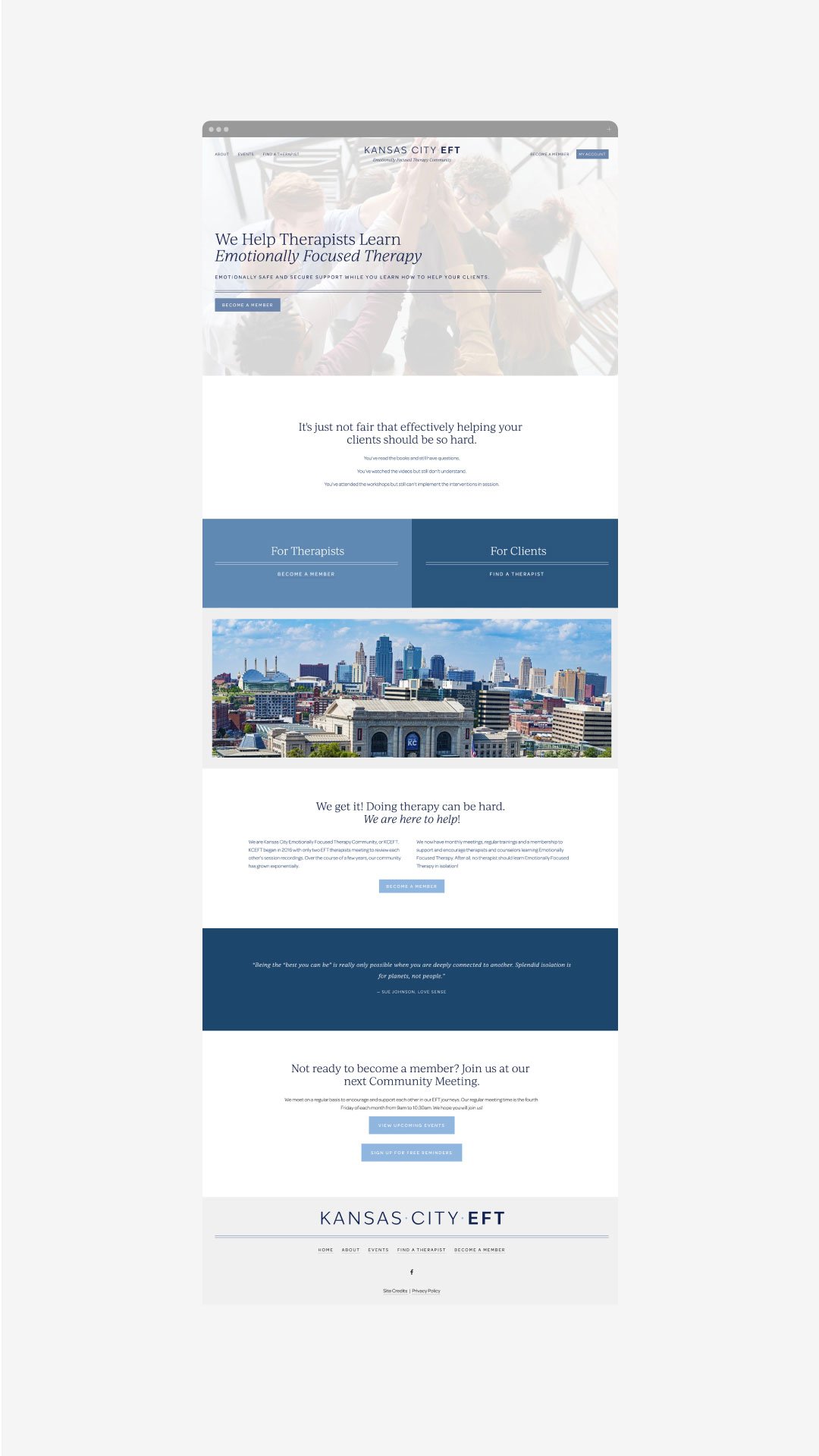
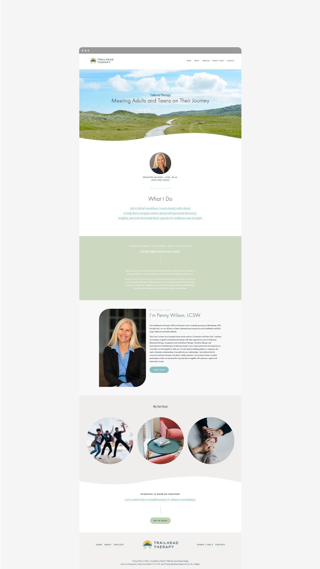
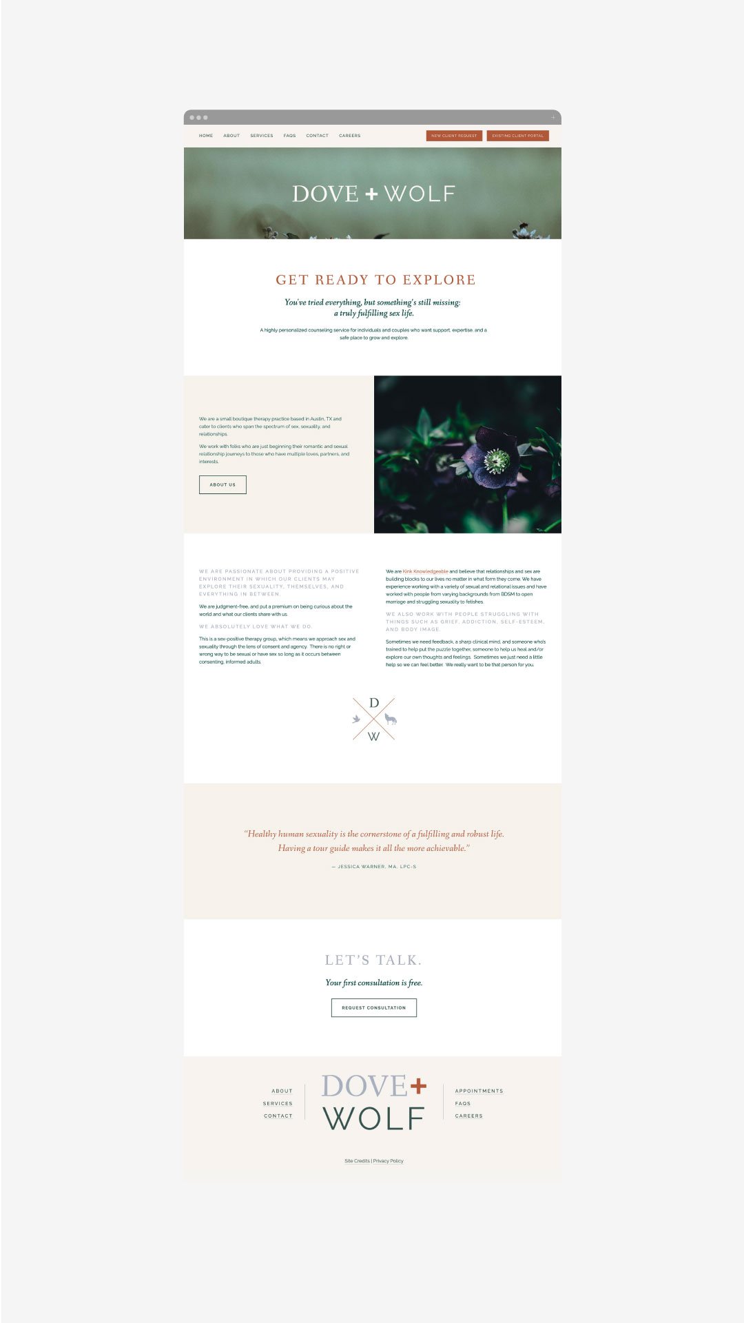
For a therapist just starting your private practice, a website can be a huge marketing machine for your growing business. You can let the designs and vibe speak for you before you ever have that initial call with a potential new client. Website designs for therapists can have a range of styles, so below we’ve rounded up our favorited designs from 2023 that were made specifically with a therapist’s website needs in mind!
The Therapy Group
The Therapy Group’s website instantly gives a sense of calm with its soft, inviting colors and beautiful textured backgrounds. We love how the brand elements are incorporated into every section without feeling overbearing.
Website: The Therapy Group
Buffalo Roam Therapy
Buffalo Roam Therapy’s website stands out from the crowd with a warm, inviting color scheme. We love the consistent use of brand elements throughout the site - it really portrays the vibe of their Kansas location!
Website: Buffalo Roam Therapy
Rebecca Newton Therapy
Sometimes less is more. Rebecca Newton Therapy’s website has simple, clean layouts - making the process of working her feel just as simple. We love the soft colors and stunning photography.
Website: Rebecca Newton Therapy
Oak & Stone Therapy
Soft colors, hand-drawn elements and unique layouts - what’s not to love! Oak and Stone Therapy has a unique and easy-to-use navigation with line elements that are carried throughout the website. We also love that the engaging copy that really speaks to who they are as therapists and what they offer.
Website: Oak & Stone Therapy
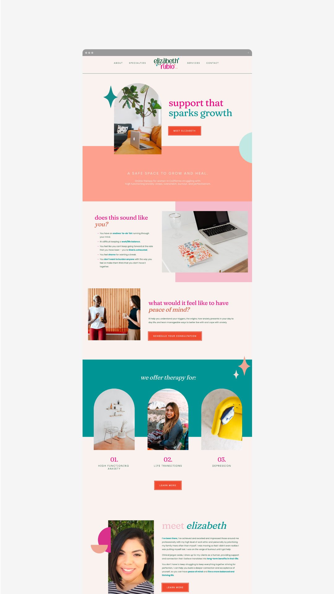
Elizabeth Rubio, LCSW
While most therapists take a light, airy feel to their website, we love that Elizabeth Rubio did not stray from color. Her website makes therapy feel fun and inviting, all while clearly conveying her offerings.
Website: Elizabeth Rubio, LCSW
NEW!
a templated guide to
messaging magic
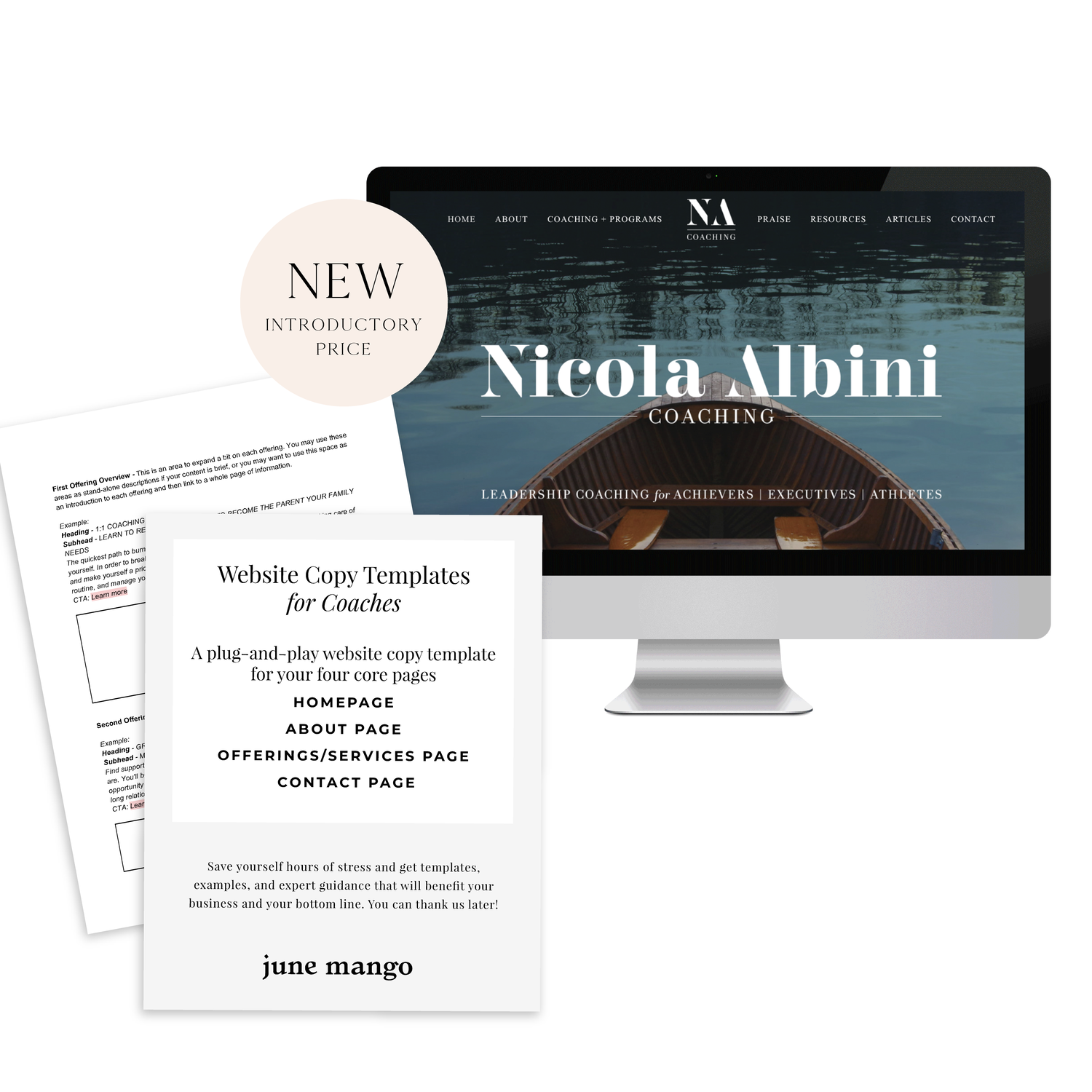
A plug-and-play website copy template for your four core pages (Home, About, Offerings, Contact). Save yourself hours of stress and get templates, examples, and expert guidance that will benefit your business and your bottom line.
get your template now >
Jessica Pavelka Counseling
We were initially drawn to Jessica’s unique photos and use of brand elements. Her website makes it clear who she is and what she offers from the second you land on the homepage - always a win!
Website: Jessica Pavelka Counseling
Dr. Tess Browne
Dr. Tess uses the soft tones of many therapists but adds in a splash of color and unique textured backgrounds. Her website does a great job of establishing her credibility and professionalism, while still feeling like a welcoming, safe space.
Website: Dr. Tess Browne
Dr. Ramona Burrage
Dr. Ramona’s therapy website is clean, quick-to-the-point and absolutely beautiful! We love the full header image, simple layouts and branded elements. It feels both sophisticated and approachable.
Website: Dr. Ramona Burrage
Dr. Nicole Z
This website incorporates nice textured and colored backgrounds that soften the vibe of the pages. It helps the page feel warmer and more welcoming - which is perfect for a therapist! We also love the beautiful logo and how it’s incorporated throughout different parts of the site.
Website: Dr. Nicole Z
Dr. Cassidy Freitas
This website just screams happy to us! We love the use of pink and arch shapes. Another piece that pulls her website together is how on-brand her images are, making the whole website feel cohesive.
Website: Dr. Cassidy Freitas
Looking for a custom website design for your therapy practice?
Skip the overwhelm and have your website
designed and launched in just 5 days!
A Guide to SEO for Therapists
Missing out on potential leads? Learn how to improve your search engine ranking and increase traffic to your website with tailored SEO tips for therapists.
If you’re a therapist, having effective SEO can help you stand out in the crowded online marketplace and attract potential leads who are looking for services. Where do you start if you’ve never done SEO before? Optimizing your website and content with tailored SEO tips is essential if you want to improve your search engine ranking and drive more traffic to your website. If you’ve never done any SEO before, you’re in the right place - start here!
Understand Search Engine Usage and Optimization Strategies.
Start by understanding how to use search engine optimization (SEO) effectively. This includes knowing which keywords and phrases to use in your pages and blog posts to improve your visibility. You should also be familiar with common SEO practices such as optimizing page titles, meta descriptions, and the structure of URLs for maximum visibility. Furthermore, set up quality link-building campaigns on social media or other related websites to drive more traffic to your website.
Create Quality Content That Showcases Your Specialty Areas.
Publishing quality content is essential for successful SEO. Relevant keywords and content tailored to what potential clients are searching for will help to increase your visibility in search engine results. Additionally, you should tailor the content to include specialty areas that you specialize in as a therapist. This ensures that your site has more chances of appearing at the top of search engine results pages whenever someone searches for a specific condition or concern.
Clearly Define Keywords and Identify Long-Tail Keywords.
Keywords are the foundation of effective SEO, and as a therapist, you’ll need to identify words and phrases that serve as important search terms for your target audience. For example, you would be better off with a keyword like “EMDR for car accidents” rather than “EMDR therapy”. The more specific, the higher likelihood you will be seen on search results. Once you’ve done that, you can optimize content in order to rank higher on SERPs (search engine results pages). Additionally, by identifying long-tail keywords relevant to your specialty practice, you can ensure better visibility when people search for specific services or types of therapy.
Optimize your Site for Mobile Viewing.
Mobile optimization is crucial for creating a successful therapy website. So many people (and potential clients!) are using phones and tablets to browse the web and look for a therapist. To ensure that these visitors don't become frustrated with load times or the design of your website on their device, make sure that your web design is responsive (aka: it scales to a smaller screens size) and optimized for different devices. This will ensure that potential clients are able to navigate and access all relevant information quickly and easily on their device of choice!
Optimize Your Website With Structured Data, Schema Markup, and Meta Descriptions & Tags.
A little jargony… I know but stick with me! Structured data, schema markup, and meta descriptions & tags are the technical foundations of Search Engine Optimization. For example, schema markups allow you to identify your content and make it easier for search engines to accurately categorize your website when people are searching for specific topics. Similarly, optimizing your meta titles and descriptions can help potential clients quickly identify whether your website offers the services they’re looking for — making it easier for them to access valuable resources. Additionally, optimizing URLs can increase click-through rates from SERPs (search engine result pages), meaning that more people have a chance of discovering the site on Google or other popular search engines. This does start to get into the weeds and this is usually where I’d recommend chatting with a web designer who knows how to easily set these data points up for your website.
Track Results With Analytics & Use Information to Effectively Monitor Progress Over Time.
In order to track the success of your SEO efforts, you should take advantage of analytics tools such as Google Analytics. It can provide valuable insights into how visitors interact with your website and how people are finding your site in the first place. It’s important to review this data regularly, so that you can make changes to your website’s design and content based on what is actually working for you. Tracking progress over time can allow you to identify where improvements could be made, allowing you to refine marketing strategies and optimize exposure. If you’re not sure how to set up Google Analytics, your web designer can help point you in the right direction!
Don’t miss out on potential leads! You can improve your search engine ranking and increase traffic to your website with a little planning and these tailored SEO tips specifically for therapists! You’ve got this.
need even more help with your website?
Skip the overwhelm and have your website
designed and launched in just 5 days!
Essential Tips for Creating a Successful Private Practice Website Design
Build an effective website for your private practice - find out how! This guide contains valuable advice for creating a website that meets all necessary requirements, helps you grow your business and attract new clients to your private practice!
A professional private practice website is an essential part of attracting new clients and building relationships with existing ones. In today's digital world, it is important to design a website that provides an exceptional user experience and highlights the services you provide. Follow this guide to learn the key elements of creating a successful, customer-friendly private practice website.
Understand Your Goals and Focus on User Experience.
When designing a website for your private practice, you should first consider your goals. Think about the types of clients you want to attract, and focus on providing an exceptional user experience. Your website is like your online office; it should reflect what a client would feel if they stepped into your office for an IRL session. Make sure the navigation is intuitive and every page loads quickly. Consider adding customer reviews, engaging visuals, and informative content that positions you as an authority in your field. Above all else, remember to prioritize customer needs and keep the design simple yet effective!
Craft an Eye-Catching Home Page Design that Fits Your Practice’s Brand.
The homepage of your website should be the most compelling page as it’s the first page visitors will see. Make sure to create an eye-catching yet professional design by using visuals and concise descriptions that stay true to your practice’s branding. Keep in mind that the homepage should provide a brief overview of what you specialize in and how you can help potential clients, so make sure all elements are branded and organized for maximum impact. Additionally, add calls-to-action to help direct visitors through the website. (A call-to-action is a fancy word for a button, link or ‘next step’ for the person visiting your website).
Be Clear About Your Services, Fees and Contact Information.
Key pillars for a successful private practice website include displaying your services, contact information, fees and scheduling capabilities in a clear and concise manner. This will allow visitors to get the answers to questions they may have about your practice as soon as possible. Additionally, consider integrating with third-party platforms to allow for easy appointment booking on the same page. Lastly, make sure any important contact information is visible and easily accessible from any page on the website
Optimize your Site for Mobile Viewing.
Mobile optimization is crucial for creating a successful private practice website. Many potential clients are likely to access your site from mobile devices such as iPads, iPhones, Android phones and tablets. To ensure that these visitors don't become frustrated with load times or the design of your website on their device, make sure that your template is responsive and optimized for different screen sizes. This will ensure that visitors are able to navigate and access all relevant information quickly and easily on their device of choice.
Make Sure the Site is Secure and Accessible to All Users.
Private practice websites must be secure for potential clients to use — after all, there are likely sensitive topics discussed on your site, and so it's important that all information shared is kept private between the clinician and client. Also, ensure that all aspects of the website are accessible to visitors. For example, make sure images have descriptive alt text for those who can't see them; links don’t just indicate “click here” but rather say what they go to; and visitors with motor difficulties can access content without relying on a mouse. (You can pop over to this post for more on this topic!). This way you can broaden the scope of your reach and attract more different types of patients.
Attracting new clients to your private practice is easy if you prioritize their user experience! You’ve got this.
need even more help with your website?
Skip the overwhelm and have your website
designed and launched in just 5 days!
How much money do you need to save for maternity leave?
The second part of planning for maternity leave is going to cover finances and inform everyone around you! If you missed them, check out the first two posts in this series: when you take your maternity leave and how to set up systems for your business to run smoothly.
This is the big question for solopreneurs planning for maternity leave:
how much money do you need to save?
To begin this process of discovery, break down what you pay on a monthly basis now and what you may be paying once the baby comes.
The first category to breakdown is your monthly personal expenses:
mortgage/rent,
utilities,
cable/internet,
auto insurance,
gas,
student loans/debt,
groceries,
health insurance
After this, factor in the baby expenses:
diapers,
pump,
pumping bags,
bottles,
misc. midnight purchases (it happens!).
Planning a baby budget and giving yourself some wiggle room for impulse buys can help alleviate a lot of financial stress in an already stressful situation. You will find there are typically a lot of monthly buys you did not expect for the baby.
The next category to break down are your monthly biz expenses:
marketing,
admin (scheduling apps, website host),
assistants/employees,
studio/office costs
The final category to break down will be your extracurricular expenses:
Netflix/hulu,
takeout/easy meals,
house cleaner,
travel,
savings,
shopping,
hospital bills.
These are all subject to change and might go up or down after the baby comes (ie: maybe more for house cleaning and less for travel). However, having a rough breakdown will help you create a feasible budget for the months you’ll be on leave!
WANT MORE?
DOWNLOAD
THE MATERNITY LEAVE MONEY
WORKSHEETS!
$1.99
Let’s help you plan for business after you have that sweet bundle of joy. We’ll cover the prep, steps and planning to keep your business running — and your mind at ease — during your months of maternity leave.
READY TO DISCOVER HOW TO PREP YOUR BUSINESS FOR YOUR BABY IN A WAY THAT WORKS BEST FOR YOU? LET’S GET STARTED!
How much money you need to have saved
How to pay yourself
How to plan for maternity leave as a solopreneur
During pregnancy, I realized that all the information about maternity leave dealt with people in corporate jobs – rarely people that work for themselves. I had to figure out everything myself (I did a LOT of deep googling). I wanted to help solopreneurs plan for maternity leave without the hassle, so created plans, worksheets, and posts to help teach others what I learned myself.
Preparing for Maternity Leave Part 1:
First, you want to get an understanding of what maternity leave will really feel like, specifically with regard to your emotions and expectations. You may think that you will feel a certain way, but you don’t really know how you will actually feel until you walk through each step.
Everything will change: your emotions, relationships, energy levels, etc. All of this is normal, but remember that while you may think everything will feel fine, it may not – and that is okay!
How do you know when to stop working?
What is the final day that you cross off your to-do’s? This is different for everyone, but there are some good guidelines to follow.
The first is to reverse engineer your time. After 35 weeks, focus your attention only on ‘nice to dos’. These are things that you don’t have to get done and are not crucial. Things such as Instagram posts, newsletters, and expenses.
Before 35 weeks focus on ‘must dos’. These are tasks such as client work, scheduling blog posts, etc. Again, this is all relative to each person and you may feel super exhausted around 30 weeks and need to lay in bed for hours a day, so keep that in mind! If you can, you may also want to scale down your hours slowly instead of stopping altogether.
How long should you plan to be out on maternity leave?
This is personal. I can’t answer that for you! However, I like to say plan for whatever you think you’ll need plus a little more. You can always come back earlier, but it is harder to add extra time at the end after you have scheduled finances, delegations, etc.
Should you work during maternity leave?
This is also different for everyone, but I can give you a few pointers. For many, it depends on the type of work you do. In general, it is better to handle minor tasks: responding to emails, writing posts or newsletters, checking in on social media - but the key is to not stress yourself out with anything work related. Give yourself permission to just be present!
Here are another few things to consider:
Maternity leave shorter than 12 weeks puts women at higher risk of postpartum depression and anxiety.
Will you/how long will you be breastfeeding?
And how long can your partner take off?
WANT MORE?
DOWNLOAD
THE MATERNITY LEAVE MONEY
WORKSHEETS!
$1.99
Let’s help you plan for business after you have that sweet bundle of joy. We’ll cover the prep, steps and planning to keep your business running — and your mind at ease — during your months of maternity leave.
READY TO DISCOVER HOW TO PREP YOUR BUSINESS FOR YOUR BABY IN A WAY THAT WORKS BEST FOR YOU? LET’S GET STARTED!
How much money you need to have saved
How to pay yourself
Creating systems for your business while you take maternity leave
I had a baby back in August 2018.
During pregnancy, I realized that all the information about maternity leave dealt with people in corporate jobs – rarely people that work for themselves. I had to figure out everything myself (I did a LOT of deep googling). I wanted to help solopreneurs plan for maternity leave without the hassle, so created plans, worksheets, and posts to help teach others what I learned myself.
In a previous post, I talked about determining how long to take off for maternity leave and when to start your maternity leave. Pop back to that post here.
Now for the business side of things: setting up systems.
For this process I like to use three tools:
1- DELEGATING
2- DEFERRING
3- DELETING
Delegating is the first step.
For this, I used my virtual assistant to help take on tasks that were still essential to my business, but that I could not accomplish myself during this time. She responded to emails and directed potential and current clients where they need to go. You may find that you need to hire someone new, or it could be as simple as passing on your Instagram to guest takeovers. The key is delegating tasks that someone else CAN do for you while you’re out on your maternity leave.
The next step is deferring.
What should you put off until you decide to come back? These are things like new client projects, sales calls, launches, etc. -- things that all take a lot of effort and time. Let them wait until you come back fully before diving into these tasks.
The last step is deleting.
If you are not going to delegate or defer a task, then you likely just need to delete it. This can include saying no to atypical projects, deleting emails, or just letting go of your marketing plan for a few months. The question to ask yourself is, “What can I take off of my plate right now?”.
Now for the non-biz related issues:
Yes, you have a business to run while your on maternity leave, but you also have a new baby! And you need some extra care, too as you recover and adjust to your new normal. Here are some things you can set up before the baby comes:
Meal prep or request a food train from friends! You are going to be tired and extremely hungry during those first few months. At the end of a long day, it is so nice to be able to lean on someone else for dinner (or those meals you so studious froze weeks ago).
You also need to find a strong support system! Whether it be family, friends, doula, partner, etc. There is not a MORE important time for community than after the arrival of a baby.
Also, prepare for the potential onset of postpartum anxiety and depression. No one thinks it will happen, but it’s much harder to find the help you need when you’re in it. Find breastfeeding support as well. La Leche league is a good group to reach out to, and there are also some city-specific resources that may be worth looking into!
I suggest creating a list of names + numbers of support professionals you can quickly call if needed (ie: lactation consultant, post-partum doula, therapist, etc).
WANT MORE?
DOWNLOAD THE MATERNITY LEAVE
SYSTEMS WORKSHEET!
$1.99
Creating a consistent brand
You’ve invested all of this time creating the perfect brand identity through logos, submarks, color palettes, and more. It is time for you (or your branding client) to keep things consistent and cohesive long after those brand files are turned over.
Develop a brand style guide
One of the main components of creating and keeping a consistent brand is through a brand style guide. This guide will provide you with brand identity standards for everything - logo, colors, fonts, icons, and more. Develop a plan for what rules you will have for how to use your brand. From how colors could be combined to the fonts you will use on printed materials - you name it. Your guide will help your brand look and feel the same no matter where you have it displayed or featured.
Create your brand messaging
Anything word related to your business, such as your tagline, mission statement, your “why,” etc. needs to be refined and fine-tuned through brand messaging. Developing your brand message can really help with wording that email, writing your about page or ways you interact in a professional setting about your business. Having this “voice” developed will help you along the way.
Identify where you will “show up”
There are plenty of possibilities of places your brand could exist and show up. I recommend taking some time to consider precisely where you plan on being a presence. This can help you determine a plan of action for those spaces, but also create a sense of how far your brand reach can extend.
Areas to consider:
Digital: where will your brand show up online or on social media?
Print: will you have printed collateral of your brand such as business cards or direct mailers?
In-person: You may have a storefront or attend conferences representing your business. You may even yourself be your brand (your business = your personal brand).
How to carry out the consistent brand
While you may think you have the capability to do all of this yourself and do it well, it can be challenging to keep up with it all. Hiring a designer or a copywriter (or both) to help you with the elements of your brand identity can be a sure way to keep your brand consistency in check. Above all else, having those resources (the brand style guide and messaging standards) can help keep things the same. No matter what platform a potential client, customer, etc. interacts with your brand - it is all the same!
WANT to CREATE
a custom LOGO?
BRANDING YOUR INSTAGRAM STORIES
There are so many ways to share on Instagram Stories and while the easiest way is to share a quick photo or video selfie, there are some strategies you can implement to add your brand's voice and visuals to your stories timeline.
Since Instagram is such a great place to connect and share socially, I love sharing pieces of my clients' logo process, color palettes I'm creating, and sneak peaks at websites I'm building. There are so many ways to share on Instagram Stories and while the easiest way is to share a quick photo or video selfie, there are some strategies you can implement to add your brand's voice and visuals to your stories timeline.
01. Share what's inspiring you
I love this one because it's so simple, but it's unique and fun. Sharing a little collage or even just one photo of someone you've been following is a great way to share your aesthetic AND connect with your fellow 'grammers. Make sure to tag your story with the handle of the person's photo(s) that you're sharing so that they can engage with you and your followers can also engage with them.
02. Share what you're working on
If you normally share the finished product, try sharing some of the pieces that make up the process in your Instagram Stories. For me, this often looks like the logos that I create that don't get the final go ahead from my client. It's fun to share these designs that otherwise would never be seen! Plus, this gives future dream clients an idea of what it actually looks like to work with you.
03. Promos + marketing
Instagram Stories is a great place to promo something you want to make sure people see! Especially since the stories show up at the top of your audience's news feed, you are more likely to get seen and skip worrying about the newest Instagram algorithm. And there are lots of unique ways you can share and promote without feeling spammy. Take a look at the examples below for inspiration.
04. Share your blog posts
This might be my favorite thing to share on Instagram Stories because you already have the content! All you have to do is jazz it up for Instagram. By creating a few images for each major point of your post, you can share your content and make sure it's getting seen even if someone never visits your blog!
Not too hard, right?
Have another idea for injecting your brand
into your Instagram Stories?
How to Get Your Website Ready to Launch
You’ve done the hard work and prepared a website that you are ready to share with the world. But before you go live, you may want to check out of a few of these things first. Use this guide to get your website ready to launch!
You’ve done the hard work and prepared a website that you are ready to share with the world. But before you take your new, shiny website live, you should run through what I call a “launch list” first. Some of these items may be more necessary than others, but certainly all steps are recommended to to make sure your website is ready to launch!
✴ Step One - Finalize Your Site’s Design + Style
Make sure you have your site title and logo set. Your logo can replace your site title in your website design, but your site title will be important for places like search results.
You can use the Site Style panel underneath the Design menu to get your fonts, colors, headings, spacing, etc. consistent and in line with your business branding.
Another thing to consider is adding in a cookie banner for your visitors, if you think their privacy is valuable to them. It is better to be on the safe than sorry side with this one (especially if you have ANY web visitors in Europe), so I encourage you to add a cookie banner into your final design.
Lastly, upload a favicon to show up in browser tabs for your visitors. This fun little detail shouldn’t be skipped!
✴ Step Two - Wrap Up Your Pages
Set a homepage that represents your brand and style well. Make sure this landing page has all of the major information covered and highlighted for your website visitors. This will be your first impression, so make it a good one!
Double check that your navigation is ordered how you want it. Consider how the user will view the site and make items like your Shop or Services page easily accessible.
Review your content for typos and while you are at it, check for broken links.
Finalize your URL slugs for all of your pages. Have them reflect the content that is available on the page. For example, you don’t want your contact page to have an odd url like /sendmeanote. Google would rather see a URL slug like /contact. In short, keep things simple and straightforward.
For bonus points, a custom 404 page is always a good idea in case visitors end up in the wrong spot. Direct them back to the home page from there.
✴ Step Three - Review Your Images
Check the quality of your images and make sure things are showing up clearly on your website. There is nothing worse than a pixelated image. Keep things crystal clear. Upload thumbnails to your pages and social sharing images that are branded and in line with the content you are sharing.
Make sure you also check images on your phone. Banner images get cropped into a square, so if you’re face is to the right side of your banner image, you may not even show up on mobile!
✴ Step Four - Check Domains and Integrations
If you happen to have more than one domain, make sure all URLs direct to the primary domain you want to use.
Have a friend double check newsletter sign-ups and form submissions to see that everything is running smoothly.
If you have other items integrated like social icon links or third-party codes, check that they direct visitors to the right pages and everything looks correct.
✴ Step Five - Get Your SEO in Check
This is an important one my friends. Do not, I repeat DO NOT, skip over this part. Learn more about SEO through one of my favorite blog posts to date.
✴ Step Six - Make Sure Your Online Shop is Ready for Shoppers
A few different steps for this one so I am going to break it down below. (Don’t have an online shop? Feel free to skip over this part!)
Add your payment processor so you can make that $$$.
Double check the tax rules that will need to be applied to your shop/products.
If you are offering physical products in your shop, you are going to need at least one shipping option available to your customers.
Try out a test order to see how the process looks for the user. From the check out page to email confirmation, see that everything is squared away.
Review your pricing again. Did you set everything at the right price point?
Turn off that test mode so you can start making some real sales!
Also consider a special promo or discount for when your site goes live to promote new shoppers!
✴ Step Seven - Hit Publish
Change your website visibility to LIVE and get ready to start sharing to the world!
Remove any page passwords if you have them, if you have a ‘website coming soon’ page take it down and if you need to invite or remove site contributors such as a copywriter or outsourced help, do so now.
Also do one last check on your mobile device since most visitors will be coming in through their phones or mobile devices!
✴ Step Eight - Celebrate!
Pop the confetti cannons, treat yourself to a happy hour, or leave the office early for the day. Find a way to celebrate and do it! You’ve earned it with all of the hard work you have put in. Congratulations!
BONUS!
To help keep up with everything listed above, I have designed a checklist for you! Print it out and keep it at your desk to make sure you have all of the boxes properly crossed off.
WANT to CREATE
a custom WEBSITE?
SIMPLE TIPS FOR MANAGING YOUR INBOX
When I talk to other creative biz owners, the most common complaint they have at any given time is about their out-of-control inbox. "Who has the time?" they say, or "It's just too overwhelming." And inbox zero? "Impossible!" There are a few major problems with having an inbox that is overflowing...
When I talk to other creative biz owners, the most common complaint they have at any given time is about their out-of-control inbox. "Who has the time?" they say, or "It's just too overwhelming." And inbox zero? "Impossible!" There are a few major problems with having an inbox that is overflowing:
Things get lost. Then tasks get left behind and client projects get delayed.
Clients feel ignored. This is my #1 no-no as a biz owner!
You feel overwhelmed or drained! You don't have time to do what lights you up / what you love.
I promise that this does not have to be the case!
I have some simple tips for managing your inbox that will help you get back to doing what you love.
Touch it once. I admit that I have a hard time with this one, but it's really helpful. The idea is that you only "touch" an email one time, which means that if you read it, respond right away rather than clicking over to the next email or marking it "unread". This helps you respond to the email without letting it linger in your inbox. But what if the email takes a lot of thought or is a revision on a logo...
Add it to your to-do list. If the email is a client asking you for something that you know will take awhile, add it to your to-do list. Do not use your inbox as your to-do list!! Instead, write the client back to confirm you received their email, and let them know when they can expect your response/next round of deliverables.
Canned responses. You guys, canned responses save my sanity. Canned responses are email templates that you can use for different types of emails. I have a canned response for inquiries, client on-boarding, scheduling, confirming calls, and about 15 more. Heres a handy little guide that walks you through how to set them up on Gmail.
Boomerang for Gmail. Sometimes you may want a reminder to follow up with someone after a a few days or if they haven't responded to you (maybe because their inbox is crazy!). In Gmail, you can install Boomerang, which allows you to set follow up reminders on any given email. For example, maybe you sent out a proposal to your dream client and want to make sure to follow up if they haven't responded within a week. Boomerang can push that email back into your inbox after a week has gone by if your dream client hasn't responded! It also allows you to schedule your emails to send out at a later date.
Archive. If you're starting from a point where you have hundreds and hundreds of emails, just start by archiving them. Archived emails are still around (not deleted), and if you just do a simple search, you can easily find them without cluttering up your inbox.
Those are my top 5 tips for managing your inbox! Here's my inbox for proof that it can be done!
Did I leave any out that you've tried? Let me know and feel free to share your cleaned up inboxes with me!
ps- Gmail did not promote this post! This is just my genuine opinion and what works for me but if Gmail wants to throw some $$ my way, I wouldn't be mad at it. Heyyyyyyy Google.
Swap Out Those Emojis for These Symbols
Move over hair flip emoji, I’ve found a new visual resource. This little visual element can help draw attention to must-read info, your latest download and more on your website
Move over hair flip emoji, I’ve found a new visual resource. Lately, I have been loving Coolsymbol.com. This website has symbols that you can incorporate just about anywhere. Best part: these are all TEXT! So anywhere you can add text, you can add these symbols. This little visual element can help draw attention to must-read info, your latest download and more on your website. See some examples below!
Announcement bar
Buttons
Linked text
Your blog post sign off
Bullet points in blog posts
You can also use these symbols far beyond your website. Email signatures, Instagram bios, social media captions and more. Get creative with it!
{Design Principles} CONTRAST
Contrast is a design principle that is so crucial to creating beautiful branding and web design. But contrast touches all parts of design, not just color. Put simply, contrast occurs when two elements of the design are different - like REALLY different.
So why the hell should you care? (I get it, you've got a business to run... so let's cut to the chase!)
Contrast is a design principle that is so crucial to creating beautiful branding and web design. When you think of contrast, you may think of color - or maybe black and white photography. The higher the contrast, the darker the blacks appear and the lighter the whites appear with little grey in between.
But contrast touches all parts of design, not just color. Put simply, contrast occurs when two elements of the design are different - like REALLY different.
So why the hell should you care? (I get it, you've got a business to run... so let's cut to the chase!)
01. CONTRAST GRABS ATTENTION. Attention gets your audience engaged. An engaged audience clicks through your website, and eventually, they get in touch with you.
02. CONTRAST CREATES ORGANIZATION. It helps your audience flow seamlessly through your About bio, your Services page and your whole site in general!
03. CONTRAST DEFINES THE FOCAL POINT. Think buttons ("Contact Me!"), header text (your mission statement) and photos. Secretly guiding your audience towards what you want them to see or do is this simple little thing called... yup - contrast! 😉
Below is a breakdown of how to create contrast:
POSITION
front/behind
above/below
centered/off-centered
isolated grouped
in/out
right/left
FORM
simple/complex
whole/broken
symmetry/asymmetry
geometric/organic
hard angles/round
DIRECTION
vertical/horizontal
stability/movement
forward/back
clockwise/counter
convex/concave
serif text/sans serif text/script text
Related Posts
Creating a Style Guide for Your Website
Keeping a consistent brand is key for creating a professional, clean look for your business. However, it can be a little difficult to keep everything uniform if you don’t have a spot with everything you need. Creating a style guide can be the perfect solution and go-to file for your website.
Keeping a consistent brand is key for creating a professional, clean look for your business. However, it can be a little difficult to keep everything uniform if you don’t have a go-to spot for all of your brand elements. Creating a style guide can be the perfect solution for your website!
So what is a style guide? Great question. A style guide combines every visual element of your brand in one nifty document. Consider it your cheat-sheet for your branding. You can easily find color codes, fonts and more thanks to your handy website style guide.
A website style guide can also serve as a “test run” for an updated branding refresh. You can review your design before doing a complete overhaul of your website, collateral materials, etc.
Here is a main checklist of what to include in your style guide:
main logo
images/inspiration
colors + color codes
fonts
other visual elements such as form buttons
Other things you could include in your style guide:
social icons
email newsletter layouts
instructions on how to use your visual elements such as spacing rules
blog post formatting
client proposal layouts
whatever you like!
Tools like Photoshop or Illustrator are great for creating your style guide, but even if you don't have fancy design programs, Canva is a great resource too!
Do you have a brand style guide? How has it helped your business? Let me know how it has been a game changer for you!
NEED EVEN MORE HELP WITH SQUARESPACE?
Skip the overwhelm and have your website designed and launched in just 5 days (or less)!
LEARN MORE
Recent Posts
Using Instant Downloads as an Email Opt-In on Squarespace (+ tutorial)
So you've got your email newsletter software set up and ready to go, but you are missing one crucial tidbit - subscribers! One way to get some sign ups is through an instant download on your website.
So you've got your email newsletter software set up and ready to go, but you are missing one crucial tidbit - subscribers! One way to get some sign ups is through a free opt-in on your website. And one way to do this is to make it an instant download straight from your website.
A benefit of an instant download is that you don't have to worry about software automation with your email subscription service. In laymen's terms, this means you don't have to set anything up in MailChimp, ConvertKit, etc. This is handled straight away through your Squarespace site.
Your instant download can be whatever you like from checklists to stock images, you get to create what is available. Keep in mind, this instant download should give potential customers/clients an awesome resource or provide a solution to an issue they might be facing. That way, they will be more willing to turn over their email address and get to the goods.
To learn more about setting up your own instant download on Squarespace, check out the tutorial below:
Like this tutorial video?
Check out the Squarespace Supply Room - a members-only video tutorial library for Squarespace. Get a year-long membership and start soaking up all that good web knowledge. More details this-a-way!
Recent Posts
How to bring your brand to life online
A brand’s online presence is a huge component of sharing your business with the world! How you position your brand online is how you are going to attract your dream clients.
A brand’s online presence is a huge component of sharing your business with the world! How you position your brand online is how you are going to attract your dream clients. During my recent webinar with Devan Danielle from devandanielle.com, we shared everything you need to know about branding your business online. From those client buzzwords to your brand’s overall personality, we talked about it all!
Want to watch the full webinar replay? Click here for access to the full video! Here's a little preview of the topics we covered below:
What You Do vs. Your Title
While your job title with your business can say a lot about what you do, it might not communicate the whole picture. Make sure to use terminology that potential clients will understand. Someone might end up turning away from your business because they get confused about what you are offering. Hone in on your expertise. While you may do a variety of things, having an overall topic or umbrella of services/products helps with clarification as well. This also sets you up as an expert on the topic, leading to referrals and increased recognition. At the end of the day, just be clear about your business along with incorporating yourself into your brand.
Brand Values + Buzzwords
So what is the purpose behind what you do? Not too sure? The definition of your business values can be a gamechanger. Your brand values act as a compass for your business. Decisions, marketing campaigns, client work and more will be clarified thanks to your brand values. Figure out what you value most as a business owner and brainstorm what your ideal client values most as well. Where the two lineup is where you need to be to attract those dream clients. This is where the money is!
Another way to connect with your dream clients is by utilizing your business buzzwords. These are the terms they are searching for on Pinterest, Google, through Instagram hashtags and more. Use these buzzwords on your social media platforms, within your website, newsletters, etc. to increase your connection with these terms for potential clients.
This is just the tip of the iceberg. We covered this and so much more in our webinar! Make sure to watch the full replay for all of tips and tricks we shared! We want to help you bring your brand to life online!
Have questions? Shoot me a DM on Instagram!
Related Posts
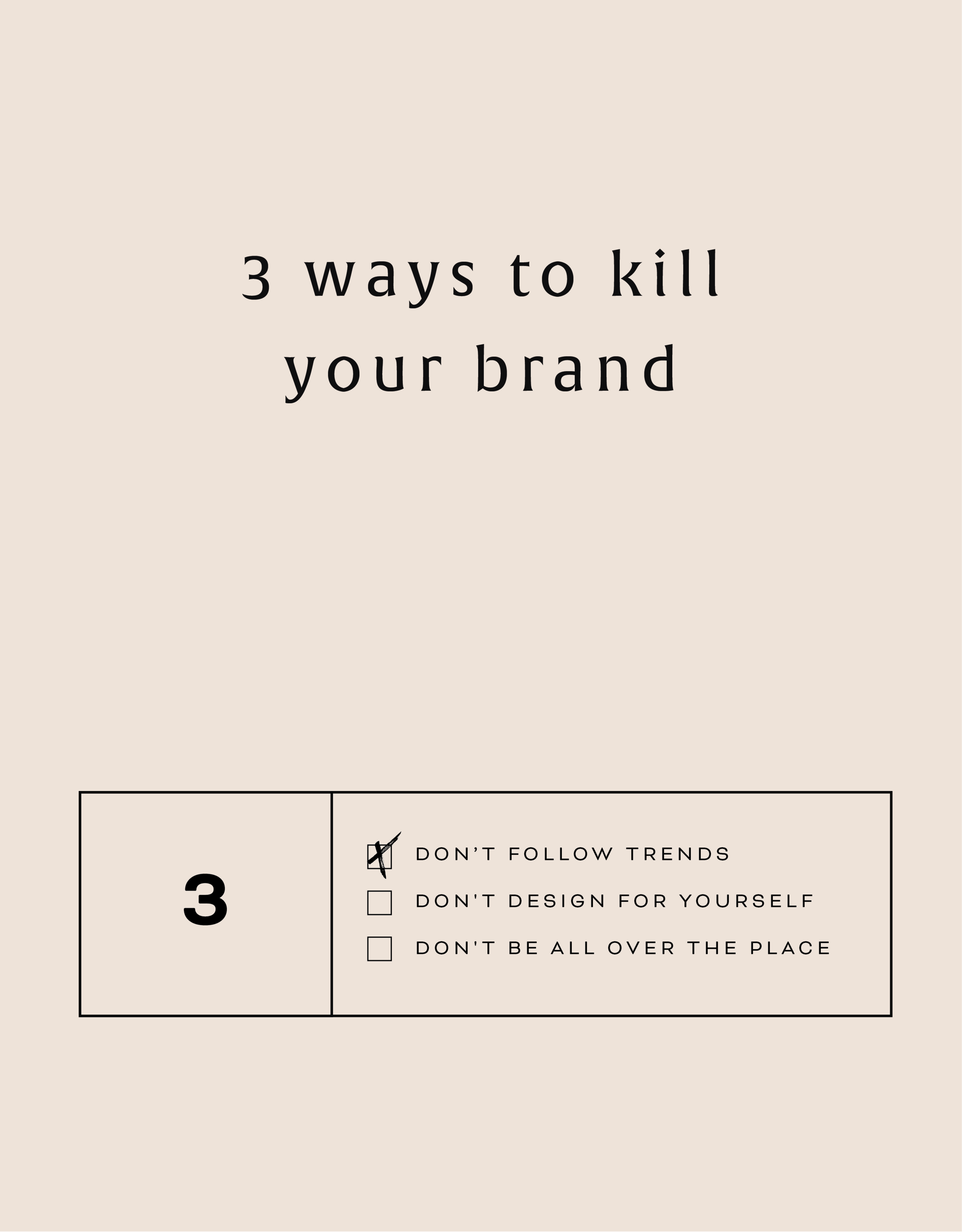
Three Ways to KILL Your Brand
Overlooking these three things in your branding can keep your brand from attracting your dream audience and yes, seriously hurt your brand. Yes you want a beautiful logo, but that logo needs to avoid being these three things first!
That title may feel a little dramatic, but a) I've been watching a lot of angsty teen movies from the 90s lately (She's All That anyone??) so it feels normal... and b) certain approaches to branding can really yield painful results. In fact, overlooking these three things in your branding can keep your brand from attracting your dream audience. Yes you want a beautiful logo, but that logo needs to avoid being these three things:
DON'T FOLLOW THE TRENDS:
You know what happens when you follow (dare I say copy) someone else's logo design? You bore people. Your dream audience takes one glance and moves on. How can you stand out when you look like everyone else?
THE FIX:
Get specific. Be who you are and share that in your brand! How would a former client describe your business? What makes you stand out? What do you deliver differently than others in your industry? Get YOU into your brand!
DON'T DESIGN FOR YOURSELF:
I see this mistake all the time. Just because you like hot pink doesn't mean it's right for your brand. Just because you like handwritten fonts doesn't mean it's right for your business if you want to attract both men and women. Just because you like something, doesn't mean your dream audience will be attracted to it.
THE FIX:
Put your audience first always! Ask yourself these questions as you go through the branding process:
What aspects (type, color, illustration, etc.) of this design will your audience be drawn to and why?
Are there any aspects (type, color, illustration, etc.) of this design that do not fit with what your audience is drawn to? If so, why?
DON'T BE ALL OVER THE PLACE
Once you've nailed down your branding elements, don't use alternate fonts, colors or imagery. It's confusing! Consistency is what builds trust online. If you aren't showing up in a consistent way (because you're using 120,567 different fonts in your Instagram posts, for example), people won't be able to recognize you or trust you.
THE FIX:
Stick with your business vision and just keep fine-tuning it, instead of backpedaling, or starting over again and again. Work with someone you trust to help you create the look or the strategy for your brand if you find yourself too immersed in it to reflect your true style and voice.
Related Posts
HOW TO CREATE A SCROLL EFFECT FOR YOUR WEBSITE MOCKUP
Since Instagram is such a great place to connect and share socially, I love sharing recent Go Live in 5 projects on there! The problem I always have with sharing websites is that it's hard to get a sense of an interactive site in a static square image. So I created a scroll effect and shared it as a video. This give a MUCH better sense of the site when you actually view it online.
Since Instagram is such a great place to connect and share socially, I love sharing recent Go Live in 5 projects on there! The problem I always have with sharing websites is that it's hard to get a sense of an interactive site in a static square image. So I created a scroll effect and shared it as a video. This give a MUCH better sense of the site when you actually view it online.
Since I've been sharing these scrolling website mockups, people just keep asking me: How do you create a scroll effect for your website mockup?? So today, I'm listing out the exact step-by-step process so you can do it, too!
*Tiny note: I use QuickTime and Photoshop for this process (and I have a Mac). This is not a sponsored post, but these are the programs I recommend.
Step 1
01. Open QuickTime
02. Click File > New Screen Recording
03. Click the red record button
04. Adjust the selection tool to crop just the screen
05. Click Start Recording
06. Scroll through the page you want to record
07. Save the recording
NEW!
a templated guide to
messaging magic

A plug-and-play website copy template for your four core pages (Home, About, Offerings, Contact). Save yourself hours of stress and get templates, examples, and expert guidance that will benefit your business and your bottom line.
get your template now >
Step 2
01. Open Photoshop
02. Add your computer mockup to layer 1
03. Add a shape that covers the computer mockup screen to layer 2
04. Drop in your recorded file (should be mp4 format)
05. Create clipping mask that pulls the recording into the shape you created from step 03
06. Open the Timeline (usually below your art window)
07. In the dropdown that says Create Frame Animation, change that to Create Video Timeline. This will add all your layers to the timeline.
08. Pull each layer in the Timeline to match the length of your video
09. To save, click Export > Render Video
That's it!
BONUS!
Want to download the Photoshop file and save a step?


