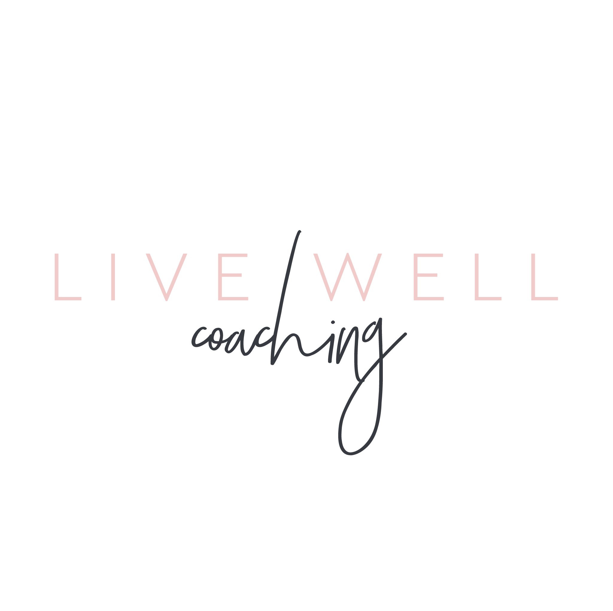
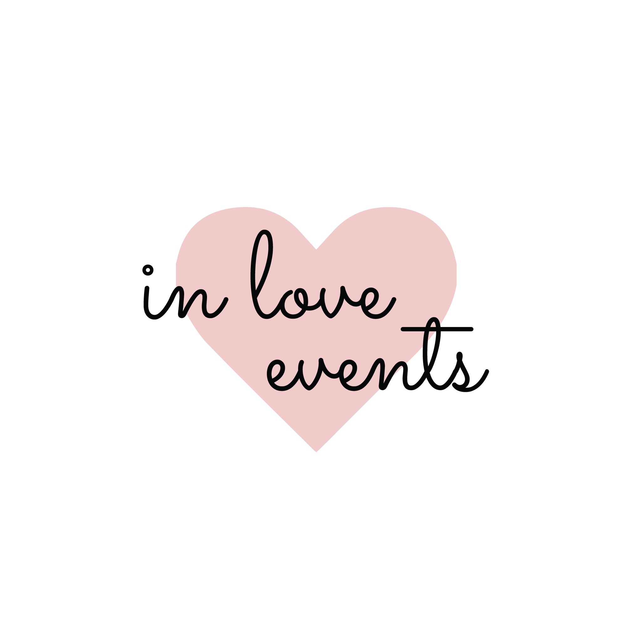
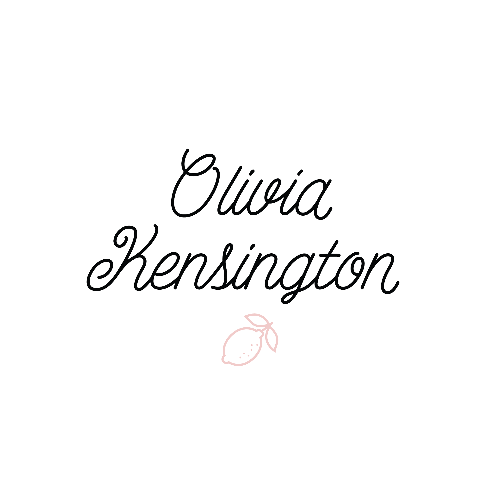
Favorite Logos of 2022
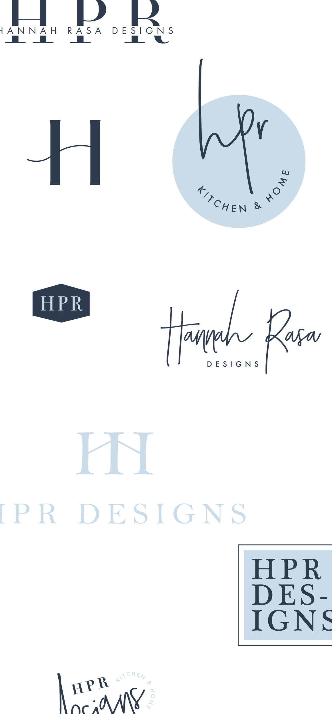
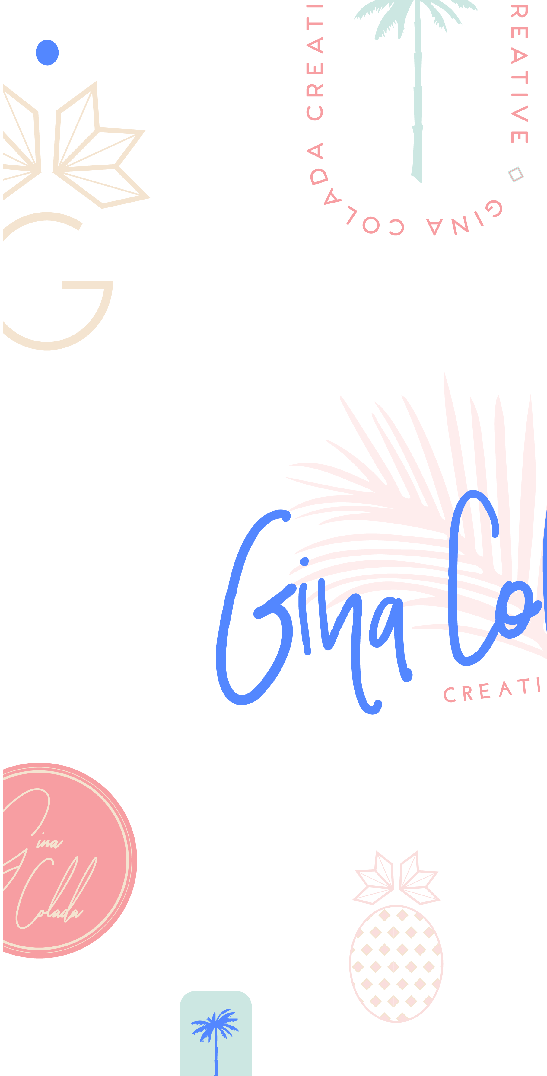
A recap of some of my favorite unchosen logos and submarks from 2022 branding projects including one of a geometric hummingbird logo and one for a health and wellness coach logo.
There were so many fun branding projects in 2022 and so many amazing clients! Since each branding process gets 2-3 fully designed brand identity options, not all logos make the cut. Even if they don’t become the final version of a logo design, the creation and refinement is still an important part of the process. The health and wellness coaching logo on the bottom left even got featured on designrush best-designs. And I’m still a little in love with the geometric hummingbird logo. 😍
pst…
Like a logo above and think it’s the perfect fit for your business?
Feel free to reach out for details on how to purchase!
Merakai Life Brand Design
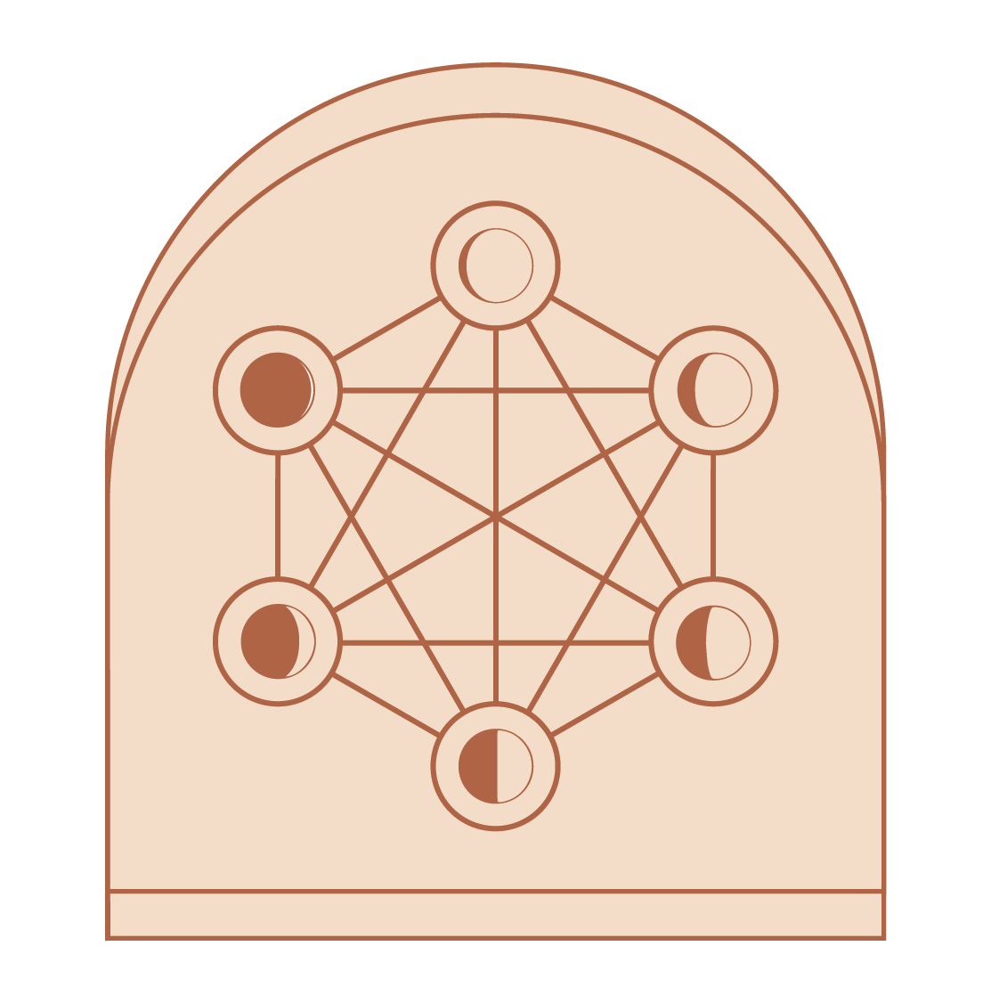
A sacred geometry logo design with phases of the moon.
Project RECAP
Merakai Life creates custom mala experiences and provides spiritual & practical guidance for clients who are highly sensitive, entrepreneurial women grappling with their spirituality often feeling anxious & overwhelmed. They reframe their anxieties and leave them feeling inspired with practical tools to implement. It's about more than just the beads, it's about what the beads are a vehicle for: transformation and connection.
This brand was not interested in a trendy, “light”-oriented design. They aren't afraid of shadows or darkness in their work, and so wanted a natural, textured feel to the designs. Sacred geometry was also really important as well as the phases of the moon. In using an earthy metallic copper, we sort of show how Merakai “reflects” what the client is experiencing and transmutes the light into the mala experiences that are then created for each client.
Cabin Fever Brand Design
Project RECAP
Such a fun branding project for Cabin Fever Coffee and Play House - think coffee house meets indoor playground without the primary colors and giant equipment. The brand is built upon the idea of a family minded space where you can attend parent-child sing and dance classes, let your kids run wild while drinking a hot cup of coffee or rent our space for your family-friendly event. These logos below include the alternate directions for the branding concepts. One is a nod to the forest friends and is more whimsical and childlike with hand drawn elements and the cute little fox. The second direction is more of an outdoorsy-iconography style design with the feeling of a cabin in the woods.
WANT to CREATE
a custom LOGO?
Favorite Logos of 2021
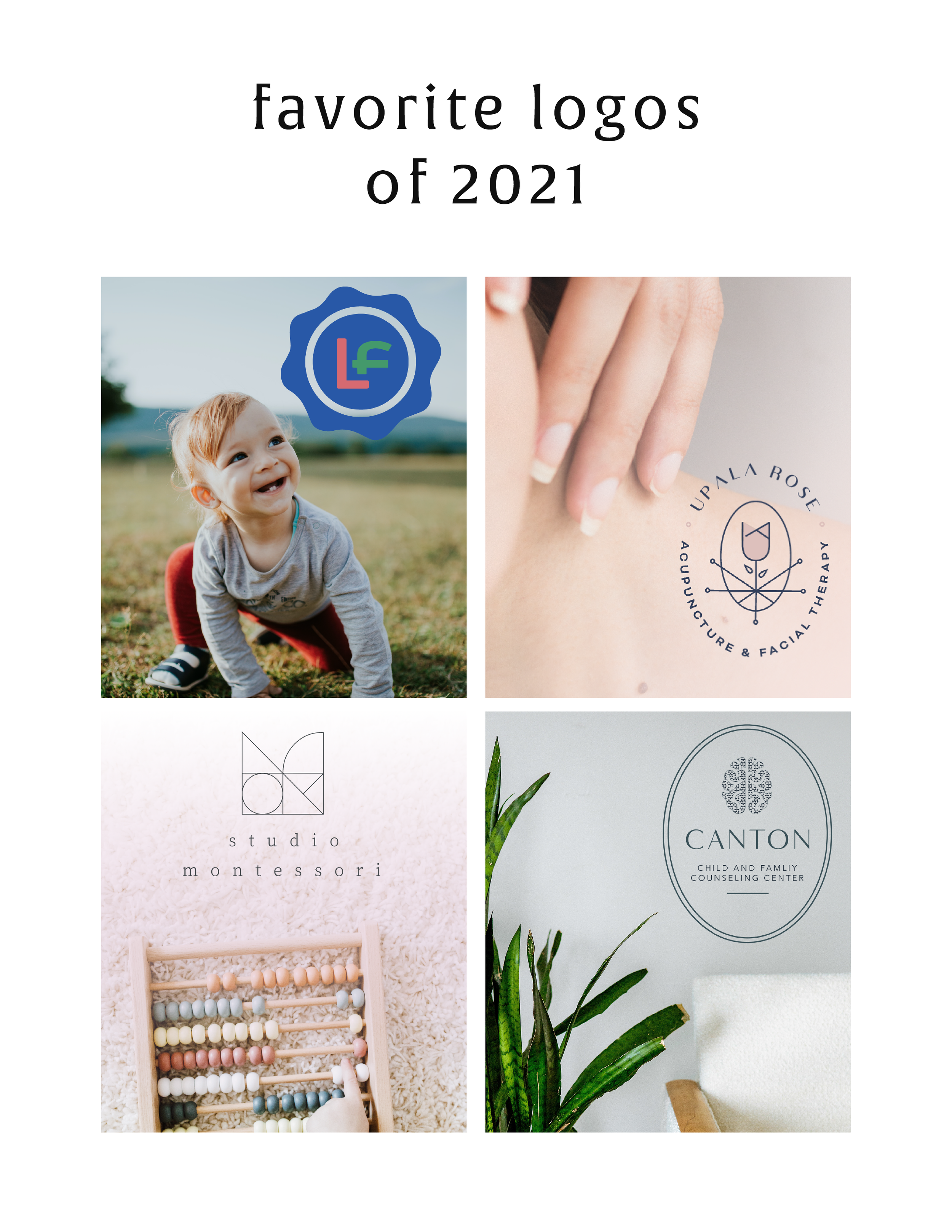
A recap of some of my favorite unchosen logos and submarks from 2021 branding projects including one for an acupuncturist and a child and family counseling logo.
There were so many fun branding projects in 2021 and so many amazing clients! Since each branding process gets 3-4 fully designed brand identity options, not all logos get the green light. Some aren't quite right for the client or maybe just didn't fit as well as another option, but I have a little love for all of my logos (and maybe get a little too attached?? Eh, whatever!).
These are some of my favorite branding concepts and their variations created that didn't make the final cut.
pst…
Like a logo above and think it’s the perfect fit for your business?
Feel free to reach out for details on how to purchase!
What is a holistic business?
Everyone’s creative process looks different, but a lot have the same initial phases. Here are a few thoughts on how to streamline yours.
Holistic businesses are ones that support the whole person behind the business, not just their business needs. Spreadsheets and profit margins are important, but so is rest, boundaries and creativity. I am a firm-believer in holistic approaches.
To look at something as a whole, not just the sum of its parts, allows one to make meaningful strides towards any goal.
When we approach our business in this way, we allow the excess to fall away and give ourselves room to grow the things that align with our values. To do this, you have to see the big picture. For example, as a new mom, I had a major shift in priorities, but also in time. I no longer had a full 8 hour day to do my work. And more importantly, I didn’t want to spend 8 hours at my desk. I wanted to squeeze my baby’s cheeks and catch up on much needed sleep. I needed to look at what my priorities were at that time to begin to make changes that related to my business. I also needed to pay my bills, so spending ALL of my time with my baby wasn’t an option either.
I started by looking at what I love to do in my business, what items brought in the most money, and how much time I realistically could spend working in a given week. Using that formula, I was able to delegate some tasks and shift some things around so that my business fit into my life (not the other way around!).
Each item affects another. Our lives are an ecosystem, and a business is one part of that. A holistic business understands this fundamental shift and utilizes a new mindset to cultivate growth, but also joy! It takes intentionality and the understanding that behind every business is the human running it.
Jamie Foley Brand Design
Project RECAP
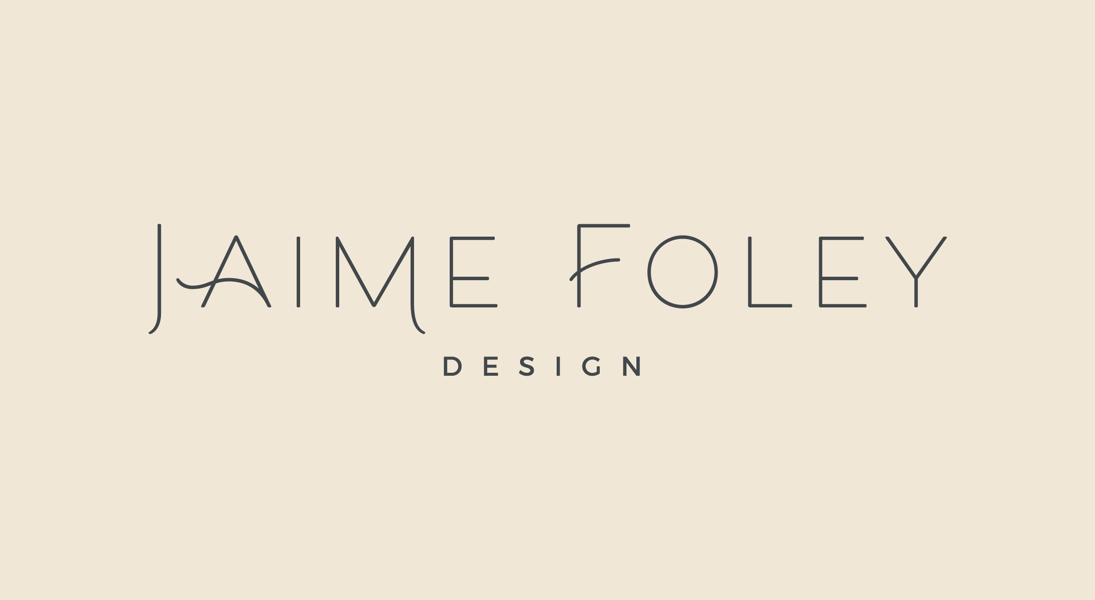
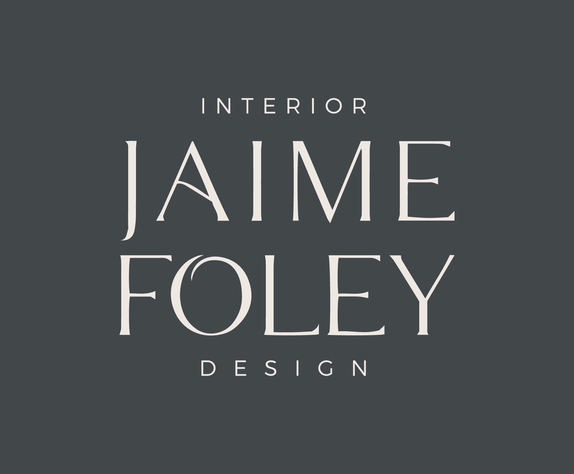
Jaime Foley is an interior designer who needed a brand identity to match her newly formed business. Jaime Foley Design Studio has a focus on the co-existence of beauty and function. Her goal is to make your home not only look great, but feel great too. With a focus on clean lines, and a modern esthetic, the mix of old and new create warmth and a space that speaks to you and your life.
So we brought that mission to life through design. Below are some of the designs from the process!
WANT to CREATE
a custom LOGO?
Favorite Logos of 2019
A recap of some of my favorite unchosen logos and submarks from 2019 branding projects.
There were so many fun branding projects in 2019 and so many amazing clients! Since each branding process gets 3-4 fully designed brand identity options, not all logos get the green light. Some aren't quite right for the client or maybe just didn't fit as well as another option, but I have a little love for all of my logos (and maybe get a little too attached?).
Below are some of my favorite branding concepts and their variations created that didn't make the final cut.
WANT to CREATE
a custom LOGO?
Creating a consistent brand
You’ve invested all of this time creating the perfect brand identity through logos, submarks, color palettes, and more. It is time for you (or your branding client) to keep things consistent and cohesive long after those brand files are turned over.
Develop a brand style guide
One of the main components of creating and keeping a consistent brand is through a brand style guide. This guide will provide you with brand identity standards for everything - logo, colors, fonts, icons, and more. Develop a plan for what rules you will have for how to use your brand. From how colors could be combined to the fonts you will use on printed materials - you name it. Your guide will help your brand look and feel the same no matter where you have it displayed or featured.
Create your brand messaging
Anything word related to your business, such as your tagline, mission statement, your “why,” etc. needs to be refined and fine-tuned through brand messaging. Developing your brand message can really help with wording that email, writing your about page or ways you interact in a professional setting about your business. Having this “voice” developed will help you along the way.
Identify where you will “show up”
There are plenty of possibilities of places your brand could exist and show up. I recommend taking some time to consider precisely where you plan on being a presence. This can help you determine a plan of action for those spaces, but also create a sense of how far your brand reach can extend.
Areas to consider:
Digital: where will your brand show up online or on social media?
Print: will you have printed collateral of your brand such as business cards or direct mailers?
In-person: You may have a storefront or attend conferences representing your business. You may even yourself be your brand (your business = your personal brand).
How to carry out the consistent brand
While you may think you have the capability to do all of this yourself and do it well, it can be challenging to keep up with it all. Hiring a designer or a copywriter (or both) to help you with the elements of your brand identity can be a sure way to keep your brand consistency in check. Above all else, having those resources (the brand style guide and messaging standards) can help keep things the same. No matter what platform a potential client, customer, etc. interacts with your brand - it is all the same!
WANT to CREATE
a custom LOGO?
LOGO PROCESS: EMBRACED PODCAST
This little logo process is from the branding process for Embraced Podcast, a podcast about women empowering women.
This little logo process is from the branding process for Embraced Podcast, a podcast about women empowering women. Having dabbled in the podcasting world for a hot second, I was excited to brand someone else's podcast! The branding to needed to embody women who share their strength, courage, perseverance, and self-love. Um... hell yes! Feminine strength was the design direction.
Below are several of the concepts and variations created before we nailed down the final logo.
WANT to CREATE
a custom LOGO?
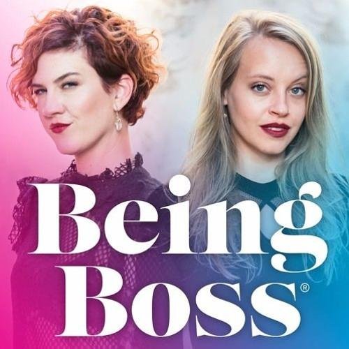
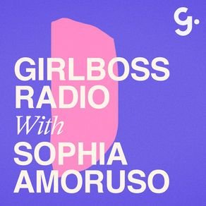
How to Make Your Podcast Cover Design Stand Out and Get Clicks
In the ever-growing sea of podcasts, it’s hard to get new listeners. Here are a few thoughts on how to create that moment of engagement when a potential new listener clicks on YOUR podcast cover verses someone else’s.
In the ever-growing sea of podcasts, it’s hard to get new listeners. Imagine this: you head to iTunes ready to plug into a podcast, but not sure what you want to listen to. Maybe you type in a search for “business” or “murder-mystery” just to see what comes up. Now… which podcast is the one your eye goes to first? Which engages you enough to make you give this new podcast your attention?
Are you wondering which it is? Here are a few thoughts on how to create that moment of engagement when a potential new listener clicks on YOUR podcast cover verses someone else’s.
Start with the basics
Use JPEG or PNG file format (no PDFs or GIFs)
Use RGB colors (no CYMK or Pantones)
Minimum size should be 1400 x 1400 pixels
Do not use any official Apple’s imagery (not even a photo of iPhone)
Make sure art clear and text is readable even at thumbnail sizes
Keep the design simple
If you’re looking through all of the podcasts, it can be overwhelming for your eye. Your likely to find yourself intuitively stopping on a podcast cover design that’s simple, without lots of text or graphics. That’s because your eye is searching for a place to rest as it washes over a sea of content. It’s overwhelming! So keep your layout simple with a simple 1-color background, 1-2 fonts, and maybe 1-2 easy-to-see graphics.
Share what it’s about
Obvious, but you should have your podcast title on there. If you’re title is long or has a subtitle, just include the main info. You can also share what your podcast is about by adding a simple graphic or photo that showcases your theme. You definitely don’t have to do this, and an alternative is to choose a font that represents the tone of your show. Fun and funky? Use a a unique, playful font. All about wedding planning? Maybe a script or whimsical handwritten font. But be careful here - your font choice should be readable (especially at small sizes) and shouldn’t be too gimmicky or distracting.
Choose imagery thoughtfully
Don’t use images of a microphone or headphones to represent podcasting… we already know it’s a podcast! In the same vein, avoid generic imagery that doesn’t describe what makes your podcast different. For example, a podcast for yoga studio owners would be better served by an image that showcases your unique thoughts than a generic yogi meditating or lotus flower.
Layout + Color
Since you are trying to keep the podcast cover design fairly simple, color can be tricky. Try to choose one main color to work with, maybe for use as the background. Then use 1-2 more colors as accents. When it comes to layout, get creative here! Maybe your title creates a unique shape or has a unique text-treatment like an outline. By breaking the rules of a typical layout a little, you create visual interest without adding any clutter.
MOST IMPORTANTLY!
The most important tip I can share to help make your podcast cover design stand out is to stay true to your brand. You already have something unique to share, and your branding should reflect that. Being consistent with your branding includes your podcast cover design. It should make your branding colors, website and all other collateral so that your audience recognizes your brand no matter where they’re engaging with you!
NEW!
a templated guide to
messaging magic
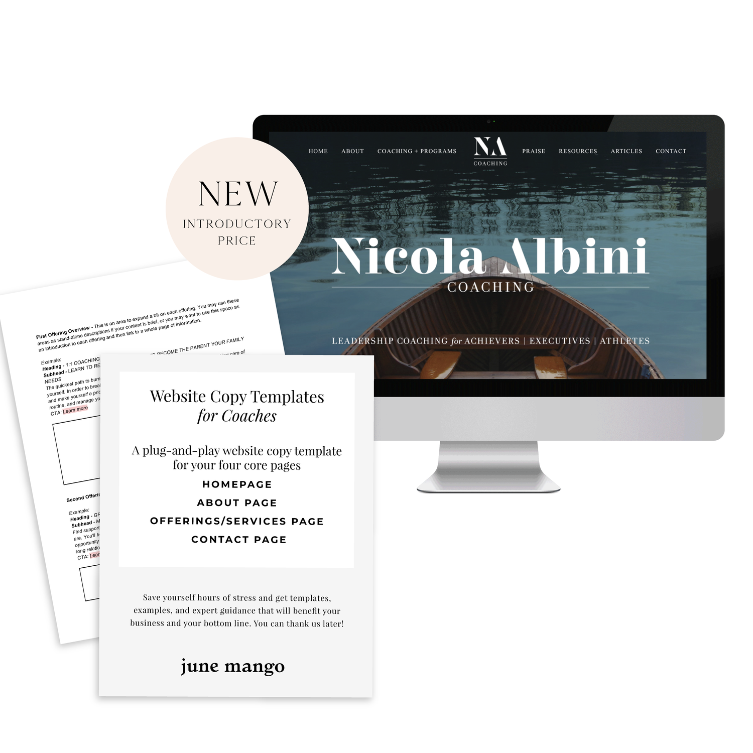
A plug-and-play website copy template for your four core pages (Home, About, Offerings, Contact). Save yourself hours of stress and get templates, examples, and expert guidance that will benefit your business and your bottom line.
get your template now >
How to Rethink Your Creative Process
Everyone’s creative process looks different, but a lot have the same initial phases. Here are a few thoughts on how to streamline yours.
Everyone’s creative process looks different, but a lot have the same initial phases. I find that I start out excited and ready to rumble with the idea. Then I dive into research and planning and looking for inspiration. This is where things sometimes fall apart. I find myself getting overwhelmed by what I need to do to bring this new idea to life.
Are you nodding your head? Here are a few thoughts on how to stop the second-guessing cycle.
No idea is a bad idea
All ideas have to start somewhere. Whatever comes to mind, get it down. You never know where that idea or design can evolve. No matter how silly you may think your initial thought or concept is, allow time for your idea to develop into something powerful. And don’t worry if you’re not the very first person to want to do something. You are the very best person to do it in your exact way. And that’s enough.
Change up your environment
Inspiration can be found in the most random of spaces. Sometimes all you need to do is get out of the office. Visit a coffee shop or local library. Talk to real live people about it. Ya, like offline. This will help you get out of your head and unstuck from your desk.
Unplug
Digital distractions can prolong the process. Put the phone down and get away from a screen if you can. Try a pen and paper first before jumping on your laptop. While checking out other people’s work can be a source of inspiration, it can limit your originality in your ideas. Use your imagination!
Do not set expectations or limitations
Setting expectations on yourself can add a layer of pressure and limit your mindset. This is one of the worst things you can do during the creative process. Don’t close of a potentially great idea because of fear. Limiting yourself would be a real shame. Think of what you could dream up if you just changed your mindset. You have talent, and you need to trust yourself. You can design great things, settle into that instead of fear or doubt!
The main point in all of this is to LET GO. Seriously. Creativity is meant to be fluid and not pinned down to a specific place. Let go and see what you create. It can get a little messy, but that’s the beauty in it.
BRANDING YOUR INSTAGRAM STORIES
There are so many ways to share on Instagram Stories and while the easiest way is to share a quick photo or video selfie, there are some strategies you can implement to add your brand's voice and visuals to your stories timeline.
Since Instagram is such a great place to connect and share socially, I love sharing pieces of my clients' logo process, color palettes I'm creating, and sneak peaks at websites I'm building. There are so many ways to share on Instagram Stories and while the easiest way is to share a quick photo or video selfie, there are some strategies you can implement to add your brand's voice and visuals to your stories timeline.
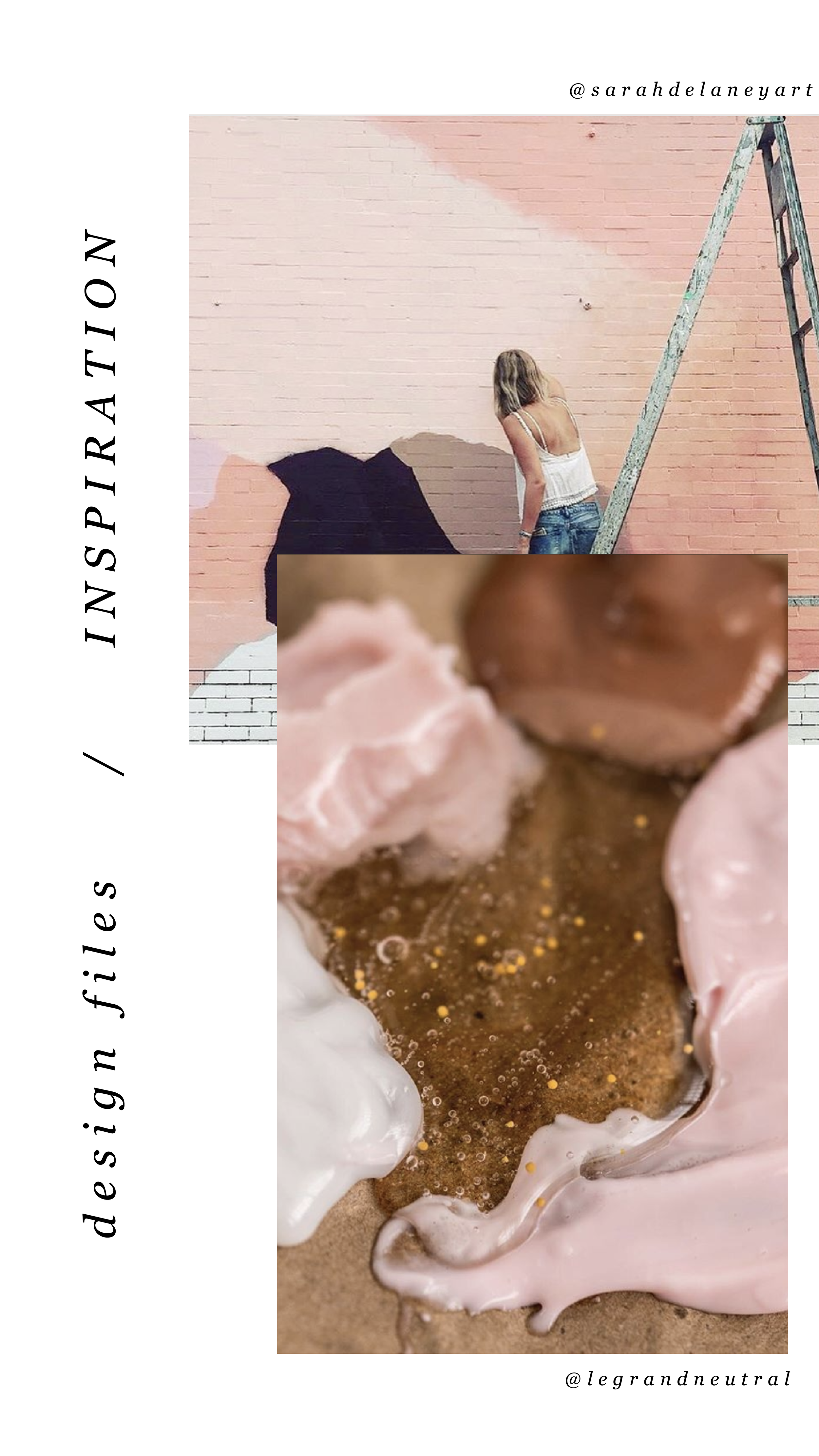
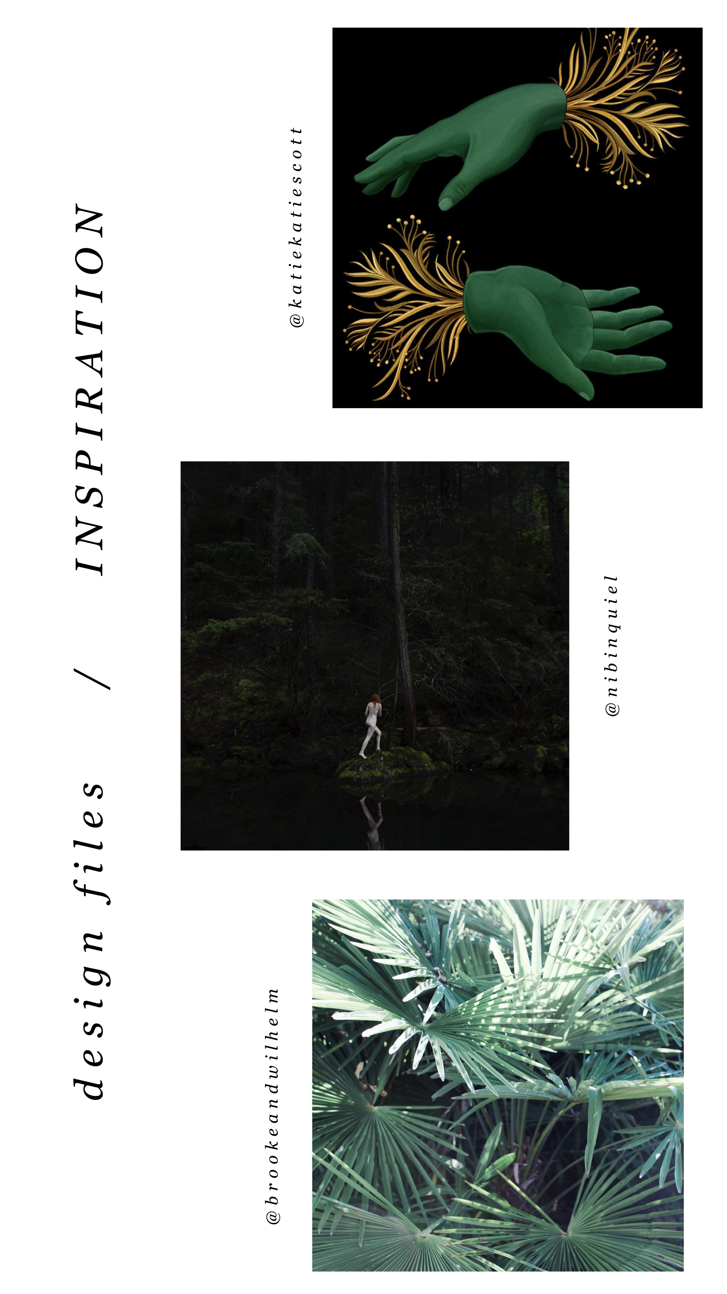
01. Share what's inspiring you
I love this one because it's so simple, but it's unique and fun. Sharing a little collage or even just one photo of someone you've been following is a great way to share your aesthetic AND connect with your fellow 'grammers. Make sure to tag your story with the handle of the person's photo(s) that you're sharing so that they can engage with you and your followers can also engage with them.
02. Share what you're working on
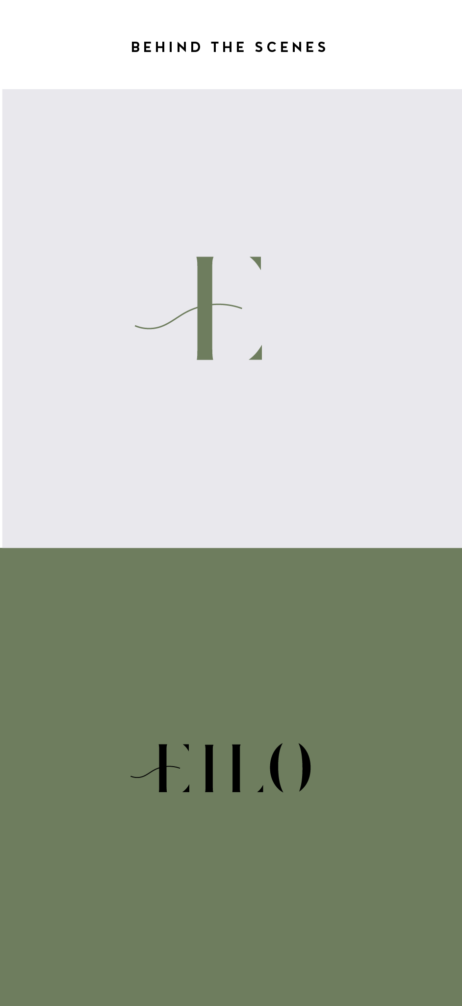
If you normally share the finished product, try sharing some of the pieces that make up the process in your Instagram Stories. For me, this often looks like the logos that I create that don't get the final go ahead from my client. It's fun to share these designs that otherwise would never be seen! Plus, this gives future dream clients an idea of what it actually looks like to work with you.
03. Promos + marketing
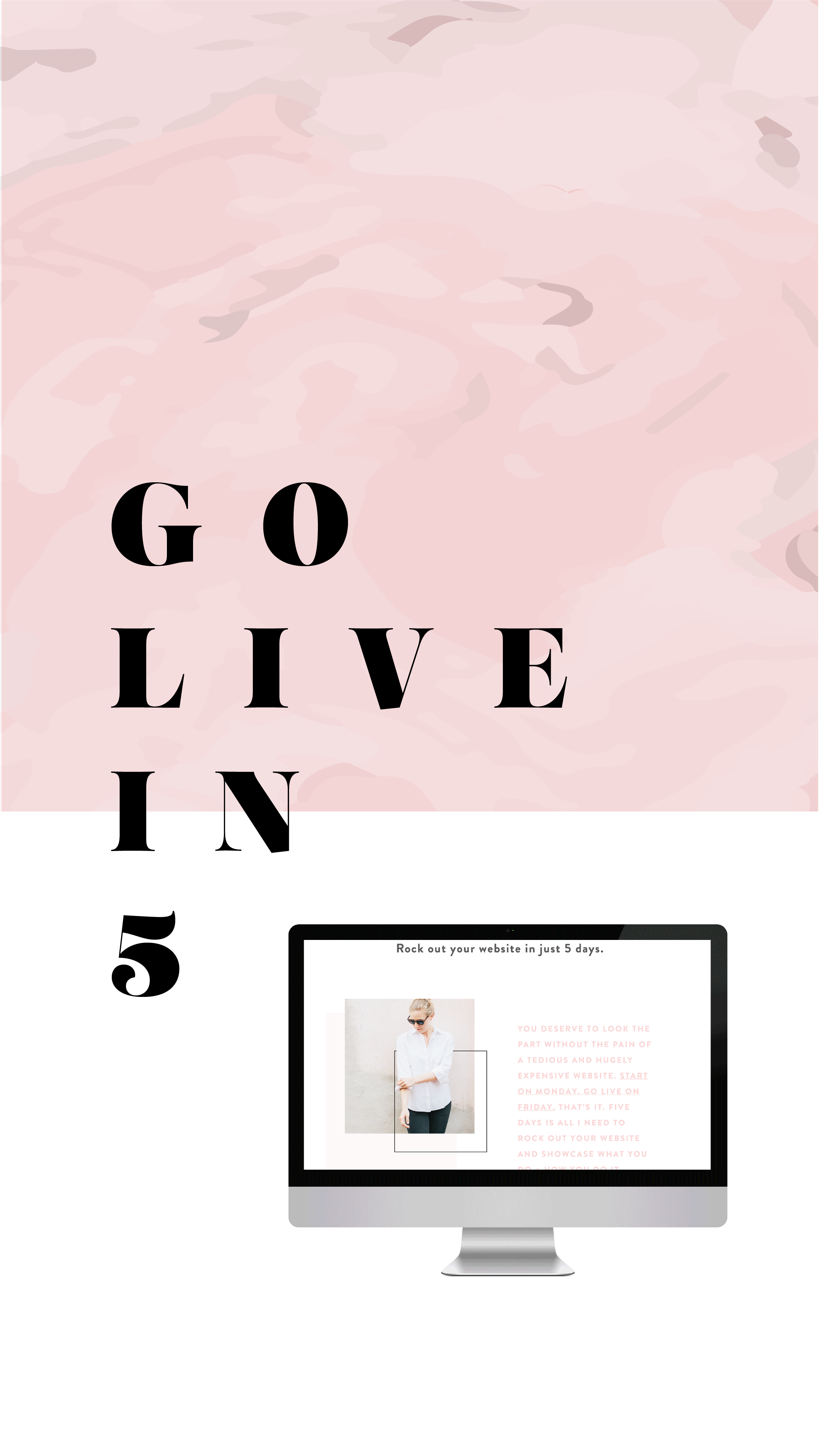
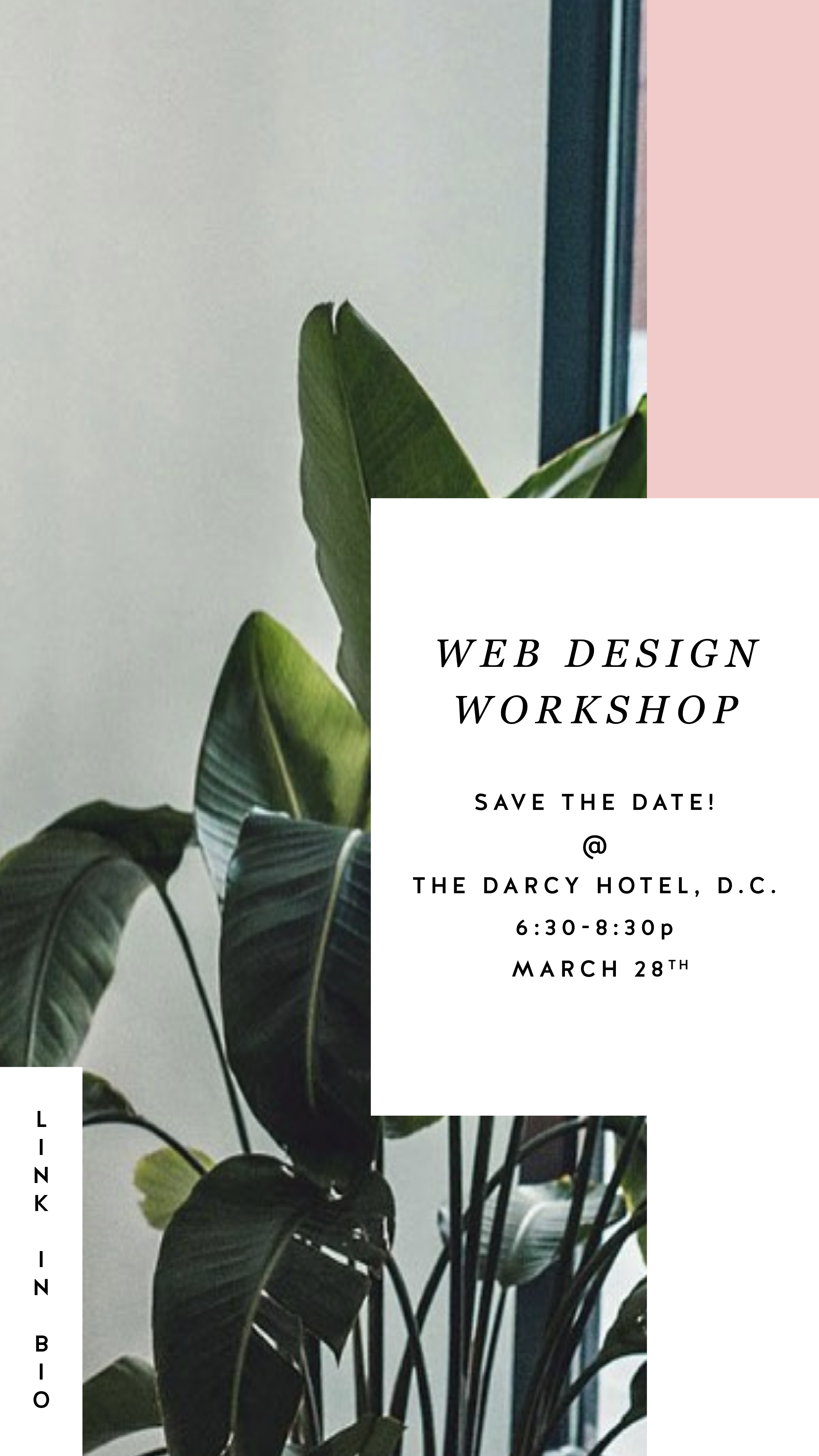
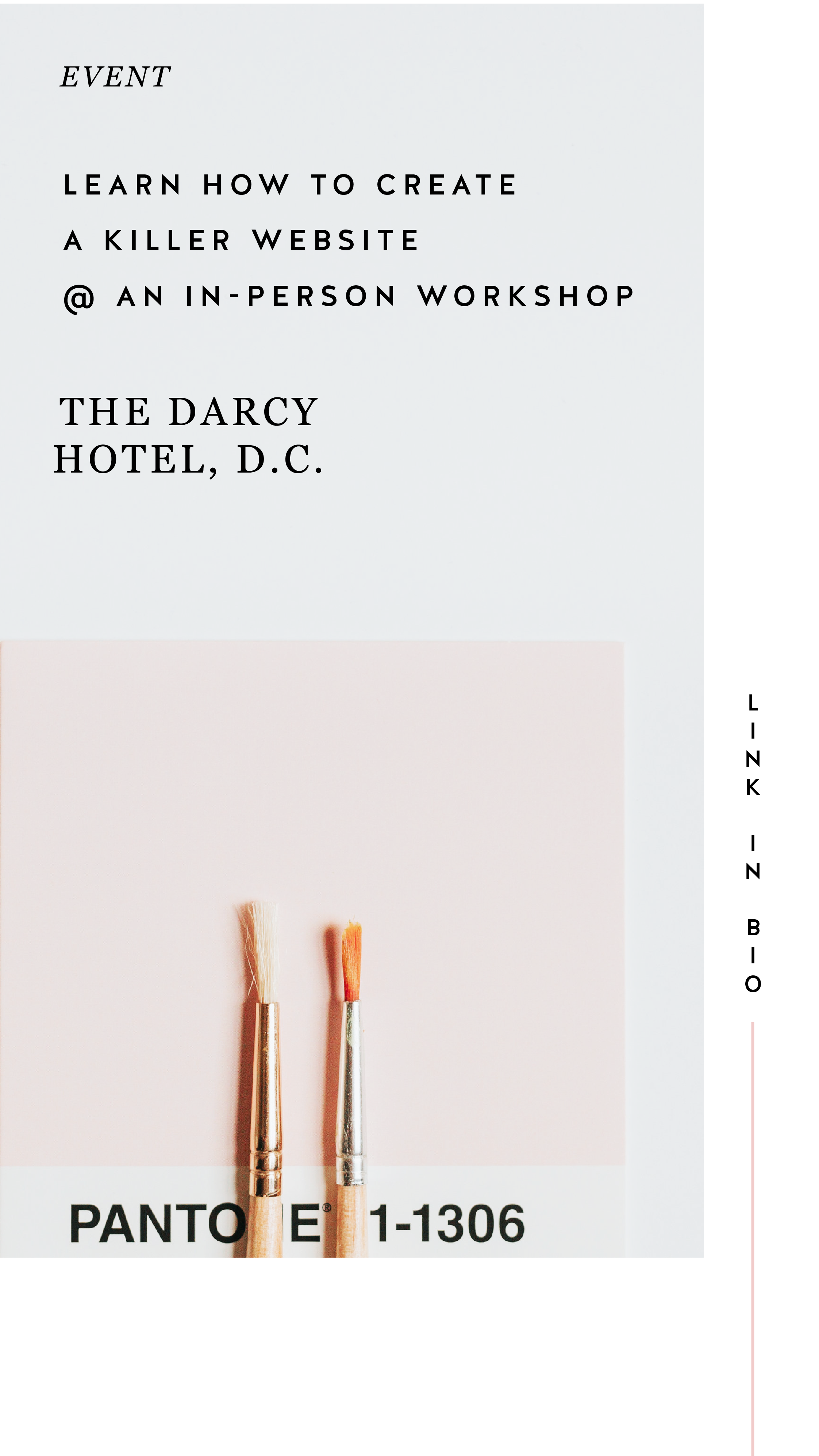
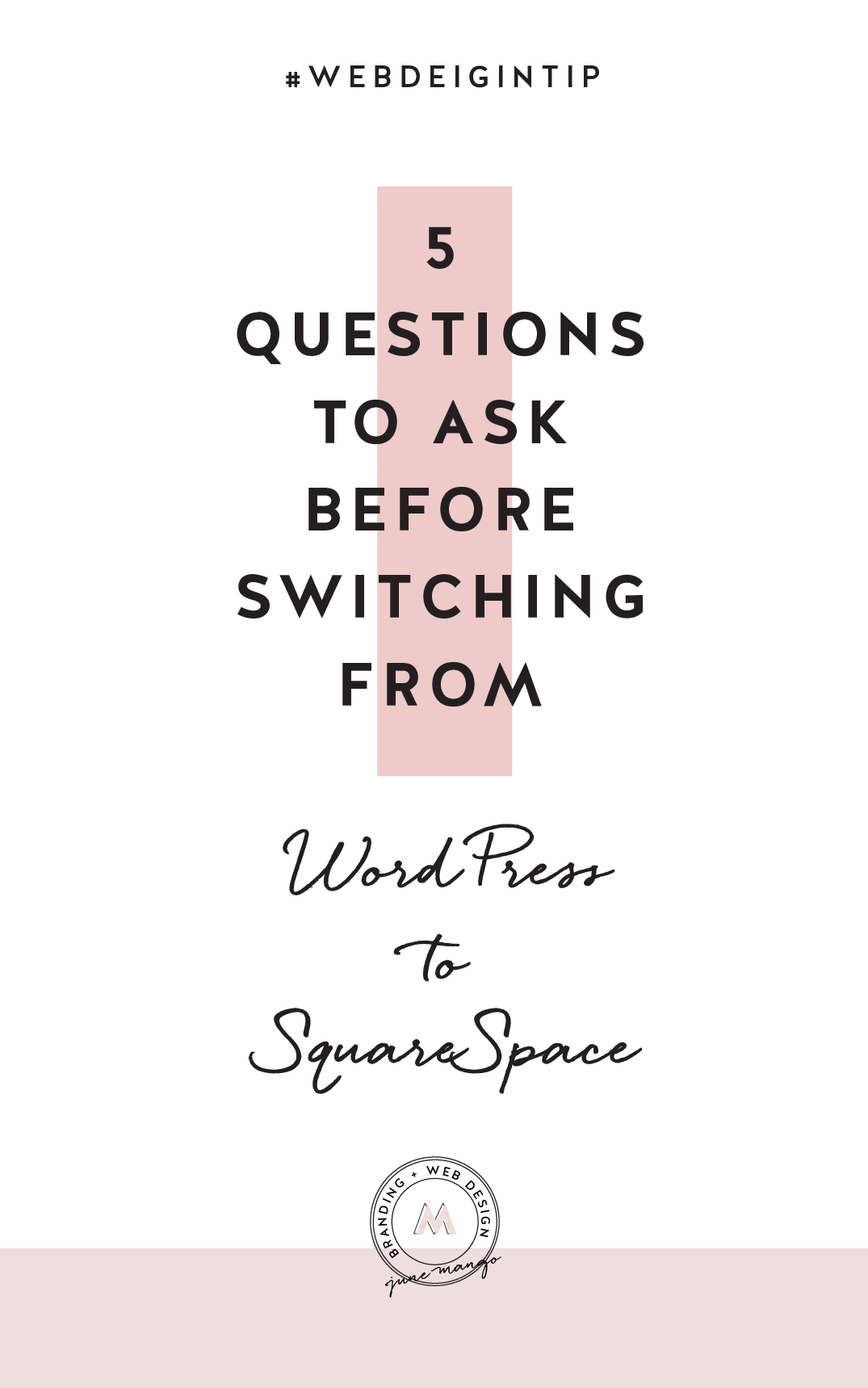
Instagram Stories is a great place to promo something you want to make sure people see! Especially since the stories show up at the top of your audience's news feed, you are more likely to get seen and skip worrying about the newest Instagram algorithm. And there are lots of unique ways you can share and promote without feeling spammy. Take a look at the examples below for inspiration.
04. Share your blog posts
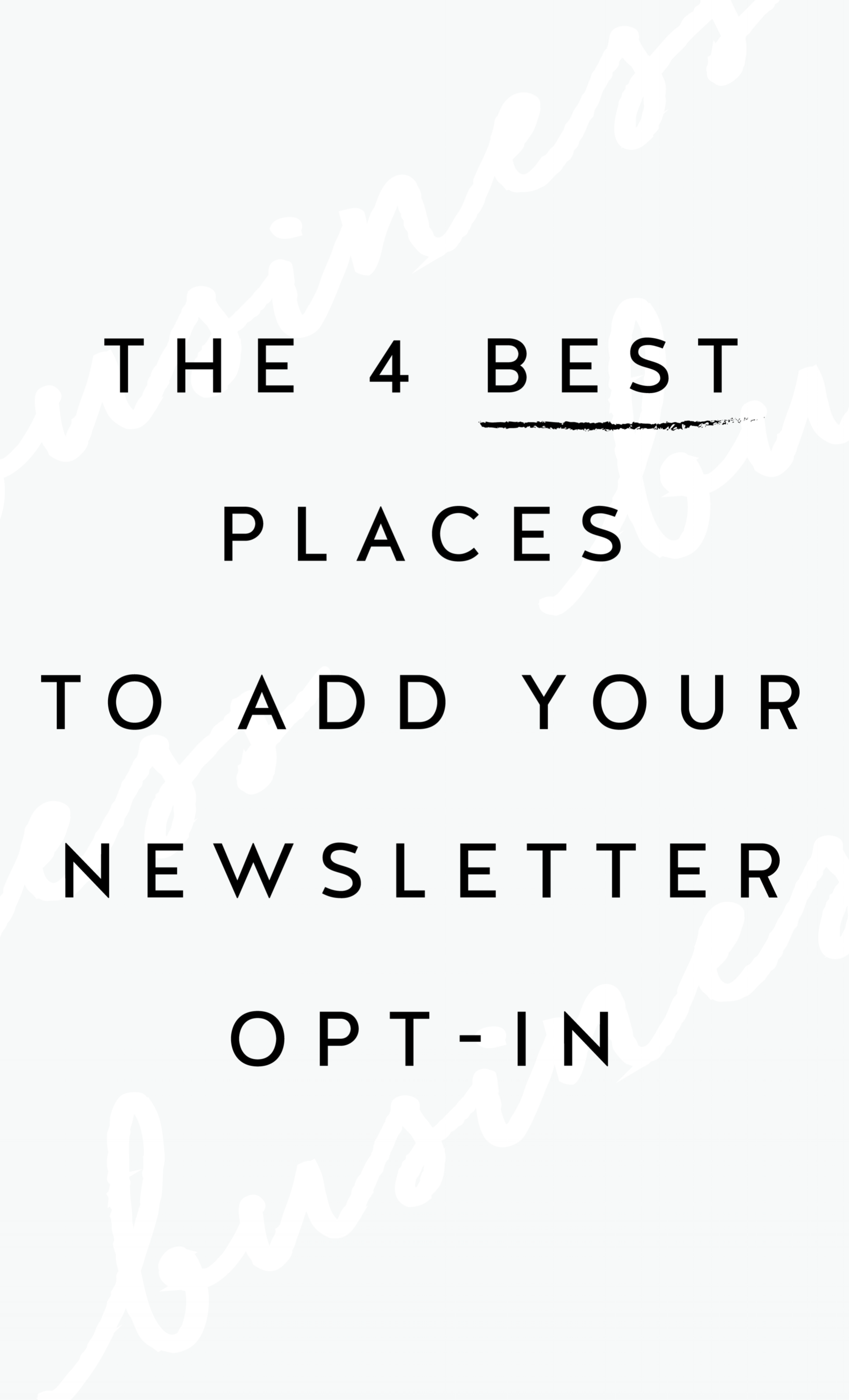
This might be my favorite thing to share on Instagram Stories because you already have the content! All you have to do is jazz it up for Instagram. By creating a few images for each major point of your post, you can share your content and make sure it's getting seen even if someone never visits your blog!
Not too hard, right?
Have another idea for injecting your brand
into your Instagram Stories?
{Design Principles} CONTRAST
Contrast is a design principle that is so crucial to creating beautiful branding and web design. But contrast touches all parts of design, not just color. Put simply, contrast occurs when two elements of the design are different - like REALLY different.
So why the hell should you care? (I get it, you've got a business to run... so let's cut to the chase!)
Contrast is a design principle that is so crucial to creating beautiful branding and web design. When you think of contrast, you may think of color - or maybe black and white photography. The higher the contrast, the darker the blacks appear and the lighter the whites appear with little grey in between.
But contrast touches all parts of design, not just color. Put simply, contrast occurs when two elements of the design are different - like REALLY different.
So why the hell should you care? (I get it, you've got a business to run... so let's cut to the chase!)
01. CONTRAST GRABS ATTENTION. Attention gets your audience engaged. An engaged audience clicks through your website, and eventually, they get in touch with you.
02. CONTRAST CREATES ORGANIZATION. It helps your audience flow seamlessly through your About bio, your Services page and your whole site in general!
03. CONTRAST DEFINES THE FOCAL POINT. Think buttons ("Contact Me!"), header text (your mission statement) and photos. Secretly guiding your audience towards what you want them to see or do is this simple little thing called... yup - contrast! 😉
Below is a breakdown of how to create contrast:
POSITION
front/behind
above/below
centered/off-centered
isolated grouped
in/out
right/left
FORM
simple/complex
whole/broken
symmetry/asymmetry
geometric/organic
hard angles/round
DIRECTION
vertical/horizontal
stability/movement
forward/back
clockwise/counter
convex/concave
serif text/sans serif text/script text
Related Posts
Creating a Style Guide for Your Website
Keeping a consistent brand is key for creating a professional, clean look for your business. However, it can be a little difficult to keep everything uniform if you don’t have a spot with everything you need. Creating a style guide can be the perfect solution and go-to file for your website.
Keeping a consistent brand is key for creating a professional, clean look for your business. However, it can be a little difficult to keep everything uniform if you don’t have a go-to spot for all of your brand elements. Creating a style guide can be the perfect solution for your website!
So what is a style guide? Great question. A style guide combines every visual element of your brand in one nifty document. Consider it your cheat-sheet for your branding. You can easily find color codes, fonts and more thanks to your handy website style guide.
A website style guide can also serve as a “test run” for an updated branding refresh. You can review your design before doing a complete overhaul of your website, collateral materials, etc.
Here is a main checklist of what to include in your style guide:
main logo
images/inspiration
colors + color codes
fonts
other visual elements such as form buttons
Other things you could include in your style guide:
social icons
email newsletter layouts
instructions on how to use your visual elements such as spacing rules
blog post formatting
client proposal layouts
whatever you like!
Tools like Photoshop or Illustrator are great for creating your style guide, but even if you don't have fancy design programs, Canva is a great resource too!
Do you have a brand style guide? How has it helped your business? Let me know how it has been a game changer for you!
NEED EVEN MORE HELP WITH SQUARESPACE?
Skip the overwhelm and have your website designed and launched in just 5 days (or less)!
LEARN MORE
Recent Posts
In the MOOD boards: Nursery Plans
Every experience, every step of this pregnancy has been a little adventure. Besides buying onesies and enjoying those little kicks getting stronger everyday, I'm also planning for the nursery!
As many of you have probably seen if you hang with me on social media, I'm expecting my first little one mid-August. Every experience, every step of this pregnancy has been a little adventure. Besides buying onesies and enjoying those little kicks getting stronger everyday, I'm also planning for the nursery! And since anytime I plan anything design-related, I make a mood board, I thought I'd share it here with y'all!
A cute little combo of celestial elements with natural wood and wicker elements and (of course!) plants. We are keeping the gender a surprise so this design let's us make the room a cozy fit for a newborn without the "traditional" unisex colors (who decided green and yellow were the go-to anyway??).
How to bring your brand to life online
A brand’s online presence is a huge component of sharing your business with the world! How you position your brand online is how you are going to attract your dream clients.
A brand’s online presence is a huge component of sharing your business with the world! How you position your brand online is how you are going to attract your dream clients. During my recent webinar with Devan Danielle from devandanielle.com, we shared everything you need to know about branding your business online. From those client buzzwords to your brand’s overall personality, we talked about it all!
Want to watch the full webinar replay? Click here for access to the full video! Here's a little preview of the topics we covered below:
What You Do vs. Your Title
While your job title with your business can say a lot about what you do, it might not communicate the whole picture. Make sure to use terminology that potential clients will understand. Someone might end up turning away from your business because they get confused about what you are offering. Hone in on your expertise. While you may do a variety of things, having an overall topic or umbrella of services/products helps with clarification as well. This also sets you up as an expert on the topic, leading to referrals and increased recognition. At the end of the day, just be clear about your business along with incorporating yourself into your brand.
Brand Values + Buzzwords
So what is the purpose behind what you do? Not too sure? The definition of your business values can be a gamechanger. Your brand values act as a compass for your business. Decisions, marketing campaigns, client work and more will be clarified thanks to your brand values. Figure out what you value most as a business owner and brainstorm what your ideal client values most as well. Where the two lineup is where you need to be to attract those dream clients. This is where the money is!
Another way to connect with your dream clients is by utilizing your business buzzwords. These are the terms they are searching for on Pinterest, Google, through Instagram hashtags and more. Use these buzzwords on your social media platforms, within your website, newsletters, etc. to increase your connection with these terms for potential clients.
This is just the tip of the iceberg. We covered this and so much more in our webinar! Make sure to watch the full replay for all of tips and tricks we shared! We want to help you bring your brand to life online!
Have questions? Shoot me a DM on Instagram!
Related Posts
Favorite Logos of 2017
A recap of some of my favorite unchosen logos and submarks from 2017 branding projects.
There were so many fun branding projects in 2017 and so many amazing clients! Since each branding process gets 3-4 fully designed brand identity options, not all logos get the green light. Some aren't quite right for the client or maybe just didn't fit as well as another option, but I have a little love for all of my logos (and maybe get a little too attached?? Eh, whatever!).
Below are some of my favorite branding concepts and their variations created that didn't make the final cut.
Related Posts
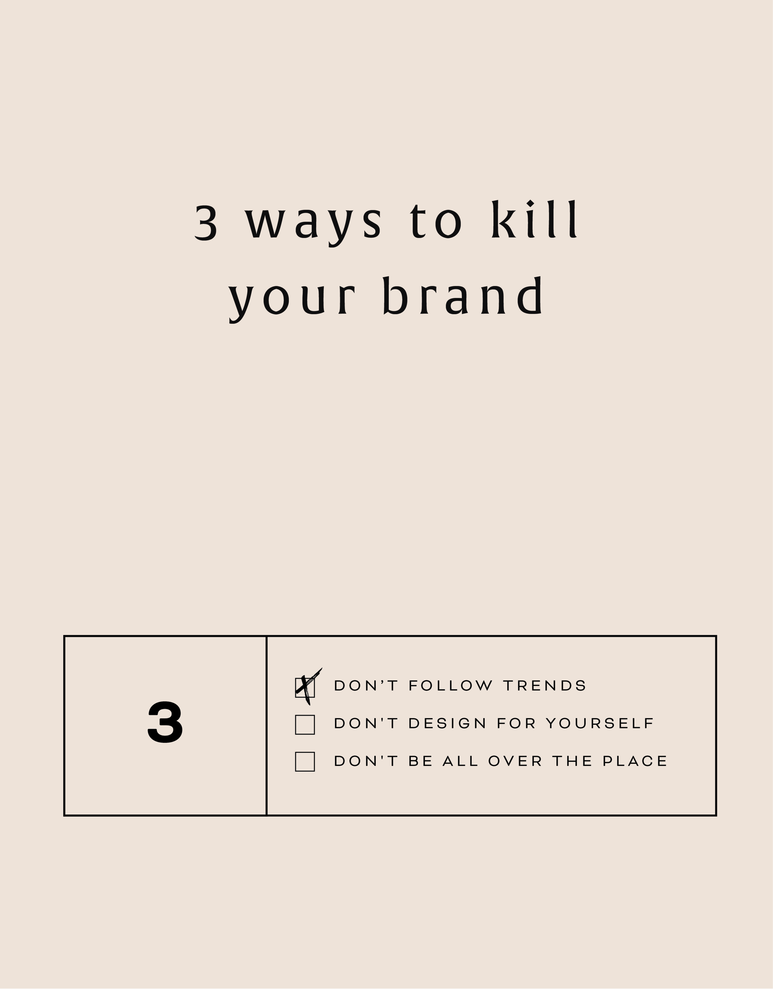
Three Ways to KILL Your Brand
Overlooking these three things in your branding can keep your brand from attracting your dream audience and yes, seriously hurt your brand. Yes you want a beautiful logo, but that logo needs to avoid being these three things first!
That title may feel a little dramatic, but a) I've been watching a lot of angsty teen movies from the 90s lately (She's All That anyone??) so it feels normal... and b) certain approaches to branding can really yield painful results. In fact, overlooking these three things in your branding can keep your brand from attracting your dream audience. Yes you want a beautiful logo, but that logo needs to avoid being these three things:
DON'T FOLLOW THE TRENDS:
You know what happens when you follow (dare I say copy) someone else's logo design? You bore people. Your dream audience takes one glance and moves on. How can you stand out when you look like everyone else?
THE FIX:
Get specific. Be who you are and share that in your brand! How would a former client describe your business? What makes you stand out? What do you deliver differently than others in your industry? Get YOU into your brand!
DON'T DESIGN FOR YOURSELF:
I see this mistake all the time. Just because you like hot pink doesn't mean it's right for your brand. Just because you like handwritten fonts doesn't mean it's right for your business if you want to attract both men and women. Just because you like something, doesn't mean your dream audience will be attracted to it.
THE FIX:
Put your audience first always! Ask yourself these questions as you go through the branding process:
What aspects (type, color, illustration, etc.) of this design will your audience be drawn to and why?
Are there any aspects (type, color, illustration, etc.) of this design that do not fit with what your audience is drawn to? If so, why?
DON'T BE ALL OVER THE PLACE
Once you've nailed down your branding elements, don't use alternate fonts, colors or imagery. It's confusing! Consistency is what builds trust online. If you aren't showing up in a consistent way (because you're using 120,567 different fonts in your Instagram posts, for example), people won't be able to recognize you or trust you.
THE FIX:
Stick with your business vision and just keep fine-tuning it, instead of backpedaling, or starting over again and again. Work with someone you trust to help you create the look or the strategy for your brand if you find yourself too immersed in it to reflect your true style and voice.
Related Posts
Defining Your Brand Values
Are you staying consistent in the message your brand delivers? One way to be sure is by defining your core brand values. Once you clearly define your core brand values, it will be much easier to stay consistent and to promote your brand across various channels.
Are you staying consistent in the message your brand delivers?
One way to be sure is by defining your core brand values. Once you clearly define your core brand values, it will be much easier to stay consistent and to promote your brand across various channels.
In fact, this is the first step in branding. Yes you want a beautiful logo that stands out, but that logo needs to be a reflection of your unique business. Your brand is more than just a logo.
DEFINE YOUR CORE VALUES & YOU CAN:
Clarify your purpose
Attract your dream customer
Define your brand voice
Stay consistent
Grow your audience
Seth Godin wisely sums it up when he says: “A brand’s value is merely the sum total of how much extra people will pay, or how often they choose the expectations, memories, stories and relationships of one brand over the alternatives.”
Related Posts
LOGO PROCESS: BASH EVENT PLANNING
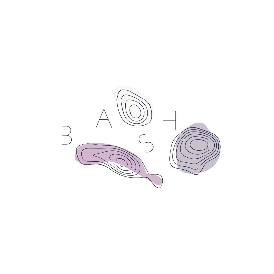
This little logo process is from the branding process for BASH Event Planning & Design. This was a challenging but FUN design process that included ideas like topography, layering and disco!
This little logo process is from the branding process for BASH Event Planning & Design. This was a challenging but FUN design process that included ideas like topography, layering and disco!
Below are several of the concepts and variations created before we nailed down the final logo.


