Why You Need a Mood Board for Your Private Practice Logo
Discover why private practice therapists need a professional logo and why a mood board is the crucial first step with therapy logos to build trust, attract more clients, and boost income with expert logo design for therapists.
If you’re a therapist in private practice, chances are you’ve spent a lot of time learning how to help people—but maybe not as much time thinking about your branding. One of the most overlooked (yet powerful) parts of building a successful practice is your logo.
But before a designer dives into the details of the logo itself, they will create a mood board. A mood board is an internal tool created to ensure that the logo designer is on the same page with their client. This mood board should of course convey the mood and vibe of the brand, but how does that translate to private practice therapists?
First Impressions Matter in Private Practice
When someone searches online for a therapist, they’re often feeling vulnerable, overwhelmed, or uncertain. Your branding is going to be one of the main visuals a potential client interacts with before deciding to contact you. The mood board is going to make sure that the vibe they are visually processing is the same vibe they will have when they work with you. Through photos, colors and graphic elements, you should be able to get the look and feel your going for and make sure it matches what you want in a logo for your private practice.
Logos for Your Therapy Practice Build Trust and Connection
A well-crafted logo isn’t just about looking pretty—it’s about creating an emotional connection. The colors, shapes, and typefaces in your logo do more than decorate—they set the tone for your practice:
Bold, vibrant palettes convey energy, confidence, and momentum.
Minimalist layouts with ample white space communicate focus and simplicity.
Hand-drawn or textured elements suggest authenticity, warmth, and a personal touch.
Geometric patterns can highlight balance, structure, and stability.
Elegant serif fonts evoke tradition, wisdom, and trust.
When your logo mirrors the feelings your clients hope to find, it makes it easier for them to picture a meaningful connection with you—often before they’ve even reached out. And the first step is to map these elements out in a mood board. The mood board will showcase your color palettes, font examples, iconography and photography. All of these should work together to create the emotional tie the logo will bring to life.
Standing Out in a Crowded Field
Let’s be honest: the therapy world is crowded, especially in cities and online platforms. Many therapists offer similar services, and clients often scroll through dozens of profiles before making a decision.
A distinctive, professional therapy logo design helps your practice stand out. Instead of blending into a sea of text-heavy listings, your visual identity makes you memorable. The right design can set you apart as the therapist who “feels right” even before a consultation call.
A Mood Board Helps Nail Down Who Your Client Is
By gathering colors, images, fonts, and textures that reflect the feelings you want clients to have when they first encounter your practice, you start to see patterns emerge. Maybe your ideal client is drawn to calm neutrals and open space, signaling a need for safety and groundedness. Or perhaps they resonate with bold, confident colors and modern typography, pointing to a desire for growth, change, and clarity.
The process forces you to move beyond “what looks nice” and into “what feels right for the people I want to reach.” A strong mood board becomes the foundation of a logo that doesn’t just look professional—it speaks directly to the clients you’re hoping to serve.
When you start your logo design process with a mood board, you’re not just picking colors or fonts—you’re setting the emotional stage for how clients will experience your practice before they ever sit down with you.
It’s the difference between guessing what might resonate and intentionally shaping the first impression you want to give.
A mood board turns your values, vision, and ideal client into something tangible. And once that foundation is in place, the logo practically designs itself—because it’s rooted in meaning, not just aesthetics.
That’s why the best therapy logos always begin with a mood board. It ensures your brand feels consistent, authentic, and aligned with the clients you most want to reach. More than a creative exercise, it’s an act of clarity—one that allows your logo to truly work for you, welcoming the right people in and helping your practice grow with purpose.
Looking for a custom logo design for your therapy practice?
Skip the overwhelm and get a logo
designed that authentically matches your therapy style.
Why Private Practice Therapists Need a Well-Designed Logo
Discover why private practice therapists need a professional logo. Learn how therapy logos build trust, attract more clients, and boost income with expert logo design for therapists.
If you’re a therapist in private practice, chances are you’ve spent a lot of time learning how to help people—but maybe not as much time thinking about your branding. One of the most overlooked (yet powerful) parts of building a successful practice is your logo.
A strong, thoughtfully designed logo can make a big difference in how potential clients see you, whether they choose to reach out, and ultimately how your business grows. Let’s explore why logo design for therapists matters and how the right therapy logos can help you book more clients and increase your income.
First Impressions Matter in Private Practice
When someone searches online for a therapist, they’re often feeling vulnerable, overwhelmed, or uncertain. Your logo is often the first visual element they see on your website, business card, or Psychology Today profile.
A professional therapy logo sends the message that your practice is established, trustworthy, and competent. On the other hand, a dated or generic logo—or worse, no logo at all—can unintentionally make your practice feel less credible. In a competitive market, that first impression can be the difference between a potential client reaching out or moving on.
Therapy Logos Build Trust and Connection
A well-crafted logo isn’t just about looking nice—it’s about creating an emotional connection. The colors, shapes, and typography you choose communicate subtle messages about your style and approach:
Soft, calming tones suggest warmth and safety.
Clean, modern lines communicate professionalism and clarity.
Nature-inspired imagery can evoke growth, healing, and renewal.
When your logo resonates with the feelings a client is looking for, it becomes easier for them to imagine working with you. That trust-building starts before the first session.
Standing Out in a Crowded Field
Let’s be honest: the therapy world is crowded, especially in cities and online platforms. Many therapists offer similar services, and clients often scroll through dozens of profiles before making a decision.
A distinctive, professional therapy logo design helps your practice stand out. Instead of blending into a sea of text-heavy listings, your visual identity makes you memorable. The right design can set you apart as the therapist who “feels right” even before a consultation call.
How a Logo Impacts Your Bottom Line
Investing in professional logo design for therapists isn’t just about aesthetics—it’s about business growth. Here’s how a great logo translates into more clients and revenue:
Higher conversion rates: A polished brand encourages potential clients to click, call, or book.
Better word-of-mouth: Clients are more likely to share your website or business card if it looks professional.
Premium positioning: A well-designed logo allows you to charge fees that reflect the quality of your services.
Think of your logo as a long-term investment in your private practice. It works for you every day—on your website, your intake forms, your social media—helping attract the right clients and reinforcing the value you provide.
Your skills as a therapist are what truly change lives—but let’s be honest, your logo is often what gets people to knock on the door in the first place.
Think of it as the friendly wave before the deep conversation. A thoughtfully designed therapy logo gives your practice a quiet superpower: it builds trust, shows off your values, and makes you memorable in a crowded field.
If you’re ready to grow your practice (and make your future clients’ scrolling thumbs stop in their tracks), investing in professional logo design for therapists is a smart move. The right logo isn’t just pretty—it works hard behind the scenes to help your business flourish.
Looking for a custom logo design for your therapy practice?
Skip the overwhelm and get a logo
designed that authentically matches your therapy style.
The 10 Best Website Designs for Therapists: 2023 Edition
Missing out on potential leads? Learn how to improve your search engine ranking and increase traffic to your website with tailored SEO tips for therapists.
For a therapist just starting your private practice, a website can be a huge marketing machine for your growing business. You can let the designs and vibe speak for you before you ever have that initial call with a potential new client. Website designs for therapists can have a range of styles, so below we’ve rounded up our favorited designs from 2023 that were made specifically with a therapist’s website needs in mind!
The Therapy Group
The Therapy Group’s website instantly gives a sense of calm with its soft, inviting colors and beautiful textured backgrounds. We love how the brand elements are incorporated into every section without feeling overbearing.
Website: The Therapy Group
Buffalo Roam Therapy
Buffalo Roam Therapy’s website stands out from the crowd with a warm, inviting color scheme. We love the consistent use of brand elements throughout the site - it really portrays the vibe of their Kansas location!
Website: Buffalo Roam Therapy
Rebecca Newton Therapy
Sometimes less is more. Rebecca Newton Therapy’s website has simple, clean layouts - making the process of working her feel just as simple. We love the soft colors and stunning photography.
Website: Rebecca Newton Therapy
Oak & Stone Therapy
Soft colors, hand-drawn elements and unique layouts - what’s not to love! Oak and Stone Therapy has a unique and easy-to-use navigation with line elements that are carried throughout the website. We also love that the engaging copy that really speaks to who they are as therapists and what they offer.
Website: Oak & Stone Therapy
Elizabeth Rubio, LCSW
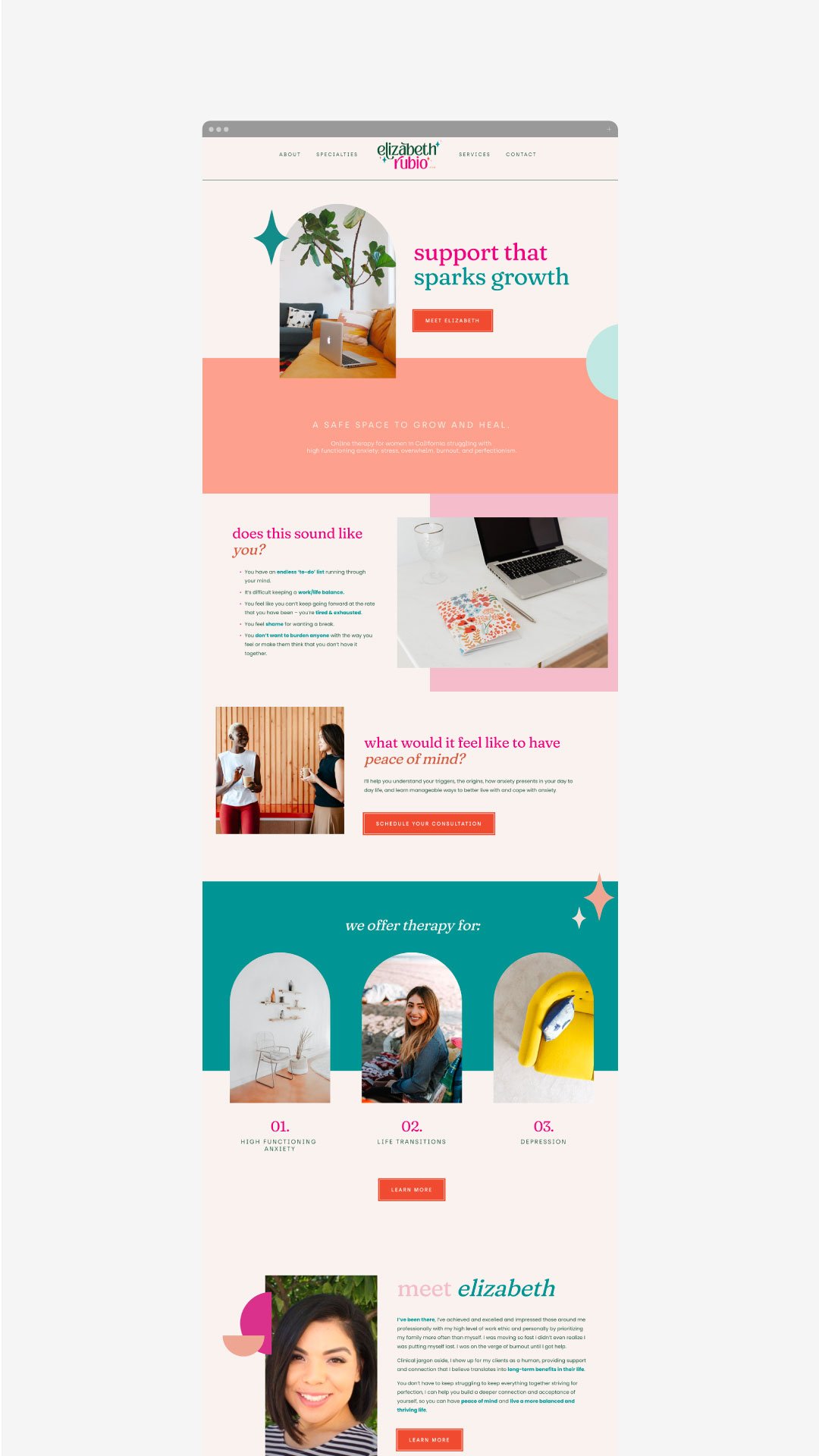
While most therapists take a light, airy feel to their website, we love that Elizabeth Rubio did not stray from color. Her website makes therapy feel fun and inviting, all while clearly conveying her offerings.
Website: Elizabeth Rubio, LCSW
NEW!
a templated guide to
messaging magic
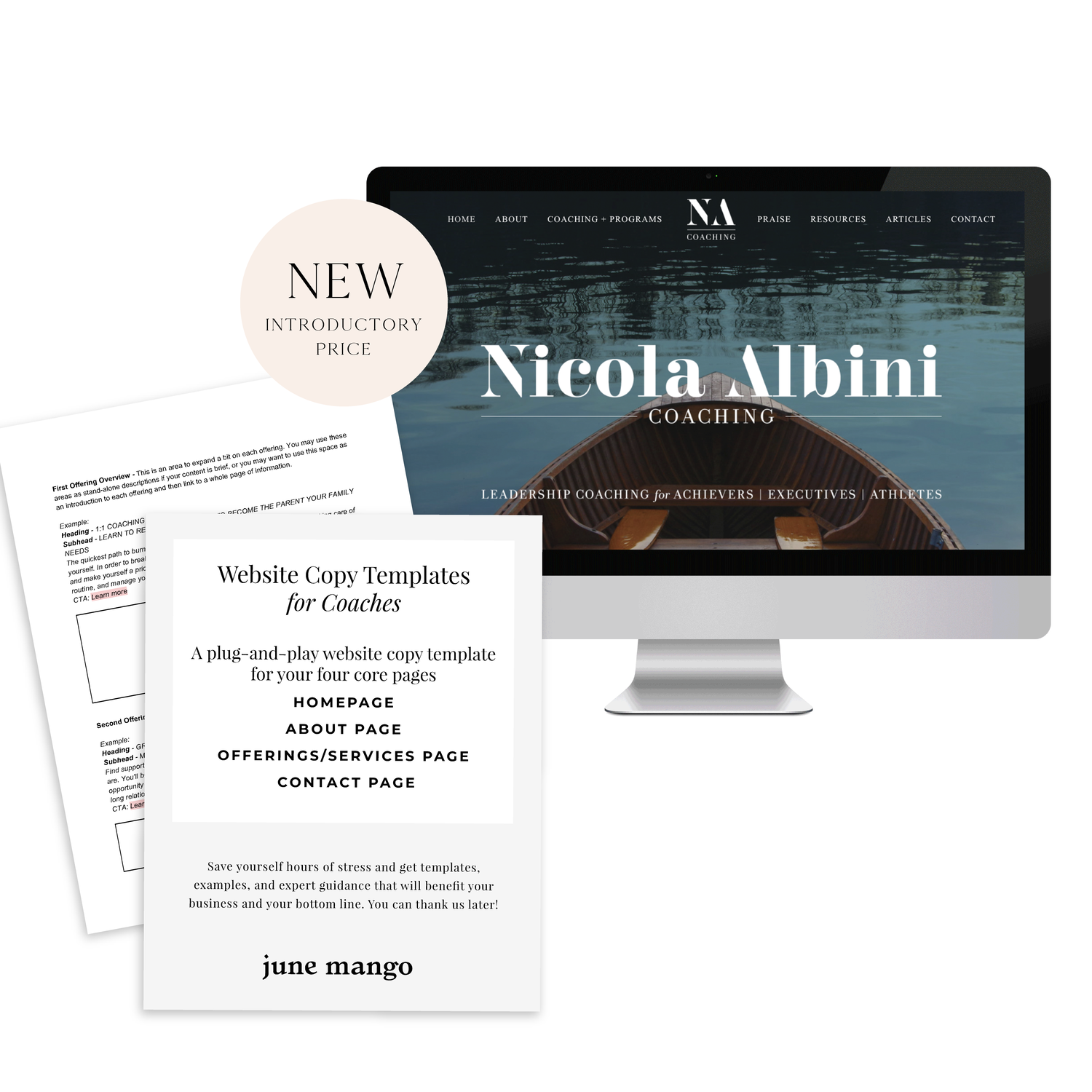
A plug-and-play website copy template for your four core pages (Home, About, Offerings, Contact). Save yourself hours of stress and get templates, examples, and expert guidance that will benefit your business and your bottom line.
get your template now >
Jessica Pavelka Counseling
We were initially drawn to Jessica’s unique photos and use of brand elements. Her website makes it clear who she is and what she offers from the second you land on the homepage - always a win!
Website: Jessica Pavelka Counseling
Dr. Tess Browne
Dr. Tess uses the soft tones of many therapists but adds in a splash of color and unique textured backgrounds. Her website does a great job of establishing her credibility and professionalism, while still feeling like a welcoming, safe space.
Website: Dr. Tess Browne
Dr. Ramona Burrage
Dr. Ramona’s therapy website is clean, quick-to-the-point and absolutely beautiful! We love the full header image, simple layouts and branded elements. It feels both sophisticated and approachable.
Website: Dr. Ramona Burrage
Dr. Nicole Z
This website incorporates nice textured and colored backgrounds that soften the vibe of the pages. It helps the page feel warmer and more welcoming - which is perfect for a therapist! We also love the beautiful logo and how it’s incorporated throughout different parts of the site.
Website: Dr. Nicole Z
Dr. Cassidy Freitas
This website just screams happy to us! We love the use of pink and arch shapes. Another piece that pulls her website together is how on-brand her images are, making the whole website feel cohesive.
Website: Dr. Cassidy Freitas
Looking for a custom website design for your therapy practice?
Skip the overwhelm and have your website
designed and launched in just 5 days!
A Guide to SEO for Therapists
Missing out on potential leads? Learn how to improve your search engine ranking and increase traffic to your website with tailored SEO tips for therapists.
If you’re a therapist, having effective SEO can help you stand out in the crowded online marketplace and attract potential leads who are looking for services. Where do you start if you’ve never done SEO before? Optimizing your website and content with tailored SEO tips is essential if you want to improve your search engine ranking and drive more traffic to your website. If you’ve never done any SEO before, you’re in the right place - start here!
Understand Search Engine Usage and Optimization Strategies.
Start by understanding how to use search engine optimization (SEO) effectively. This includes knowing which keywords and phrases to use in your pages and blog posts to improve your visibility. You should also be familiar with common SEO practices such as optimizing page titles, meta descriptions, and the structure of URLs for maximum visibility. Furthermore, set up quality link-building campaigns on social media or other related websites to drive more traffic to your website.
Create Quality Content That Showcases Your Specialty Areas.
Publishing quality content is essential for successful SEO. Relevant keywords and content tailored to what potential clients are searching for will help to increase your visibility in search engine results. Additionally, you should tailor the content to include specialty areas that you specialize in as a therapist. This ensures that your site has more chances of appearing at the top of search engine results pages whenever someone searches for a specific condition or concern.
Clearly Define Keywords and Identify Long-Tail Keywords.
Keywords are the foundation of effective SEO, and as a therapist, you’ll need to identify words and phrases that serve as important search terms for your target audience. For example, you would be better off with a keyword like “EMDR for car accidents” rather than “EMDR therapy”. The more specific, the higher likelihood you will be seen on search results. Once you’ve done that, you can optimize content in order to rank higher on SERPs (search engine results pages). Additionally, by identifying long-tail keywords relevant to your specialty practice, you can ensure better visibility when people search for specific services or types of therapy.
Optimize your Site for Mobile Viewing.
Mobile optimization is crucial for creating a successful therapy website. So many people (and potential clients!) are using phones and tablets to browse the web and look for a therapist. To ensure that these visitors don't become frustrated with load times or the design of your website on their device, make sure that your web design is responsive (aka: it scales to a smaller screens size) and optimized for different devices. This will ensure that potential clients are able to navigate and access all relevant information quickly and easily on their device of choice!
Optimize Your Website With Structured Data, Schema Markup, and Meta Descriptions & Tags.
A little jargony… I know but stick with me! Structured data, schema markup, and meta descriptions & tags are the technical foundations of Search Engine Optimization. For example, schema markups allow you to identify your content and make it easier for search engines to accurately categorize your website when people are searching for specific topics. Similarly, optimizing your meta titles and descriptions can help potential clients quickly identify whether your website offers the services they’re looking for — making it easier for them to access valuable resources. Additionally, optimizing URLs can increase click-through rates from SERPs (search engine result pages), meaning that more people have a chance of discovering the site on Google or other popular search engines. This does start to get into the weeds and this is usually where I’d recommend chatting with a web designer who knows how to easily set these data points up for your website.
Track Results With Analytics & Use Information to Effectively Monitor Progress Over Time.
In order to track the success of your SEO efforts, you should take advantage of analytics tools such as Google Analytics. It can provide valuable insights into how visitors interact with your website and how people are finding your site in the first place. It’s important to review this data regularly, so that you can make changes to your website’s design and content based on what is actually working for you. Tracking progress over time can allow you to identify where improvements could be made, allowing you to refine marketing strategies and optimize exposure. If you’re not sure how to set up Google Analytics, your web designer can help point you in the right direction!
Don’t miss out on potential leads! You can improve your search engine ranking and increase traffic to your website with a little planning and these tailored SEO tips specifically for therapists! You’ve got this.
need even more help with your website?
Skip the overwhelm and have your website
designed and launched in just 5 days!
Essential Tips for Creating a Successful Private Practice Website Design
Build an effective website for your private practice - find out how! This guide contains valuable advice for creating a website that meets all necessary requirements, helps you grow your business and attract new clients to your private practice!
A professional private practice website is an essential part of attracting new clients and building relationships with existing ones. In today's digital world, it is important to design a website that provides an exceptional user experience and highlights the services you provide. Follow this guide to learn the key elements of creating a successful, customer-friendly private practice website.
Understand Your Goals and Focus on User Experience.
When designing a website for your private practice, you should first consider your goals. Think about the types of clients you want to attract, and focus on providing an exceptional user experience. Your website is like your online office; it should reflect what a client would feel if they stepped into your office for an IRL session. Make sure the navigation is intuitive and every page loads quickly. Consider adding customer reviews, engaging visuals, and informative content that positions you as an authority in your field. Above all else, remember to prioritize customer needs and keep the design simple yet effective!
Craft an Eye-Catching Home Page Design that Fits Your Practice’s Brand.
The homepage of your website should be the most compelling page as it’s the first page visitors will see. Make sure to create an eye-catching yet professional design by using visuals and concise descriptions that stay true to your practice’s branding. Keep in mind that the homepage should provide a brief overview of what you specialize in and how you can help potential clients, so make sure all elements are branded and organized for maximum impact. Additionally, add calls-to-action to help direct visitors through the website. (A call-to-action is a fancy word for a button, link or ‘next step’ for the person visiting your website).
Be Clear About Your Services, Fees and Contact Information.
Key pillars for a successful private practice website include displaying your services, contact information, fees and scheduling capabilities in a clear and concise manner. This will allow visitors to get the answers to questions they may have about your practice as soon as possible. Additionally, consider integrating with third-party platforms to allow for easy appointment booking on the same page. Lastly, make sure any important contact information is visible and easily accessible from any page on the website
Optimize your Site for Mobile Viewing.
Mobile optimization is crucial for creating a successful private practice website. Many potential clients are likely to access your site from mobile devices such as iPads, iPhones, Android phones and tablets. To ensure that these visitors don't become frustrated with load times or the design of your website on their device, make sure that your template is responsive and optimized for different screen sizes. This will ensure that visitors are able to navigate and access all relevant information quickly and easily on their device of choice.
Make Sure the Site is Secure and Accessible to All Users.
Private practice websites must be secure for potential clients to use — after all, there are likely sensitive topics discussed on your site, and so it's important that all information shared is kept private between the clinician and client. Also, ensure that all aspects of the website are accessible to visitors. For example, make sure images have descriptive alt text for those who can't see them; links don’t just indicate “click here” but rather say what they go to; and visitors with motor difficulties can access content without relying on a mouse. (You can pop over to this post for more on this topic!). This way you can broaden the scope of your reach and attract more different types of patients.
Attracting new clients to your private practice is easy if you prioritize their user experience! You’ve got this.
need even more help with your website?
Skip the overwhelm and have your website
designed and launched in just 5 days!
Keeping Up Your SEO
SEO, or Search Engine Optimization, is basically the process of maximizing your website’s ranking and visibility when searched via Google or other popular search engines. While SEO can be a complicated topic, and the true algorithm for optimization is unknown, there are a few simple steps that you can take to ensure that your website is set up for success in the search engine world.
SEO, or Search Engine Optimization, is basically the process of maximizing your website’s ranking and visibility when searched via Google or other popular search engines. While SEO can be a complicated topic, and the true algorithm for optimization is unknown, there are a few simple steps that you can take to ensure that your website is set up for success in the search engine world.
One of the biggest, and most helpful, is starting (or keeping up) a blog.
How a blog can help with your SEO
SEO picks up and catalogs the words on your website, so writing content that is ‘SEO Rich’ or is typically searched by the public, is essential in boosting your website rank. Keywords (or better yet, keyphrases) are truly the answer to this process. Include them in your title, description and throughout your blog.
Images are also a great way to add an extra amount of SEO by customizing the file name and ensuring that the images you choose to include in your post are both good quality and formatted correctly.
Most big website builders such as Squarespace give you ample opportunities to include SEO boosting material such as blog tags, headlines, etc. Make sure to utilize all these options in one way or another to make the most out of your blog and get as much traffic as possible. An example of this from my own site would be something like “holistic-web-designer.png”.
Developing a blog content calendar
Now that we’ve covered the importance of the blog, you might be wondering how on earth to keep a blog up - especially if your business isn’t something that requires one. But not to fear, creating a blog content calendar requires time and effort, but will take the stress off of curating content every single day.
When developing your content, think of your ideal client, questions they may have or any pain points in their lives that they need to have addressed. This is your chance to talk to them fully, uninterrupted and as persuasively as you wish. Bear in mind that this is YOUR content - say what you want to your ideal customers and build the personality in your business.
After you develop a few blog content ideas start to write them down in a list format one after the other until you have roughly enough ideas to fill up at least a month or so!
Grab a blank calendar
To start with the planning side, determine how often you want to be blogging. Is it every other day? Once a week? Maybe just once a month? It’s all up to you. Once you figure that out, begin to fill relevant blog topics into each slot.
Doing the work
Now that you have all the pre-planning out of the way, all that’s left is to start writing!
Drafting and outlining your posts can help you remember to include the keywords needed for optimal SEO as well as stay on topic throughout the entire writing process.
After the blogs are written and ready to be posted, do some research to determine what time would be best to schedule each one and set them to go live at that specific time. Promote your posts on social media with graphics, quotes or stats to advertise each one.
Keeping up a blog is a commitment and takes time and effort if you want to truly make a good one, but the payoff at the end of the day makes it an essential online business builder as it increases SEO, boosts awareness and gives you a chance to speak into your clients in a different way!
Be patient
A common misconception about SEO is that it will boost your ranking overnight. Nope. Building up your Google results takes T-I-M-E. Sometimes it can even take up to a year. Don’t get discouraged! Just keep plugging away and you WILL see results. Just keep in mind that SEO isn’t some magic bullet, but more like another tool in your marketing toolbox.
WANT to CREATE
a custom WEBSITE?
Create an Engaging About Page
So you’ve created your About page and it’s almost ready to go! Now you’re ready to put the pixel-perfect cherry on top with three final easy-to-implement tips that will improve your About page TODAY!
01. ADD YOUR PHOTO!
You may feel self-conscious about sharing your photo, and I get it. That one angle makes your hair look funny or you’re waiting to lose weight…okay well A) you are b-e-a-u-tiful girl and life is short! and B) add your photo anyway. People buy from people. They want to see WHO YOU ARE. And the only way they can do that is to see your smiling (*keyword*) face on your website. In an ideal world, this photo wouldn’t be a selfie, but work with whatcha got. If you want to add more than one photo, go for it!!
02. ADD SOCIAL PROOF
Social proof is a fancy term for sharing that you’re legit. People want to know that others have worked with you and liked the process. Social proof can come in lots of forms so here’s a quick list below:
Testimonials
Web/blog features
Podcast features
Media badges
Awards
These are just some common ones, but you can add any of these! This is a great way to share that you, sista, are the SH!T without writing about it in your text.
03. THIS IS MOST IMPORTANT!
OK, now that you’ve set up the greatest About page on the World Wide Web, please do this one last thing: Add a clear call-to-action! This can be a button or a link or a place to join your newsletter. Whatever it is, just make sure you tell your audience what you want them to do next. Often, this is some sort of link to your offerings page (Services, Shop, etc). Just don’t leave them hangin’.
NOT TOO HARD RIGHT?
These tips are totally doable, so go do them! And when you’re done, share your about pages with me! I’d love to meet you.
WANT to CREATE
a custom WEBSITE?
Adding a Background Image to a Form
Switch things up from the standard Squarespace design of your form with a background image! Incorporate some simple custom coding into your website to design a unique form.
block ID #{
background-image:
url(insert URL here);
background-size: cover;
color: white;
}
Switch things up from the standard Squarespace design of your form with a background image! Incorporate some simple custom coding into your website to design a unique form.
In this video I cover:
How to identify the content block where you will be placing your background image
The specific code used to achieve this look (see below)
SHOW NOTES
0:16 Identifying block ID code to change the form block
1:26 Adding code ID to custom CSS
2:00 Adding specific code to add background image
2:56 Changing background image size to fit the form
3:30 Changing form text color
need even more help with squarespace?
Skip the overwhelm and have your website
designed and launched in just 5 days!
Adding an Anchor Link in Squarespace 7.1
Learn how to create a "page jump" within your Squarespace website. Get website visitors where you want them to go quicker with this trick.
Learn how to create a "page jump" within your Squarespace website. Get website visitors where you want them to go quicker with this trick.
In this video I cover:
How to identify the section you want to link your scroll
Properly putting the correct code to your section
<div id= "section name">

</div>
WANT to CREATE
a custom WEBSITE?
No Code Custom Button Options
Discover how to use image blocks to create custom buttons for your website. No custom code needed to incorporate this element into your website design.
Discover how to use image blocks to create custom buttons for your website. No custom code needed to incorporate this element into your website design.
In this video I cover:
How to use the image content block to create a button
The various image content blocks you can use as buttons
The content you can link within these images
Show Notes
0:26 Inserting an image block
0:36 Uploading an image that looks like a button
0:57 Linking your image button
1:15 Resizing your image block
2:00 Uploading a background image for your button
2:11 Setting up a poster image design
2:36 Adding text on top of your button
2:44 Resizing the height of your image block button
3:14 Updating your button font style
The following information was created for use with templates made with Squarespace 7.0. Stay tuned for more tips and tricks
for the new 7.1 platform!
need even more help with squarespace?
Skip the overwhelm and have your website
designed and launched in just 5 days!
Questions to ask yourself when you’re in a business funk
Everyone’s creative process looks different, but a lot have the same initial phases. Here are a few thoughts on how to streamline yours.
Every few years, my creative brain starts to wander. I imagine new businesses I could start or new projects that really feel like they would light me up. I fantasize about how amazing it would be to take on these new roles and shake up my routines. When these thoughts bubble up, I admittedly follow them down the rabbit hole of creative dreamland. What I always end up realizing is that I don’t actually want to burn everything down and start over.
So what is bringing up all of this distracted energy?
What’s usually happening is a little below the surface (always is, right?). Sometimes this happens around a season of rest or wintering. Sometimes this happens when you’ve been at it awhile and are beginning to feel those telltale signs of burnout. Sometimes you do have more to give or may have had a shift in your values or priorities.
Whatever the reason, if you find yourself feeling like you're in a business rut, here are some questions you can ask yourself.
What do I like doing?
What DON’T I like doing?
What am I really good at?
What is really important to me right now?
Who is really important to me right now?
What will have the greatest impact on my life and/or my business?
Using these questions will help you determine what to focus on and what to let go of. From here, you can begin to find ways to incorporate new creative ideas into your current business; you probably don’t need to burn it all down and start anew.
Getting into a funk is a natural part of life and business. Everything is cyclical after all. Pop open your journal, ask yourself these questions, and see what comes up.
Rest is not a reward
Everyone’s creative process looks different, but a lot have the same initial phases. Here are a few thoughts on how to streamline yours.
What is the deal with our cultural idea of rest? It seems to be synonymous with lazy, unproductive, invaluable, and even shameful. I’m here to remind you, no… implore you, to reconsider these ideas of rest. KC Davis speaks to this idea of rest being deserved inherently and not something we only deserve at the end of productivity.
We only have so much energy at any given moment.
As we exchange that energy throughout our daily lives, we become literally depleted of that energy. Imagine you work 6 hours with clients everyday, but then continue on to clean your house, take care of kids or pets, go for a run, chat with a partner, check in on a family member, and on and on. Each activity depletes your energy storage.
A good way to think about energy is as a glass of water. Some activities in our lives require a lot of that water (eg: client work, parenting, exercise, etc). Some activities may only need a small sip (eg: writing an email or doing the dishes). And some activities may be more like an energy exchange (eg: chatting with a friend), which is more like giving a little water and getting a little back. But at some point, your cup is running low. You just don’t have any more water to give to anyone, including yourself. We all have limited energy.
And so, we rest. We recover. We re-up.
It’s a critical part of the process! And it allows you to actually give more than if you push on through.
But another belief many have is that rest is the thing at the end. It’s the reward for all the hard work. “Once I do XYZ, then I can take a break”. “If I can just squeeze out three more emails, then I will let myself rest.”
Rest is not a reward. Rest is something you are inherently worthy of.
It is as essential as food and water. It makes you better at everything else. There is no shame in resting, sleeping, meditating, going for a walk, watching a little Netflix, folding the laundry tomorrow, or never folding the laundry at all. You are not lazy. You still have value.
Allow yourself to take breaks. Pencil it into your calendar if you have to. Put the laundry out of sight. Do whatever you need to do to shift the belief that your rest is not as valuable as your work.
We are all worthy of rest.
WANT to CREATE
a custom WEBSITE?
What is a holistic business?
Everyone’s creative process looks different, but a lot have the same initial phases. Here are a few thoughts on how to streamline yours.
Holistic businesses are ones that support the whole person behind the business, not just their business needs. Spreadsheets and profit margins are important, but so is rest, boundaries and creativity. I am a firm-believer in holistic approaches.
To look at something as a whole, not just the sum of its parts, allows one to make meaningful strides towards any goal.
When we approach our business in this way, we allow the excess to fall away and give ourselves room to grow the things that align with our values. To do this, you have to see the big picture. For example, as a new mom, I had a major shift in priorities, but also in time. I no longer had a full 8 hour day to do my work. And more importantly, I didn’t want to spend 8 hours at my desk. I wanted to squeeze my baby’s cheeks and catch up on much needed sleep. I needed to look at what my priorities were at that time to begin to make changes that related to my business. I also needed to pay my bills, so spending ALL of my time with my baby wasn’t an option either.
I started by looking at what I love to do in my business, what items brought in the most money, and how much time I realistically could spend working in a given week. Using that formula, I was able to delegate some tasks and shift some things around so that my business fit into my life (not the other way around!).
Each item affects another. Our lives are an ecosystem, and a business is one part of that. A holistic business understands this fundamental shift and utilizes a new mindset to cultivate growth, but also joy! It takes intentionality and the understanding that behind every business is the human running it.
3 Useful Resources for Your Online Business
It does not matter how hard you work, if you are not being efficient with your time, it is going to hurt you in the long run. When 3 hours of work could have taken you 45 minutes if you only sat down for 15 to plan it out - it may be time to start incorporating more tactics to help you work smarter (not harder).
It does not matter how hard you work, if you are not being efficient with your time, it is going to hurt you in the long run. When 3 hours of work could have taken you 45 minutes if you only sat down for 15 to plan it out - it may be time to start incorporating more tactics to help you work smarter (not harder).
Utilizing applications is an easy first step - scheduling social media content, keeping track of hours, meetings, etc. What used to be a daily task can now transition to weekly as you get acquainted with the latest scheduling technology and let it work wonders for your time.
Outsourcing is another massive time saver. If you don’t have time to keep up your blog but it significantly boosts your SEO, making it mandatory, hire a writer. You could also hire a VA who is social media savvy and can do all the time-consuming content work in half the time!
Start time blocking! Tackle the overwhelming feeling that comes when you have 12 things to do that day. When they all have to get done, and they are all of equal importance, it can feel like you spend the whole day running from one to the other with your hair on fire. If you schedule out your tasks one by one, you will not have to worry about whether or not you’ll get it all done - you know you will - and when! It will also keep you accountable to be productive when you know how long you have to work.
Here are 3 useful resources to help you get on top of your work efficiently while not compromising quality!
Canva
Canva is an online design software that can make creating and publishing items for your business extremely easy. You can create thumbnail images for your blog posts, graphics for your newsletters and more. The platform is pretty collaborative too so it is great for designing back and forth with a team.
Items you can create with Canva:
Blog Thumbnails
Newsletter graphics
Social media design
Pinterest templates
Business cards
Presentations
+ more
Your Website
Your website can also be a great resource for your business. House your event calendar for customers and clients to access with ease. You can integrate your scheduling platform such as Acuity or MindBody within your site to book out client spots.
Plus with your website analytics panel, you can see what content resonates with your audience and continue tapping into that type of content.
Task Management Platform
For many business owners, their pen and paper to-do list can quickly get out of hand. If you have twenty different lists around your desks with all the tasks you have to do and seem to always be letting to-do’s slip, then you need a task management platform.
Are you a service-based business? This makes a task management platform even more important because on top of your typical business functions, you are working to provide valuable services.
Some great task management platforms include Asana, Trello, and ClickUp. Using one of these websites may help transform the efficiency of your business and will give you peace of mind with your to-do list!
WANT to CREATE
a custom WEBSITE?
Creating Newsletter Content
Having a newsletter is an essential element in developing and marketing your business. It aids in converting visitors into future clients as you keep them in the loop of your business and also provides free value to show your paid worth.
Having a newsletter is an essential element in developing and marketing your business. It aids in converting visitors into future clients as you keep them in the loop of your business and also provides free value to show your paid worth.
Newsletters can be even more successful than social media marketing for a lot of businesses, so you want to make sure you're putting forth just as much or more effort into creating newsletter content than you are into creating social media content.
How to generate ideas for your email content
Figuring out what to include is similar to finding out what to add to your blog - as we addressed in our previous post - you want to provide value to your audience through tips, best practices, information about your services/products and more.
This all builds off of addressing your ideal client, and connects them with their wants and needs. If you are not connecting them with something they will deem valuable, they are going to quickly lose interest.
While it may be tempting to want to only highlight your business successes, testimonials, etc. try to give your hope-to-be-clients something that they can use themselves, not just what feels like another sales pitch.
General email newsletter content ideas
Here are a few ideas to get you started:
Blog roundups
PDF freebies
Video trainings
Downloadable templates
Deals and discounts
Product highlights
Positive feedback
Team highlights
Upcoming events
Creating a newsletter can seem overwhelming at first - thinking about the structure, design and types of content needed to keep your audience’s attention - but once you get in a rhythm, you will find that it tends to flow naturally and begins to get easier with time!
WANT to CREATE
a custom WEBSITE?
How to Promote Your Business
Getting your business out there online can really help you gain new customers and clients. While there are multiple methods for developing your online presence, in this blog post we will be covering your social media.
Getting your business out there online can really help you gain new customers and clients. While there are multiple methods for developing your online presence, in this blog post we will be covering your social media.
Social media is a great way to connect with your ideal audience and meet potential new customers. Along with extending your reach, social media can allow you to connect and convert (easily!) as well.
Finding the right platform
Part of your online success with social media is discovering the right platform for your business and content. Take time to think about your ideal client. Consider which platform they spend most of their time scrolling and posting. This is where you want to be posting your content for them to see!
If you have an incredible social media account with great eye-catching content and photography, you are going to gain followers from all over. This helps build a business with a professional reputation. As a best practice, you can pre-schedule your posting content 2 weeks ahead (at least) to help you stay on top of consistency in your social media posts.
What to post
While half of the battle is discovering which platform is best, the other is determining what content to share on social media. You want to provide value to your audience through tips, best practices, information about your services/products and more.
A good place to start is to describe what pain points your business or products can address for your ideal client. This will give them a clear picture that you are the right choice for their needs!
Give your social media strategy some time and be attentive to your customers - they can help you figure out what content to share and what types of posts they like the most. Keep an eye on your analytics for that. Make note to evaluate what is working well and what needs to be addressed with your content periodically to keep up with what works best for you and your social media!
Social media doesn’t have to be a complicated process, but it can certainly help you gain new business along the way.
Need help with your online presence? Let’s start with your website! Discover more about our services here.
WANT to CREATE
a custom WEBSITE?
How to set effective boundaries in your business
Everyone’s creative process looks different, but a lot have the same initial phases. Here are a few thoughts on how to streamline yours.
Determine what your needs are first. You may know exactly what it is that you need more of (or less of) within your business. But sometimes there are clues that you may not have the full picture and some needs might get overlooked. There are a few ways to suss out needs you may not be giving your full attention to. Check in with your body. Do you feel flushed, tense, exhausted, sleepy? Now write these feelings down and see what it is your body might be asking for.
Another key tool is your anger. What really gets your goat? When you find yourself getting really annoyed or mad (at a client, a situation, or partner), this is a good indication that you had a need that wasn’t being met. This is a surefire place that is asking for a boundary to be put up to prevent feeling angry again.
Create rules around your needs. If one of your needs is having time for a long morning routine that eats into typical office hours, create a rule around that need. This might look like setting your working hours from 10:00am-6:00pm. Don’t check email or even come near your to-do list until that time. Stick to these rules and create a practice around them. Eventually, they will become patterns that feel second nature and you’ll find yourself wondering why you ever worried about starting your work day so “late”.
Communicate them confidently. When you are sure of yourself, your clients will naturally accept your rules and choices. I learned (and am still learning) this one through parenting a toddler. If I set the limit with ease and confidence, my two year old is way less likely to throw a tantrum. But the other key to this formula is to accept that they may not like your limits, and that’s okay. Your client is allowed to feel miffed that you didn’t respond to their email right away. My toddler is allowed to be mad that his TV show has a time limit. That’s okay. Feel free to feel your feelings, bud. But dems the breaks.
WANT to CREATE
a custom WEBSITE?
How to Remove Hyphenation Throughout Your Website
Not loving the word break with the hyphenation on your website? Use this snippet of code to remove hyphenation through your website and keep words intact!
Not loving the word break with the hyphenation on your website? Use this snippet of code to remove hyphenation through your website and keep words intact!
In this video I cover:
Where to insert your code in your website to update the hyphenation
The specific code used to achieve this look (see below)
Show Notes
0:30 Copying code into custom CSS to remove hyphen
P, h1, h2 { hyphens: manual !important; hyphens: manual !important; hyphens: manual !important; hyphens: manual !important; }
How to Add Custom Name Fields in Squarespace Email Campaigns
Learn how to add custom name fields in Squarespace email campaigns. This merge tags trick is great for customizing your email content!
Learn how to add custom name fields in Squarespace email campaigns. This merge tags trick is great for customizing your email content!
In this video I cover:
How to access this setting in your email campaigns
Ways to incorporate this feature in your email design
Show Notes:
0:13 Inserting the subscriber name in your email
WANT to CREATE
a custom WEBSITE?
Adding Background Color Behind Text with Code in Squarespace
Add some color to your website page on Squarespace! By incorporating a background color behind your text, you can draw attention to call to actions, new offerings and more on your website. Only a few simple steps and easy to follow custom code needed!
<div style=“background-color: #000000; padding-top: 5%; padding-bottom: 5%; text-align: center’>
  <h3 style=“color: white;”>Word</h3>
</div>
Add some color to your website page on Squarespace! By incorporating a background color behind your text, you can draw attention to call to actions, new offerings and more on your website. Only a few simple steps and easy to follow custom code needed!
In this video I cover:
Ideas to where to add a background color to your website design
The specific code used to achieve this look (see below)
Show Notes
0:28 Insert code block
1:25 How to change the text color
1:52 How to change the background color
2:20 How to change the padding and alignment
3:25 Adjusting the left and right padding with spacers


