How to Rethink Your Creative Process
Everyone’s creative process looks different, but a lot have the same initial phases. Here are a few thoughts on how to streamline yours.
Everyone’s creative process looks different, but a lot have the same initial phases. I find that I start out excited and ready to rumble with the idea. Then I dive into research and planning and looking for inspiration. This is where things sometimes fall apart. I find myself getting overwhelmed by what I need to do to bring this new idea to life.
Are you nodding your head? Here are a few thoughts on how to stop the second-guessing cycle.
No idea is a bad idea
All ideas have to start somewhere. Whatever comes to mind, get it down. You never know where that idea or design can evolve. No matter how silly you may think your initial thought or concept is, allow time for your idea to develop into something powerful. And don’t worry if you’re not the very first person to want to do something. You are the very best person to do it in your exact way. And that’s enough.
Change up your environment
Inspiration can be found in the most random of spaces. Sometimes all you need to do is get out of the office. Visit a coffee shop or local library. Talk to real live people about it. Ya, like offline. This will help you get out of your head and unstuck from your desk.
Unplug
Digital distractions can prolong the process. Put the phone down and get away from a screen if you can. Try a pen and paper first before jumping on your laptop. While checking out other people’s work can be a source of inspiration, it can limit your originality in your ideas. Use your imagination!
Do not set expectations or limitations
Setting expectations on yourself can add a layer of pressure and limit your mindset. This is one of the worst things you can do during the creative process. Don’t close of a potentially great idea because of fear. Limiting yourself would be a real shame. Think of what you could dream up if you just changed your mindset. You have talent, and you need to trust yourself. You can design great things, settle into that instead of fear or doubt!
The main point in all of this is to LET GO. Seriously. Creativity is meant to be fluid and not pinned down to a specific place. Let go and see what you create. It can get a little messy, but that’s the beauty in it.
Mama Feature ▴ Kim Wensel
I am so excited to introduce a brand new blog series to my website - Mama Feature. This section of my blog content is focused on sharing the stories and life advice from fellow mama biz owners. For this first feature, we are chatting with Kim Winsel. Kim is the CEO of Pattern of Purpose. Her business focuses on brand strategy, copywriting and customer research for other entrepreneurs. Not only does Kim kick ass at work, she is a mama to two little ones. Read more about her story below!
I am so excited to introduce a brand new blog series to my website - Mama Features. This section of my blog content is focused on sharing the stories and life advice from fellow mama biz owners. For this first feature, we are chatting with Kim Wensel. Kim is the CEO of Pattern of Purpose. Her business focuses on brand strategy, copywriting and customer research for other entrepreneurs. Not only does Kim kick ass at work, she is a mama to two little ones. Read more about her story below!
Tell me a little about your business
I'm a brand strategist and storyteller for entrepreneurs and locally-owned small business who want to attract more clients online. I help them understand what really sets their business apart and create messaging that transforms website lurkers into paying customers.
What is the best piece of advice you’ve received about starting, owning, and/or thriving as a small business owner?
There's no such thing as paying your dues in entrepreneurship. You get to run your business the way you want to NOW! You don't have to wait until you've left your day job or until you make your first hire. You should always be operating your business in a way that feels good -- from the services you offer to the type of marketing that you pursue. The positive energy you get from doing things in a way that feels good is going to flow into everything else, especially how clients feel about working with you.
How do you blend motherhood and building a business?
The first, and perhaps most important thing for me, has been paying for reliable daycare and preschool. Waking up each day knowing my kids will be cared for, will learn, and will be challenged is something I am so grateful for. It has allowed me to focus on my work in a way I couldn't do any other way. I also am at peace with sometimes working in the evenings or weekends, so long as that doesn't become the norm or expectation. When I do that I also make sure my husband takes time in the week for himself.
It's really easy to let your relationship slide down the list of priorities when you're juggling business and babies, so we've made a pact recently to schedule regular date nights and designate shows we watch together, so we're investing in our marriage as much as we invest in our careers and kids.
What has surprised you most about motherhood?
I'm really good at work. I've found that's because I can control most outcomes if I just dedicate more time or work harder. With motherhood, that's not necessarily the case. There are so many things out of your control and allowing yourself to let go of some of your expectations is going to mean the difference between enjoying the ride and stressing out over the same thing day in and day out. Patience, grace, and humility are all things my kids have taught me, especially as they've stopped me in my tracks reflecting the things I say and do!
What's your morning routine?
Becoming a mom has turned me into a morning person, not by choice! Our day typically begins around 6:00am and the kids are out the door by 7:30. I'm most productive before 10:00am, so I front load my writing tasks while drinking my daily two cups of coffee - black. I rarely schedule meetings before then, which means I can fully focus on getting the most important thing on my to-do list done before the day takes over.
How do you define balance?
I don't think about balance so much in the grand scheme of things, but rather in the course of days and weeks. If I want to get something done I put it in my calendar. And when I'm planning I *try* to keep those things during the time my kids are at school. It's not perfect but it helps me see, at a glance, where I'm prioritizing my time and how I might need to adjust once the evening or weekend rolls around.
When life gets crazy and balance is not possible, what core values do you hold on to?
This question is tough! Morning time, meal times, and bedtimes are devoted to family. No matter what I have going on, we spend that time together, which I think gives my kids comfort knowing I'm physically and mentally present even when we may have a thousand things going on.
If you could take a look at the future, what do you see for not only yourself personally, but also for your business?
I value personal connection and travel in my personal life and hope I can lean into these as much as possible with my business. I like to work closely with my clients, which has mostly been done through screen time in my business so far. I'd love to work with more businesses in person through deep engagements.
I see myself in five or ten years bringing my daughter along with me on these business trips, heightening her appreciation for our beautiful world and instilling a sense of confidence to pursue her career ambitions, no matter what they may be.
3 Pearls of wisdom you can share about motherhood, business or blending it together?
Appreciate the things about where you are in business right now while still holding space for where you want to be in the future.
You can plan for almost everything if you plan ahead.
It doesn't have to be hard for you in order for it to be valuable to someone else.
―
Be sure to follow Kim on Instagram to keep up
with her biz happenings and mama moments!
BRANDING YOUR INSTAGRAM STORIES
There are so many ways to share on Instagram Stories and while the easiest way is to share a quick photo or video selfie, there are some strategies you can implement to add your brand's voice and visuals to your stories timeline.
Since Instagram is such a great place to connect and share socially, I love sharing pieces of my clients' logo process, color palettes I'm creating, and sneak peaks at websites I'm building. There are so many ways to share on Instagram Stories and while the easiest way is to share a quick photo or video selfie, there are some strategies you can implement to add your brand's voice and visuals to your stories timeline.
01. Share what's inspiring you
I love this one because it's so simple, but it's unique and fun. Sharing a little collage or even just one photo of someone you've been following is a great way to share your aesthetic AND connect with your fellow 'grammers. Make sure to tag your story with the handle of the person's photo(s) that you're sharing so that they can engage with you and your followers can also engage with them.
02. Share what you're working on
If you normally share the finished product, try sharing some of the pieces that make up the process in your Instagram Stories. For me, this often looks like the logos that I create that don't get the final go ahead from my client. It's fun to share these designs that otherwise would never be seen! Plus, this gives future dream clients an idea of what it actually looks like to work with you.
03. Promos + marketing
Instagram Stories is a great place to promo something you want to make sure people see! Especially since the stories show up at the top of your audience's news feed, you are more likely to get seen and skip worrying about the newest Instagram algorithm. And there are lots of unique ways you can share and promote without feeling spammy. Take a look at the examples below for inspiration.
04. Share your blog posts
This might be my favorite thing to share on Instagram Stories because you already have the content! All you have to do is jazz it up for Instagram. By creating a few images for each major point of your post, you can share your content and make sure it's getting seen even if someone never visits your blog!
Not too hard, right?
Have another idea for injecting your brand
into your Instagram Stories?
It's Time to Make A "Don't List"
How much do you value your time? I would think a lot, but does your schedule reflect that? Are you wasting time on tasks and commitments that you dread?
How much do you value your time? Are you wasting time on tasks and commitments that you dread?
Most of us do, but it’s time for that trend to stop. We get bogged down by our to-do’s, but what if we flipped the script and instead of creating a to-do list, we created a “don’t list.” Think about it. How freeing would it be to take some of those i-just-hate-this-but-feel-i-have-to items off of your list? Think realistically about what matters in the scope of your life and your business.
If something is not a “HELL YES” it should be a complete no. Or at least a “no, thank you.”
No more second guessing this process. Go with your gut. You have those feelings for a reason; let’s time to listen to them.
Sketchy potential client call? Thank you, next.
The perfect design client + a nice payday? HELL YES
Taking a speaking gig 3 states away from your kiddos? Maybe not.
Being a guest on a podcast from your home office? HELL YES
You get the point. The more you say no to the not so great options coming your way, you leave room for a bigger yes that is bound to happen. Life is too short to do stuff that we don’t love. Plus, if you are an entrepreneur, you have worked too hard not to do the work you enjoy. You’ve hustled enough.
So let’s put this challenge into practice. Download your own Don’t List and write down ten things you are going to say no to or not waste your time with. Post this up next to your desk or in your closet. Remind yourself daily of the things you are going to say no to. Leave room for those hell yes’s. Get your downloadable HERE!
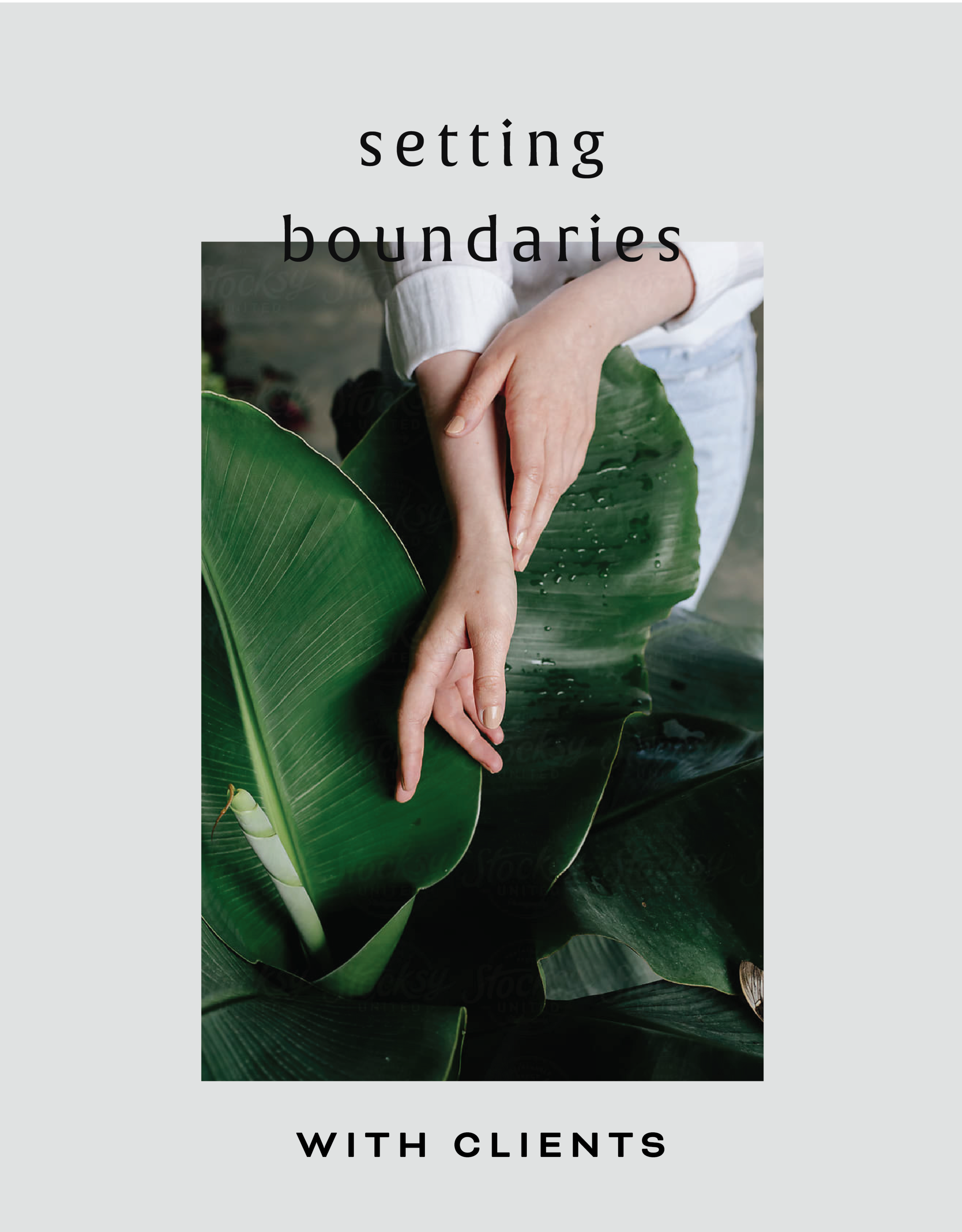
Setting Boundaries with Clients
Even if you love your clients, it's still super important to set up clear and simple client boundaries. This not only helps you, but is important for them as well. I promise it's helpful for everyone involved!
Even if you love your clients, it's still super important to set up clear and simple client boundaries. This not only helps you, but is important for them as well. For you, setting clear client boundaries will allow you to get your work done more efficiently, stick to a timeline, get paid what you're worth and help prevent burnout. For your clients, boundaries help them understand how the project will flow and what they can expect from you as well as what you expect from them. I promise it's helpful for everyone involved!
So here's a few tips and tricks to help you create your own client boundaries for your business:
During the initial client call
Setting boundaries with your clients is key to starting off on the right foot. No need to worry about seeming demanding during this part, but consider this as the perfect setup for a successful relationship. Get clear with your office hours, the best ways to reach you and the project timeline. If you are dealing with a client who enjoys sending a late night email message, let them know that there message will be read and responded to, not at midnight but during your office hours. this is also a good time to let them know what you need from them to get started with a project. If it helps, set due dates and timelines. Everyone works better when they have a set date to get shit done!
Within your welcome packet/proposal
All of those items you talked about in your call? Include them in writing in your welcome packet or proposal. Outline where project communication will take place - such as in Asana versus multiple email threads. Remind them that you don’t answer emails or texts on the weekend. Getting these items in writing and in their possession will help if you have to address later their breach of boundaries. Hopefully this won’t happen, but it is always helpful to have on hand.
Within your contract
First and foremost, have a contract!! It helps protect you AND your client. This is a great place to add those nitty gritty details like due dates and late fees. Be sure to address these items with your client directly as well. While everyone should read a contract carefully before signing it, it's no fun to have to refer back to the contract as the only point of reference that discusses the boundaries you've set.
In your email signature
If you do have office hours, outlining them in an email signature can be a consistent remind to a client of your availability. This doesn’t have to be in bold, red text, but you can keep it in your brand colors and in smaller text underneath your name.
During a client check-in
If these ideas don’t seem to stick with your client, you’ve got to stick up for yourself. Nicely, of course! Schedule a client check-in to provide updates on the project so they can feel informed and confident in your process. Once you are wrapping up, tell them about how they have started to breach your boundaries. Talk through with them how they have communicated with you has taken over your tasks and maybe even kept things behind schedule. A solution could be weekly updates on the process of the project or sharing your content schedule so they can keep tabs on your project status. Don’t be shy! This is for your sanity and theirs!
So now that you've got your clients squared away, it's time to control your inbox! Check out my Simple Tips for Managing Your Inbox.
Squarespace SEO: The Basics
Search Engine Optimization is crucial for getting your business at the top of searches and in front of potential clients, customers and more. There are a few basic practices that you can implement starting today to get you start. Most of these steps are pretty straight forward, but we are going to break down why and how you should have these completed on your website.
Search Engine Optimization is crucial for getting your business at the top of searches and in front of potential clients, customers and more. There are a few basic practices that you can implement starting today to get you started. Most of these steps are pretty straight forward, but we are going to break down why and how you should have these completed on your website.
1. Make Your Page Titles SEO Friendly
Don’t have generic page names. Incorporate keywords and phrases that can increase your visibility online! For example, instead of just using ‘About’ for a page title, try ‘About the Designer.’
2. Fill Out Your Business Information
You may have created your website in a rush to just get something up or focused so much on the design elements, you might have neglected this important must-have. Add to your Business Information setting to help with local search ability and increase the use of keywords. Access this through your Squarespace settings menu and select Business Information.
3. Refine Your File Naming System
No more ‘screenshot124.png’ for file names! Optimize files with specific keywords and relevant tags. If you are adding a photo to your web design portfolio make sure it has a strong file name. Something like ‘Web-Design-Creative-Portfolio’ will do great.
4. Spread the Local Love
If you are a local business or storefront, you MUST include your local town or city name throughout your website. You want to have SEO keywords that target your specific geographic area, especially if this a key factor for your business.
5. Get Descriptive
For every product and page that you have on your Squarespace site, double check to make sure that you include rich descriptions to increase your SEO. Product descriptions are available to be written through your shop menu. See an example of one of my product descriptions below! To update your page descriptions, select the gear icon next to your page name in your Squarespace pages menu. There will be a section towards the bottom to update that information!
These are just a few to get you started! Another quick tip before you begin is to develop a list of your business keywords and phrases to reference through each step to help you with the writing process.
Have any questions? Let me know!
The following information was created for use with templates made with Squarespace 7.0.
Stay tuned for more tips and tricks for the new 7.1 platform!
Related Posts
How to Get Your Website Ready to Launch
You’ve done the hard work and prepared a website that you are ready to share with the world. But before you go live, you may want to check out of a few of these things first. Use this guide to get your website ready to launch!
You’ve done the hard work and prepared a website that you are ready to share with the world. But before you take your new, shiny website live, you should run through what I call a “launch list” first. Some of these items may be more necessary than others, but certainly all steps are recommended to to make sure your website is ready to launch!
✴ Step One - Finalize Your Site’s Design + Style
Make sure you have your site title and logo set. Your logo can replace your site title in your website design, but your site title will be important for places like search results.
You can use the Site Style panel underneath the Design menu to get your fonts, colors, headings, spacing, etc. consistent and in line with your business branding.
Another thing to consider is adding in a cookie banner for your visitors, if you think their privacy is valuable to them. It is better to be on the safe than sorry side with this one (especially if you have ANY web visitors in Europe), so I encourage you to add a cookie banner into your final design.
Lastly, upload a favicon to show up in browser tabs for your visitors. This fun little detail shouldn’t be skipped!
✴ Step Two - Wrap Up Your Pages
Set a homepage that represents your brand and style well. Make sure this landing page has all of the major information covered and highlighted for your website visitors. This will be your first impression, so make it a good one!
Double check that your navigation is ordered how you want it. Consider how the user will view the site and make items like your Shop or Services page easily accessible.
Review your content for typos and while you are at it, check for broken links.
Finalize your URL slugs for all of your pages. Have them reflect the content that is available on the page. For example, you don’t want your contact page to have an odd url like /sendmeanote. Google would rather see a URL slug like /contact. In short, keep things simple and straightforward.
For bonus points, a custom 404 page is always a good idea in case visitors end up in the wrong spot. Direct them back to the home page from there.
✴ Step Three - Review Your Images
Check the quality of your images and make sure things are showing up clearly on your website. There is nothing worse than a pixelated image. Keep things crystal clear. Upload thumbnails to your pages and social sharing images that are branded and in line with the content you are sharing.
Make sure you also check images on your phone. Banner images get cropped into a square, so if you’re face is to the right side of your banner image, you may not even show up on mobile!
✴ Step Four - Check Domains and Integrations
If you happen to have more than one domain, make sure all URLs direct to the primary domain you want to use.
Have a friend double check newsletter sign-ups and form submissions to see that everything is running smoothly.
If you have other items integrated like social icon links or third-party codes, check that they direct visitors to the right pages and everything looks correct.
✴ Step Five - Get Your SEO in Check
This is an important one my friends. Do not, I repeat DO NOT, skip over this part. Learn more about SEO through one of my favorite blog posts to date.
✴ Step Six - Make Sure Your Online Shop is Ready for Shoppers
A few different steps for this one so I am going to break it down below. (Don’t have an online shop? Feel free to skip over this part!)
Add your payment processor so you can make that $$$.
Double check the tax rules that will need to be applied to your shop/products.
If you are offering physical products in your shop, you are going to need at least one shipping option available to your customers.
Try out a test order to see how the process looks for the user. From the check out page to email confirmation, see that everything is squared away.
Review your pricing again. Did you set everything at the right price point?
Turn off that test mode so you can start making some real sales!
Also consider a special promo or discount for when your site goes live to promote new shoppers!
✴ Step Seven - Hit Publish
Change your website visibility to LIVE and get ready to start sharing to the world!
Remove any page passwords if you have them, if you have a ‘website coming soon’ page take it down and if you need to invite or remove site contributors such as a copywriter or outsourced help, do so now.
Also do one last check on your mobile device since most visitors will be coming in through their phones or mobile devices!
✴ Step Eight - Celebrate!
Pop the confetti cannons, treat yourself to a happy hour, or leave the office early for the day. Find a way to celebrate and do it! You’ve earned it with all of the hard work you have put in. Congratulations!
BONUS!
To help keep up with everything listed above, I have designed a checklist for you! Print it out and keep it at your desk to make sure you have all of the boxes properly crossed off.
WANT to CREATE
a custom WEBSITE?
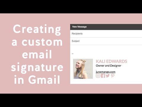
Create a Custom Email Signature in Gmail
In the tutorial below, learn how to create your very own custom email signature for your Gmail account. Highlight your social media and share your business with others thanks to your stylized signature!
Creating a custom email signature is a seemingly simple task that actually is trickier than you think. It is really helpful to have one, as it's just another thing that makes your business look and feel legit. In the tutorial below, you'll learn how to create your very own custom email signature for your Gmail account.
Links You Will Need:
Flat Icon
Google Chrome Color Picker Tool
Video Tutorial Time Stamps
0:25 Open up Google document
0:33 Create table for elements
0:45 Inserting headshot into signature table
1:05 Adding in the email signature content
1:18 Adding social media links/icons
2:22 Linking images with proper social media links
3:20 Stylizing your fonts
4:25 Updating your table properties
4:38 Updating your signature in Gmail
So that was easy, right? Highlight your social media and share your business with others thanks to your stylized signature!
How motherhood can make your business better
I had my business baby years before I had my sweet, little human baby. I loved my business and felt really proud to watch it grow and change over time. When I was planning to come back to work after having my son, I was worried that my business wouldn’t thrive like it had been before I became pregnant. What happened instead was something a little bit magical.
I was able to shift into a new set of hours and a workload that was less than I’d had in years. I felt like I was balancing less, but what I was adding to the scales was more important and worthwhile. In other words, my business after baby became more aligned with what I wanted all along.
So with that, here are some unexpected ways I’ve seen how motherhood can make your business better.
It helps you prioritize your time.
People talk about this one often. You have fewer hours in the day because some of those hours have to go to your kiddo. But if you still want to work as much as before, you’re forced to be efficient with your time. I can now crank out the bulk of what I need to get done in just 4 or 5 hours a day. I probably could have been doing that since the very beginning, but instead would get distracted by what I like to call “pretty procrastination” like Pinterest or perfecting a blog post cover. Now, I simply don’t have time. My kid will win the battle over Pinterest scrolling time any day.
It allows you to connect and “network” with other mamas.
This one is one of the best ways that motherhood has made my business better. I’m now in a few “business mama” groups and I love it! We can connect on marketing strategies and sleeping strategies in the same breath. And while I join for the community aspect, I tend to see referrals because these women come to trust me and my expertise. And I genuinely want to help their businesses succeed! It’s a win-win-win.
It puts everything into perspective.
Sort of obvious and totally cliche. (But here’s the deal with cliches - they exist because they’re true! If enough people say it, it becomes cliche. But they’re all saying it because it’s a common experience! So let’s embrace the cliches, #amiright??) Motherhood makes you realize that the thing that matters MOST is your kiddo. Everything else becomes supplementary to that. So when there is a website emergency that happens at bedtime… well it’s not really an emergency at all. At least not one that can’t wait until I’m done reading Goodnight Moon (for the 126,937th time).
It reaffirms who you are.
The first year of motherhood is straight up crazy. Between the hormones, lack of sleep, new routines and suddenly having a new human around, it’s easy to lose yourself. I personally think that every new mama is effected by this differently. For some, not being able to get dressed up, put on makeup and feel fresh is super tough. For others, not having any autonomy or feeling overly depended upon is what shakes them up. For me, I lost myself in my business. I didn’t know who I was as both a designer and mama. A year in and I’ve settled back in even more firmly into who I am as a designer and business owner. I KNOW who I am, and it’s 98% of who I was before. But after becoming a mama, I’m unapologetically myself - in life and business.
SIMPLE TIPS FOR MANAGING YOUR INBOX
When I talk to other creative biz owners, the most common complaint they have at any given time is about their out-of-control inbox. "Who has the time?" they say, or "It's just too overwhelming." And inbox zero? "Impossible!" There are a few major problems with having an inbox that is overflowing...
When I talk to other creative biz owners, the most common complaint they have at any given time is about their out-of-control inbox. "Who has the time?" they say, or "It's just too overwhelming." And inbox zero? "Impossible!" There are a few major problems with having an inbox that is overflowing:
Things get lost. Then tasks get left behind and client projects get delayed.
Clients feel ignored. This is my #1 no-no as a biz owner!
You feel overwhelmed or drained! You don't have time to do what lights you up / what you love.
I promise that this does not have to be the case!
I have some simple tips for managing your inbox that will help you get back to doing what you love.
Touch it once. I admit that I have a hard time with this one, but it's really helpful. The idea is that you only "touch" an email one time, which means that if you read it, respond right away rather than clicking over to the next email or marking it "unread". This helps you respond to the email without letting it linger in your inbox. But what if the email takes a lot of thought or is a revision on a logo...
Add it to your to-do list. If the email is a client asking you for something that you know will take awhile, add it to your to-do list. Do not use your inbox as your to-do list!! Instead, write the client back to confirm you received their email, and let them know when they can expect your response/next round of deliverables.
Canned responses. You guys, canned responses save my sanity. Canned responses are email templates that you can use for different types of emails. I have a canned response for inquiries, client on-boarding, scheduling, confirming calls, and about 15 more. Heres a handy little guide that walks you through how to set them up on Gmail.
Boomerang for Gmail. Sometimes you may want a reminder to follow up with someone after a a few days or if they haven't responded to you (maybe because their inbox is crazy!). In Gmail, you can install Boomerang, which allows you to set follow up reminders on any given email. For example, maybe you sent out a proposal to your dream client and want to make sure to follow up if they haven't responded within a week. Boomerang can push that email back into your inbox after a week has gone by if your dream client hasn't responded! It also allows you to schedule your emails to send out at a later date.
Archive. If you're starting from a point where you have hundreds and hundreds of emails, just start by archiving them. Archived emails are still around (not deleted), and if you just do a simple search, you can easily find them without cluttering up your inbox.
Those are my top 5 tips for managing your inbox! Here's my inbox for proof that it can be done!
Did I leave any out that you've tried? Let me know and feel free to share your cleaned up inboxes with me!
ps- Gmail did not promote this post! This is just my genuine opinion and what works for me but if Gmail wants to throw some $$ my way, I wouldn't be mad at it. Heyyyyyyy Google.
Swap Out Those Emojis for These Symbols
Move over hair flip emoji, I’ve found a new visual resource. This little visual element can help draw attention to must-read info, your latest download and more on your website
Move over hair flip emoji, I’ve found a new visual resource. Lately, I have been loving Coolsymbol.com. This website has symbols that you can incorporate just about anywhere. Best part: these are all TEXT! So anywhere you can add text, you can add these symbols. This little visual element can help draw attention to must-read info, your latest download and more on your website. See some examples below!
Announcement bar
Buttons
Linked text
Your blog post sign off
Bullet points in blog posts
You can also use these symbols far beyond your website. Email signatures, Instagram bios, social media captions and more. Get creative with it!
{Design Principles} CONTRAST
Contrast is a design principle that is so crucial to creating beautiful branding and web design. But contrast touches all parts of design, not just color. Put simply, contrast occurs when two elements of the design are different - like REALLY different.
So why the hell should you care? (I get it, you've got a business to run... so let's cut to the chase!)
Contrast is a design principle that is so crucial to creating beautiful branding and web design. When you think of contrast, you may think of color - or maybe black and white photography. The higher the contrast, the darker the blacks appear and the lighter the whites appear with little grey in between.
But contrast touches all parts of design, not just color. Put simply, contrast occurs when two elements of the design are different - like REALLY different.
So why the hell should you care? (I get it, you've got a business to run... so let's cut to the chase!)
01. CONTRAST GRABS ATTENTION. Attention gets your audience engaged. An engaged audience clicks through your website, and eventually, they get in touch with you.
02. CONTRAST CREATES ORGANIZATION. It helps your audience flow seamlessly through your About bio, your Services page and your whole site in general!
03. CONTRAST DEFINES THE FOCAL POINT. Think buttons ("Contact Me!"), header text (your mission statement) and photos. Secretly guiding your audience towards what you want them to see or do is this simple little thing called... yup - contrast! 😉
Below is a breakdown of how to create contrast:
POSITION
front/behind
above/below
centered/off-centered
isolated grouped
in/out
right/left
FORM
simple/complex
whole/broken
symmetry/asymmetry
geometric/organic
hard angles/round
DIRECTION
vertical/horizontal
stability/movement
forward/back
clockwise/counter
convex/concave
serif text/sans serif text/script text
Related Posts
4 Ways to Use the Squarespace Pop-up Form (besides your newsletter)
Pop-up forms are a great way to engage your website visitors in a fresh way. This attention-grabbing feature can be customized far beyond the typical newsletter sign-ups. Use these ideas to figure out the best option for your business!
Pop-up forms are a great way to engage your website visitors in a fresh way. This attention-grabbing feature can be customized far beyond the typical newsletter sign-ups. Use these ideas to figure out the best option for your business!
Connect on social - Direct your website visitors to your social media channels where they can get to know you and your work even better! Get connected with them. Plus, make some new friends!
Terms, policies, consent, cookies - With the General Data Protection Regulation (GDPR) affecting businesses like yours and mine, ensuring you have your bases covered is a must. Integrating your pop-up to feature stuff such as your terms, policies, consent, cookies, etc. is a good idea. Make sure you do your research to determine which items are needed for your website!
Promote an event or launch - Do you have an upcoming calendar item? Share date details and how visitors can learn more through your pop-up. Lead them to a landing page with all of the information or get them signed up for a specific email to get what they need.
Feature a blog post - You’ve worked hard on your content, make sure people read it! Get more eyes to get on your tips and tricks with this type of “alert.” This will also engage visitors to keep exploring throughout your website.
So which pop-up to try first? Incorporate a rotation of all four to beta test which type works best for you.
The following information was created for use with templates made with Squarespace 7.0.
Stay tuned for more tips and tricks for the new 7.1 platform!
Related Posts
need even more help with squarespace?
Skip the overwhelm and have your website designed and launched in just 5 days (or less)!
LEARN MORE
Creating a Style Guide for Your Website
Keeping a consistent brand is key for creating a professional, clean look for your business. However, it can be a little difficult to keep everything uniform if you don’t have a spot with everything you need. Creating a style guide can be the perfect solution and go-to file for your website.
Keeping a consistent brand is key for creating a professional, clean look for your business. However, it can be a little difficult to keep everything uniform if you don’t have a go-to spot for all of your brand elements. Creating a style guide can be the perfect solution for your website!
So what is a style guide? Great question. A style guide combines every visual element of your brand in one nifty document. Consider it your cheat-sheet for your branding. You can easily find color codes, fonts and more thanks to your handy website style guide.
A website style guide can also serve as a “test run” for an updated branding refresh. You can review your design before doing a complete overhaul of your website, collateral materials, etc.
Here is a main checklist of what to include in your style guide:
main logo
images/inspiration
colors + color codes
fonts
other visual elements such as form buttons
Other things you could include in your style guide:
social icons
email newsletter layouts
instructions on how to use your visual elements such as spacing rules
blog post formatting
client proposal layouts
whatever you like!
Tools like Photoshop or Illustrator are great for creating your style guide, but even if you don't have fancy design programs, Canva is a great resource too!
Do you have a brand style guide? How has it helped your business? Let me know how it has been a game changer for you!
NEED EVEN MORE HELP WITH SQUARESPACE?
Skip the overwhelm and have your website designed and launched in just 5 days (or less)!
LEARN MORE
Recent Posts
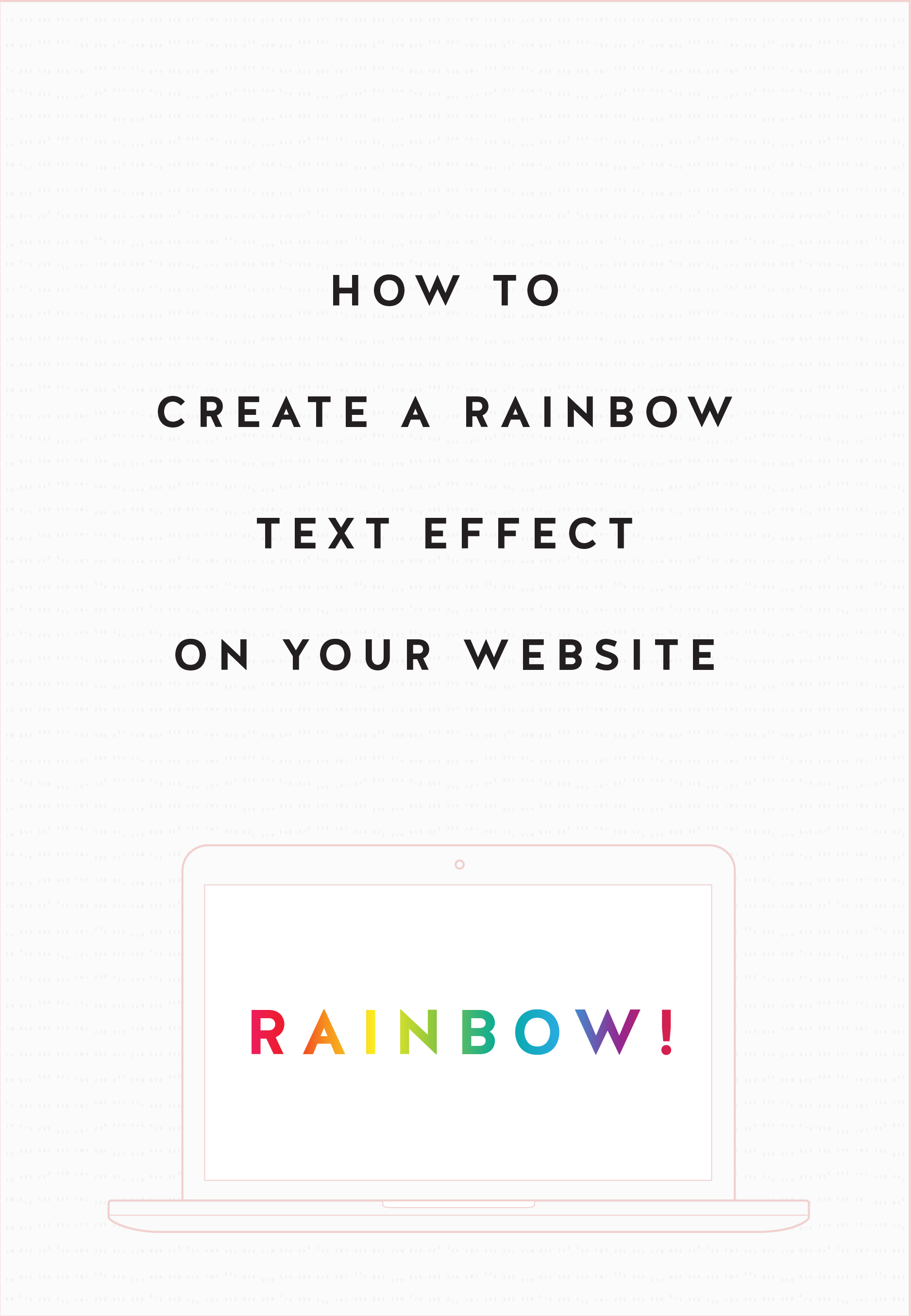
HOW TO CREATE A RAINBOW TEXT EFFECT ON YOUR WEBSITE
Sometimes it's fun to just add a random, pretty effect to your website, just because. Because who doesn't like rainbows? And since the answer to that is "No one!", why not add some rainbows to your website?
Sometimes it's fun to just add a random, pretty effect to your website, just because. Because who doesn't like rainbows? And since the answer to that is "No one!", why not add some rainbows to your website?
Let's do it.
How to create a rainbow text effect on your website:
First, add a CODE content block to your page.
Then add this snippet of code and change YOUR TEXT GOES HERE to whatever you'd like your text to say:
<style> .rainbowhead { display: block; margin:auto; background: linear-gradient(330deg, #e05252 0%, #99e052 25%, #52e0e0 50%, #9952e0 75%, #e05252 100%); background-clip: text; text-fill-color: transparent; } </style><body> <h1 class="rainbowhead">YOUR TEXT GOES HERE</span></h1> </body>
And that's it! You should now have rainbow text effect on your Heading 1 text! You can change this to any heading or font size you need by changing the "h1" to match the following:
<h1> = Heading 1
<h2> = Heading 2
<h3> = Heading 3
<p> = Normal
And that's it! Isn't it pretty?
The following information was created for use with templates made with Squarespace 7.0.
Stay tuned for more tips and tricks for the new 7.1 platform!
need even more help with squarespace?
Skip the overwhelm and have your website
designed and launched in just 5 days!
What works (and what doesn't) on an effective website
Websites are living, breathing things. Websites evolve and change and so does the way users interact with your website. There are lots of web design trends and even some commonplace design layouts that everyone assumes are great - but are they really?
Websites are living, breathing things. Websites evolve and change and so does the way users interact with your website. There are lots of web design trends and even some commonplace design layouts that everyone assumes are great - but are they really?
Here are some real statistics that show what makes an effective website - and the mistakes that hurt your bottom line.
01. Custom images are better than stock
You may well know that those goofy stock images of a girl smiling with salad are pretty lame. There are lots of really good (and free) stock photo options out there these days (pssst... here's a great list), but even those don't work quite as well as having your own, unique photos. The goal is to humanize your brand because people buy from people. They want to feel like they know you or have some sense of who you are and what it will be like to work with you.
02. Rotating banner images don't work
This seems to be a dying trend, but if your site has more than one photo at the top of your homepage and is set up to rotate or slide through each image, you're wasting good photography. Stats show that only a teeny tiny group will click on one of those images, and if they do, 86% will click on the first. Even if you're just trying to showcase images, people are impatient and may not wait for that third photo to rotate through before scrolling or clicking away.
03. Too much copy can hurt you
When you're a creative biz owner, it's easy to want to share your story with beautiful, creative language. The problem with lots of text and too much flowery language is that your message gets lost. My tip I give to my web clients is to cut their copy in half. Sometime I ask them to cut it in half twice. If someone lands on your site and has to spend time looking for the jist or worse - try to make sense of what you're trying to say, you're likely to lose them. Simply say what you mean and keep is simple.
04. Photos with people SELL
As I mentioned above, people buy from people. Yes, we're all behind our little screens here, but we were wired for real connection. It's no surprise then that photos that contain people help your audience relate to you and ultimately buy from you. Even just a hand or back of someone's head works!
05. Obvious navigation names are best
Similar to #3 above, you want to keep your navigation tabs named cleanly and clearly. Page names like About and Contact are both obvious to all audiences and Google (which will crawl these to understand what your website is about). Sometimes as creatives we want to do something fun like "Get the Goodies" instead of Shop, but try to save this for the copy on that page rather than the navigation link.
Those are doable, right?! And they'll make a big different when it comes to creating an effective website for your biz.
need even more help with squarespace?
Skip the overwhelm and have your website
designed and launched in just 5 days!
Do This 15 Minute Website Audit
I'm the queen of fast and effective over here at June Mango. Heck, I build websites in 5 days or less doncha know. I know we all have businesses to run and kids to parent and shit. to. do.
I'm the queen of fast and effective over here at June Mango. Heck, I build websites in 5 days or less doncha know. I know we all have businesses to run and kids to parent and shit. to. do.
So I have a little web audit that you can do right now (ya, this second!) and it will only take you 15 minutes. So lez go:
STEP 1:
Check for broken links. Using this handy tool, you can find any broken links that might be lurking listed all in once place. Then all you have to do is head to the page where they're "linked from" (it shows you this) and fix 'em!
STEP 2:
Double check that your images have been tagged. In Squarespace, you have the option of entering a custom Filename in the image editor. Add a name that included a key search phrase for that page (ie: web-design-in-5-days.jpg). Rinse and repeat for any images missing tags.
STEP 3:
Update your footer and legal pages. Have you done this lately? Make sure the copyright in your footer is for the current year. Give your legal pages (ie: privacy policy, etc) a quick read through to make sure you haven't missed new service offerings and update that date, too. Psssst... don't have a Privacy Policy? It's illegal not to, so add one!
STEP 4:
Run through your About page. Do you have a current headshot up there? Are you smiling in it? How about your copy - is it more than 4 paragraphs? If so, cut it in half. People don't want to read your life's history - only what's relevant to your biz. Make sure your sharing why your an expert and what it's like to work with you. Add the cutesy info to the very bottom and keep it short (ie: We all love dogs, but we don't need to know more than that you have one and what it's name is).
STEP 5:
Submit your site to Google. Added pages, blog posts or other new content in the last couple months? Google may not know that! Tell Google to go crawl your pages and find all your juicy new content by entering your site
So... did it take more than 15 minutes? Fast and effective... hell ya!
Want a pro web audit to get even more help? We’re here to help.
need even more help with squarespace?
Skip the overwhelm and have your website
designed and launched in just 5 days!
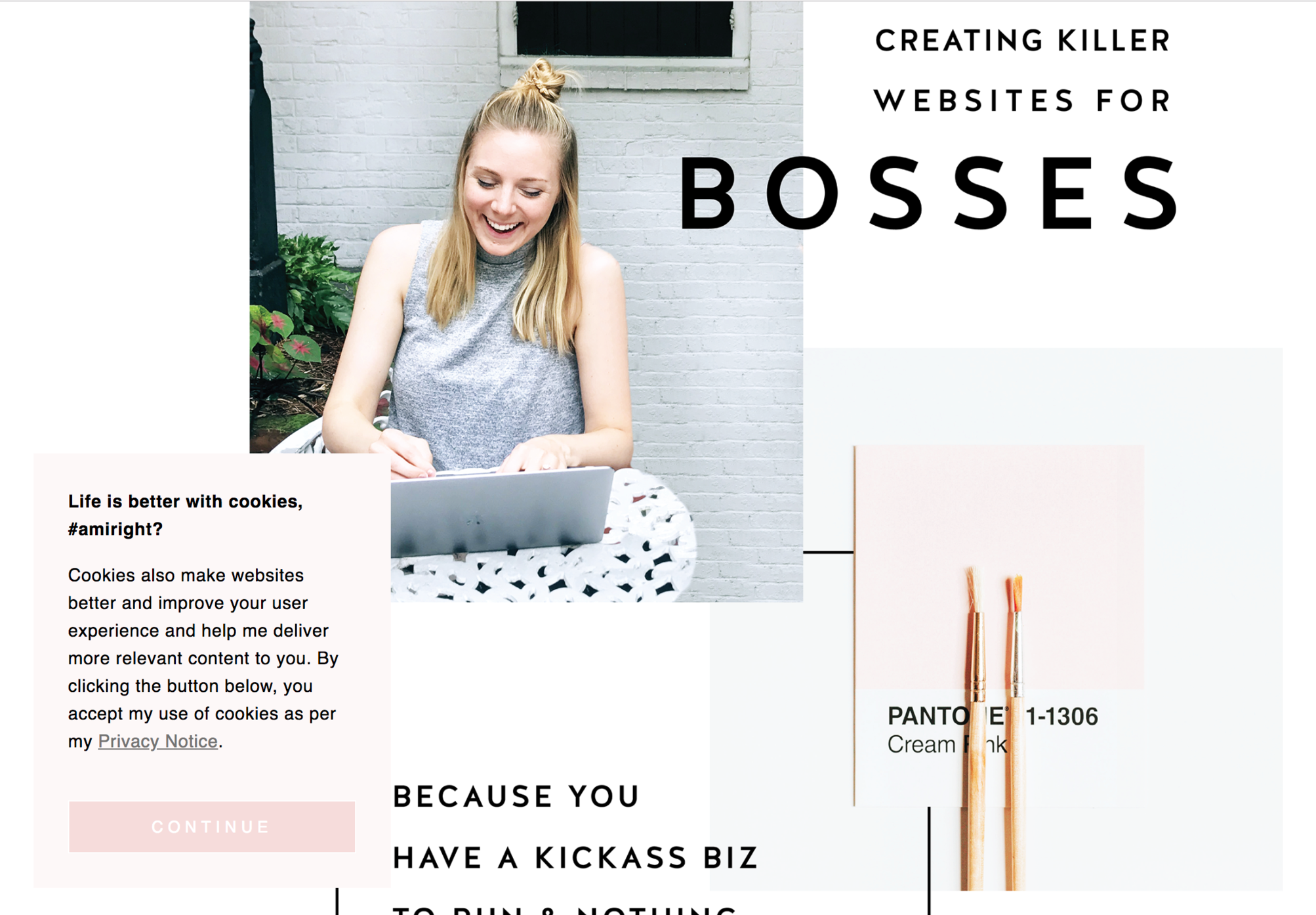
Code & Cookies: How to style your Squarespace cookie notice
Just because the General Data Protection Regulation (GDPR) is causing your online business to feature information like terms, policies, consent, and cookies throughout your website, doesn't mean that it can't look good.
Getting a headache from all then new General Data Protection Regulation (GDPR) requirements? I feel ya. While I'm no expert, I do have one quick tip for you to help stay complient AND on brand. Just because the GDPR is causing your online business to feature information like terms, policies, consent, and cookies throughout your website, doesn't mean that it can't look good.
Check out the steps below to style your SQSP cookie notice in your branding!
There are a few simple code changes to make your notice match your branding colors. Here are the steps:
In the main Squarespace menu, click DESIGN. Then CUSTOM CSS.
Copy and paste the following code. Then change the bolded text to update your colors and fonts to match your branding!
// Cookie Notice
.cookie-notice {
background: #FDF8F8 !important;
border: none !important;
-webkit-border-radius: 12px;
-moz-border-radius: 12px;
border-radius: 0px;
color: black !important;
width: 250px;
font-family: 'Brandon Grotesque', sans-serif !important;
font-size: 85% !important;
letter-spacing: 0.03em;
line-height: 1.6em;
position: fixed !important;
top: auto !important;
bottom: 30px !important;
left: 30px !important;
right: auto !important;
padding: 30px !important;
}
.cookie-notice a {
color: hsl(0, 1%, 45%);
}
.cookie-notice .accept {
width: 100%;
padding: 10px !important;
background: #F6DCDB;
color: #fff;
font-family: 'Brandon Grotesque', sans-serif !important;
text-transform: uppercase;
font-size: 90%;
letter-spacing: 0.3em;
-webkit-border-radius: 5px;
-moz-border-radius: 5px;
border-radius: 0px;
margin-top: 0 !important;
border-top-style: none !important;
border-right-style: none !important;
border-bottom-style: none !important;
border-left-style: none !important;
}
@media only screen and (max-width: 640px) {
.cookie-notice {
width: 150px;
font-size: 70% !important;
top: 10px !important;
bottom: auto !important;
left: 10px !important;
right: auto !important;
padding: 10px !important;
}
}
And there ya go! Done and done!
The following information was created for use with templates made with Squarespace 7.0.
Stay tuned for more tips and tricks for the new 7.1 platform!
need even more help with squarespace?
Skip the overwhelm and have your website
designed and launched in just 5 days!
5 Ways to Take Advantage of a Slow Summer
You've survived the busy season and the slow summer is starting. While rest is a huge component of this time, you can be proactive in preparing for a packed schedule starting in a few months. Here are 5 way to take advantage of a slow summer!
You've survived the busy season and Summer is finally here! But what often comes with Summer is that slow period in your biz. Even with less work on your plate, you can still be proactive in preparing for a packed schedule starting in a few months.
1. Creating content - Now is the time to get that content created and scheduled weeks in advance. You can brainstorm newsletter topics and start drafting content. Get a photoshoot on the calendar or pick up some props for a day of shooting photos in the office for your Instagram. No more stressing about getting that newsletter out on time, you can prepare ahead of time!
2. Networking - Meet up with that digital friend in person! Grab lunch or get "virtual coffee" with that connection you have been too busy to talk to. Another idea is to attend a creative conference. That's the perfect place to network with others.
3. Planning a launch or new service - Whether it's a launch or revealing a new service, setting these things up can take a lot of time and organization. Your slow season is the perfect time to get this done.
4. Complete a course - That course you bought three months ago? You still haven't even touched it, have you? Start that baby up and complete it. Time to get your money's worth out of that investment.
5. Set new goals - Your busy season could have sparked some new goals or altered existing ones. Now that you have the time, make note of your goals and put them in a place that you will see them consistently, like your office. What can you cross off during the summer that can make these goals happen?
BONUS - Just enjoy the break! Work will always pick back up (even when you think it won't, promise!) so enjoy those naps while you can. Set up poolside and read that fiction novel that's been on your bedside table for months. Get together with friends for a beach weekend. Whatever refuels you, do it!
Creating a Branded Multi-Link Page like LinkTree
This tutorial is a simple way to create a branded LinkTree type of page that is branded and is a page you can build directly on your Squarespace site!
Creating a LinkTree link for Instagram is a great way to showcase a more than one page that your audience can click on from your Instagram profile. It allows them to see a few pages from your site without the pain of having to switch out the link in your Instagram profile all the time.
The downside is that you have to pay to remove the LinkTree branding, and recently Instagram may have even started cracking down on the use of LinkTree urls. So I've come up with a simple way to create a branded LinkTree type of page that is branded and is a page you can build directly on your Squarespace site. All you need to do is create a Cover page and voila! In the tutorial below, you'll learn how to create your very own branded multi-link page like LinkTree!
So that was easy, right?
need even more help with squarespace?
Skip the overwhelm and have your website
designed and launched in just 5 days!

