
HOW TO CREATE A RAINBOW TEXT EFFECT ON YOUR WEBSITE
Sometimes it's fun to just add a random, pretty effect to your website, just because. Because who doesn't like rainbows? And since the answer to that is "No one!", why not add some rainbows to your website?

Sometimes it's fun to just add a random, pretty effect to your website, just because. Because who doesn't like rainbows? And since the answer to that is "No one!", why not add some rainbows to your website?
Let's do it.
How to create a rainbow text effect on your website:
First, add a CODE content block to your page.
Then add this snippet of code and change YOUR TEXT GOES HERE to whatever you'd like your text to say:
<style> .rainbowhead { display: block; margin:auto; background: linear-gradient(330deg, #e05252 0%, #99e052 25%, #52e0e0 50%, #9952e0 75%, #e05252 100%); background-clip: text; text-fill-color: transparent; } </style><body> <h1 class="rainbowhead">YOUR TEXT GOES HERE</span></h1> </body>
And that's it! You should now have rainbow text effect on your Heading 1 text! You can change this to any heading or font size you need by changing the "h1" to match the following:
<h1> = Heading 1
<h2> = Heading 2
<h3> = Heading 3
<p> = Normal
And that's it! Isn't it pretty?
The following information was created for use with templates made with Squarespace 7.0.
Stay tuned for more tips and tricks for the new 7.1 platform!
need even more help with squarespace?
Skip the overwhelm and have your website
designed and launched in just 5 days!


What works (and what doesn't) on an effective website
Websites are living, breathing things. Websites evolve and change and so does the way users interact with your website. There are lots of web design trends and even some commonplace design layouts that everyone assumes are great - but are they really?

Websites are living, breathing things. Websites evolve and change and so does the way users interact with your website. There are lots of web design trends and even some commonplace design layouts that everyone assumes are great - but are they really?
Here are some real statistics that show what makes an effective website - and the mistakes that hurt your bottom line.
01. Custom images are better than stock
You may well know that those goofy stock images of a girl smiling with salad are pretty lame. There are lots of really good (and free) stock photo options out there these days (pssst... here's a great list), but even those don't work quite as well as having your own, unique photos. The goal is to humanize your brand because people buy from people. They want to feel like they know you or have some sense of who you are and what it will be like to work with you.
02. Rotating banner images don't work
This seems to be a dying trend, but if your site has more than one photo at the top of your homepage and is set up to rotate or slide through each image, you're wasting good photography. Stats show that only a teeny tiny group will click on one of those images, and if they do, 86% will click on the first. Even if you're just trying to showcase images, people are impatient and may not wait for that third photo to rotate through before scrolling or clicking away.
03. Too much copy can hurt you
When you're a creative biz owner, it's easy to want to share your story with beautiful, creative language. The problem with lots of text and too much flowery language is that your message gets lost. My tip I give to my web clients is to cut their copy in half. Sometime I ask them to cut it in half twice. If someone lands on your site and has to spend time looking for the jist or worse - try to make sense of what you're trying to say, you're likely to lose them. Simply say what you mean and keep is simple.
04. Photos with people SELL
As I mentioned above, people buy from people. Yes, we're all behind our little screens here, but we were wired for real connection. It's no surprise then that photos that contain people help your audience relate to you and ultimately buy from you. Even just a hand or back of someone's head works!
05. Obvious navigation names are best
Similar to #3 above, you want to keep your navigation tabs named cleanly and clearly. Page names like About and Contact are both obvious to all audiences and Google (which will crawl these to understand what your website is about). Sometimes as creatives we want to do something fun like "Get the Goodies" instead of Shop, but try to save this for the copy on that page rather than the navigation link.
Those are doable, right?! And they'll make a big different when it comes to creating an effective website for your biz.
need even more help with squarespace?
Skip the overwhelm and have your website
designed and launched in just 5 days!


Do This 15 Minute Website Audit
I'm the queen of fast and effective over here at June Mango. Heck, I build websites in 5 days or less doncha know. I know we all have businesses to run and kids to parent and shit. to. do.
I'm the queen of fast and effective over here at June Mango. Heck, I build websites in 5 days or less doncha know. I know we all have businesses to run and kids to parent and shit. to. do.
So I have a little web audit that you can do right now (ya, this second!) and it will only take you 15 minutes. So lez go:
STEP 1:
Check for broken links. Using this handy tool, you can find any broken links that might be lurking listed all in once place. Then all you have to do is head to the page where they're "linked from" (it shows you this) and fix 'em!
STEP 2:
Double check that your images have been tagged. In Squarespace, you have the option of entering a custom Filename in the image editor. Add a name that included a key search phrase for that page (ie: web-design-in-5-days.jpg). Rinse and repeat for any images missing tags.
STEP 3:
Update your footer and legal pages. Have you done this lately? Make sure the copyright in your footer is for the current year. Give your legal pages (ie: privacy policy, etc) a quick read through to make sure you haven't missed new service offerings and update that date, too. Psssst... don't have a Privacy Policy? It's illegal not to, so add one!
STEP 4:
Run through your About page. Do you have a current headshot up there? Are you smiling in it? How about your copy - is it more than 4 paragraphs? If so, cut it in half. People don't want to read your life's history - only what's relevant to your biz. Make sure your sharing why your an expert and what it's like to work with you. Add the cutesy info to the very bottom and keep it short (ie: We all love dogs, but we don't need to know more than that you have one and what it's name is).
STEP 5:
Submit your site to Google. Added pages, blog posts or other new content in the last couple months? Google may not know that! Tell Google to go crawl your pages and find all your juicy new content by entering your site
So... did it take more than 15 minutes? Fast and effective... hell ya!
Want a pro web audit to get even more help? We’re here to help.
need even more help with squarespace?
Skip the overwhelm and have your website
designed and launched in just 5 days!

Code & Cookies: How to style your Squarespace cookie notice
Just because the General Data Protection Regulation (GDPR) is causing your online business to feature information like terms, policies, consent, and cookies throughout your website, doesn't mean that it can't look good.
Getting a headache from all then new General Data Protection Regulation (GDPR) requirements? I feel ya. While I'm no expert, I do have one quick tip for you to help stay complient AND on brand. Just because the GDPR is causing your online business to feature information like terms, policies, consent, and cookies throughout your website, doesn't mean that it can't look good.
Check out the steps below to style your SQSP cookie notice in your branding!
There are a few simple code changes to make your notice match your branding colors. Here are the steps:
In the main Squarespace menu, click DESIGN. Then CUSTOM CSS.
Copy and paste the following code. Then change the bolded text to update your colors and fonts to match your branding!
// Cookie Notice
.cookie-notice {
background: #FDF8F8 !important;
border: none !important;
-webkit-border-radius: 12px;
-moz-border-radius: 12px;
border-radius: 0px;
color: black !important;
width: 250px;
font-family: 'Brandon Grotesque', sans-serif !important;
font-size: 85% !important;
letter-spacing: 0.03em;
line-height: 1.6em;
position: fixed !important;
top: auto !important;
bottom: 30px !important;
left: 30px !important;
right: auto !important;
padding: 30px !important;
}
.cookie-notice a {
color: hsl(0, 1%, 45%);
}
.cookie-notice .accept {
width: 100%;
padding: 10px !important;
background: #F6DCDB;
color: #fff;
font-family: 'Brandon Grotesque', sans-serif !important;
text-transform: uppercase;
font-size: 90%;
letter-spacing: 0.3em;
-webkit-border-radius: 5px;
-moz-border-radius: 5px;
border-radius: 0px;
margin-top: 0 !important;
border-top-style: none !important;
border-right-style: none !important;
border-bottom-style: none !important;
border-left-style: none !important;
}
@media only screen and (max-width: 640px) {
.cookie-notice {
width: 150px;
font-size: 70% !important;
top: 10px !important;
bottom: auto !important;
left: 10px !important;
right: auto !important;
padding: 10px !important;
}
}
And there ya go! Done and done!
The following information was created for use with templates made with Squarespace 7.0.
Stay tuned for more tips and tricks for the new 7.1 platform!
need even more help with squarespace?
Skip the overwhelm and have your website
designed and launched in just 5 days!

5 Ways to Take Advantage of a Slow Summer
You've survived the busy season and the slow summer is starting. While rest is a huge component of this time, you can be proactive in preparing for a packed schedule starting in a few months. Here are 5 way to take advantage of a slow summer!
You've survived the busy season and Summer is finally here! But what often comes with Summer is that slow period in your biz. Even with less work on your plate, you can still be proactive in preparing for a packed schedule starting in a few months.
1. Creating content - Now is the time to get that content created and scheduled weeks in advance. You can brainstorm newsletter topics and start drafting content. Get a photoshoot on the calendar or pick up some props for a day of shooting photos in the office for your Instagram. No more stressing about getting that newsletter out on time, you can prepare ahead of time!
2. Networking - Meet up with that digital friend in person! Grab lunch or get "virtual coffee" with that connection you have been too busy to talk to. Another idea is to attend a creative conference. That's the perfect place to network with others.
3. Planning a launch or new service - Whether it's a launch or revealing a new service, setting these things up can take a lot of time and organization. Your slow season is the perfect time to get this done.
4. Complete a course - That course you bought three months ago? You still haven't even touched it, have you? Start that baby up and complete it. Time to get your money's worth out of that investment.
5. Set new goals - Your busy season could have sparked some new goals or altered existing ones. Now that you have the time, make note of your goals and put them in a place that you will see them consistently, like your office. What can you cross off during the summer that can make these goals happen?
BONUS - Just enjoy the break! Work will always pick back up (even when you think it won't, promise!) so enjoy those naps while you can. Set up poolside and read that fiction novel that's been on your bedside table for months. Get together with friends for a beach weekend. Whatever refuels you, do it!
Creating a Branded Multi-Link Page like LinkTree
This tutorial is a simple way to create a branded LinkTree type of page that is branded and is a page you can build directly on your Squarespace site!
Creating a LinkTree link for Instagram is a great way to showcase a more than one page that your audience can click on from your Instagram profile. It allows them to see a few pages from your site without the pain of having to switch out the link in your Instagram profile all the time.
The downside is that you have to pay to remove the LinkTree branding, and recently Instagram may have even started cracking down on the use of LinkTree urls. So I've come up with a simple way to create a branded LinkTree type of page that is branded and is a page you can build directly on your Squarespace site. All you need to do is create a Cover page and voila! In the tutorial below, you'll learn how to create your very own branded multi-link page like LinkTree!
So that was easy, right?
need even more help with squarespace?
Skip the overwhelm and have your website
designed and launched in just 5 days!

HOW TO CREATE A SLIDER WITH TEXT BLOCK OVERLAY
Adding a slider can create a lot of dynamic engagement with your content. I think this is a great item to feature on a custom blog layout! You can also add it to the homepage, or anywhere really!

Adding a slider can create a lot of dynamic engagement with your content. I think this is a great item to feature on a custom blog layout! You can also add it to the homepage, or anywhere really!
This quick customization allows you to customize the design of the caption that appears on top of the image. By adding a background box and some pretty text, your audience will definitely get clicking!
Ready to learn how? Let's do it.
How to create a slider with text block overlay
on your Squarespace website:
First, add a Slider content block to your page (Gallery > Slideshow)
Then add this snippet of code below to your Custom CSS (Design > Custom CSS)
To change the color of the text or background box, change the bold parts of the code below.
/* slider with text overlay */
.sqs-block-gallery .sqs-gallery-block-slideshow {
max-height: 500px !important;
.sqs-gallery-design-stacked-slide {
max-height: 500px !important;
overflow: hidden;
img {
transition: all ease-in-out 300ms !important;
}
}
.meta {
background-color: white;
max-width: 60% !important;
transition: all ease-in-out 700ms !important;
-webkit-transition: all ease-in-out 700ms !important;
-moz-transition: all ease-in-out 700ms !important;
-ms-transition: all ease-in-out 700ms !important;
}
.meta-title {
text-align: center;
font-size: 16px;
text-transform: uppercase;
letter-spacing: 2px;
padding: 6px 20px;
color: #042663;
}
.meta-description p {
text-align: center;
color: #9DB0D8;
font-size: 12px;
letter-spacing: 1px;
padding-top: 4px;
max-width: 550px;
}
.meta-description a:link {
color: #9DB0D8;
text-align: center !important;
}
.sqs-gallery-design-stacked-slide:hover {
img {
-webkit-filter: blur(3px);
filter: blur(3px);
}
}
@media (max-width : 667px) {
.meta {
display: block !important;
max-width: 70% !important;
min-width: 70% !important;
left: 50% !important;
}
.meta-title {
font-size: 12px;
}
.meta-description p {
display: none;
}
}
}
You should now have a slider with text block overlay!

All you have to do now is upload your images and add your Title Captions!
(To do this, hover over a slider image and click the gear icon. Then add your title! If you want to add the "Read Post" text, simply add this to the description box and link it to whatever page or post you'd like.)
And that's it!
The following information was created for use with templates made with Squarespace 7.0.
Stay tuned for more tips and tricks for the new 7.1 platform!
need even more help with squarespace?
Skip the overwhelm and have your website
designed and launched in just 5 days!
Selling on your website, simplified
Selling on your website does not have to be difficult! Through this webinar with my friend Liz from LizWhite.co, we shared our go-to tips for getting your online sales systems together. The strategies we share will help you feel prepared and not stressed about the process.

Selling on your website does not have to be difficult! That's why Liz from LizWhite.co and I wanted to share our go-to tips for getting your online sales systems together. The strategies we share in our recent webinar will help you take the steps necessary to lock in dream clients without feeling stressed about the process.
Here's a little preview of the topics we covered below:
The Best Way to Collect Email Addresses
Provide people with a reason to trust you with their email. Make sure to share content that really is valuable to them. That way, when they see your emails pop up in their inbox, they will want to open them. (For example, I offer lots of actionable SQSP tips and tricks!).
A great place to feature your opt in is on your homepage. Your opt in is not the usual 'sign up for my email list' button, but a more highlighted feature on your site. Let this stand out on your page with an enticing design like a cute graphic or unique button. You also don't have to limit this opt in to just your homepage! Featuring your newsletter sign-up form on multiple pages throughout your site is always a good idea.
What To Do on Your About Pages
Ultimately people are visiting your About page to learn more about how you can help them, not your life story. The main point of your website is to continually position yourself as an expert. Your About page should just continue to reiterate this to your potential clients.
Consider reframing your about page into a 'Start Here' page. This can blend the about page structure, the person behind the business and what your business can provide to others. This type of page can guide people through a few different routes, such as checking out your blog or hiring you for your services.
A final thought - make sure to add a headshot or photo of yourself on your About page! Crucial. People want to put a face with your name! People buy from people, so keep that in mind. Add a human touch to the digital space!
need even more help with squarespace?
Skip the overwhelm and have your website
designed and launched in just 5 days!

In the MOOD boards: Nursery Plans
Every experience, every step of this pregnancy has been a little adventure. Besides buying onesies and enjoying those little kicks getting stronger everyday, I'm also planning for the nursery!
As many of you have probably seen if you hang with me on social media, I'm expecting my first little one mid-August. Every experience, every step of this pregnancy has been a little adventure. Besides buying onesies and enjoying those little kicks getting stronger everyday, I'm also planning for the nursery! And since anytime I plan anything design-related, I make a mood board, I thought I'd share it here with y'all!

A cute little combo of celestial elements with natural wood and wicker elements and (of course!) plants. We are keeping the gender a surprise so this design let's us make the room a cozy fit for a newborn without the "traditional" unisex colors (who decided green and yellow were the go-to anyway??).


Writing to Attract Dream Customers
The point of a website is to communicate. There are words and stories that we need to share! Through the 'Writing to Attract Dream Customers' webinar with Jessica Willingham, we cover topics that you need to keep in mind with your copy.

The point of a website is to communicate. There are words and stories that we need to share! Through the 'Writing to Attract Dream Customers' webinar with Jessica Willingham, we cover topics that you need to keep in mind with your copy.
Want to watch the full webinar replay? Click here for access to the full video! Here's a little preview of the topics we covered below:
Forget the Rules
Everyone can write. As humans, we understand how to tell stories. It is in us! With a little bit of craft, you can write your own copy. Get rid of the idea that you can not write - you totally can! Include terms that you normally use in your everyday conversations. How do you address people? What are some things that you say when you are excited? Consider these types of ideas when composing your copy.
Write conversationally, but keep in mind that your writing needs to mimic the rhythm of your natural speech. Try reading your drafted copy aloud and see if it falls in line with your speech. Language molds to the way that we want to express ourselves. We don't have to mold ourselves to fit the grammatical language. It's your tool to play with! Using direct language is also a great way to connect and speak to your customers. Write to real people.
Be Positive
Touch on your reader's pain points in your copy, but don't throw it all at them on page one. Focus on the positive outcomes that your customer could experience through working with you, not the problems that they are currently facing.
As you compose the copy for your website, each page needs to have momentum that drives the reader to continue to navigate throughout your site, such as an opt in. Give a 'what's next' step. Also, make sure to keep your copy in the present tense. Past tense does not provide a connection to the reader like present tense does.
These are just a few of the topics we shared in the webinar. To check them all out, click here. Make sure to grab a pen and paper for this one, there's a ton jam-packed in there.
Recent Posts
NEED EVEN MORE HELP WITH SQUARESPACE?
Skip the overwhelm and have your website designed and launched in just 5 days (or less)!
LEARN MORE

Using Instant Downloads as an Email Opt-In on Squarespace (+ tutorial)
So you've got your email newsletter software set up and ready to go, but you are missing one crucial tidbit - subscribers! One way to get some sign ups is through an instant download on your website.
So you've got your email newsletter software set up and ready to go, but you are missing one crucial tidbit - subscribers! One way to get some sign ups is through a free opt-in on your website. And one way to do this is to make it an instant download straight from your website.
A benefit of an instant download is that you don't have to worry about software automation with your email subscription service. In laymen's terms, this means you don't have to set anything up in MailChimp, ConvertKit, etc. This is handled straight away through your Squarespace site.
Your instant download can be whatever you like from checklists to stock images, you get to create what is available. Keep in mind, this instant download should give potential customers/clients an awesome resource or provide a solution to an issue they might be facing. That way, they will be more willing to turn over their email address and get to the goods.
To learn more about setting up your own instant download on Squarespace, check out the tutorial below:
Like this tutorial video?
Check out the Squarespace Supply Room - a members-only video tutorial library for Squarespace. Get a year-long membership and start soaking up all that good web knowledge. More details this-a-way!
Recent Posts
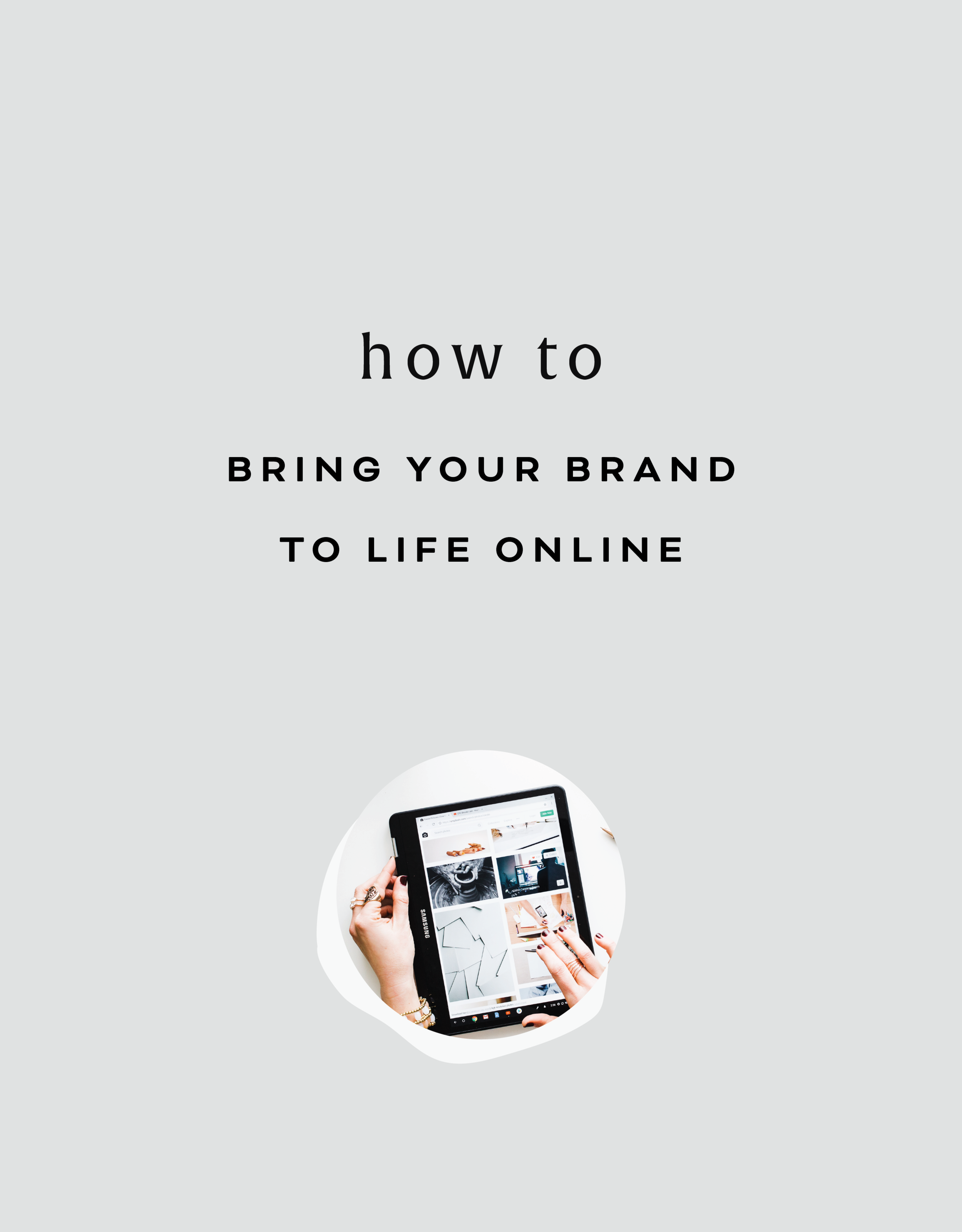
How to bring your brand to life online
A brand’s online presence is a huge component of sharing your business with the world! How you position your brand online is how you are going to attract your dream clients.
A brand’s online presence is a huge component of sharing your business with the world! How you position your brand online is how you are going to attract your dream clients. During my recent webinar with Devan Danielle from devandanielle.com, we shared everything you need to know about branding your business online. From those client buzzwords to your brand’s overall personality, we talked about it all!
Want to watch the full webinar replay? Click here for access to the full video! Here's a little preview of the topics we covered below:
What You Do vs. Your Title
While your job title with your business can say a lot about what you do, it might not communicate the whole picture. Make sure to use terminology that potential clients will understand. Someone might end up turning away from your business because they get confused about what you are offering. Hone in on your expertise. While you may do a variety of things, having an overall topic or umbrella of services/products helps with clarification as well. This also sets you up as an expert on the topic, leading to referrals and increased recognition. At the end of the day, just be clear about your business along with incorporating yourself into your brand.
Brand Values + Buzzwords
So what is the purpose behind what you do? Not too sure? The definition of your business values can be a gamechanger. Your brand values act as a compass for your business. Decisions, marketing campaigns, client work and more will be clarified thanks to your brand values. Figure out what you value most as a business owner and brainstorm what your ideal client values most as well. Where the two lineup is where you need to be to attract those dream clients. This is where the money is!
Another way to connect with your dream clients is by utilizing your business buzzwords. These are the terms they are searching for on Pinterest, Google, through Instagram hashtags and more. Use these buzzwords on your social media platforms, within your website, newsletters, etc. to increase your connection with these terms for potential clients.
This is just the tip of the iceberg. We covered this and so much more in our webinar! Make sure to watch the full replay for all of tips and tricks we shared! We want to help you bring your brand to life online!
Have questions? Shoot me a DM on Instagram!
Related Posts

Ways to Conquer + Avoid Burnout
Burnout can creep up on you over the course of months or even years and exhaust you to your core rendering you unable to continue doing the work you once loved. Here are a few ways to conquer burnout and even help you avoid it altogether!
Burnout isn't just reserved for CEOs of giant companies or supermoms trying to "do it all." Burnout can creep up on you over the course of months or even years and exhaust you to your core rendering you unable to continue doing the work you once loved.
Think you may be on the road to burnout?
Take this quick little quiz to find out:
Have you become irritable or impatient with clients?
Are you feeling exhausted most of the time or feel unable to be productive?
Have you lost the satisfaction you once had from your work or creative projects?
Are you experiencing a shift in your physical well being (ie: increased headaches, back pains, etc)?
Do you feel stressed on Sunday nights thinking about the week ahead?
If you answered yes to any of these questions, you may want to take a step back. Also, let’s just pause to note that this is normal, it happens and it’s okay. Below are a few ways to alleviate burnout and hopefully help you avoid it altogether.
WAYS TO HELP YOU ALLEVIATE BURNOUT:
1. Take a deep breath -
Meditation might be your answer to tackle your sizzling burnout. Apps like Headspace or Calm walk you through meditation exercises to help recenter you. Even just 10 minutes a day can be so helpful. Even if you don’t dig meditation, try a little mindfulness. Go on a walk without your phone (what!?). Eat dinner without talking, watching or listening to anything or anyone. Fold laundry and focus on each movement of your arms. You can turn anything into a mindfulness practice!
2. Talk to a loved one (or an expert) -
Catching up with a close friend can help break up those stressful schedules. Talk about something other than work to help get your mind off of it. Schedule a coffee date or Zoom hang. Get it on your calendar so that you actually make space for this time. If things feel like you truly can’t get control or are on a super high level of stress and anxiety, it might be a good idea to find a counselor, therapist or coach.
3. Shut it down -
Time to turn off the technology and go analog. Shut down the desktop and turn off the tablet. An electronic free afternoon might be the perfect cure. Still need to get stuff done for work? Try the pen and paper route instead for a bit. If you need to be on your computer, close all your apps and browser tabs. Have JUST ONE THING open. Also try to set screen hours. Say 7:30pm is the cut off time to turn off the TV + phone and instead read or play a game.
WAYS TO HELP YOU AVOID BURNOUT IN THE FUTURE:
1. Learn to say no -
Easier said than done, right? I'm a recovering people-pleaser, so I get it. Learning to say no can help you big time with future burnout. Think of the more meaningful things you can say yes to when you say no to more tedious things. Boundaries in business takes practice, so just know that each time you say no it gets easier. (Hot tip: accept that the other person will likely have uncomfortable feelings about your boundaries and that’s okay.)
2. Save some white space in your schedule -
Overcrowding your schedule means there’s no space for rest. Keeping time slots clear in your planner will help you avoid burnout. Create a standing meeting with yourself weekly (or even daily) to catch up on that favorite show or read a few chapters of a book. Just step back. Remember, rest is not a reward.
3. Give yourself rest -
The best way to avoid burnout is to get plenty of rest. If you can, try stop binging the latest Netflix original and go to sleep early (listen, it’s hard and I get it!). Take the weekend off of work. Plan a vacation and DON'T CHECK EMAIL! Actually allow yourself to rest and reset. If these options feel too big, try smaller moments of rest to start with. Go for a ten minute walk. Get up and stretch before starting your next task. Call someone you love and talk with them for 10 or 15 minutes. Breathe.
Even just being aware of burnout can help. Balance matters and you deserve it!
Related Posts
WHAT IS A FAVICON AND WHY YOU NEED TO ADD ONE TO YOUR WEBSITE
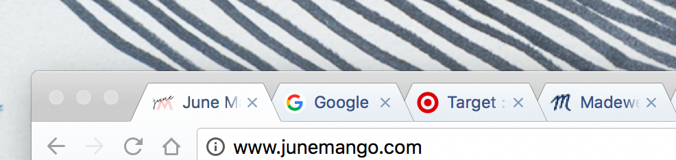
Favicon means “favorite icon.” It is the little icon at the top of a website’s browser tab. It also helps users identify a website. Here's why you need this little design detail.
What is a favicon?
Favicon means “favorite icon.” It is the little icon at the top of a website’s browser tab. It also helps users identify a website.
Why you need a favicon
A favicon is the icing on top of the cake when it comes to your website design. You’ve perfected your layout, finalized the content and you are ready to launch your website to the world. A favicon helps with a consistent brand appearance. Having a branded symbol for your browser icon is way better than the standard black box that comes with standard Squarespace sites.
Plus, this is how people find their way back to your site when they click away or open a new tab. If you're anything like me, you probably have a LOT of tabs open at a time. The only way I can find my way back to a site successfully is by finding it's favicon.
How to customize your favicon for your website
The best rule of thumb when it comes to favicons - keep it simple. Think of the ‘P’ for Pinterest or Target’s iconic red target. You want it to be an identifier for your brand, but you have to keep in mind how small your favicon is going show up to your website visitors. One or two colors max should do the trick.
You can create your favicon in your favorite design software. Canva, Photoshop, Illustrator, etc. should do the trick. Keep the format to 16x16 pixels and the background transparent. Once you have designed your favicon, you can upload it to your Squarespace site through the Design page underneath Logo and Title. Scroll a little bit to find the Browser Icon section. Upload and hit save! You might need to clear your browser history and cache for you to be able to see your favicon.
BONUS! I have a few fun favicons that you can download and start using ASAP! Just click here to grab those goodies.


By adding this little symbol, you’ve upped your branding game for your website! Way to go!
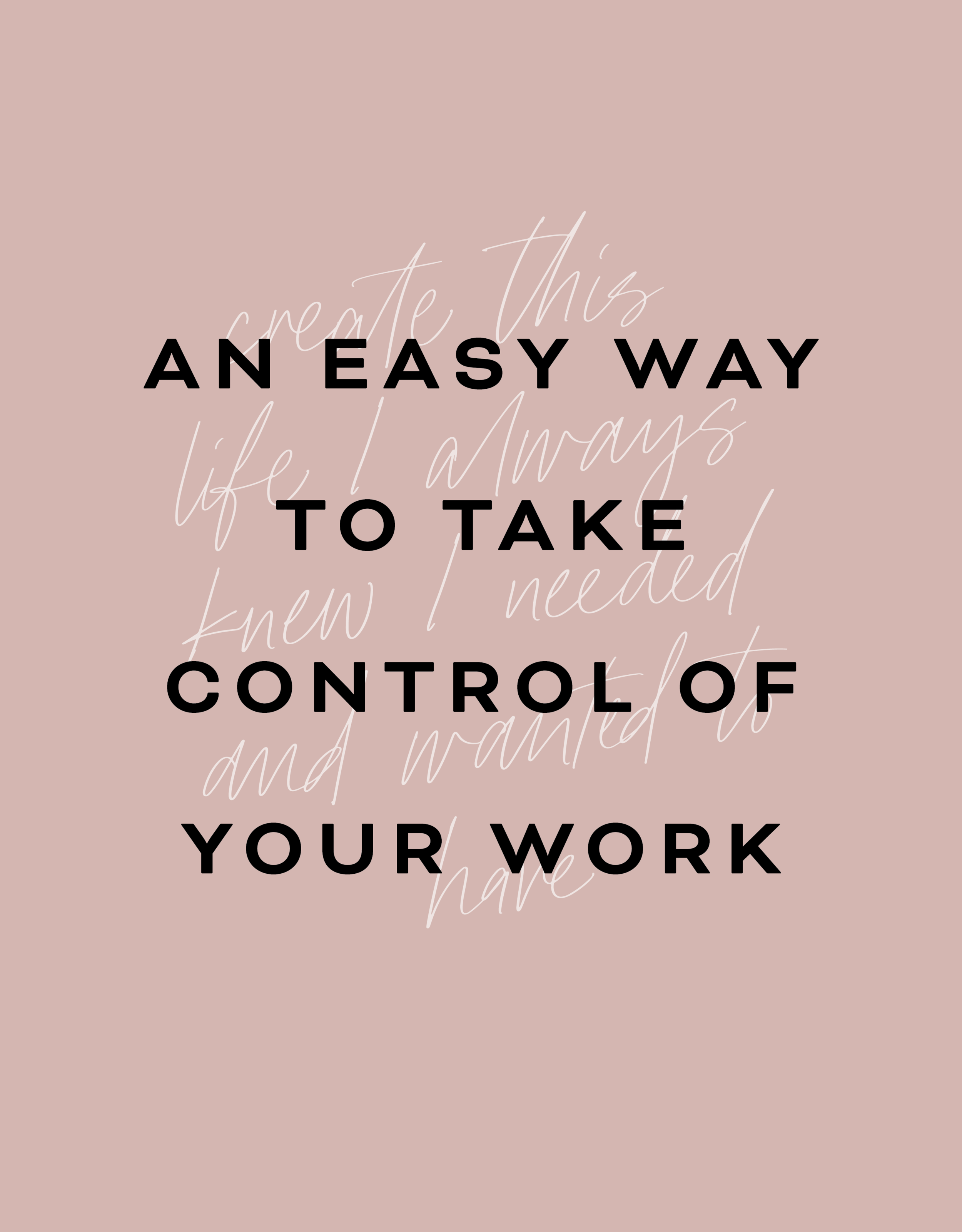
AN EASY WAY TO TAKE CONTROL OF YOUR WORK + LIVE LIFE ON YOUR OWN TERMS
How do you price your services? How do you create and grow a newsletter list? How do you marry who you are and what you do in an authentic way so that you can attract your "wolf pack"? Here's a super easy way to get answers to these biz questions and soooo many more!
I started my business in September 2015. I quit my day job as an agency art director and busted out on my own. Only it didn't exactly feel like "busting out". It mostly felt like sitting down at my computer in my tiny studio apartment and trying to figure out what to do next. How would I find clients? How would I make enough money? How would I create this life I always knew I needed and wanted to have?
It wasn't that I thought I couldn't do it. I knew I could. I just didn't totally know how.
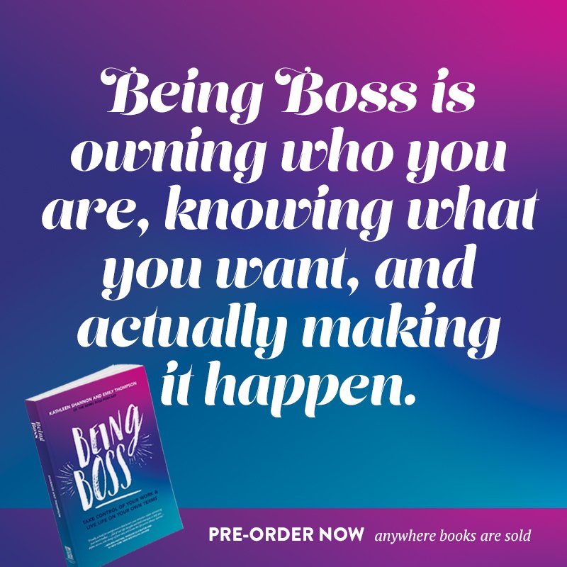
So I read blog posts and scoured Pinterest for biz advice and tried to do what I could on my own. Then I got an email from Kathleen Shannon, who I'd been following for a while over at Braid Creative. Her email was promoting a new podcast she was starting all about how to "be boss". Um, yes please. I started listening to her podcast, Being Boss, and it literally changed the trajectory of my business completely.
Along with her co-host, Emily Thompson, they shared all kinds of practical advice. How to price your services, how to create and grow a newsletter list, how to marry who you are and what you do in an authentic way so that you can attract your "wolf pack" - it was all there. They offered so much killer, free content on the podcast that I decided to sign up for their Clubhouse. The Being Boss Clubhouse was basically a more intensive version of the podcast with more worksheets, checklists and advice from these two biz experts. It was invaluable.
Now they've put all that good info from the Clubhouse (worksheets and all!) into a book. And it's only $21! You guys, if I could give advice on how to take control of your work if you're a new business owner (or even in your first few years), I would simple tell you to grab this book and POUR through it. I wish it had been released when I was starting my business. It would have saved me so much time and $$$$.


It's important for me to note that this is NOT AN AFFILIATED POST. If you decide you want to pick up a copy of the book, I will see $0 of that. I just want to share this resource with you if you are feeling anything like I felt in September 2015. Because it's hard and I really, truly get that.
You can grab yourself a copy of the Being Boss Book at any bookseller near you or on Amazon. I promise you will get that $21 back (an a helluvalot more). Happy Reading!
Related Posts
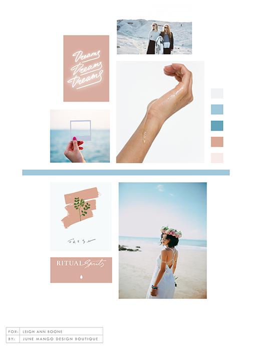
NEW WORK: LEIGH ANN BOONE ESSENTIAL OILS AND COACHING
New work! This lovely branding and web launch for Leigh Ann Boone, an essential oil expert, is a great example of a light and airy design. Plus, we built her website in just 3 days with the Polished web process!
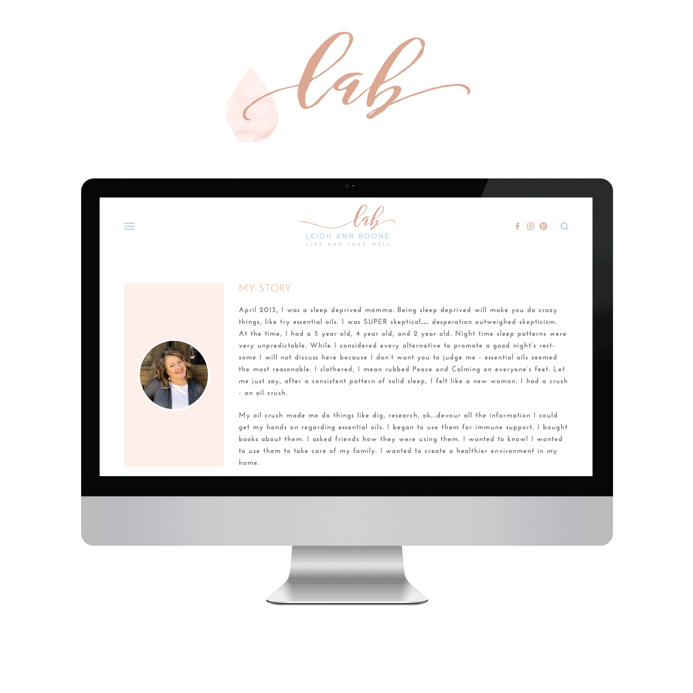
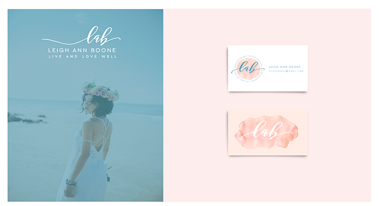
Client: Leigh Ann Boone
Service: Branding, Polished Web Design
Design Direction: Inspiring, Calming, Minimal
#1 Goal: New service promotion
Timeline: 5 days
Branding: June Mango
URL: leighannboone.com


HOW TO DISPLAY GALLERY CAPTIONS ON A MOBILE DEVICE
Ever notice how sometimes a perfectly amazing feature set up for a desktop browser doesn't quite translate like you want it to on mobile? I've found a way to modify the gallery caption display so that it will always work no matter what device you're on!
Ever notice how sometimes a perfectly amazing feature set up for a desktop browser doesn't quite translate like you want it to on mobile? It's a bummer and can make you rethink the whole design.
This happened to a client's site recently when I set up a gallery of her art work and displayed the name of each painting as a caption. The default gallery caption option displays the caption when you hover your mouse over the image. Cool! But not so cool on a mobile device where it just doesn't display at all! Womp womp.
So, I've found a way to modify the caption display so that it will always work no matter what device you're on.
First, head into the Design panel.
Click Custom CSS.
Paste in the following code:
/*** DISPLAY GALLERY CAPTION ***/
.yui3-lightbox2 .sqs-lightbox-meta {
opacity: 1 !important;
background: rgba(0, 0, 0, 0.7) !important;
}
@media only screen and (max-width: 1024px){
.yui3-lightbox2 .sqs-lightbox-meta{
bottom: 0px !important;
}
}
And that's it!
You should now be able to view the gallery captions
on both mobile and desktop browsers.
The following information was created for use with templates made with Squarespace 7.0.
Stay tuned for more tips and tricks for the new 7.1 platform!

Favorite Logos of 2017
A recap of some of my favorite unchosen logos and submarks from 2017 branding projects.
There were so many fun branding projects in 2017 and so many amazing clients! Since each branding process gets 3-4 fully designed brand identity options, not all logos get the green light. Some aren't quite right for the client or maybe just didn't fit as well as another option, but I have a little love for all of my logos (and maybe get a little too attached?? Eh, whatever!).
Below are some of my favorite branding concepts and their variations created that didn't make the final cut.


Related Posts
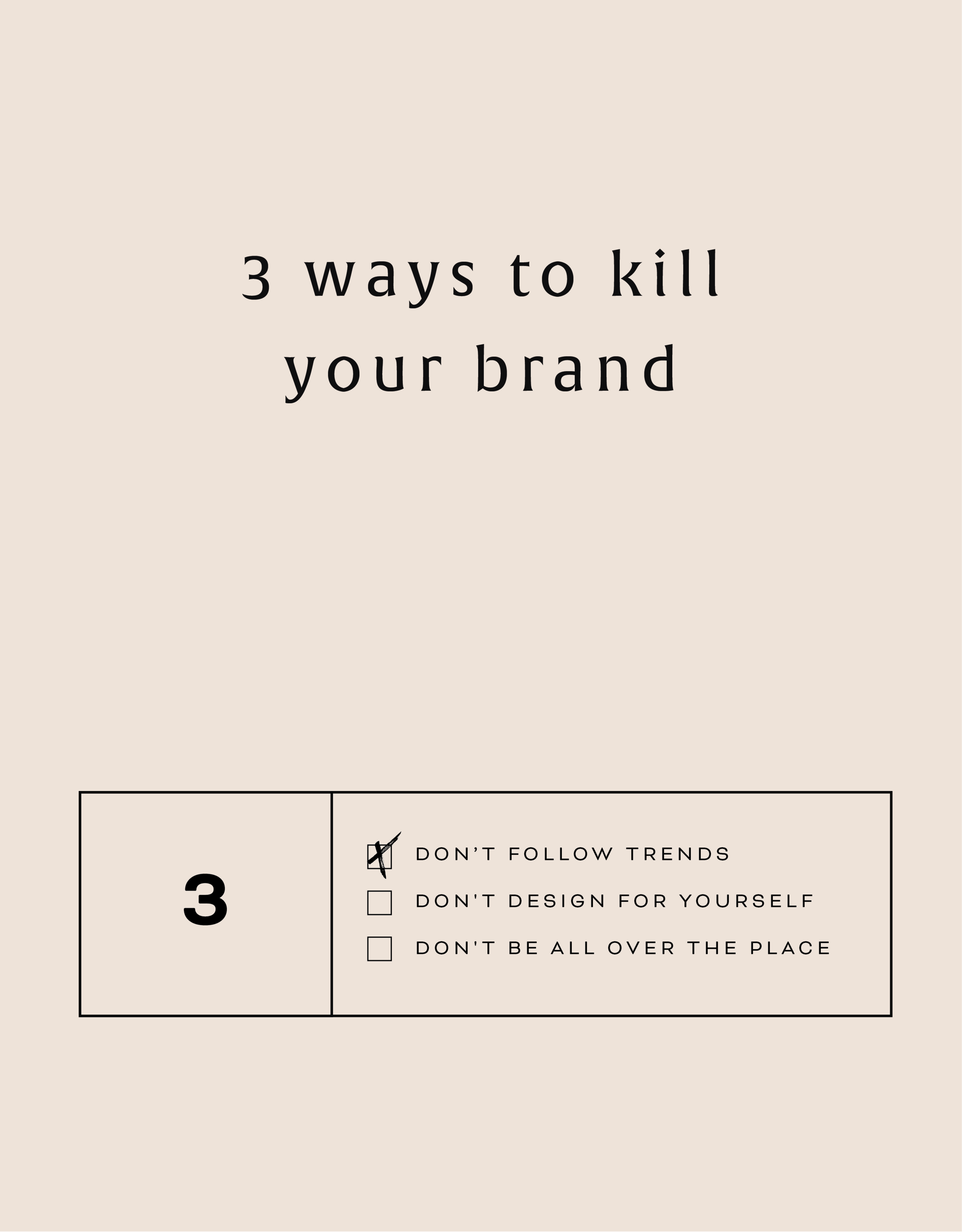
Three Ways to KILL Your Brand
Overlooking these three things in your branding can keep your brand from attracting your dream audience and yes, seriously hurt your brand. Yes you want a beautiful logo, but that logo needs to avoid being these three things first!
That title may feel a little dramatic, but a) I've been watching a lot of angsty teen movies from the 90s lately (She's All That anyone??) so it feels normal... and b) certain approaches to branding can really yield painful results. In fact, overlooking these three things in your branding can keep your brand from attracting your dream audience. Yes you want a beautiful logo, but that logo needs to avoid being these three things:
DON'T FOLLOW THE TRENDS:
You know what happens when you follow (dare I say copy) someone else's logo design? You bore people. Your dream audience takes one glance and moves on. How can you stand out when you look like everyone else?
THE FIX:
Get specific. Be who you are and share that in your brand! How would a former client describe your business? What makes you stand out? What do you deliver differently than others in your industry? Get YOU into your brand!
DON'T DESIGN FOR YOURSELF:
I see this mistake all the time. Just because you like hot pink doesn't mean it's right for your brand. Just because you like handwritten fonts doesn't mean it's right for your business if you want to attract both men and women. Just because you like something, doesn't mean your dream audience will be attracted to it.
THE FIX:
Put your audience first always! Ask yourself these questions as you go through the branding process:
What aspects (type, color, illustration, etc.) of this design will your audience be drawn to and why?
Are there any aspects (type, color, illustration, etc.) of this design that do not fit with what your audience is drawn to? If so, why?
DON'T BE ALL OVER THE PLACE
Once you've nailed down your branding elements, don't use alternate fonts, colors or imagery. It's confusing! Consistency is what builds trust online. If you aren't showing up in a consistent way (because you're using 120,567 different fonts in your Instagram posts, for example), people won't be able to recognize you or trust you.
THE FIX:
Stick with your business vision and just keep fine-tuning it, instead of backpedaling, or starting over again and again. Work with someone you trust to help you create the look or the strategy for your brand if you find yourself too immersed in it to reflect your true style and voice.
Related Posts

HOW TO CREATE A SCROLL EFFECT FOR YOUR WEBSITE MOCKUP
Since Instagram is such a great place to connect and share socially, I love sharing recent Go Live in 5 projects on there! The problem I always have with sharing websites is that it's hard to get a sense of an interactive site in a static square image. So I created a scroll effect and shared it as a video. This give a MUCH better sense of the site when you actually view it online.

Since Instagram is such a great place to connect and share socially, I love sharing recent Go Live in 5 projects on there! The problem I always have with sharing websites is that it's hard to get a sense of an interactive site in a static square image. So I created a scroll effect and shared it as a video. This give a MUCH better sense of the site when you actually view it online.
Since I've been sharing these scrolling website mockups, people just keep asking me: How do you create a scroll effect for your website mockup?? So today, I'm listing out the exact step-by-step process so you can do it, too!
*Tiny note: I use QuickTime and Photoshop for this process (and I have a Mac). This is not a sponsored post, but these are the programs I recommend.
Step 1
01. Open QuickTime
02. Click File > New Screen Recording
03. Click the red record button

04. Adjust the selection tool to crop just the screen

05. Click Start Recording
06. Scroll through the page you want to record
07. Save the recording
NEW!
a templated guide to
messaging magic
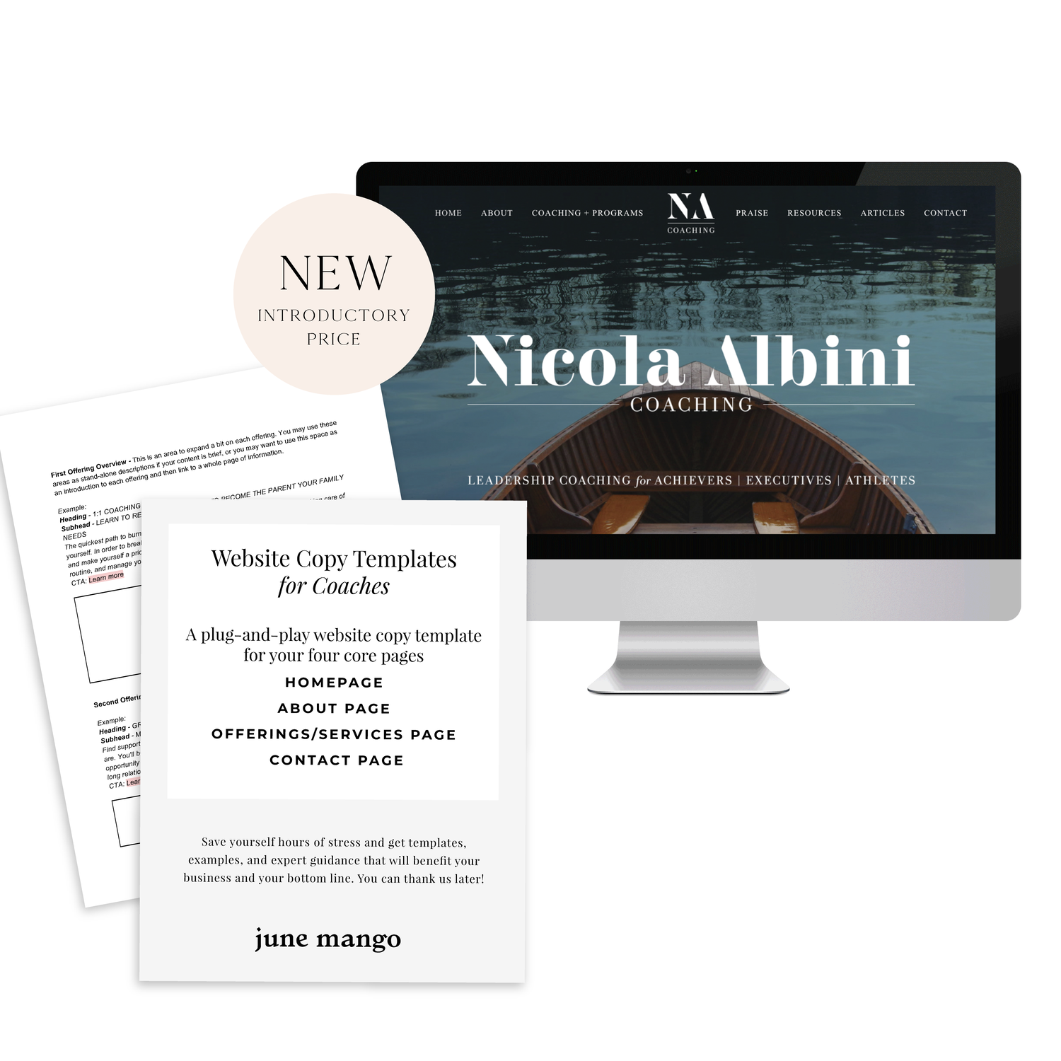
A plug-and-play website copy template for your four core pages (Home, About, Offerings, Contact). Save yourself hours of stress and get templates, examples, and expert guidance that will benefit your business and your bottom line.
get your template now >
Step 2
01. Open Photoshop
02. Add your computer mockup to layer 1
03. Add a shape that covers the computer mockup screen to layer 2
04. Drop in your recorded file (should be mp4 format)
05. Create clipping mask that pulls the recording into the shape you created from step 03
06. Open the Timeline (usually below your art window)
07. In the dropdown that says Create Frame Animation, change that to Create Video Timeline. This will add all your layers to the timeline.
08. Pull each layer in the Timeline to match the length of your video
09. To save, click Export > Render Video
That's it!
BONUS!

Want to download the Photoshop file and save a step?