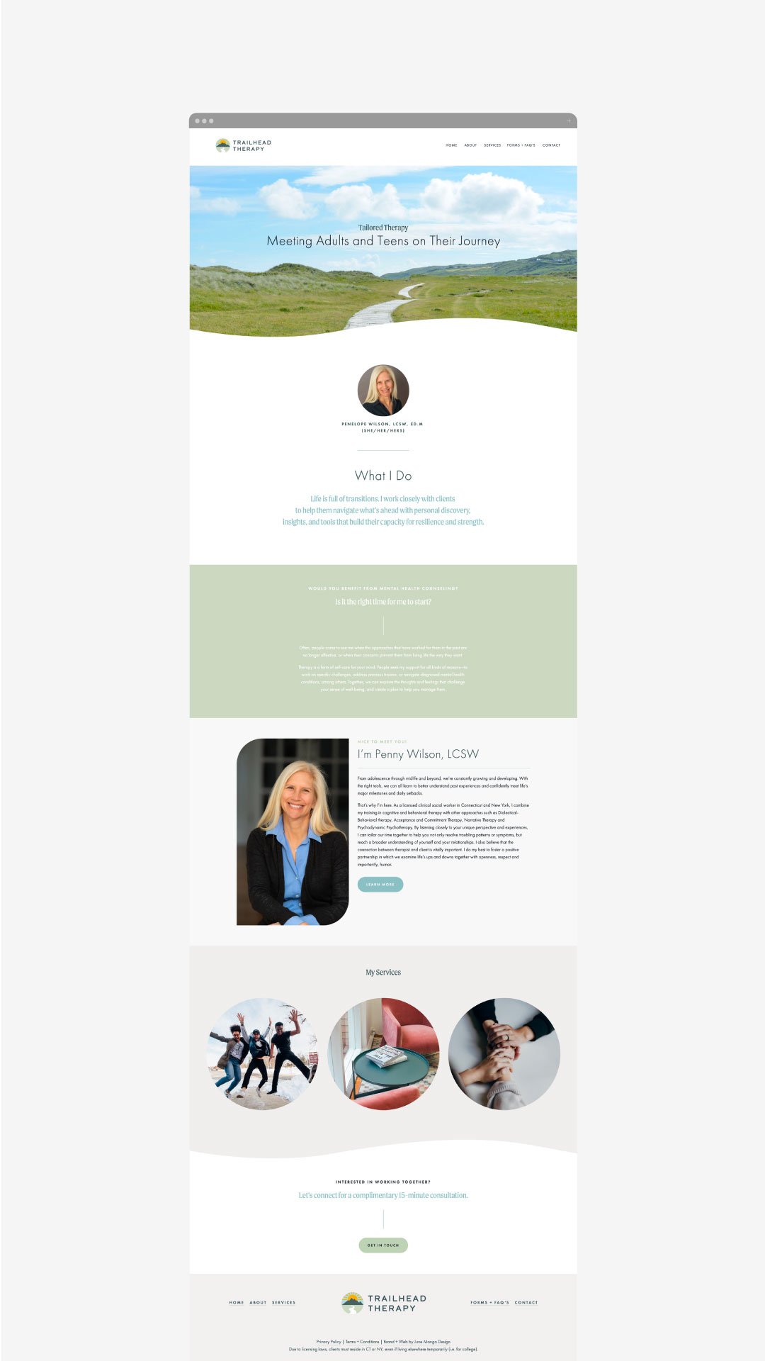
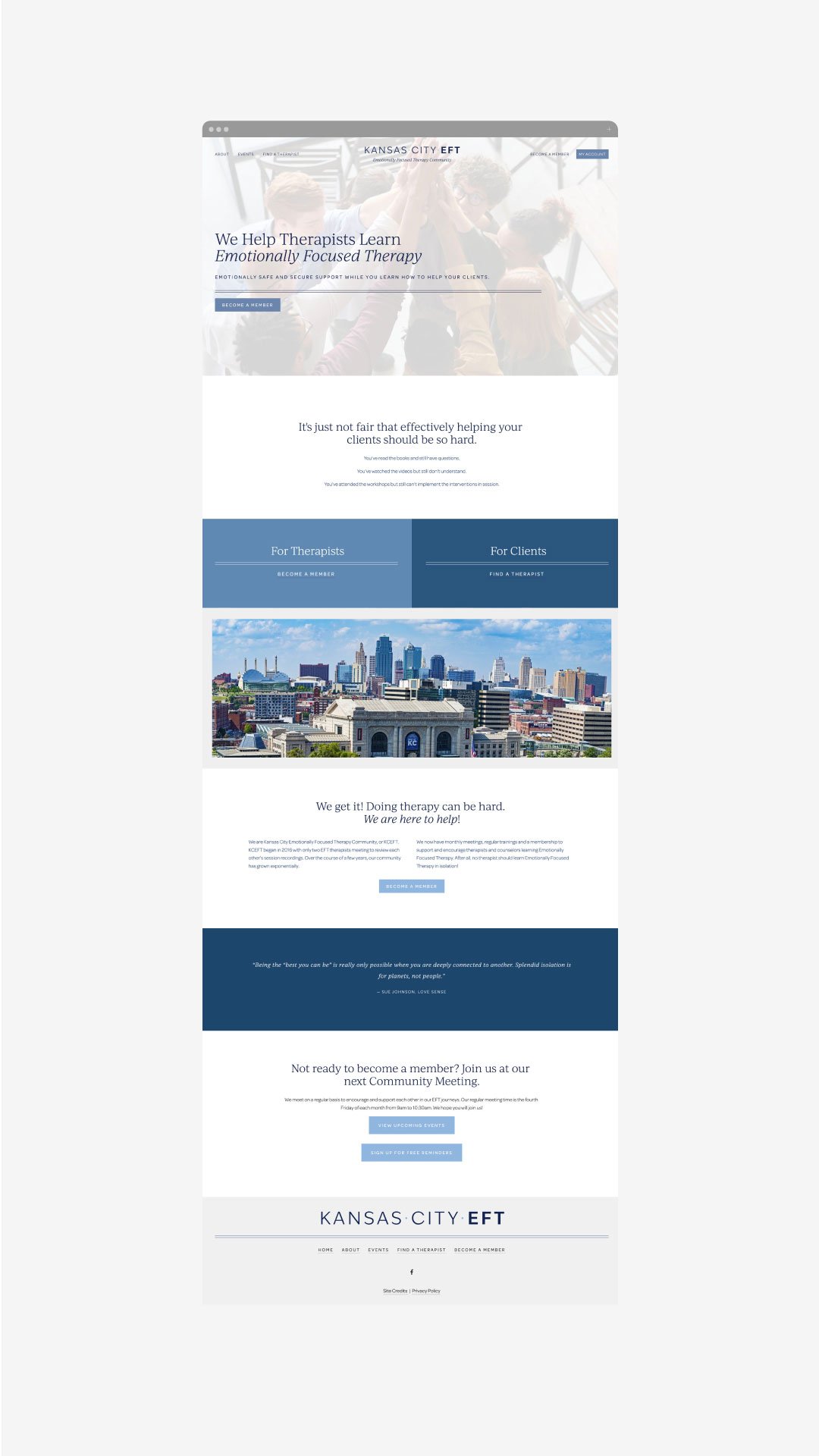
What goes into the therapist web design process?
So you’re starting your own private practice, or maybe you’re expanding your work and want more of an online presence than just a Psychology Today profile or Facebook Business Page but you feel overwhelmed. Where do you begin? What does the process look like for a therapist’s web design process verses a more typical small business?
You can do this!
First, decide whether you want to DIY your therapy website or if you’d like to have a professional designer knock out the process for you. There are benefits to either choice, and it usually comes down to which you want to invest: time or money. If you’re just starting your private practice, you may find that you have a bit more time to spend on the web design process, but if you’re expanding your therapy practice, you may feel that investing a little extra is worth the time saved and professional quality as the end result.
01. THE DIY THERAPY WEBSITE PROCESS
Determine your niche and who your ideal clients will be. What will bring your clients peace and success in therapy? What is your unique approach? What makes you the perfect fit for someone looking for a therapist today? Once you answer these questions, you can build from there.
Write your copy. Ooof. Yes, it’s kinda hard, and yes you can do it on your own. Keep it simple - literally. Explain your offerings as if someone had never even heard of therapy before. Fill them in on exactly what a session with you looks like, who you serve (adults, families, etc), and what they can expect. Also give them some background on you or your staff - let them get to know your therapists through the website.
Create brand guidelines. You should have a logo, or at least a font for your therapy practice’s name. Pick 4-6 colors to use on the website and any other branded materials you may need (business cards, letterheads, etc). Pick 1-2 fonts. When in doubt, keep in simple.
Gather photos. Grab good stock photography or snap photos of your actual space. Make sure there’s good lighting! And don’t forget to include pictures of you and/or your therapists. (And smile!)
List out your pages. Home, About, Offerings, Contact… Those are pretty basic and almost all therapy websites need them. Maybe you also need Our Approach, a Blog or a longer Bio page.
Pull it all together. Literally. Throw it into Word or Canva - just get a rough sense of how all these colors, photos and words work together in the same space.
Pick a web design platform. Squarespace, Wix, SimplePractice… whatever floats your boat. You may also want to grab a pre-designed template to help get you started (but these can be tricky too.)
Add your content and connect your domain name. Don’t have a domain name, grab one from GoDaddy or somewhere similar. .COM’s are still best and try to keep it easy for people to remember.
SEO! Do you have to? No. Will it help you? Absolutely. This is a bit of a rabbit hole, so see here if you want to dive in.
Celebrate, market it, and rest! You did it, now share it! Send an email, share it on social, tell all your friends! Then rest; doing your own therapy web design is hard work.
01. THE EXPERT-LED THERAPY WEBSITE PROCESS
Determine your niche and who your ideal clients will be. Same as above, but often a good brand strategist will be able to share questions and guide your answers to align your growth goals with your values.
Brand design time! Your designer will now use all of the juicy strategy and brand positioning you created together to design a logo and icon that really draws in that ideal client. This is also where the fonts and colors get nailed down.
Messaging and copy get written next. Emotion-driven messaging will help turn those looking for a therapist into people who click the next step. Good messaging on a therapist’s website will make the potential client feel understood and seen by you. Not all web designers write copy, but some do and those who don’t can still help guide the process.
Carefully curated photos. Your web designer will be able to utilize any photos you have and mix those with thoughtfully selected stock photos to really weave together the emotional vibe you want your clients to feel enveloped by. These photos will also be selected to ensure they match the branding and color palette.
Design and layout. Your web designer will get to work laying everything out on the website for you! This is where you get to sit back, relax, and watch it come to life online. You get time to make revisions and then voila! - it’s time to launch.
SEO. Your web design should be doing all of the alt tags, page descriptions and other optimizations to ensure you can garner search results for your therapy practice based on thoughtful keyphrase research and implementation.
Launch and marketing. Same as above: it’s time to share your new therapy website design with the world!
That’s it!
The truth is that all therapist website designs are not created equal, and the design of your website really does matter.
Everybody uses Google to find what they’re looking for these days — including those who are seeking a therapist. Your potential clients will want to check you out and learn about your practice before booking their first appointment or consultation request with you. A web designer can really help, but you absolutely can DIY a beautiful, functional website too! Either way, you’ve got this.
3 Useful Resources for Your Online Business
It does not matter how hard you work, if you are not being efficient with your time, it is going to hurt you in the long run. When 3 hours of work could have taken you 45 minutes if you only sat down for 15 to plan it out - it may be time to start incorporating more tactics to help you work smarter (not harder).
It does not matter how hard you work, if you are not being efficient with your time, it is going to hurt you in the long run. When 3 hours of work could have taken you 45 minutes if you only sat down for 15 to plan it out - it may be time to start incorporating more tactics to help you work smarter (not harder).
Utilizing applications is an easy first step - scheduling social media content, keeping track of hours, meetings, etc. What used to be a daily task can now transition to weekly as you get acquainted with the latest scheduling technology and let it work wonders for your time.
Outsourcing is another massive time saver. If you don’t have time to keep up your blog but it significantly boosts your SEO, making it mandatory, hire a writer. You could also hire a VA who is social media savvy and can do all the time-consuming content work in half the time!
Start time blocking! Tackle the overwhelming feeling that comes when you have 12 things to do that day. When they all have to get done, and they are all of equal importance, it can feel like you spend the whole day running from one to the other with your hair on fire. If you schedule out your tasks one by one, you will not have to worry about whether or not you’ll get it all done - you know you will - and when! It will also keep you accountable to be productive when you know how long you have to work.
Here are 3 useful resources to help you get on top of your work efficiently while not compromising quality!
Canva
Canva is an online design software that can make creating and publishing items for your business extremely easy. You can create thumbnail images for your blog posts, graphics for your newsletters and more. The platform is pretty collaborative too so it is great for designing back and forth with a team.
Items you can create with Canva:
Blog Thumbnails
Newsletter graphics
Social media design
Pinterest templates
Business cards
Presentations
+ more
Your Website
Your website can also be a great resource for your business. House your event calendar for customers and clients to access with ease. You can integrate your scheduling platform such as Acuity or MindBody within your site to book out client spots.
Plus with your website analytics panel, you can see what content resonates with your audience and continue tapping into that type of content.
Task Management Platform
For many business owners, their pen and paper to-do list can quickly get out of hand. If you have twenty different lists around your desks with all the tasks you have to do and seem to always be letting to-do’s slip, then you need a task management platform.
Are you a service-based business? This makes a task management platform even more important because on top of your typical business functions, you are working to provide valuable services.
Some great task management platforms include Asana, Trello, and ClickUp. Using one of these websites may help transform the efficiency of your business and will give you peace of mind with your to-do list!
WANT to CREATE
a custom WEBSITE?
Creating Newsletter Content
Having a newsletter is an essential element in developing and marketing your business. It aids in converting visitors into future clients as you keep them in the loop of your business and also provides free value to show your paid worth.
Having a newsletter is an essential element in developing and marketing your business. It aids in converting visitors into future clients as you keep them in the loop of your business and also provides free value to show your paid worth.
Newsletters can be even more successful than social media marketing for a lot of businesses, so you want to make sure you're putting forth just as much or more effort into creating newsletter content than you are into creating social media content.
How to generate ideas for your email content
Figuring out what to include is similar to finding out what to add to your blog - as we addressed in our previous post - you want to provide value to your audience through tips, best practices, information about your services/products and more.
This all builds off of addressing your ideal client, and connects them with their wants and needs. If you are not connecting them with something they will deem valuable, they are going to quickly lose interest.
While it may be tempting to want to only highlight your business successes, testimonials, etc. try to give your hope-to-be-clients something that they can use themselves, not just what feels like another sales pitch.
General email newsletter content ideas
Here are a few ideas to get you started:
Blog roundups
PDF freebies
Video trainings
Downloadable templates
Deals and discounts
Product highlights
Positive feedback
Team highlights
Upcoming events
Creating a newsletter can seem overwhelming at first - thinking about the structure, design and types of content needed to keep your audience’s attention - but once you get in a rhythm, you will find that it tends to flow naturally and begins to get easier with time!
WANT to CREATE
a custom WEBSITE?
How to Promote Your Business
Getting your business out there online can really help you gain new customers and clients. While there are multiple methods for developing your online presence, in this blog post we will be covering your social media.
Getting your business out there online can really help you gain new customers and clients. While there are multiple methods for developing your online presence, in this blog post we will be covering your social media.
Social media is a great way to connect with your ideal audience and meet potential new customers. Along with extending your reach, social media can allow you to connect and convert (easily!) as well.
Finding the right platform
Part of your online success with social media is discovering the right platform for your business and content. Take time to think about your ideal client. Consider which platform they spend most of their time scrolling and posting. This is where you want to be posting your content for them to see!
If you have an incredible social media account with great eye-catching content and photography, you are going to gain followers from all over. This helps build a business with a professional reputation. As a best practice, you can pre-schedule your posting content 2 weeks ahead (at least) to help you stay on top of consistency in your social media posts.
What to post
While half of the battle is discovering which platform is best, the other is determining what content to share on social media. You want to provide value to your audience through tips, best practices, information about your services/products and more.
A good place to start is to describe what pain points your business or products can address for your ideal client. This will give them a clear picture that you are the right choice for their needs!
Give your social media strategy some time and be attentive to your customers - they can help you figure out what content to share and what types of posts they like the most. Keep an eye on your analytics for that. Make note to evaluate what is working well and what needs to be addressed with your content periodically to keep up with what works best for you and your social media!
Social media doesn’t have to be a complicated process, but it can certainly help you gain new business along the way.
Need help with your online presence? Let’s start with your website! Discover more about our services here.
WANT to CREATE
a custom WEBSITE?
How to set effective boundaries in your business
Everyone’s creative process looks different, but a lot have the same initial phases. Here are a few thoughts on how to streamline yours.
Determine what your needs are first. You may know exactly what it is that you need more of (or less of) within your business. But sometimes there are clues that you may not have the full picture and some needs might get overlooked. There are a few ways to suss out needs you may not be giving your full attention to. Check in with your body. Do you feel flushed, tense, exhausted, sleepy? Now write these feelings down and see what it is your body might be asking for.
Another key tool is your anger. What really gets your goat? When you find yourself getting really annoyed or mad (at a client, a situation, or partner), this is a good indication that you had a need that wasn’t being met. This is a surefire place that is asking for a boundary to be put up to prevent feeling angry again.
Create rules around your needs. If one of your needs is having time for a long morning routine that eats into typical office hours, create a rule around that need. This might look like setting your working hours from 10:00am-6:00pm. Don’t check email or even come near your to-do list until that time. Stick to these rules and create a practice around them. Eventually, they will become patterns that feel second nature and you’ll find yourself wondering why you ever worried about starting your work day so “late”.
Communicate them confidently. When you are sure of yourself, your clients will naturally accept your rules and choices. I learned (and am still learning) this one through parenting a toddler. If I set the limit with ease and confidence, my two year old is way less likely to throw a tantrum. But the other key to this formula is to accept that they may not like your limits, and that’s okay. Your client is allowed to feel miffed that you didn’t respond to their email right away. My toddler is allowed to be mad that his TV show has a time limit. That’s okay. Feel free to feel your feelings, bud. But dems the breaks.
WANT to CREATE
a custom WEBSITE?
How to Remove Hyphenation Throughout Your Website
Not loving the word break with the hyphenation on your website? Use this snippet of code to remove hyphenation through your website and keep words intact!
Not loving the word break with the hyphenation on your website? Use this snippet of code to remove hyphenation through your website and keep words intact!
In this video I cover:
Where to insert your code in your website to update the hyphenation
The specific code used to achieve this look (see below)
Show Notes
0:30 Copying code into custom CSS to remove hyphen
P, h1, h2 { hyphens: manual !important; hyphens: manual !important; hyphens: manual !important; hyphens: manual !important; }
How to Add Custom Name Fields in Squarespace Email Campaigns
Learn how to add custom name fields in Squarespace email campaigns. This merge tags trick is great for customizing your email content!
Learn how to add custom name fields in Squarespace email campaigns. This merge tags trick is great for customizing your email content!
In this video I cover:
How to access this setting in your email campaigns
Ways to incorporate this feature in your email design
Show Notes:
0:13 Inserting the subscriber name in your email
WANT to CREATE
a custom WEBSITE?
Create an Engaging About Page : Part 1
This is maybe the hardest page to create on your website. It’s personal, but also still business-oriented. Should you share a lot or just a little? How many pictures should you include? Should you write it in first person or third person?
It’s confusing. But here are some easy-to-implement tips that will improve your About page TODAY!
01. USE YOUR VOICE!
Unless you are creating an About page for a large company with a big team of people, use your own voice. Don’t write it in 3rd person (ie: Kali is so awesome and smart and funny…). If this feels strange to you, try dictating what you want to write. Then you can copyedit what you’ve said. By actually saying it, you’re less likely to write something you wouldn’t actually say in real life. The second option here is to write it first, and then read it aloud. The same principle applies - if it sounds weird when it comes out of your mouth, it isn’t in your voice.
02. TRIM YOUR TEXT!
You wrote all of your text in your own voice and it sounds amazing! Now cut it in half.
No for real. Trim your copy more than you think you need to. Cut the extraneous and really try to make it say only what’s most important. People online are lazy (but probs still nice!)… they don’t want to read a full essay about you! They just don’t. The fact that you’re reading this long-ish blog post is amazing (and you probably skimmed this too, LBH).
03. WHAT TO KEEP?
OK, now that I’ve asked you to cut your details, you’re probably wondering what you should actually keep. I think there are a few crucial bits you should have on your About page:
Maybe a quick background on why you started your biz
Why you’re an expert (credentials, work history, time in business, etc)
A few cute details, but use them sparingly! Not tons of info about your goldfish, for example.
IF YOU FOLLOW THOSE THREE STEPS, YOUR ABOUT PAGE IS ALREADY IN GREAT SHAPE! I HAVE THREE MORE TIPS ABOUT PHOTOGRAPHY, SOCIAL PROOF AND THE ACTUAL MOST IMPORTANT THING YOU NEED ON YOUR ABOUT PAGE IN MY NEXT POST!
Adding Background Color Behind Text with Code in Squarespace
Add some color to your website page on Squarespace! By incorporating a background color behind your text, you can draw attention to call to actions, new offerings and more on your website. Only a few simple steps and easy to follow custom code needed!
<div style=“background-color: #000000; padding-top: 5%; padding-bottom: 5%; text-align: center’>
  <h3 style=“color: white;”>Word</h3>
</div>
Add some color to your website page on Squarespace! By incorporating a background color behind your text, you can draw attention to call to actions, new offerings and more on your website. Only a few simple steps and easy to follow custom code needed!
In this video I cover:
Ideas to where to add a background color to your website design
The specific code used to achieve this look (see below)
Show Notes
0:28 Insert code block
1:25 How to change the text color
1:52 How to change the background color
2:20 How to change the padding and alignment
3:25 Adjusting the left and right padding with spacers
WANT to CREATE
a custom WEBSITE?
How To Add A Link That Scrolls Down To The Footer In Squarespace
Create a link that automatically scrolls to your footer design for your website visitors. Super helpful for getting your visitors where they need to go!
Create a link that automatically scrolls to your footer design for your website visitors. Super helpful for getting your visitors where they need to go!
In this video I cover:
How to add a code block to your footer
Linking your coded section within your website page text
<div id= "connect">

</div>
The following information was created for use with templates made with Squarespace 7.0.
Stay tuned for more tips and tricks for the new 7.1 platform!
WANT to CREATE
a custom WEBSITE?
How to Add an Index Page to a Folder in Squarespace
Learn how to add an index page to a folder on your Squarespace website. This design trick can help you throughout your website creation process!
Learn how to add an index page to a folder on your Squarespace website. This design trick can help you throughout your website creation process!
In this video I cover:
How to find the link of your index page to put in your folder
Ways to incorporate this work around into your website design
Show notes:
0:30 Work-around for adding an index page to a folder
0:52 Copying URL slug of index page to new page
The following information was created for use with templates made with Squarespace 7.0. Stay tuned for more tips and tricks for the new 7.1 platform!
WANT to CREATE
a custom WEBSITE?
Creating systems for your business while you take maternity leave
I had a baby back in August 2018.
During pregnancy, I realized that all the information about maternity leave dealt with people in corporate jobs – rarely people that work for themselves. I had to figure out everything myself (I did a LOT of deep googling). I wanted to help solopreneurs plan for maternity leave without the hassle, so created plans, worksheets, and posts to help teach others what I learned myself.
In a previous post, I talked about determining how long to take off for maternity leave and when to start your maternity leave. Pop back to that post here.
Now for the business side of things: setting up systems.
For this process I like to use three tools:
1- DELEGATING
2- DEFERRING
3- DELETING
Delegating is the first step.
For this, I used my virtual assistant to help take on tasks that were still essential to my business, but that I could not accomplish myself during this time. She responded to emails and directed potential and current clients where they need to go. You may find that you need to hire someone new, or it could be as simple as passing on your Instagram to guest takeovers. The key is delegating tasks that someone else CAN do for you while you’re out on your maternity leave.
The next step is deferring.
What should you put off until you decide to come back? These are things like new client projects, sales calls, launches, etc. -- things that all take a lot of effort and time. Let them wait until you come back fully before diving into these tasks.
The last step is deleting.
If you are not going to delegate or defer a task, then you likely just need to delete it. This can include saying no to atypical projects, deleting emails, or just letting go of your marketing plan for a few months. The question to ask yourself is, “What can I take off of my plate right now?”.
Now for the non-biz related issues:
Yes, you have a business to run while your on maternity leave, but you also have a new baby! And you need some extra care, too as you recover and adjust to your new normal. Here are some things you can set up before the baby comes:
Meal prep or request a food train from friends! You are going to be tired and extremely hungry during those first few months. At the end of a long day, it is so nice to be able to lean on someone else for dinner (or those meals you so studious froze weeks ago).
You also need to find a strong support system! Whether it be family, friends, doula, partner, etc. There is not a MORE important time for community than after the arrival of a baby.
Also, prepare for the potential onset of postpartum anxiety and depression. No one thinks it will happen, but it’s much harder to find the help you need when you’re in it. Find breastfeeding support as well. La Leche league is a good group to reach out to, and there are also some city-specific resources that may be worth looking into!
I suggest creating a list of names + numbers of support professionals you can quickly call if needed (ie: lactation consultant, post-partum doula, therapist, etc).
WANT MORE?
DOWNLOAD THE MATERNITY LEAVE
SYSTEMS WORKSHEET!
$1.99
Mama Feature ▴ Shelley Easter
Shelley Easter is a momma to 6-year-old twins! She is a Shopify website designer specializing in e-commerce businesses that sell lifestyle products. She has been a web designer for over 10 years now and began focusing on e-commerce in the last couple of years. It's a niche that she loves! With e-commerce, clients can see real tangible results with sales increases and that's so exciting for her as a designer.
Shelley Easter is a momma to 6-year-old twins! She is a Shopify website designer specializing in e-commerce businesses that sell lifestyle products. She has been a web designer for over 10 years now and began focusing on e-commerce in the last couple of years. It's a niche that she loves! With e-commerce, clients can see real tangible results with sales increases and that's so exciting for her as a designer. Check out her work at Launch Party!
What is the best piece of advice you’ve received about starting, owning, and/or thriving as a small business owner?
"Your business can't grow if you don't grow." I'm not sure where I picked that up, but it's something I've noticed over the last few years. For me, owning a business has been a massive experiment in personal growth.
I went from being the girl who had panic attacks over my college speech class to saying yes to any speaking opportunity that came my way -- including a 45 min in-person presentation! From feeling anxiety when anyone asked me "what do you do?" to practicing my elevator speech over and over again.
From charging $400 for my first website to over $10k today. It's all been such a lesson in growing as a person and becoming more confident and comfortable with myself.
How do you blend motherhood and building a business?
When I was pregnant with my twins, I had a client tell me that I wouldn't still work after they were born. She was confident I'd have no interest anymore. That couldn't have been further from the truth. True, when they were born I was in a complete fog of breastfeeding and not sleeping for months (and months and months), but I felt a desire to get back to work. I started slowly and with the help of my Mom, had a few hours a few days a week that I dedicated to client projects. Over time, it gradually increased.
I didn't truly step into the world as a business owner until my children were 2. That was when I went to my first conference and really "owned" being a business owner. I felt such a pull to make a difference. I was really motivated to show my children that I could make my own way and head a successful business. I'm always proud to share with them when I get new clients and other wins.
What has surprised you most about motherhood?
Gosh, probably everything. I became a mom at 26 and was absolutely bewildered when I found out I was having twins -- it was a complete shock. I had no idea what to expect and felt so, so overwhelmed by it. I dove into reading every twin book I could find, joined an expecting twins Facebook group and tried to find as much support as possible.
A lot of the well-meaning comments people say to expectant mothers, like "say goodbye to ever sleeping again" or "everything will change!" scared me. And when people found out I was having twins, it was especially ramped up. I really took those comments to heart.
So after I had them, I was pleasantly surprised to discover that my life wasn't a total nightmare. There was so much joy. And as simple as it sounds, I was still me. Yes, those early years were very challenging at times, but we rose to the occasion.
What's your morning routine?
My kids are in elementary school now and we wake up at 7am. I'm still a night owl and it's difficult every day to get out of bed at that time. I wake up to Alexa playing a song that my kids chose - they take turns weekly picking out our morning song.
Alexa Routines are the MVP for our mornings. She tells us when to get up, when to start eating breakfast, when we to stop eating breakfast, when to brush our teeth (and she plays the toothbrushing podcast Chompers for them), when to put on our shoes and when to walk out the door! Since I set up those routines, I no longer have to keep track of the time in the mornings and the kids (mostly) listen to her directions. It's a gamechanger.
After the kids hop on the bus I head to the gym. I love a morning workout so that I can start the day feeling good. After I get home I set up shop and start my work day with a homemade matcha latte.
How do you define balance?
I'm not sure that I think too much about balance per say, but I spend a lot of time thinking about how I want to live my life. Essentially, I want to live my life enjoying my time with my family, making time for my own hobbies and friends and building a business that lights me up. I have loose monthly goals that help keep me in line.
I go to ballet and Trader Joe's every week, which takes up almost the whole time my kids are at school. I'm good with that. It's my favorite day of the week. My husband and I have date nights about once a month. I try to meet a friend for lunch once a month -- and that's something I want to do a bit more of.
When my kids get home from school, I'm almost always done with work. I like having hard stop-times, but if I'm really in the groove or want to get ahead of something, I don't beat myself up for working a little extra.
The nights and weekends are filled with family time. We get to eat breakfast and dinner together as a family every day and I'm so grateful for that.
When life gets crazy and balance is not possible, what core values do you hold on to?
When my work is taking up extra time, or I'm traveling for work, I generally don't feel guilt around that. I think it's good for my kids to see that work is important to me and I talk to them about why I have my own business. I never put my work ahead of them and will always make time to spend with them every day. Family comes first.
3 Pearls of wisdom you can share about motherhood, business or blending it together?
1. Naps are a very good use of time.
2. We can do hard things.
3. Motherhood and business ownership mixes just fine.
―
Be sure to follow Shelley on Instagram to keep up with her biz happenings and mama moments!
Custom Styling Buttons with CSS in Squarespace
Sometimes the standard Squarespace settings don’t do the trick! Customize your website buttons with custom coding. Switch up the colors, borders and more through this simple code.
Sometimes the standard Squarespace settings don’t do the trick! Customize your website buttons with custom coding. Switch up the colors, borders and more through this simple code.
In this video I cover:
Ideas for various buttons and ways to style them on your website
The specific code used to achieve this look (see below)
Show notes
0:18 Adding code to custom CSS
0:50 Changing the size of your button
1:06 Changing the background color of your button
1:37 Changing the border radius of your button
2:45 Changing the border of your button
3:50 Changing the text color of your button
4:13 Changing the width of your button
.sps-block-button .sps-block-button-element—small {
  background-color: pink;
  border-radius: 50px;
  border: 2px solid black;
  width:75%;
}

.sps-block-button .sps-block-button-element—small:hover {
  border: 2px solid black;
  background-color: white;
  color: black;
}
The following information was created for use with templates made with Squarespace 7.0.
Stay tuned for more tips and tricks for the new 7.1 platform!
Favorite Logos of 2019
A recap of some of my favorite unchosen logos and submarks from 2019 branding projects.
There were so many fun branding projects in 2019 and so many amazing clients! Since each branding process gets 3-4 fully designed brand identity options, not all logos get the green light. Some aren't quite right for the client or maybe just didn't fit as well as another option, but I have a little love for all of my logos (and maybe get a little too attached?).
Below are some of my favorite branding concepts and their variations created that didn't make the final cut.
WANT to CREATE
a custom LOGO?
Adding a Vertical Line with Code
Squarespace already offers a horizontal line in its content blocks, but check out this video to discover how to add vertical lines to your website with simple code. Through the custom code window you can create vertical lines, customize the color and more.
Squarespace already offers a horizontal line in its content blocks, but check out this video to discover how to add vertical lines to your website with simple code. Through the custom code window you can create vertical lines, customize the color and more.
In this video I cover:
Ideas on where to incorporate this design element into your site design
The specific code used to achieve this look (see below)
Show Notes
0:10 Insert code block
0:50 Changing the line thickness
1:00 Changing the line style
1:17 Changing the line color
1:25 Changing the line height
<style>
.v1 {
border-left: 6px solid green;
height: 500px;
  }
</style>

<div class="v1"></div>
The following information was created for use with templates made with Squarespace 7.0.
Stay tuned for more tips and tricks for the new 7.1 platform!
WANT to CREATE
a custom WEBSITE?
Adding a Background Color to Your Acuity Scheduling Block
Make your online scheduler stand out with some custom code! Your Acuity scheduling block can be your go-to spot for potential new clients or general business inquiries to get in touch with you - give it some CSS love with this snippet of code.
Make your online scheduler stand out with some custom code! Your Acuity scheduling block can be your go-to spot for potential new clients or general business inquiries to get in touch with you - give it some CSS love with this snippet of code.
In this video I cover:
How to access your Acuity scheduling block information and update the code
The specific code used to achieve this look (see below)
Show Notes
0:25 Adding Acuity scheduling block
0:45 Inspecting the scheduling block to find background code
2:03 Copying the block code
2:30 Adding custom CSS
3:10 Changing the background color
#blockid{
  background-color: #000000
}
#blockid{
  background-color: #000000
}
The following information was created for use with templates made with Squarespace 7.0.
Stay tuned for more tips and tricks for the new 7.1 platform!
NEW!
a templated guide to messaging magic
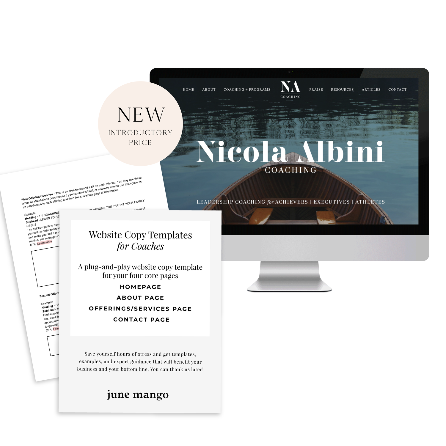
A plug-and-play website copy template for your four core pages (Home, About, Offerings, Contact). Save yourself hours of stress and get templates, examples, and expert guidance that will benefit your business and your bottom line.
learn more >
WANT to CREATE
a custom WEBSITE?
Creating and Styling an Announcement Bar
Promote your latest offering, share a freebie or draw attention to some business news through your announcement bar on your Squarespace site!
Promote your latest offering, share a freebie or draw attention to some business news through your announcement bar on your Squarespace site!
In this video I cover:
Types of content to include in your announcement bar
How to stylize your announcement bar
Show Notes
0:42 How to add announcement bar
1:15 Adding text to announcement bar
1:30 Adding a link to announcement bar
2:30 Changing the background
3:08 Changing the text appearance
The following information was created for use with templates made with Squarespace 7.0.
Stay tuned for more tips and tricks for the new 7.1 platform!
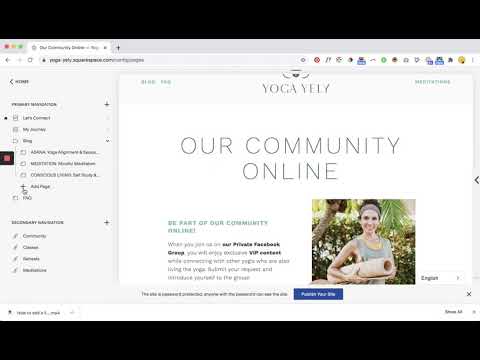
Anchor Links
Does your website design incorporate a lot of index pages? No worries! You can direct a website visitor to a specific part of your index page thanks to an anchor link! No more need for the long scroll to get to where you want to be.
Does your website design incorporate a lot of index pages? No worries! You can direct a website visitor to a specific part of your index page thanks to an anchor link! No more need for the long scroll to get to where you want to be.
In this video I cover:
Where to locate the specific URL for the section you want within your index page
How to properly link and create your anchor link within a page
Video tutorial notes:
1:00 Adding text that you want to link
1:20 Pulling your index page URL
1:50 Adding in link to text
2:30 Testing out update
The following information was created for use with templates made with Squarespace 7.0.
Stay tuned for more tips and tricks for the new 7.1 platform!
Type Study on Insta
I’ve somehow found myself wrapped up in multiple outreach programs that are just pulling - no, TEARING - at my heartstrings lately. Maybe it’s the holidays, maybe it’s the incessant political newsfeed, or maybe it’s just my heart growing after becoming a mama, but I am overwhelmed.
For example, after learning about the crazy-fast depletion of the elephant population, I promptly adopted an orphaned elephant named Enkesha. She’s absolutely precious (and you can peep her story here). Then I heard about Dressember from the crazy-clad Ella London and shared their mission with all my fellow ladies.
But the one that really got me…I mean like really pushed me over the edge of the i-can’t-sit-here-and-do-nothing cliff was the death of a 16 year old migrant kid being detained at the border. Before you run away from this post, let me assure you it’s not politically-motivated. It’s mother-motivated. I’m heartbroken for his mother. I’m heartbroken for all the mothers who have lost their sweet, innocent kiddos. I was feeling helpless, so I turned to what I know - design. If nothing else, I want to remember the names of the 7 children who have died during this border crisis. They are real. They are loved. And they will be remembered, at the very least, by me.

