Creating Columns for Images and Text
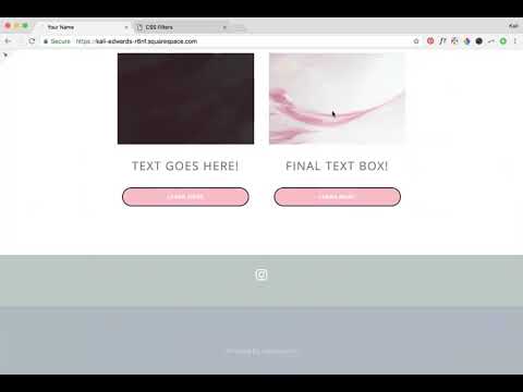
Depending on your website design, you may need to add columns to your web page. Through this video, I share simple steps on creating columns for you to feature text and images.
Depending on your website design, you may need to add columns to your web page. Through this video, I share simple steps on creating columns for you to feature text and images.
In this video I cover:
How to use content blocks to create columns
Ways to best drag and drop your content blocks to get your desired layout
Design ideas for adding columns to your site
Show Notes
0:23 Adding image content blocks
2:20 Adding text under images
3:46 Adding buttons under text
4:45 Adding spacers to adjust column sizing
The following information was created for use with templates made with Squarespace 7.0.
Stay tuned for more tips and tricks for the new 7.1 platform!
Adding a Testimonial Background without Code
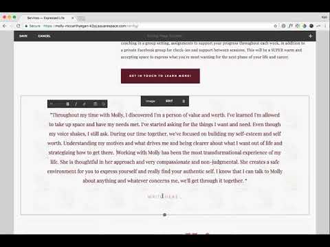
Testimonials are super important to have on your website. Show potential clients your expertise, how you handle projects and interact with your clients. In this tutorial, I share how to customize this spot on your website to attract more views - no coding needed!
Testimonials are super important to have on your website. Show potential clients your expertise, how you handle projects and interact with your clients. In this tutorial, I share how to customize this spot on your website to attract more views - no coding needed!
IN THIS VIDEO I COVER:
Using images to enhance your testimonial highlights
Stylizing your testimonial copy
Show Notes
0:20 Adding content block with image
0:46 Adding testimonial text
1:35 Changing the text in Style Editor
2:55 Changing content sizing in Style Editor
The following information was created for use with templates made with Squarespace 7.0.
Stay tuned for more tips and tricks for the new 7.1 platform!
Adding Tab Style Buttons onto Images
Your website buttons don’t have to be boring! Through this tutorial, learn how to customize your Squarespace website buttons to look like tabs on your images. This is a great way to draw attention to your latest offerings or special online freebies!
Your website buttons don’t have to be boring! Through this tutorial, learn how to customize your Squarespace website buttons to look like tabs on your images. This is a great way to draw attention to your latest offerings or special online freebies!
In this video I cover:
How to achieve this look through your Squarespace site styles menu
Overview of various ways to use this button on your website to inspire your website design
Show Notes
0:30 Adding image blocks
1:30 Adding button to image blocks
2:10 Editing buttons in Style Editor
3:00 Changing button separation setting
The following information was created for use with templates made with Squarespace 7.0.
Stay tuned for more tips and tricks for the new 7.1 platform!
How to Edit Your Image Brightness with a Rollover / Hover Filter
Enhance your images on your Squarespace website through image rollover effects! This effect can be used on any image within your website to add something unique to your overall website design.
Enhance your images on your Squarespace website through image rollover effects! This effect can be used on any image within your website to add something unique to your overall website design.
In this video I cover:
How to use some simple custom code to increase the brightness of your image as you hover over it
Different ideas on how to use this feature on your website
Show Notes
0:20 Paste code into Custom CSS
0:33 Editing brightness of hover filter
Copy the custom code from the section below for your site!
img {
transition: all ease-in-out 500ms
!important;
}
img: hover {
-webkit-filter:
brightness (10) !important;
}
The following information was created for use with templates made with Squarespace 7.0.
Stay tuned for more tips and tricks for the new 7.1 platform!
How to Add Multiple Images at Once
Save time when uploading blog posts or featuring new content on your website with this simple and easy trick to add multiple images at once to your site without creating a bunch of image blocks!
Save time when uploading blog posts or featuring new content on your website with this simple and easy trick to add multiple images at once to your site without creating a bunch of image blocks!
In this video I cover:
Ways to use the gallery content block to save you time during the uploading process
Overview of the different display settings for your gallery content block
Show Notes
0:30 Editing blog post
0:42 Adding gallery content block
1:08 Selecting multiple images to upload
1:39 Linking images
The following information was created for use with templates made with Squarespace 7.0.
Stay tuned for more tips and tricks for the new 7.1 platform!
Create an Instant Download Opt In
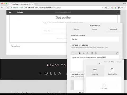
In this tutorial, you'll learn how to create an INSTANT download opt-in after someone signs up for your newsletter. This allows someone to immediately download the opt-in file vs. waiting to receive it via email.
In this tutorial, you'll learn how to create an INSTANT download opt-in after someone signs up for your newsletter. This allows someone to immediately download the opt-in file vs. waiting to receive it via email.
In this video I cover:
How to set up your email newsletter
Ways to properly upload your instant download opt in for website visitors
Show Notes
0:27 Creating newsletter block
1:20 Adding opt-in download
1:58 Linking your download
The following information was created for use with templates made with Squarespace 7.0.
Stay tuned for more tips and tricks for the new 7.1 platform!
Adding Instant Downloads: PDFs, images, zip files, etc
Share freebies, wallpapers, PDFs and more through instant downloads on your website. This content is great for driving traffic to your website and sharing on social media.
Share freebies, wallpapers, PDFs and more through instant downloads on your website. This content is great for driving traffic to your website and sharing on social media.
In this video I cover:
How to link text, images or buttons to your instant download
Different types of files you can upload as instant downloads on your site
Show Notes
0:52 Linking download file to text
2:02 Linking download file to button
2:27 Linking download file to image
The following information was created for use with templates made with Squarespace 7.0.
Stay tuned for more tips and tricks for the new 7.1 platform!
Adding a Logo and Favicon to Your Website
Incorporate your branding into your website through uploading your favicon and logo to your Squarespace website. Review the tutorial below for steps on how to add these files into your design!
Incorporate your branding into your website through uploading your favicon and logo to your Squarespace website. Review the tutorial below for steps on how to add these files into your design!
In this video I cover:
How to access your logo and favicon setting in Squarespace
Uploading your branding to your website for your logo and favicon
Best practices for favicon file sizes
Show Notes
0:20 Accessing your logo and favicon
0:45 Adding your logo file
0:50 Adding your favicon
1:02 Ideal favicon sizing
The following information was created for use with templates made with Squarespace 7.0.
Stay tuned for more tips and tricks for the new 7.1 platform!
Importing WordPress Posts and Pages
If you are making the move from WordPress to Squarespace, there are a few steps you can take to transfer that content from your previous website to your new one. Through this tutorial I walk you through that process, take a look below!
If you are making the move from WordPress to Squarespace, there are a few steps you can take to transfer that content from your previous website to your new one. Through this tutorial I walk you through that process, take a look below!
IN THIS VIDEO I COVER:
How to access your Wordpress content and export for Squarespace
How to properly upload your Wordpress content file
Show Notes
0:20 Importing content from Wordpress
0:56 Troubleshooting import with XML file
1:20 Locating XML file in Wordpress
1:55 Uploading XML file
The following information was created for use with templates made with Squarespace 7.0.
Stay tuned for more tips and tricks for the new 7.1 platform!
Hiding and Password Protecting Pages
Sometimes your content needs to be protected. Creating password protected pages on your website can be the perfect solution. Through this tutorial, I share how to create these pages on your site and why they can be used for.
Sometimes your content needs to be protected. Creating password protected pages on your website can be the perfect solution. Through this tutorial, I share how to create these pages on your site and why they can be used for.
IN THIS VIDEO I COVER:
How hide a page from your main navigation
Adding a password to your unlinked page
Ideas for your password protected or hidden page
Show Notes
0:18 Moving page to “Not Linked” section
0:52 Adding a password to hidden page
The following information was created for use with templates made with Squarespace 7.0.
Stay tuned for more tips and tricks for the new 7.1 platform!
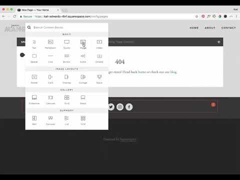
Create and Link a Custom 404 (aka: error) Page
Every once and a while, a website visitor can enter a URL for your website incorrectly or click on a link that no longer exists on your website. Don’t let those non-exist pages, pull people away from your site. Create a 404 (aka: error) page to bring people back to the place they need to be. See more through the tutorial video below!
Every once and a while, a website visitor can enter a URL for your website incorrectly or click on a link that no longer exists on your website. Don’t let those non-exist pages, pull people away from your site. Create a 404 (aka: error) page to bring people back to the place they need to be. See more through the tutorial video below!
IN THIS VIDEO I COVER:
Why your website needs a 404 page
What you should include on your error page
Connecting your 404 page to display correctly
Show Notes
0:41 Adding new 404 page
1:20 Adding and linking text on 404 page
2:40 Adding branded content to 404 page
3:45 Connecting 404 page
The following information was created for use with templates made with Squarespace 7.0.
Stay tuned for more tips and tricks for the new 7.1 platform!
Streamline Your Website's Style All in One Place
Simplify your site styles and update your design settings all in one place. No more clicking through multiple pages trying to figure out how you are going to make your button styles look. This tutorial was a game changing trick for my business and I am excited to share it with you!
Simplify your site styles and update your design settings all in one place. No more clicking through multiple pages trying to figure out how you are going to make your button styles look. This tutorial was a game changing trick for my business and I am excited to share it with you!
IN THIS VIDEO I COVER:
Quick and easy way to update your site styles
How to save time during your design process
Show Notes
0:52 Creating a style page
1:10 Adding headers
1:35 Adding buttons
1:58 Adding images
2:35 Using Style Editor to customize elements
5:30 Adding content blocks to style page
The following information was created for use with templates made with Squarespace 7.0.
Stay tuned for more tips and tricks for the new 7.1 platform!
Transitioning Back to Work After a Career Break
You’ve taken some time to focus on things over than your biz for a bit. You may have wrapped up a maternity leave (like me!) or had an extended vacation. While breaks can be a fantastic thing, the transition back to your desk chair can be a little difficult if you don’t prepare for that transition.
You’ve taken some time to focus on things other than your biz for a bit. You may have wrapped up a maternity leave (like me!) or had an extended vacation. While breaks can be a fantastic thing, the transition back to your desk chair can be a little difficult if you don’t prepare for that transition.
Here are some tips that I recommend for getting back into the office efficiently and limiting the stress of it all.
Ease back into things slowly
If you work from home or have the luxury of making your hours, try a few half days of work instead of the full 8-hour shift. Having this easing period can help with the shock of being back in it all.
If you don’t have the chance to set your hours, make sure that when you clock in, you clock out on time as well. No late nighters trying to play catch up. Take your time and get back into the swing of things.
You’ll probably feel a little out of sorts being back at work and that’s normal. It will be a change of pace compared to what you are coming from. It’s okay to feel this way. Just acknowledge that you may need a little more time in the mornings to get ready for the day or more time at the end of the day to unwind or squish those new baby cheeks. Figure out a flow that works best for you.
Prioritize your to-do’s
Please, please, please - prioritize your to-do’s when you are getting back to the grind. It’s so important during this time.
Create a list of the top three things to complete. Stick with those. Don’t get distracted by your inbox or take up time organizing your desktop files now. This is not the time to procrastinate. You’ve got a little bit of catching up to do or a kiddo to get home to. Stick to your plan and having a short list is way more manageable. Finish those three by lunch? Way to go. Try adding three more before the day is over. No need to overwork yourself, but try to use your time wisely. Time management is key.
Ask for help when you need it
I’m going to be real with you here. You are going to feel overwhelmed at least a few times before you get out of the clear. That’s okay. Ask for help! Processes may have changed, or clients have updated items while you were gone. Get up to date on the latest.
Another option for your workload is hiring a contractor or virtual assistant. You can assign items on your list and offload some things. I highly suggest this option if it is doable for you!
Whatever tip you use, just give yourself some grace. It will take some time for things to feel like they are back to “normal” or at least the new normal. And that’s totally Ok.
WANT to CREATE
a custom WEBSITE?
Mobile Layouts Explained
As much as I love a good desktop design for a website, so many people are viewing your content on a mobile device. In this video I explain the process of making your website design mobile-friendly and how to double check if everything looks good for your mobile visitors!
As much as I love a good desktop design for a website, so many people are viewing your content on a mobile device. In this video I explain the process of making your website design mobile-friendly and how to double check if everything looks good for your mobile visitors!
IN THIS VIDEO I COVER:
What mobile browsers are
How to check your site on a tablet
How to check your site on a phone
Show Notes
0:28 Navigating to mobile view
1:08 Checking layout with browser
1:45 How mobile layouts work
The following information was created for use with templates made with Squarespace 7.0.
Stay tuned for more tips and tricks for the new 7.1 platform!
WANT to CREATE
a custom WEBSITE?
Creating a consistent brand
You’ve invested all of this time creating the perfect brand identity through logos, submarks, color palettes, and more. It is time for you (or your branding client) to keep things consistent and cohesive long after those brand files are turned over.
Develop a brand style guide
One of the main components of creating and keeping a consistent brand is through a brand style guide. This guide will provide you with brand identity standards for everything - logo, colors, fonts, icons, and more. Develop a plan for what rules you will have for how to use your brand. From how colors could be combined to the fonts you will use on printed materials - you name it. Your guide will help your brand look and feel the same no matter where you have it displayed or featured.
Create your brand messaging
Anything word related to your business, such as your tagline, mission statement, your “why,” etc. needs to be refined and fine-tuned through brand messaging. Developing your brand message can really help with wording that email, writing your about page or ways you interact in a professional setting about your business. Having this “voice” developed will help you along the way.
Identify where you will “show up”
There are plenty of possibilities of places your brand could exist and show up. I recommend taking some time to consider precisely where you plan on being a presence. This can help you determine a plan of action for those spaces, but also create a sense of how far your brand reach can extend.
Areas to consider:
Digital: where will your brand show up online or on social media?
Print: will you have printed collateral of your brand such as business cards or direct mailers?
In-person: You may have a storefront or attend conferences representing your business. You may even yourself be your brand (your business = your personal brand).
How to carry out the consistent brand
While you may think you have the capability to do all of this yourself and do it well, it can be challenging to keep up with it all. Hiring a designer or a copywriter (or both) to help you with the elements of your brand identity can be a sure way to keep your brand consistency in check. Above all else, having those resources (the brand style guide and messaging standards) can help keep things the same. No matter what platform a potential client, customer, etc. interacts with your brand - it is all the same!
WANT to CREATE
a custom LOGO?
Mama Feature ▴ Katie Wussow
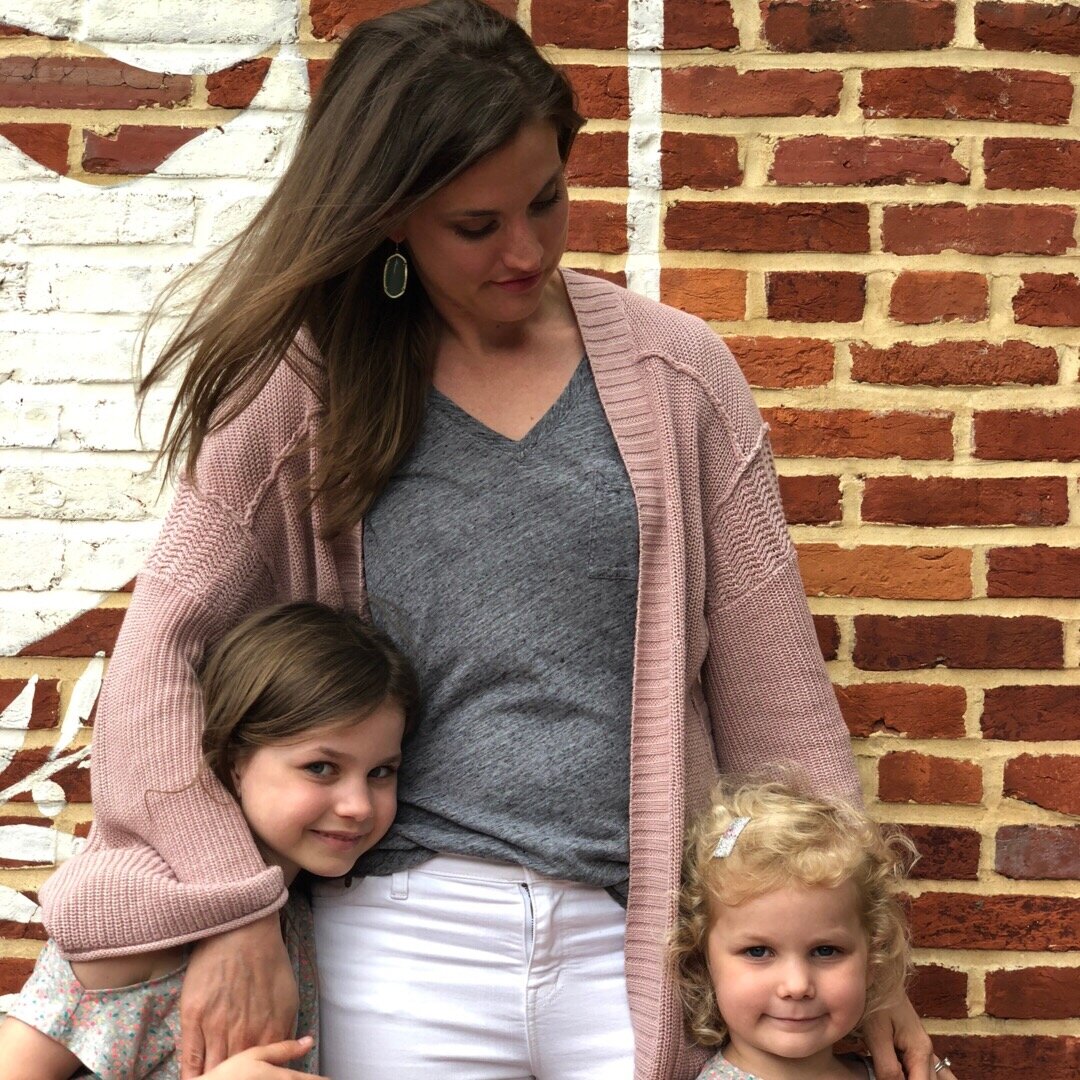
Katie Wussow is a mama to two sweet little girls - ages 5 and 7! She runs a successful consulting business that focuses on providing creative women with the tools and mindset they need to grow their business in a meaningful way. Katie has a great perspective on combining motherhood with entrepreneurship - she believes that each season will bring new things. It is okay to adapt and change as life goes on! Read more about Katie in our Mama Feature below!
Katie Wussow is a mama to two sweet little girls - ages 5 and 7! She runs a successful consulting business that focuses on providing creative women with the tools and mindset they need to grow their business in a meaningful way. Katie has a great perspective on combining motherhood with entrepreneurship - she believes that each season will bring new things. It is okay to adapt and change as life goes on! Read more about Katie in our Mama Feature below!
Tell me a little about your business
I'm a business consultant that helps creative women confidently lead growing businesses. I help put solid business plans and goals in place through my one-on-one coaching program, the Thrive Program.
What is the best piece of advice you’ve received about starting, owning, and/or thriving as a small business owner?
Big things take time. It's so important to stay consistent and not get discouraged when things take longer than you think.
How do you blend motherhood and building a business?
There are so many answers to this question, but I try to take things one season at a time. Kids, business, and life are always changing, and something that worked last year may not work this year. My business looks totally different now than it did when I had two kids under two. I imagine it will keep looking different as our kids get older and the needs of our family and my business continue to change.
What has surprised you most about motherhood?
I'm constantly so surprised watching my kids grow up! They are so funny, capable, smart, and independent. It's such a joy watching them grow.
What's your morning routine?
I try to get up before my kids every day, even on the weekends. It really helps me feel like I'm starting the day on my own terms and not immediately jumping into "mom-mode." On weekdays, I get up at 6:00, make a cup of coffee, and sit on my couch and read the bible and pray for about 45 minutes. Then I get myself ready (not a glamorous process) and start making breakfast and lunches for the family. The kids get up around 7:30 and we are off to the races!
How do you define balance?
For me, balance is about making sure that everything I'm doing, whether in life or business, has an intention behind it. I need to know why I'm doing the things I'm doing, or I need to stop doing them. As a working mom and wife I don't have time to waste with things that aren't important or meaningful.
Balance also means that my life doesn't revolve around my kids, but also their lives don't revolve around me. If I'm the only one making sacrifices, then that's a problem. But, if they are always the ones sacrificing for me, that's a problem, too.
When life gets crazy and balance is not possible, what core values do you hold on to?
I try to stay faithful in every season. If things are crazy and I don't feel like I'm able to "balance" things the way I want, if I can still say I'm being faithful, then that should be enough. And lots and lots of grace.
If you could take a look at the future, what do you see for not only yourself personally, but also for your business?
The big picture behind my business is to help women become confident leaders. Right now, I mainly do this through my consulting program, the Thrive Program. But, I am (slowly) working on a more comprehensive suite of resources and services to help women lead growing businesses. I have a lot of work to do!
3 Pearls of wisdom you can share about motherhood, business or blending it together?
I wrote a blog post about this! (Check it out here!)
Some high points are:
1) take care of yourself. the life of a working mom requires a lot of energy, and you won't have that energy if you don't pursue healthy habits. (I'm NOT saying that you need to get in the gym 5 days a week when you have a newborn. Keep things realistic and doable.)
2) embrace different seasons. Like I said before, different seasons in your life and business will feel different and require different approaches. Embrace this!
and 3) get some perspective. God willing, we all have 40-50 years to work. Our time with our kids at home will be much shorter. Don't panic if you feel you need to step back from work for a season to enjoy motherhood. You have plenty of years left to do what you love.
―
Be sure to follow Katie on Instagram to keep up
with her biz happenings and mama moments!
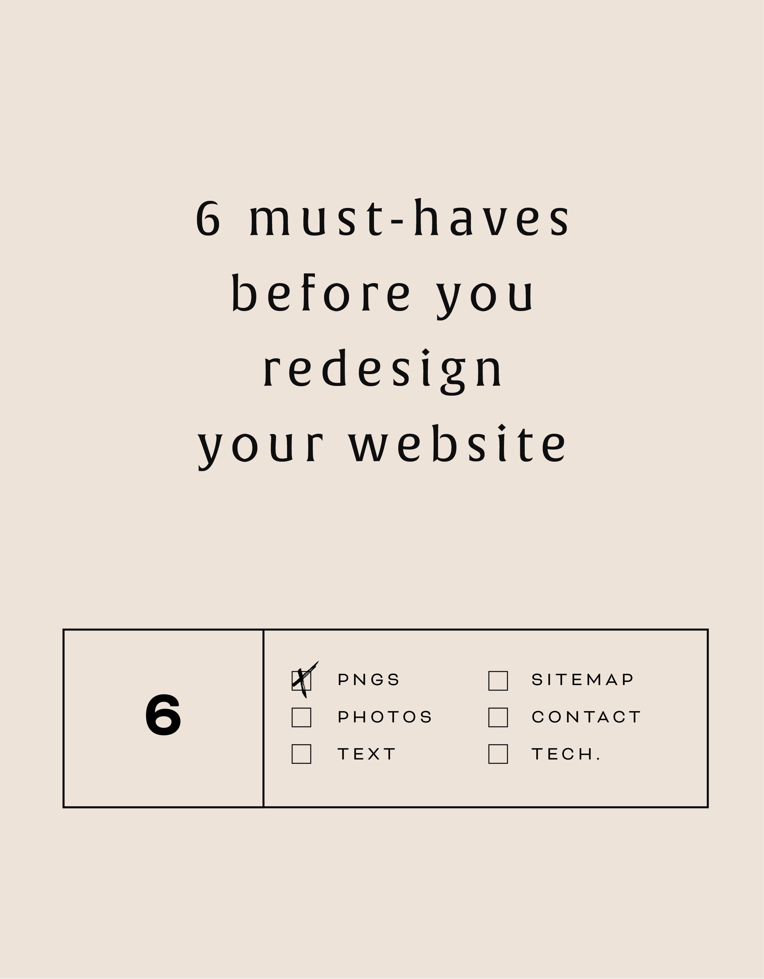
6 must-haves before you redesign your website
Getting ready to start a new web design project? Make sure you have these pre-design details to help you prepare for a successful web launch!
Getting ready to start a new web design project? Make sure you have these pre-design details to help you prepare for a successful web launch!
6 MUST-HAVES BELOW:
01. PNG logo files
PNG files ("image.png") are most compatible with screen viewing. JPEG files often have a different color format which can make the colors appear lighter on screen.
02. Photos
Have your headshots ready to roll so they can be easily accessed and uploaded. They should be high-res enough for the web, meaning at least 2000px wide, but not too high-res. Limit your photos to 20 MB or below.
03. Sitemap
A sitemaps is really just a fancy web-word for your list of pages. Knowing what pages you need on your site helps you divide your content appropriately.
04. Text for each page
So important and the item that always the hardest to finalize, text or 'copy' as it's sometimes called, will help you or your designer lay out the design of each page. Having your text before you begin also let's you think through how you'll guide your audience through the site.
05. Contact Info
How do you want potential clients to get in touch with you? Having a form or scheduling system on your site along with your email address let's your audience know exactly what you want them to do.
06. Technical Details
Make sure you have purchased your domain name and have the login info ready. Ditto for newsletter software (MailChimp, ConvertKit, etc) and social media accounts. Having this all in one place saves time when it comes time to connect them to the site!
By doing just a little bit of website homework, you'll be ready to hit the ground running when your project starts!
LOGO PROCESS: EMBRACED PODCAST
This little logo process is from the branding process for Embraced Podcast, a podcast about women empowering women.
This little logo process is from the branding process for Embraced Podcast, a podcast about women empowering women. Having dabbled in the podcasting world for a hot second, I was excited to brand someone else's podcast! The branding to needed to embody women who share their strength, courage, perseverance, and self-love. Um... hell yes! Feminine strength was the design direction.
Below are several of the concepts and variations created before we nailed down the final logo.
WANT to CREATE
a custom LOGO?
How to Make Your Podcast Cover Design Stand Out and Get Clicks
In the ever-growing sea of podcasts, it’s hard to get new listeners. Here are a few thoughts on how to create that moment of engagement when a potential new listener clicks on YOUR podcast cover verses someone else’s.
In the ever-growing sea of podcasts, it’s hard to get new listeners. Imagine this: you head to iTunes ready to plug into a podcast, but not sure what you want to listen to. Maybe you type in a search for “business” or “murder-mystery” just to see what comes up. Now… which podcast is the one your eye goes to first? Which engages you enough to make you give this new podcast your attention?
Are you wondering which it is? Here are a few thoughts on how to create that moment of engagement when a potential new listener clicks on YOUR podcast cover verses someone else’s.
Start with the basics
Use JPEG or PNG file format (no PDFs or GIFs)
Use RGB colors (no CYMK or Pantones)
Minimum size should be 1400 x 1400 pixels
Do not use any official Apple’s imagery (not even a photo of iPhone)
Make sure art clear and text is readable even at thumbnail sizes
Keep the design simple
If you’re looking through all of the podcasts, it can be overwhelming for your eye. Your likely to find yourself intuitively stopping on a podcast cover design that’s simple, without lots of text or graphics. That’s because your eye is searching for a place to rest as it washes over a sea of content. It’s overwhelming! So keep your layout simple with a simple 1-color background, 1-2 fonts, and maybe 1-2 easy-to-see graphics.
Share what it’s about
Obvious, but you should have your podcast title on there. If you’re title is long or has a subtitle, just include the main info. You can also share what your podcast is about by adding a simple graphic or photo that showcases your theme. You definitely don’t have to do this, and an alternative is to choose a font that represents the tone of your show. Fun and funky? Use a a unique, playful font. All about wedding planning? Maybe a script or whimsical handwritten font. But be careful here - your font choice should be readable (especially at small sizes) and shouldn’t be too gimmicky or distracting.
Choose imagery thoughtfully
Don’t use images of a microphone or headphones to represent podcasting… we already know it’s a podcast! In the same vein, avoid generic imagery that doesn’t describe what makes your podcast different. For example, a podcast for yoga studio owners would be better served by an image that showcases your unique thoughts than a generic yogi meditating or lotus flower.
Layout + Color
Since you are trying to keep the podcast cover design fairly simple, color can be tricky. Try to choose one main color to work with, maybe for use as the background. Then use 1-2 more colors as accents. When it comes to layout, get creative here! Maybe your title creates a unique shape or has a unique text-treatment like an outline. By breaking the rules of a typical layout a little, you create visual interest without adding any clutter.
MOST IMPORTANTLY!
The most important tip I can share to help make your podcast cover design stand out is to stay true to your brand. You already have something unique to share, and your branding should reflect that. Being consistent with your branding includes your podcast cover design. It should make your branding colors, website and all other collateral so that your audience recognizes your brand no matter where they’re engaging with you!
Editing Your Website's Footer
Your website footer can be the home for all types of quick links and information your site needs. Learn what you should include in your footer and how to update this section of your design through this tutorial!
Your website footer can be the home for all types of quick links and information your site needs. Learn what you should include in your footer and how to update this section of your design through this tutorial!
IN THIS VIDEO I COVER:
How to make your website look more professional with footer content
Suggestions on what to include in your footer
Show Notes
0:34 Editing footer
0:43 Deleting text box
0:50 Styling the footer


