HOW TO MAKE A MOOD BOARD
Mood boards help align the aesthetic, color palette, and tone of a project. They get me on the same page with my clients. They can also help get the ideas out of my brain (or off of Pinterest, if I'm wedding planning) and into a clearly organized visual hierarchy.
Mood boards are so crucial to everything I do that's visual. Starting a logo project? MOOD BOARD! Re-decorating my living room? MOOD BOARD! Planning my wedding visuals? MOOD BOARD!
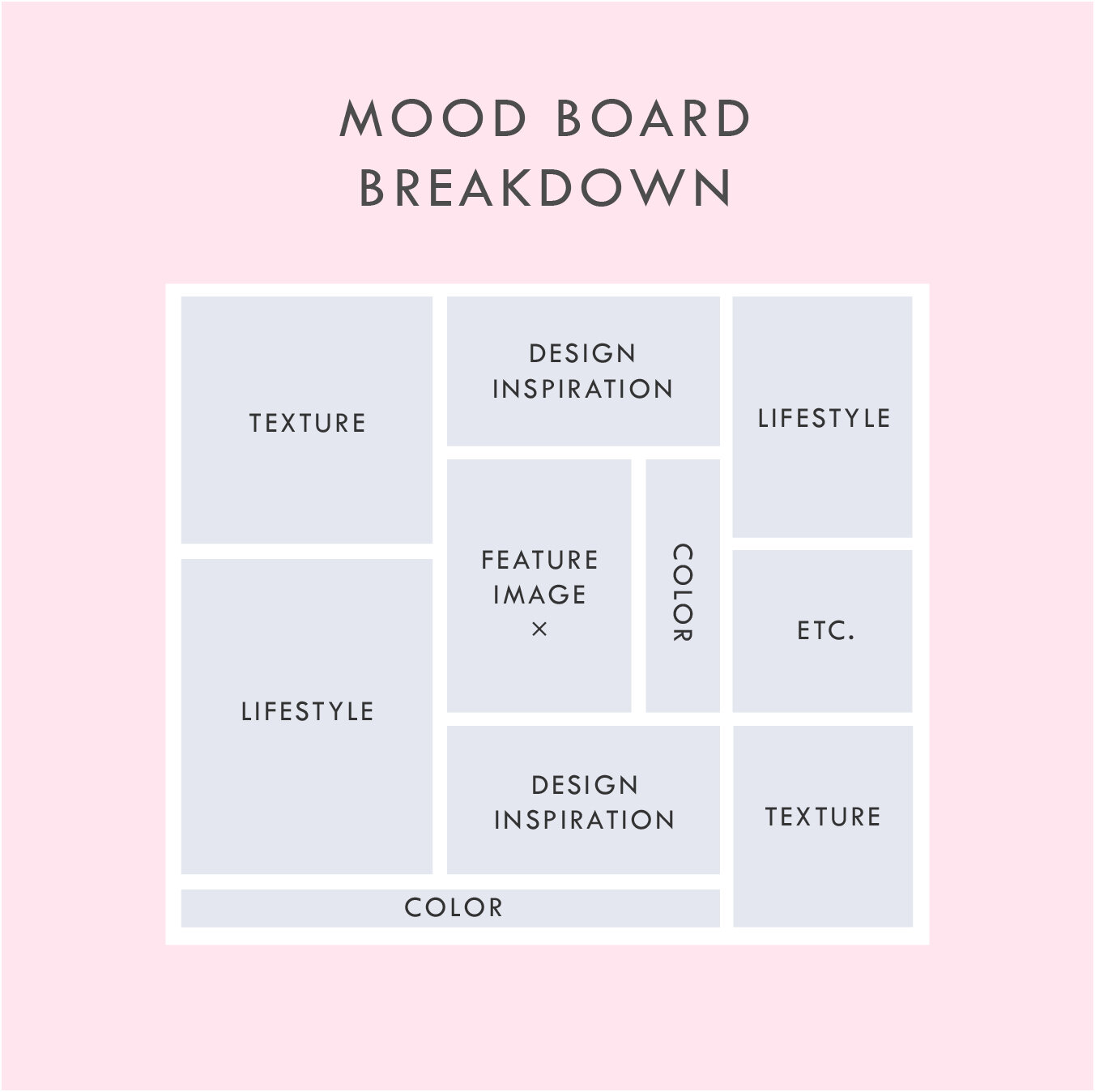
Mood boards force you to select the crucial images that best represent the style of whatever you're getting ready to create. I go a step further and make sure to pick images that include the following:
texture
design elements / inspiration
lifestyle images
color palette swatches
Above is a breakdown of how I organize a sample mood board which each of these elements.
In addition to the elements listed in this mood board layout, you can see that I also have a space for a "feature image" right in the middle. This should be the core mood / style / feeling of the project. It should be whatever resonates with you the most.
I also have a space for whatever else makes sense for the brand or project. I called this "Etc." This can be any image or detail that you find is inspirational but may not fit the other elements.
A good mood board should help keep you visually focused as you move into the next phases of the project.
If you'd like some inspiration, try this or this!
If you'd like to try your hand at creating your own mood board, I've got three free mood board templates you can download here! These are in PDF format, which means you can open them in most design programs.
NEW!
a templated guide to
messaging magic
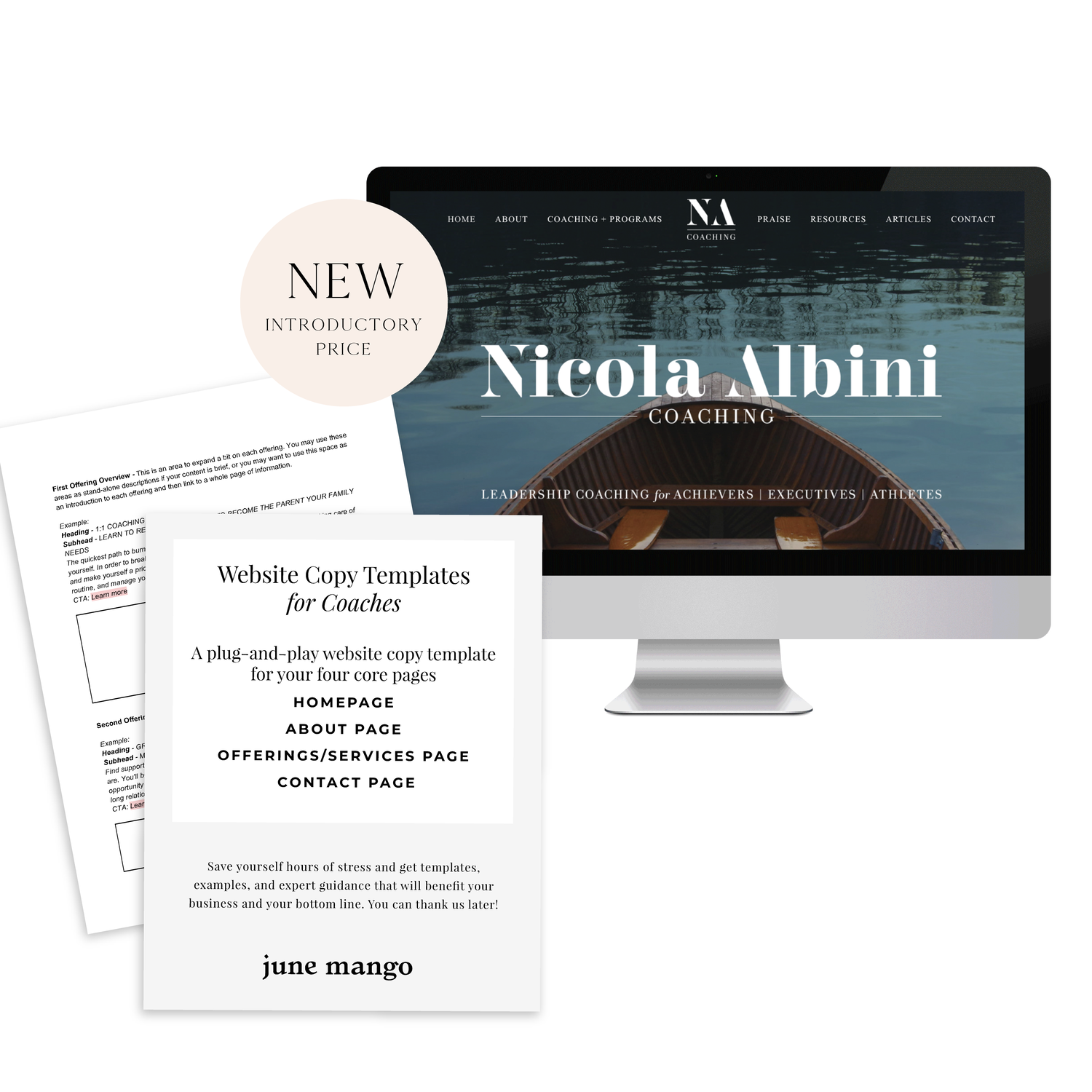
A plug-and-play website copy template for your four core pages (Home, About, Offerings, Contact). Save yourself hours of stress and get templates, examples, and expert guidance that will benefit your business and your bottom line.
get your template now >
ENGAGED, A WEDDING PODCAST
I can't believe it's taken me this long to post about the branding and web design for my podcast, Engaged! This is one of my fave projects to date. I started this podcast because I was feeling a lack of authenticity out there in the wedding industry. It often feels like a lot of fluff (bouquets and sequins and napkins, oh my!) and not a lot of real talk. What if you're planning the wedding while you two live in separate places? Or how do you plan a wedding if you just want to have a barefooted love party in your backyard? (Hint: Here's how). What do you do if you start planning a wedding and then find out your pregnant! Yep, that's a future episode.
It's been great to get advice and hear real stories from couple who've done the wedding planning dance. But of course, I can't do anything without branding it! #designerd
This is just a peek at the website's design. If you want to see more of the website or listen to some of the episodes, head on over this-a-way. We'd love to have you listen!!
Related Posts
need even more help with squarespace?
Skip the overwhelm and have your website designed and launched in just 5 days (or less)!
LEARN MORE
STOCK PHOTO GUIDE · PART 1
Stock photos can be a fabulous asset to your marketing and web design projects. They can lend a helpful hand in creating a gorgeous project, but make sure that hand doesn't end up as a crutch where you just grab any old photo. These are my go-to tips for choosing the right stock photo for YOU.
Stock photos can be a fabulous asset to your marketing and web design projects. They can lend a helpful hand in creating a gorgeous project, but make sure that hand doesn't end up as a crutch where you just grab any old photo. Below are my go-to tips for choosing the right stock photo for YOU.
DON'T -
Go right to the old standards. Pictures of people in business suits jumping, a man pulling his hair out, anyone with a blank white sign.... just don't do it. It's overdone and makes you seems instantly outdated and unoriginal. Plus, they look unnatural, and there's a good chance that people have seen the same (or similar) images elsewhere, which may be bad for your brand depending on what associations they have with these images.
Disregard color. The photo shouldn't be really dark and moody if you're website is mostly pink and yellow. Look for stock photos that have a similar color palette or lightness/darkness to match your project.
Be afraid to edit. Throw that image into Photoshop to crop it, change a color or delete an element that doesn't fit. You don't have to feel limited to what you get when you press download.
DO -
Aim for creativity. You're stock photos should be a curated collection of high-quality photography that doesn't feel phony. Those stock photos with people smiling as they eat their Cheerios scream S-T-O-C-K. No thanks. People want to see modern, relevant, authentic images. Images people can relate to are worth the coveted space on your website or marketing materials.
Refine your search. Most stock photo sites allow you to filter your search results. Take advantage of these tools to search for the photo that will fit best for your project. Need to overlay text? Look for a photo with a composition that includes copy space. Looking for one person, a group or just an object? You can filter by number of people, too.
Accurately reflect your brand. Asking yourself if the photo makes sense for your brand is the most important element of choosing a good stock photo. If you are a marketing towards women, you likely won't benefit from using a photo of a tattoo-covered biker dude (unless these woman like that sorta thang). Make a rule to choose stock photos in the same style for consistency. Use rules like color palettes, similar lighting, white backgrounds only, etc. Whatever matches your brand style.
Hopefully you feel armed with a stock photo plan of action. Using these tips above, you'll be sure to have a gorgeous and consistent look to your project. Check back for Part 2 of this post series where I'll dive into all my favorite paid (and a few free!) stock photo sites!
Related Posts
need even more help with squarespace?
Skip the overwhelm and have your website designed and launched in just 5 days (or less)!
LEARN MORE
BRANDING- BEYOND THE LOGO
A brand is a lot more than the fonts, colors, and design elements that make up the visual brand identity. Branding ultimately is the identity of the business if you were to whittle it down to it's core. So, how do you start to carve that baby down?
So you've seen a lot of lovely little logos on Pinterest and are ready to brand your biz! Heck ya, let's do it! But let's make sure we do it right.
So, how do you start to carve that baby down?
Let's start by thinking about what you want to be known for? This could be a service offering or product. It could also be the way you work with you clients. what makes you the best florist in Northern Michigan, for example? What do your clients value about working with you?
Once you have that nailed down, it's time to narrow in on what you have. Look through your answers to the above questions and ask yourself what's essential and what's just bonus material. This may not be the easiest exercise, but consider what feels like it could really elicit the most powerful brand or what the client would tell someone else about you.
Now, try to narrow it down even further. See if you can get this down to just three words. And try to make them pop a little - you want to stand out right. For example, I may be creative, multifarious and efficient but does that make you really excited to take on a design project with me? Probably not.
Make it easy for people to buy from you, not that other guy. Think about what you want your brand to be at the core, and then jazz it up a bit to differentiate yourself. Once you do this, you are ready for a kick-ass, colorful, clean logo design.
Related Posts
NEW WORK: SWEETWATER LAVENDER FARM
when someone tells me they want me to create a brand identity and landing page around that, well then I just lose it. I loved working on this project so, so much. I'm so excited to see how Sweetwater Lavender Farm grows and all the exciting things headed their way.
When someone tells me that they're quitting their job to buy a lavender farm and pursue their dreams in Northern Michigan, I make weird high-pitched noises and feel all fuzzy inside. Say wha?? You're going to grow lavender and open up an adorable shop? You're pursuing your dream with passion and intention? Hell. Yes.
And when someone tells me they want me to create a brand identity and landing page around that, well then I just lose it. I loved working on this project so, so much. I'm so excited to see how Sweetwater Lavender Farm grows and all the exciting things headed their way.
Related Posts
need even more help with squarespace?
Skip the overwhelm and have your website designed and launched in just 5 days (or less)!
LEARN MORE
HOW TO BRAND YOUR INSTAGRAM GRID
There are several ways to brand yourself and ultimately grow your dream-following on Instagram. (A dream-following is made up of an audience who is genuinely interested in your content + your brand and will therefore be more likely to buy from you).
If you're like me, you probably love scrolling through Instagram and seeing the gorgy photos other creative entrepreneurs are posting. I definitely do. I can get sucked into an Instagram time warp and lose hours staring at styled posts and pretty feeds! And you know what I do after I find a beautiful Instagram account? I follow them! Obvi.
There are several ways to brand yourself and ultimately grow your dream-following on Instagram. (A dream-following is made up of an audience who is genuinely interested in your content + your brand and will therefore be more likely to buy from you).
When a new person stumbles upon your Instagram account, they will likely take a peek at your account's grid. (The grid is made up of all the images you've posted to date that fall below your account info). A cohesive grid will do wonders for converting passing 'grammers into steadfast followers. Below are a few things you can do to polish your Instagram grid.
Pick an aesthetic theme.
This can vary depending on what works best for you, but there should be some consistency to what your posting. Make a rule or two for yourself and STICK TO IT. A few good options include:
Picking a color palette. (ie: pastels, rustic neutrals, crisp whites + greys)
Picking a style. (ie: minimalism, bright + bold, dark + moody)
Picking a limited number of interests. (ie: beauty, interior decorating, your baby + your pup)
Here are some great examples of real people who have used a theme to create a gorgeous brand on Instagram:
Create a strategic grid.
Before I post anything, I take a look at my previous posts. How will the new photo look in my grid? Here are three questions to ask yourself before posting:
How does this image look next to the last photo I posted?
How does this post look above the photo that will be under it?
Do the colors of the new image coordinate with these two photos?
Does the layout coordinate with these two photos (ie: avoid photos with lots of detail from being side to side. It's hard on the eyes.)
Here are some great examples of real people who have created a strategic grid on Instagram:
Critique your current grid.
If you begin posting in a new style based on the tips above, don't be afraid to edit your previous photos. Deleting images that don't fit in can help visually clean up your feed and create a consistent look, which will help you appear more put together as a brand on Instagram.
Hopefully these tips help you craft a branded Instagram grid! If you have any additional tips that I missed, please let me know in the comments.
STOCK PHOTO GUIDE · PART 2
Best stock photo sites for your blog or website
In my last post, I talked about how to pick the right stock photos for your blog or personal brand. In part 2 of this post series, I want to dive into where to find the best stock photos. There are so many sites out there that offer both free and paid photos. But a lot of them don't even come close to offering an authentic product. So where should you start your search for cool, creative photos? Dive down to my curated list of free stock photos below.
Best Free Stock Photos
Unsplash This website adds 10 new royalty-free photos every few days, and the photos consist of breathtaking landscapes and unique portraits.
Picjumbo This is a great one for food or nutrition bloggers since they have some awesome food photography. The photos also have a little less of a hipster vibe if you're looking for something traditional.
IM Creator This is such a well organized collection of photos. This site also has web templates and other goodies to assist with your website. The catch: attribution is required.
Death to Stock Photo With 10 free photos every month just for signing up, this site offers curated images that are really high quality. You can also purchase the premium membership for access to over 400 photos.
FancyCrave These are great for both commercial and personal projects. With two new photos added daily, there's a pretty giant selection to choose from!
Stocka If you're looking for 'product' photos or images with a clean, white background, Stocka is perfect.
Splitshare Another great resource with a lot of photos to choose from. It's also organized really well making it easy to search and find exactly what you're looking for.
Pexels This is one of my faves for it's colorful, creative selection. These photos are perfect for blogs and websites.
Startup Stock Photos These are more business-oriented, but are great if you're looking for a computer / desk shot.
Gratisography Looking for the opposite of corporate stock photos? Look no further. These quirky (sometimes creepy?) photos are anything but the same old stock photo.
stocksnap.io This site offers high-res, photos with a handful of unique layouts and compositions.
Jay Mantri This lady has some gorgy photos. Most consist of destinations and amazing texture shots. It's set up like a photo blog, so it's a bit hard to search, but they're worth getting lost in.
Designer Pics These photos have a faded, yet colorful feel. They're really unique and perfect for the right niche.
finda.photo This site is made for the phrase 'last but not least'. This site is brings together tons of free photos from a lot of the sites I've listed above. It has a robust search engine that lets you narrow down your choices through filters like color, collection (landscapes or close-ups) or source (unsplash or Jay Mantri). In short, it's awesome.
Related Posts
NEED EVEN MORE HELP WITH SQUARESPACE?
Skip the overwhelm and have your website designed and launched in just 5 days (or less)!
LEARN MORE
KYLEE ACKER BRANDING PROCESS
This is a behind the scenes peek at the branding process. The goal was to really showcase her initials since this is her personal brand. The trick was to make both the K & A recognizable because each letter is of equal importance. Th color palette combines classic neutrals with a slightly feminine, but not overpowering pop of pink.
Every designer has a slightly different process. Some designers like to share just 2-3 design concepts, and some like to share 10+. I'm somewhere in the middle and tend to share 4-6. I think that gives enough variety without overwhelming my clients. Too many choices can be paralyzing and ineffective.
Remember that hella stylish mood board I shared recently? This is a behind the scenes peek at the branding process. The goal was to really showcase her initials since this is her personal brand. The trick was to make both the K & A recognizable because each letter is of equal importance. Th color palette combines classic neutrals with a slightly feminine, but not overpowering pop of pink.
Which one would you choose?
Related Posts
LOGO PROCESS • RLS FASTPITCH
I like to give six logo concepts to my clients, because this feels like the perfect number. It's the Goldilocks of branding ( not too overwhelming and more than just a few options ). I know everyone's process is a bit different. Some designers only give three logos. Some give 15+. But I feel like I can nail down enough concepts to get the ball rolling and have each be creative and unique with six. Too many more than six and my creative juice stop flowing. Plus, I have found that my clients often feel paralyzed by the decision if there are too many to choose from.
I thought it might be nice to show some behind the scenes details for those curious about my branding process. These are six logo concepts that I designed for RLS Fastpitch. Although we ended up going through a few more iterations before we nailed down the final logo, these were a great starting point.
I like to give six logo concepts to my clients, because this feels like the perfect number. It's the Goldilocks of branding ( not too overwhelming and more than just a few options ). I know everyone's process is a bit different. Some designers only give three logos. Some give 15+. But I feel like I can nail down enough concepts to get the ball rolling and have each be creative and unique with six. Too many more than six and my creative juice stop flowing. Plus, I have found that my clients often feel paralyzed by the decision if there are too many to choose from.
The other thing about my logo process is that all of these logos are black and white. I find that color can be distracting, especially in the beginning. Once a client nails down one or two logo concepts, I implement color in the next round. I sometimes include the color palette direction along side the black and white logos, which is what I did here. This helps give them an idea of the logos as a whole ( design + color ).
Related Posts
5 SIGNS IT'S TIME TO LEVEL UP YOUR BRANDING
There are lots of reason to give your business a branding refresh. Depending on where you are with your business or blog, it may be time for you to rethink your current design identity. Here are five of the most common, and most necessary, signs that it's time to upgrade your branding.
There are lots of reason to give your business a branding refresh. Depending on where you are with your business or blog, it may be time for you to rethink your current design identity. Here are five of the most common, and most necessary, signs that it's time to level up your branding.
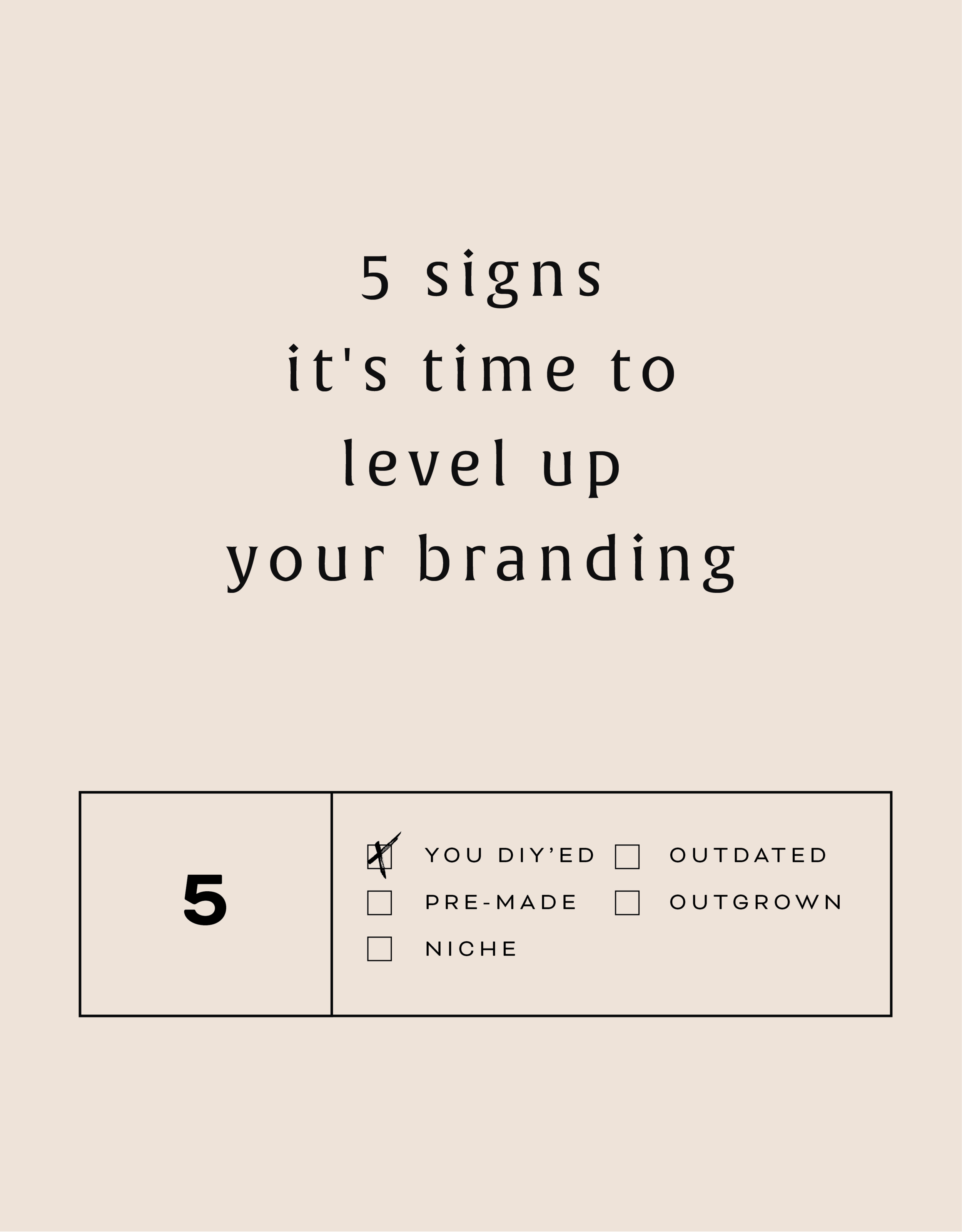
1 - You made a DIY logo because you have the philosophy that "Done!" is better than "Perfect"
You wanted to launch your business or product and didn't have time to invest in full-blown branding. Now that you've settled into steady business, you're looking for a more professional look that showcases your growing biz.
2 - You bought a pre-made logo
Etsy has some damn fine design, let me just say. If you are one of the many shoppers who purchased a pre-made logo from a creative market like Etsy, you may have a cute logo, but you may also share it with countless other businesses. Time to develop a logo that's unique to you.
3 - You've officially defined your niche
Maybe you are a photographer that started out snapping shots of everything from babies to interior design. Now that you've settled into your work, you've decided you'd like to focus on weddings and engagements. Make sure your logo reflects your niche market.
4 - It's outdated or you just don't like it
You may have created your branding materials years ago and feel that they just aren't working for you anymore. Perhaps you wanted your logo to follow a trend that now feels outdated. Put simply, you just don't love it.
5 - You're business has outgrown you
You started a one-woman shop but have grown into a small business with - yay! - employees. You may even want to change your business name from something that is personal ( ie: Kali Edwards Creative ) to a something a more over-arching name.
This isn't as daunting as it sounds. Finding a designer you jive with (heyyy!) and who will help you through the process will allow you to love your branding and continue to grow your business!
Any of these apply to you? More than one even? It may be time to consider giving your brand a simple refresh.
Related Posts
BRANDING FOR PHOTOGRAPHERS
Whether you’ve just launched your photography business or are a seasoned veteran looking for a brand refresh, there are four main ideas to help you find your focus.
1. Be distinctive
The kind of photography you focus on is the most important item to consider before you begin a logo or branding project. Are you a food and styling photographer, wedding and family photographer, or an urban street photographer? These are all such vastly different styles of capturing a moment that they will require completely different branding approaches. Now we can narrow it down from here.
2. Brand it, #boss
How do you take your unique photography niche and turn it into a beautiful brand?
Answer: Style. Find that emotional connection your style has with your customers. A bride-to-be has seen your most recent engagement shoot and just adores the way you captured the couples love. She wants that romantic feeling for her engagement shoot, too. Allow your branding to reflect that romance you bring to your photography. Show this bride-to-be and any other that when they hire you, your photography style will make her swoon. Maybe that means using calligraphy in your logo or creating a soft and feminine color palette. Keep asking yourself throughout the process, "Is this in line with my style?" This emotional tie into your branding elements will give clients a sense of your approach before they even chat with you.
3. Work your website
As a photographer, your website is so important. This is the best place to showcase your photos. Organizing them into galleries and recent shoots will help your future client visualize their own photos. Continue the emotional experience of your brand by telling a fluid story to your customer. A good example may look like this:
Click … HomepageIntroduction to Drizzle Food Photography and Styling, where I am inspired by ingredients and abundance in the kitchen.
Click … Gallery A collection of gorgy examples of past photo shoots for dreamy clients and delish dishes.
Click … Contact How to get in touch to book my unique and valuable photography services.
Let the photos do the talking. On your website, the branding should act and an important accent that underscores your photography style.
4. One step further
As the savvy photography business owner you are, you know there’s more to branding than just the logo and website. Social media (styled photos anyone?), photo flyers and media kits are all places to expose your branding and your business. Think about each client’s experience from beginning to end. From finding you on Instagram to thank you stationary, gather all your pieces and review what you have. Make sure it conveys the emotion and style of the photos you take.
In the end, it should all be in line with your vision, mission and fabulous photography.
BRANDING FOR FLORISTS
I'm starting a new blog series called "Branding for...". In these posts, I will highlight a creative industry and zero in on some key how-to's for:
• Communicating your mission
• Translating your passion into a unique brand identity
• Inspiring your dream clients to work with you
• Creating a winning website
• Finding the "joy" job (you know, the client and project that ignites your passion!)
Let's dive in, shall we?!
I'm starting a new blog series called "Branding for...". In these posts, I will highlight a creative industry and zero in on some key how-to's for:
Communicating your mission
Translating your passion into a unique brand identity
Inspiring your dream clients to work with you
Creating a winning website
Finding the "joy" job (you know, the client and project that ignites your passion!)
Let's dive in, shall we?!
Branding for Florists
Whether you've just launched your business or are a seasoned veteran looking for a brand refresh, there are four main ideas to help you find your focus.
1. Be distinctive
What makes you unique? What is the thing that makes your floral business stand out from all the rest. Is that you grew up in Hawaii and have a deep-rooted love for all things bright and tropical? Is it that you are a hopeless romantic at heart and derive deep joy from bringing a wedding to life through floristry? What makes your clients love you and your work?
2. Brand it, #bossbabe
How do you take your unique-ness ( see above! ), and turn it into the most fantastic florist branding ever?
Answer: Emotion. Find that emotional connection your style has with your customers. A bride-to-be has seen your whimsical hanging eucalyptus installation on Pinterest and has fallen in love. She wants that romantic feeling for her big day, too. Allow your branding to reflect that romance you bring to your floral design. Show this bride-to-be and any other that when they hire you, your floral arrangements will make her swoon.
You create an emotional connection through your branding based on the patterns, colors and fonts you choose to marry into a uniquely perfect fit for your business. Done right, clients will have a sense of your style before they even chat with you.
3. Work your website
Branding doesn't stop with your business cards. Your brand needs to carry through to your website, too. Now is the time to consider your dream client's journey through your site. Yes, I said journey. Think about where they will start (homepage, blog?) and where you want them to end up (contact page, portfolio?). Continue the emotional experience by telling a fluid story to your customer. A good example may look like this:
Click ... Homepage Introduction to Sweet Pea Floral Design, where my mission is to create seasonal arrangements that are whimsical and romantic.
Click ... Portfolio A collection of gorgy examples of past work for dreamy clients.
Click ... Contact How to get in touch to book my unique and valuable services.
Thinking about how a potential customer will wander through your website will allow you to create the right structure, content and navigation.
4. One step further
As the savvy floral business owner you are, you know there's more to consider. Social media ( header images, profile pictures, behind the scenes Instagram shoots ), advertisements and media kits are all places to carry over your branding. Think about each client's experience from beginning to end. From ribbons to store front signs to thank you stationary, pull everything together and review what you have. Make sure to ask yourself if it sends the signals to the right kind of clients. In the end, it should all be in line with your vision, mission and style.


