BREAKING THE BOUNDARIES OF MOOD BOARD MOSAICS
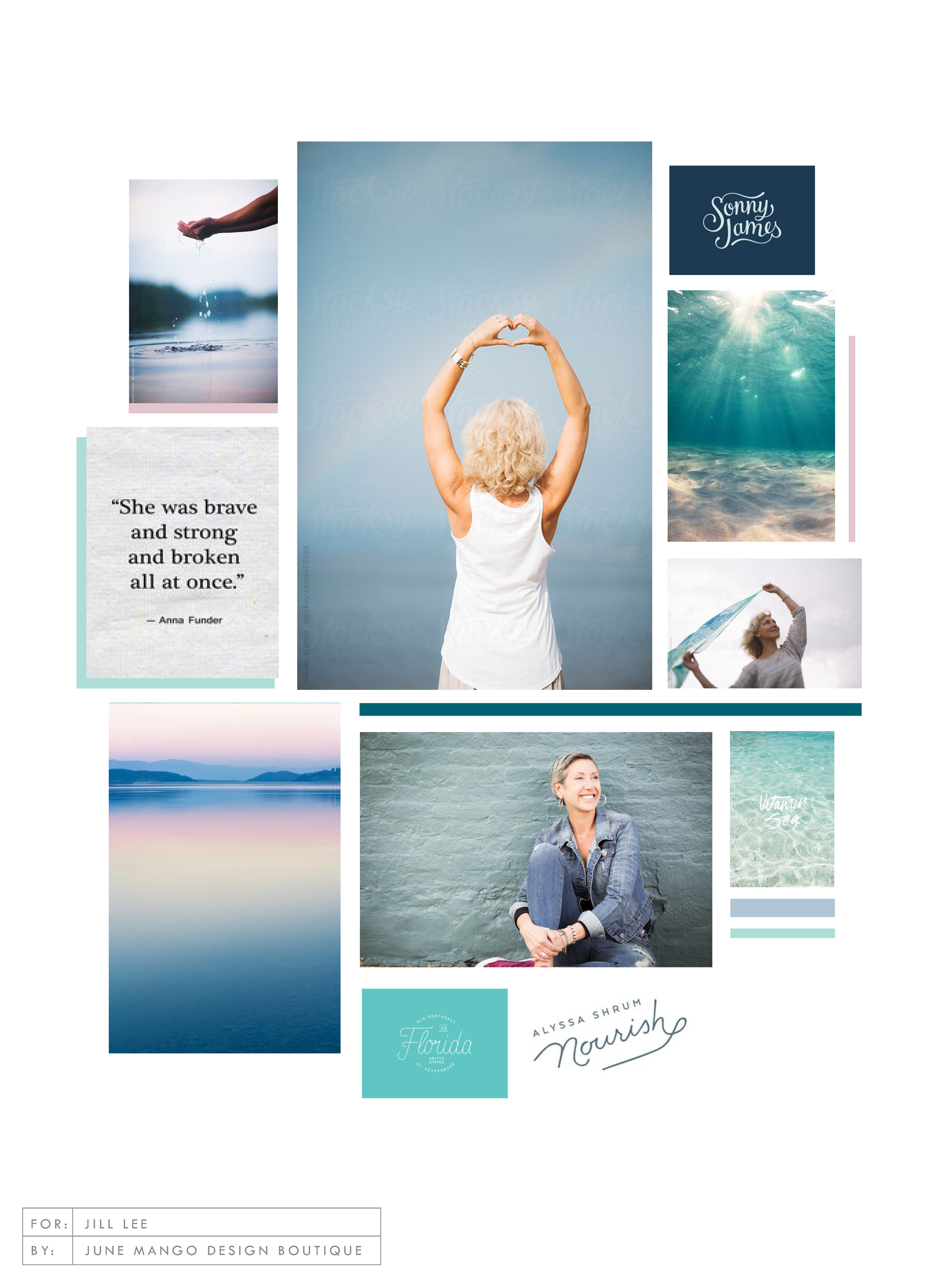
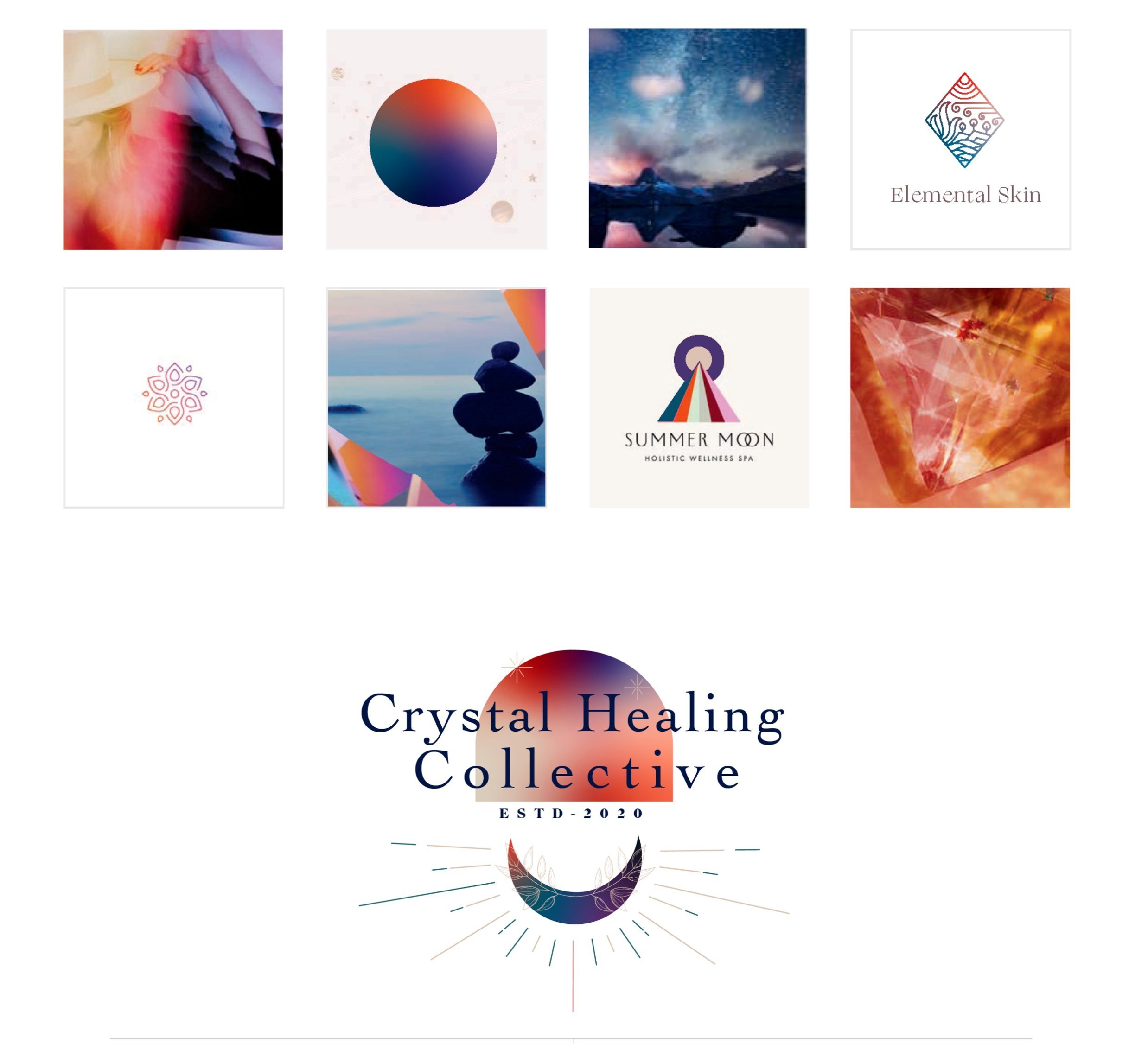
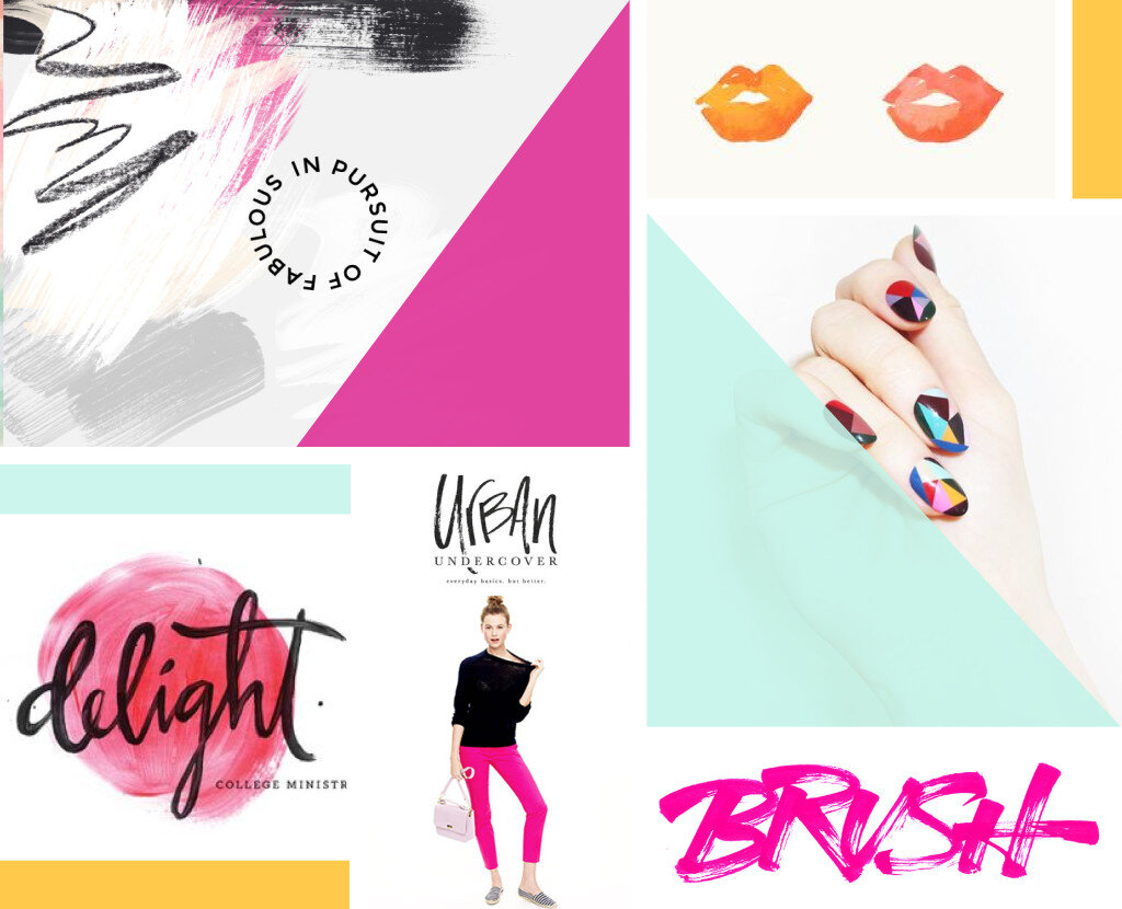
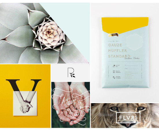
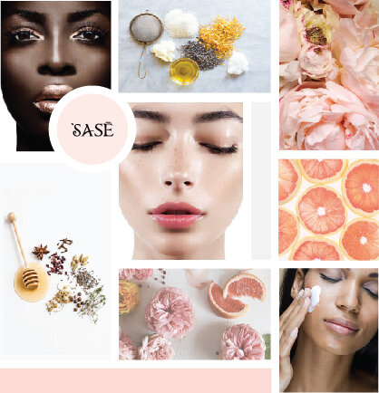
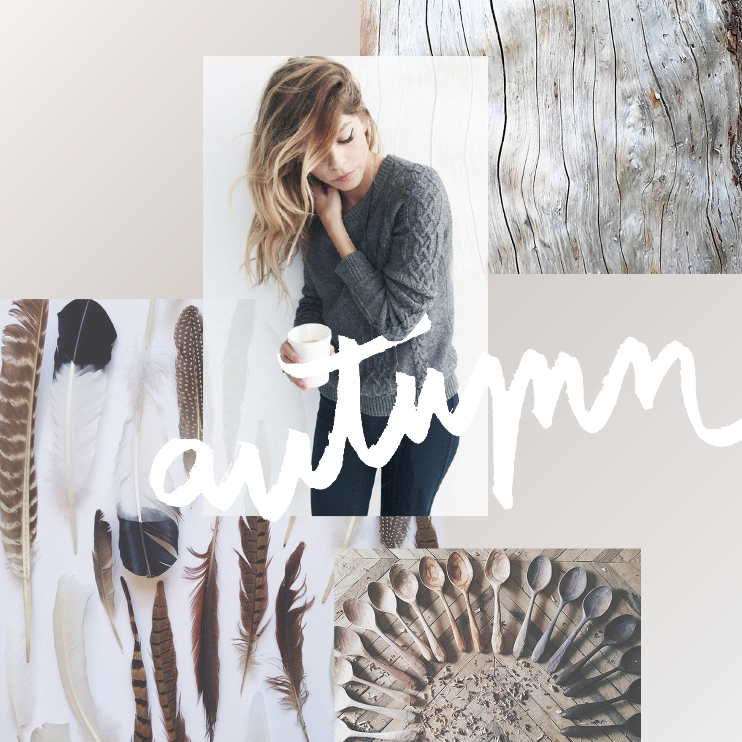
Totally deconstructed. More white space, more breathing room. More color blocks, but all integrated into the collage vs. being stacked together. Still a brand-focused lifestyle image at the center grounding the collage as well as the brand. And little, layered type elements.
I think all designers have a touch of Creative ADD. All of my favorite designers are constantly changing and pushing their brands + the creative processes to be better, cooler, or more unique.
I have this ADD too, and recently I've been itching to bust out of the standard mood board mosaic design. It's just EVERYWHERE, and frankly, I'm bored. And here's a little secret: boredom = creativity's best friend. Being bored makes me want to shake it up! Create something new and funky! Get weird and wild! Design-wise, that is. :)
So here's where I ended up on a the new make-up of my mood boards.
Totally deconstructed. More white space, more breathing room. More color blocks, but all integrated into the collage vs. being stacked together. Still a brand-focused lifestyle image at the center grounding the collage as well as the brand. And little, layered type elements.
I think mood board collages + color are my love language. ❤️
So what do you think? Love it? Hate it? Wanna live in it (I do!!). I'd love to hear your thoughts on the new mood board so feel free to holla at me!
Related Posts
GET THE MOST OUT OF YOUR MOOD BOARD
Have I told you how much I love mood boards? They are crazy-crucial for my design process to make sure I'm on the same page with my clients. They probably take the most time out everything I work on in a branding project. I spend so much time curating images to make sure it's just right.
Why?
Have I told you how much I love mood boards? They are crazy-crucial for my design process to make sure I'm on the same page with my clients. They probably take the most time out everything I work on in a branding project. I spend so much time curating images to make sure it's just right.
Why? Because it sets the tone for the rest of the project.
I show these mood boards to a client and invite criticism because it should be dead-on with their brand vision.
If it's not, discussing what works and what doesn't gives me valuable feedback that I use to dictate what comes next: the logo design. The mood board is like the essence of the brand, boiled down into one big ol' beautiful soup-o-squares.
So how can you make sure you
get the most out of your mood board?
Think about how you feel when you look at the mood board as a whole. This is honestly the most important item. What mood does it convey? What emotions do you feel? What actions do you want to take? These should be in line with what you want others to feel when they see you brand or website. It should be dead on. And if it isn't...
Think about what doesn't fit that mood. Is there an element that's giving off the wrong vibe? Maybe some of the graphic elements or colors aren't quite right. You can even try covering the offending element to see if the mood board works without it.
Consider the big picture. Sure, it's on trend and the colors are pretty, but does it really work for all the visual platforms you'll be using to tell your brand story? Make sure the mood board will allow your brand to live online, in print and anywhere else you will run your biz.
Are you proud of this de sign? Do you want to show your mom, you're biz bestie or even your cat? AWESOME! You should love it and be excited to show it off to your future clients. It will be the direction for your beautiful business, after all.
If you look for these key items when critiquing the mood board for your brand's direction, you should easily get the most out of the mood board process.
Ready to get the mood board party started?
Head this-a-way to try your hand at a DIY mood board.
NEW WORK: AMY KURETSKY ACUPUNCTURE WEBSITE
Amy Kuretsky is an acupuncturist and health coach who is killing it with awesome health tips and an awesome holistic approach to life and business. She shares some of her insights via Periscope on the daily, so definitely check her out there.
We created a website that really showcased her personal brand and expertise. Lots of (super informative) content get broken up by graphic elements and client testimonials. I am very slightly obsessed. Plus, we rocked it out in just 5 days.
See more of the website and give Amy some heart eyes this-a-way.
NEW WORK: STEMS AND SPRIGS SQUARESPACE WEB DESIGN
This SquareSpace web design project has me feeling all fuzzy inside. This lovely little site was created for a florist in Northern Michigan who A) Is one of the sweetest ladies I've ever virtually met, and B) Makes the most gorgeous floral designs EVAH.
This SquareSpace web design project has me feeling all fuzzy inside. This lovely little site was created for a florist in Northern Michigan who A) Is one of the sweetest ladies I've ever virtually met, and B) Makes the most gorgeous floral designs EVAH.
Kalin, the owner of Stems and Sprigs, had a SquareSpace website set up but just couldn't seem to align the layout and design with her brand. We worked together to create a soft, feminine, and sophisticated feel for her website that now allows her to truly broadcast her brand in an authentic way.
Take a peek at the results below.
Related Posts
NEW WORK: SWEETWATER LAVENDER FARM
when someone tells me they want me to create a brand identity and landing page around that, well then I just lose it. I loved working on this project so, so much. I'm so excited to see how Sweetwater Lavender Farm grows and all the exciting things headed their way.
When someone tells me that they're quitting their job to buy a lavender farm and pursue their dreams in Northern Michigan, I make weird high-pitched noises and feel all fuzzy inside. Say wha?? You're going to grow lavender and open up an adorable shop? You're pursuing your dream with passion and intention? Hell. Yes.
And when someone tells me they want me to create a brand identity and landing page around that, well then I just lose it. I loved working on this project so, so much. I'm so excited to see how Sweetwater Lavender Farm grows and all the exciting things headed their way.
Related Posts
need even more help with squarespace?
Skip the overwhelm and have your website designed and launched in just 5 days (or less)!


