
What works (and what doesn't) on an effective website
Websites are living, breathing things. Websites evolve and change and so does the way users interact with your website. There are lots of web design trends and even some commonplace design layouts that everyone assumes are great - but are they really?

Websites are living, breathing things. Websites evolve and change and so does the way users interact with your website. There are lots of web design trends and even some commonplace design layouts that everyone assumes are great - but are they really?
Here are some real statistics that show what makes an effective website - and the mistakes that hurt your bottom line.
01. Custom images are better than stock
You may well know that those goofy stock images of a girl smiling with salad are pretty lame. There are lots of really good (and free) stock photo options out there these days (pssst... here's a great list), but even those don't work quite as well as having your own, unique photos. The goal is to humanize your brand because people buy from people. They want to feel like they know you or have some sense of who you are and what it will be like to work with you.
02. Rotating banner images don't work
This seems to be a dying trend, but if your site has more than one photo at the top of your homepage and is set up to rotate or slide through each image, you're wasting good photography. Stats show that only a teeny tiny group will click on one of those images, and if they do, 86% will click on the first. Even if you're just trying to showcase images, people are impatient and may not wait for that third photo to rotate through before scrolling or clicking away.
03. Too much copy can hurt you
When you're a creative biz owner, it's easy to want to share your story with beautiful, creative language. The problem with lots of text and too much flowery language is that your message gets lost. My tip I give to my web clients is to cut their copy in half. Sometime I ask them to cut it in half twice. If someone lands on your site and has to spend time looking for the jist or worse - try to make sense of what you're trying to say, you're likely to lose them. Simply say what you mean and keep is simple.
04. Photos with people SELL
As I mentioned above, people buy from people. Yes, we're all behind our little screens here, but we were wired for real connection. It's no surprise then that photos that contain people help your audience relate to you and ultimately buy from you. Even just a hand or back of someone's head works!
05. Obvious navigation names are best
Similar to #3 above, you want to keep your navigation tabs named cleanly and clearly. Page names like About and Contact are both obvious to all audiences and Google (which will crawl these to understand what your website is about). Sometimes as creatives we want to do something fun like "Get the Goodies" instead of Shop, but try to save this for the copy on that page rather than the navigation link.
Those are doable, right?! And they'll make a big different when it comes to creating an effective website for your biz.
need even more help with squarespace?
Skip the overwhelm and have your website
designed and launched in just 5 days!


Do This 15 Minute Website Audit
I'm the queen of fast and effective over here at June Mango. Heck, I build websites in 5 days or less doncha know. I know we all have businesses to run and kids to parent and shit. to. do.
I'm the queen of fast and effective over here at June Mango. Heck, I build websites in 5 days or less doncha know. I know we all have businesses to run and kids to parent and shit. to. do.
So I have a little web audit that you can do right now (ya, this second!) and it will only take you 15 minutes. So lez go:
STEP 1:
Check for broken links. Using this handy tool, you can find any broken links that might be lurking listed all in once place. Then all you have to do is head to the page where they're "linked from" (it shows you this) and fix 'em!
STEP 2:
Double check that your images have been tagged. In Squarespace, you have the option of entering a custom Filename in the image editor. Add a name that included a key search phrase for that page (ie: web-design-in-5-days.jpg). Rinse and repeat for any images missing tags.
STEP 3:
Update your footer and legal pages. Have you done this lately? Make sure the copyright in your footer is for the current year. Give your legal pages (ie: privacy policy, etc) a quick read through to make sure you haven't missed new service offerings and update that date, too. Psssst... don't have a Privacy Policy? It's illegal not to, so add one!
STEP 4:
Run through your About page. Do you have a current headshot up there? Are you smiling in it? How about your copy - is it more than 4 paragraphs? If so, cut it in half. People don't want to read your life's history - only what's relevant to your biz. Make sure your sharing why your an expert and what it's like to work with you. Add the cutesy info to the very bottom and keep it short (ie: We all love dogs, but we don't need to know more than that you have one and what it's name is).
STEP 5:
Submit your site to Google. Added pages, blog posts or other new content in the last couple months? Google may not know that! Tell Google to go crawl your pages and find all your juicy new content by entering your site
So... did it take more than 15 minutes? Fast and effective... hell ya!
Want a pro web audit to get even more help? We’re here to help.
need even more help with squarespace?
Skip the overwhelm and have your website
designed and launched in just 5 days!

Code & Cookies: How to style your Squarespace cookie notice
Just because the General Data Protection Regulation (GDPR) is causing your online business to feature information like terms, policies, consent, and cookies throughout your website, doesn't mean that it can't look good.
Getting a headache from all then new General Data Protection Regulation (GDPR) requirements? I feel ya. While I'm no expert, I do have one quick tip for you to help stay complient AND on brand. Just because the GDPR is causing your online business to feature information like terms, policies, consent, and cookies throughout your website, doesn't mean that it can't look good.
Check out the steps below to style your SQSP cookie notice in your branding!
There are a few simple code changes to make your notice match your branding colors. Here are the steps:
In the main Squarespace menu, click DESIGN. Then CUSTOM CSS.
Copy and paste the following code. Then change the bolded text to update your colors and fonts to match your branding!
// Cookie Notice
.cookie-notice {
background: #FDF8F8 !important;
border: none !important;
-webkit-border-radius: 12px;
-moz-border-radius: 12px;
border-radius: 0px;
color: black !important;
width: 250px;
font-family: 'Brandon Grotesque', sans-serif !important;
font-size: 85% !important;
letter-spacing: 0.03em;
line-height: 1.6em;
position: fixed !important;
top: auto !important;
bottom: 30px !important;
left: 30px !important;
right: auto !important;
padding: 30px !important;
}
.cookie-notice a {
color: hsl(0, 1%, 45%);
}
.cookie-notice .accept {
width: 100%;
padding: 10px !important;
background: #F6DCDB;
color: #fff;
font-family: 'Brandon Grotesque', sans-serif !important;
text-transform: uppercase;
font-size: 90%;
letter-spacing: 0.3em;
-webkit-border-radius: 5px;
-moz-border-radius: 5px;
border-radius: 0px;
margin-top: 0 !important;
border-top-style: none !important;
border-right-style: none !important;
border-bottom-style: none !important;
border-left-style: none !important;
}
@media only screen and (max-width: 640px) {
.cookie-notice {
width: 150px;
font-size: 70% !important;
top: 10px !important;
bottom: auto !important;
left: 10px !important;
right: auto !important;
padding: 10px !important;
}
}
And there ya go! Done and done!
The following information was created for use with templates made with Squarespace 7.0.
Stay tuned for more tips and tricks for the new 7.1 platform!


need even more help with squarespace?
Skip the overwhelm and have your website
designed and launched in just 5 days!

HOW TO CREATE A SLIDER WITH TEXT BLOCK OVERLAY
Adding a slider can create a lot of dynamic engagement with your content. I think this is a great item to feature on a custom blog layout! You can also add it to the homepage, or anywhere really!

Adding a slider can create a lot of dynamic engagement with your content. I think this is a great item to feature on a custom blog layout! You can also add it to the homepage, or anywhere really!
This quick customization allows you to customize the design of the caption that appears on top of the image. By adding a background box and some pretty text, your audience will definitely get clicking!
Ready to learn how? Let's do it.
How to create a slider with text block overlay
on your Squarespace website:
First, add a Slider content block to your page (Gallery > Slideshow)
Then add this snippet of code below to your Custom CSS (Design > Custom CSS)
To change the color of the text or background box, change the bold parts of the code below.
/* slider with text overlay */
.sqs-block-gallery .sqs-gallery-block-slideshow {
max-height: 500px !important;
.sqs-gallery-design-stacked-slide {
max-height: 500px !important;
overflow: hidden;
img {
transition: all ease-in-out 300ms !important;
}
}
.meta {
background-color: white;
max-width: 60% !important;
transition: all ease-in-out 700ms !important;
-webkit-transition: all ease-in-out 700ms !important;
-moz-transition: all ease-in-out 700ms !important;
-ms-transition: all ease-in-out 700ms !important;
}
.meta-title {
text-align: center;
font-size: 16px;
text-transform: uppercase;
letter-spacing: 2px;
padding: 6px 20px;
color: #042663;
}
.meta-description p {
text-align: center;
color: #9DB0D8;
font-size: 12px;
letter-spacing: 1px;
padding-top: 4px;
max-width: 550px;
}
.meta-description a:link {
color: #9DB0D8;
text-align: center !important;
}
.sqs-gallery-design-stacked-slide:hover {
img {
-webkit-filter: blur(3px);
filter: blur(3px);
}
}
@media (max-width : 667px) {
.meta {
display: block !important;
max-width: 70% !important;
min-width: 70% !important;
left: 50% !important;
}
.meta-title {
font-size: 12px;
}
.meta-description p {
display: none;
}
}
}
You should now have a slider with text block overlay!

All you have to do now is upload your images and add your Title Captions!
(To do this, hover over a slider image and click the gear icon. Then add your title! If you want to add the "Read Post" text, simply add this to the description box and link it to whatever page or post you'd like.)
And that's it!
The following information was created for use with templates made with Squarespace 7.0.
Stay tuned for more tips and tricks for the new 7.1 platform!
need even more help with squarespace?
Skip the overwhelm and have your website
designed and launched in just 5 days!

HOW TO DISPLAY GALLERY CAPTIONS ON A MOBILE DEVICE
Ever notice how sometimes a perfectly amazing feature set up for a desktop browser doesn't quite translate like you want it to on mobile? I've found a way to modify the gallery caption display so that it will always work no matter what device you're on!
Ever notice how sometimes a perfectly amazing feature set up for a desktop browser doesn't quite translate like you want it to on mobile? It's a bummer and can make you rethink the whole design.
This happened to a client's site recently when I set up a gallery of her art work and displayed the name of each painting as a caption. The default gallery caption option displays the caption when you hover your mouse over the image. Cool! But not so cool on a mobile device where it just doesn't display at all! Womp womp.
So, I've found a way to modify the caption display so that it will always work no matter what device you're on.
First, head into the Design panel.
Click Custom CSS.
Paste in the following code:
/*** DISPLAY GALLERY CAPTION ***/
.yui3-lightbox2 .sqs-lightbox-meta {
opacity: 1 !important;
background: rgba(0, 0, 0, 0.7) !important;
}
@media only screen and (max-width: 1024px){
.yui3-lightbox2 .sqs-lightbox-meta{
bottom: 0px !important;
}
}
And that's it!
You should now be able to view the gallery captions
on both mobile and desktop browsers.
The following information was created for use with templates made with Squarespace 7.0.
Stay tuned for more tips and tricks for the new 7.1 platform!
2 Easy Newsletter Customizations for Squarespace
More customizations for all you Squarespace lovers today! This one changes the standard newsletter block. I find that this can be a dead giveaway that your site is built on Squarespace, so why not jazz it up? These two handy code snippets will allow you to customize your submit buttons as well as the form fields. As always, it's super easy - just copy and paste!
More customizations for all you Squarespace lovers today! This one changes the standard newsletter block. I find that this can be a dead giveaway that your site is built on Squarespace, so why not jazz it up?
These two handy code snippets will allow you to customize your submit buttons as well as the form fields. As always, it's super easy - just copy and paste! Below is the example newsletter with the design changes.
01. Newsletter Button Font
There are a few little code changes you can make to jazz up the plain "Read More" to match your branding colors. Here are the steps:
In the main Squarespace menu, click DESIGN. Then CUSTOM CSS.
Copy and paste the following code:
/*** NEWSLETTER BUTTON - TEXT AND BACKGROUND COLOR ***/
.newsletter-block .newsletter-form-button{
font-family: Kessel !important;
letter-spacing: .2em;
}
The red highlighted text is where you can change your font and background color for the button. Do not edit the other text! (You can also add this code to an individual page if you don’t want it to affect all newsletter buttons on your site).
02. Open Form Fields for the Newsletter
There are a few little code changes you can make to jazz up the plain form fields to match your branding colors and feel more modern. Here are the steps:
In the main Squarespace menu, click DESIGN. Then CUSTOM CSS.
Copy and paste the following code:
/*** NEWSLETTER FORM FIELDS ***/
.newsletter-form-field-element {
background: none !important;
border-top: none !important;
border-left: none !important;
border-right: none !important;
border-bottom: solid 3px #F2CBCB !important;
}
/*** NEWSLETTER BUTTON BORDER ***/
.newsletter-block .newsletter-form-button{
border-bottom: solid 3px #F2CBCB !important;}
The red highlighted text is where you can change your form's line color. You can also make the line thicker or thinner by changing the pixel weight (ie: 1px for thinner and 6px for thicker). Do not edit the other text! (You can also add this code to an individual page if you don’t want it to affect all newsletter form fields on your site).
And that's it!
The following information was created for use with templates made with Squarespace 7.0.
Stay tuned for more tips and tricks for the new 7.1 platform!
NEW!
A templated guide to messaging magic
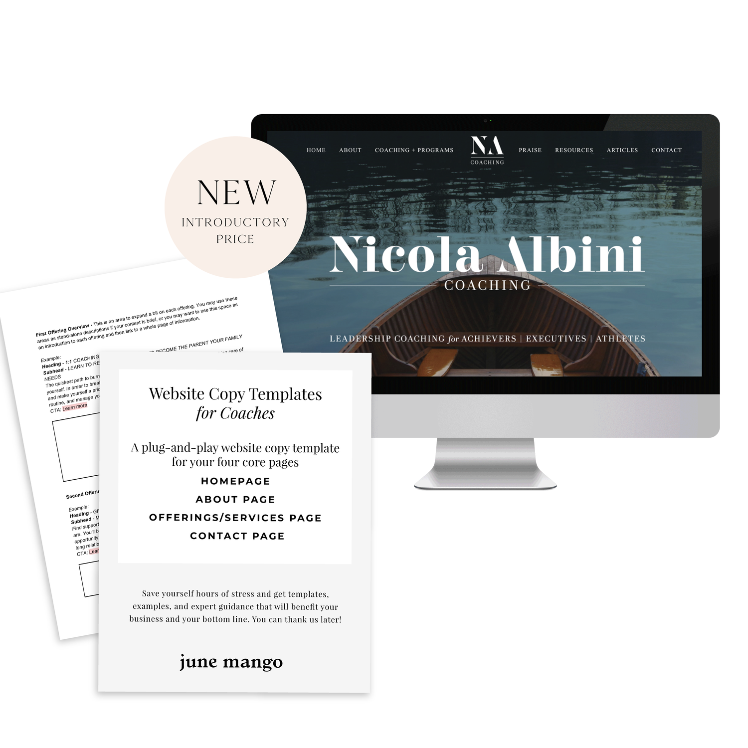
A plug-and-play website copy template for your four core pages (Home, About, Offerings, Contact). Save yourself hours of stress and get templates, examples, and expert guidance that will benefit your business and your bottom line.
LEARN MORE
SEO for Beginners
SEO is something everyone wants but no one fully understands.
This is partly because Google is sneaky - always changing its algorithm. It can be hard to keep up with the new rules. But there are actually some really simple tips you can use to make sure your SEO ranking is as high as possible.
SEO is something everyone wants but no one fully understands.
This is partly because Google is sneaky - always changing its algorithm. It can be hard to keep up with the new rules. But there are actually two really simple things you can focus on to make sure your SEO ranking is as high as possible:
Content
Link Building
Content
Content is king. You may have heard that phrase before and it's true for positioning you as an expert, getting hired and for ranking higher with your SEO. Below are four ways to make sure your content is fully optimized.
Blog Posts - Did you know that blog posts should be at least 300 words long? If not all of your posts are this long, no worries. But the more there is to read, the more Google will have to crawl + find your content.
Name Your Images - Give each of your images a keyword-heavy name. Why? Images are an important way of telling search engines what your website is about. Plus, Google Images is not to be forgotten! I clicked through to 100s of sites by looking through Google Images vs. the listed search results. Just make sure to use strategic keywords related to your content, and add dashes in between the words. For example, my image above would be "seo-for-beginners.png" .
Image File Sizes - Large images will reduce site speed; a key metric google uses for indexing sites. Many web platforms (like Squarespace!) automatically resize your images for you, so don't stress. But ideally, try to keep you image resolution at 72 ppi or no more than 2 MB.
Keywords - If there was one takeaway from this section it's this: ADD KEYWORDS EVERYWHERE! Your SEO keywords are the key words and phrases in your web content that make it possible for people to find your site via search engines. A website that is well optimized for search engines "speaks the same language" as its potential visitor base with keywords for SEO that help connect searchers to your site. Pages, blogs, titles, tag lines, literally everywhere. Keywords are the words clients will type into google to find you. For example, if I am adding keywords to this post, I would probably add "SEO for beginners". So I would add that to my title, 2-3 times in my actual post content, tag my images with those keywords, etc.
Link Building
Now before we dive into Link Building (aka: the process of getting external pages to link to a page on your website), I want to note that this really does take time. So don't stress if you don't have all or even any of these items set up. They are something you can work towards over time. Ok, PSA over! So let's talk link building.
Get Social - Being on several social platforms does wonders for SEO. Frankly, Google goes gaga for this. Basically, it simply means you are findable. It also lets you add your website's link with ‘high authority’ websites like Twitter and Instagram. Bonus: Add these social networks to your site to encourage that social sharing and cross-platform collaboration.
Invite Sharing - Encourage your audience to share your shit. Add easy Tweetable text with Click to Tweets, add a custom Pin It button to your images, and add sharing buttons below blog posts to encourage audience-inspired promotion.
Partnerships - Call your business bestie and ask if you can collaborate. Maybe writing a guest post for her or asking her to link out to your website as a resource are two examples of ways you can collaborate in a non-slimy way that will help you with link building. Aim for brands/businesses that have similar customer groups and find ways that each part can add value to the other. Two brands are stronger than one and the bonus is that having another person or business linking to you also positions you as an expert!
apply all of the above to increase your SEO
on your Squarespace site specifically!
Download the guide here.
need even more help with squarespace?
Skip the overwhelm and have your website designed and launched in just 5 days (or less)!
LEARN MORE
Related Posts

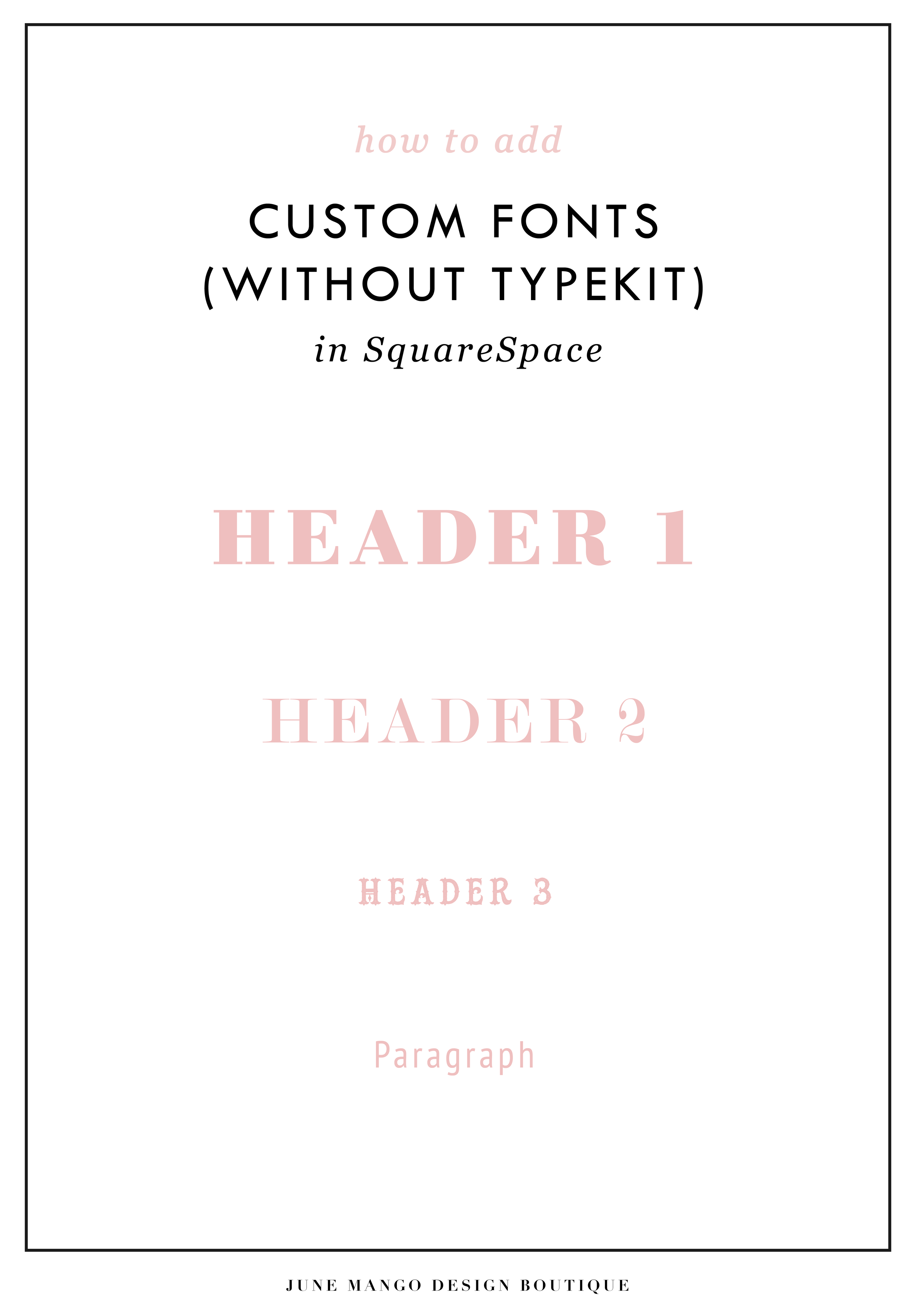
Easily Add Custom Fonts To Your Squarespace Website Design (WITHOUT TYPEKIT)
So you've just been given a beautiful new branding package from your designer full of brand new fonts and everything else. But now you're stumped as to how to add these custom branded fonts to your Squarespace site. But I've gotcher back with a Squarespace hack for you that will bring those branded fonts to life online!
So you've just been given a beautiful new branding package from your designer full of brand new fonts and everything else. But now you're stumped as to how to add these custom fonts to Squarespace. But I've got your back with a Squarespace hack for you that will bring those branded fonts to life online! This little Squarespace hack took me a long time to discover (*covers eyes in shame*)... which is crazy because it's actually pretty simple! It just takes a few simple steps and a little custom code. But anyone can do it! I promise.
Read on for the full tutorials to learn how to add custom font to Squarespace 7.0 and 7.1.
HERE ARE THE STEPS for 7.0:
In the main Squarespace menu, click DESIGN. Then CUSTOM CSS.
Below the CSS editor, click MANAGE CUSTOM FILES.
Then upload your font file (this is a file with an extension of .ttf or .otf)

Copy and paste the following code into the CSS editor:
@font-face {
font-family: 'FONT NAME';
src: url('FONT GOES HERE');}
Change the text that says FONT NAME to the name of your custom font
Highlight the text that says FONT GOES HERE. Then click MANAGE CUSTOM FILES and click on the font you uploaded in the steps above. FONT GOES HERE should now be replaced with a url.

Repeat this step with all of your custom fonts.
Once you have all of your fonts uploaded and added to the CSS code, it's time to make them replace the default Squarespace fonts. To do this, copy and paste the code below into the CSS editor:
h1{ font-family: 'FONT NAME' !important;}
h2{font-family: 'FONT NAME' !important;}
h3{font-family: 'FONT NAME' !important;}
p{font-family: 'FONT NAME' !important;}
You can still adjust the settings of each font in the regular style editor (ie: font size, letter spacing, etc). Make sure to click Save at the top of the Custom CSS page. That’s how to add custom fonts to Squarespace 7.0.
Huzzah!
HERE ARE THE STEPS for 7.1:
Repeat the steps above with all of your custom fonts.
(Because Squarespace 7.1 has 8 different font and heading sizes, you have a couple of additional optional lines of CSS to add depending on which size font you want use to add your custom font to Squarespace.)
Once you have all of your fonts uploaded and added to the CSS code, it's time to make them replace the default Squarespace fonts. To do this, copy and paste the code below into the CSS editor:
h1{ font-family: 'FONT NAME' !important;}
h2{font-family: 'FONT NAME' !important;}
h3{font-family: 'FONT NAME' !important;}
h4{font-family: 'FONT NAME' !important;}
p1{font-family: 'FONT NAME' !important;}
p2{font-family: 'FONT NAME' !important;}
p3{font-family: 'FONT NAME' !important;}
p4{font-family: 'FONT NAME' !important;}
You can still adjust the settings of each font in the regular style editor (ie: font size, letter spacing, etc). Make sure to click Save at the top of the Custom CSS page. That’s how to add custom fonts to Squarespace 7.1.
Don’t forget to refresh your website design and test out the new fonts.
Once you have added the custom fonts to your Squarespace website design, you can begin to test out the new look. Refresh any areas of your site that feature text and check for font rendering issues – if everything looks good, then congratulations – you have successfully added custom fonts to your Squarespace site!
need even more help with squarespace?
Skip the overwhelm and have your website
designed and launched in just 5 days!
CUSTOM BLOCK QUOTES FOR SQUARESPACE TESTIMONIALS
What's that? You want more #squarespacehacks? Ya? Well you are in luck my frand. I've got a really cool one today that I'm pumped to share: Custom Block Quotes! This is so perfect for featured testimonials or important tidbits you want to call attention to on a sales page. So let's fancy up those boring old Squarespace quotes, shall we?
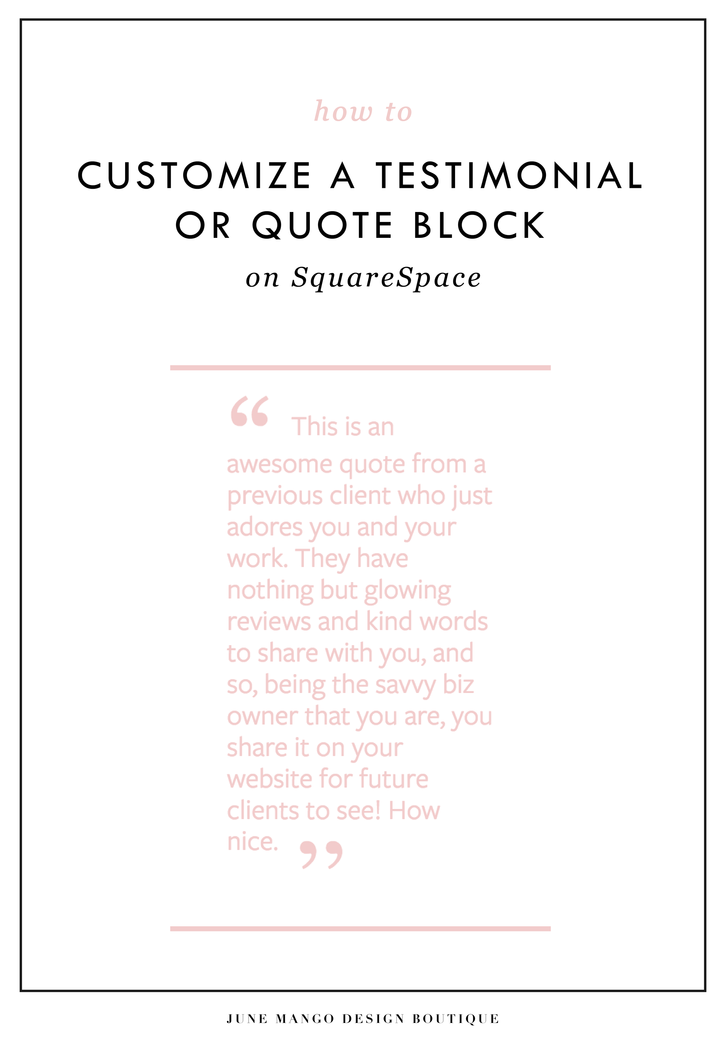
What's that? You want more #squarespacehacks?
Well you are in luck my friend. I've got a really cool one today that I'm pumped to share: Custom Block Quotes! This is so perfect for featured testimonials or important tidbits you want to call attention to on a sales page. So let's fancy up those boring old Squarespace quotes, shall we?
HERE ARE THE STEPS:
In the main Squarespace menu, click DESIGN. Then CUSTOM CSS.
Copy and paste the following code:
.newblockquote { background: #fff; border-top: 5px solid #F2CBCB; border-bottom: 5px solid #F2CBCB; margin: 1.5em 0px; padding: 0.5em 10px; quotes: "\201C""\201D""\2018""\2019"; color: #F2CBCB; font-size: 25px; padding-top: 35px; padding-left: 50px; padding-right: 50px; padding-bottom: 35px; }
.newblockquote:before { color: #F2CBCB; content: open-quote; font-size: 4em; line-height: 0.1em; margin-right: 0.1em; vertical-align: -0.4em; font-family: Volkhov, Georgia, Serif; }
.newblockquote:after { display: none !important; color: #F2CBCB; content: close-quote; font-size: 4em; line-height: 0.1em; margin-left: 0.1em; vertical-align: -0.6em; font-family:Volkhov, Georgia, Serif; }
.newblockquote p { display: inline; }
The pink highlighted text is where you can change your colors. Do not edit the other text. (You can also add this code to an individual page if you only want to see the effects on one page of your Squarespace site).
On the Squarespace page you'd like to add a quote block to, insert a CODE content block.
Paste the following code, replace the text with your own and then click save:
<p class="newblockquote">
This is an awesome quote from a previous client who just adores you and your work. They have nothing but glowing reviews and kind words to share with you, and so, being the savvy biz owner that you are, you share it on your website for future clients to see! How nice.
</p>
The pink highlighted text is where you can change your text and add your quote. Do not edit the grey text.
And that's it!
The following information was created for use with templates made with Squarespace 7.0.
Stay tuned for more tips and tricks for the new 7.1 platform!

ADDING BORDERS AND BOXED TEXT IN SQUARESPACE
Another day, another Squarespace hack! This hack helps you add a cool border to your text to create a boxed text. This is great for when you want to call attention to certain text. Perfect for sales pages or even for testimonials or quotes! Read on for the full tutorial.
Another day, another Squarespace hack! This hack helps you add a cool border to your text to create a boxed text. This is great for when you want to call attention to certain text. Perfect for sales pages or even for testimonials or quotes! Read on for the full tutorial.
HERE ARE THE STEPS:
In the main Squarespace menu, click DESIGN. Then CUSTOM CSS.
Copy and paste the following code:
.fancyborder { border:4px solid #F2CBCB; padding: 10px; }
The pink highlighted text is where you can change your colors and width of the border. Do not edit the other text. (You can also add this code to an individual page if you only want to see the effects on one page of your Squarespace site).
Then on the page you're adding the boxed text to, insert a MARKDOWN block.
Add this code:
<div class="fancyborder">
All of your awesome text can go here! You can write as much or as little as you want! It's totally up to you, but no matter what you write, it will look super cool with your custom border! Boom.
</div>

Replace the brown text with your own. Click SAVE.
And that's it!! Easy peasy.
The following information was created for use with templates made with Squarespace 7.0.
Stay tuned for more tips and tricks for the new 7.1 platform!
NEW!
a templated guide to messaging magic
A plug-and-play website copy template for your four core pages (Home, About, Offerings, Contact). Save yourself hours of stress and get templates, examples, and expert guidance that will benefit your business and your bottom line.
learn more >

HOW TO CUSTOMIZE YOUR "READ MORE" LINK ON SQUARESPACE
I've got another little snippet of code for all you Squarespace lovers today! This one is for that boring old "Read More" link that appears on a Summary Block. Especially if you are using Squarespace's Summary Block to showcase your blog posts, the "Read More" link is often a good spot to get your audience to engaged (ie: so that they read more!) with your featured posts. So how do you take it from boring black text to something that matches your brand? I've gotcher back.
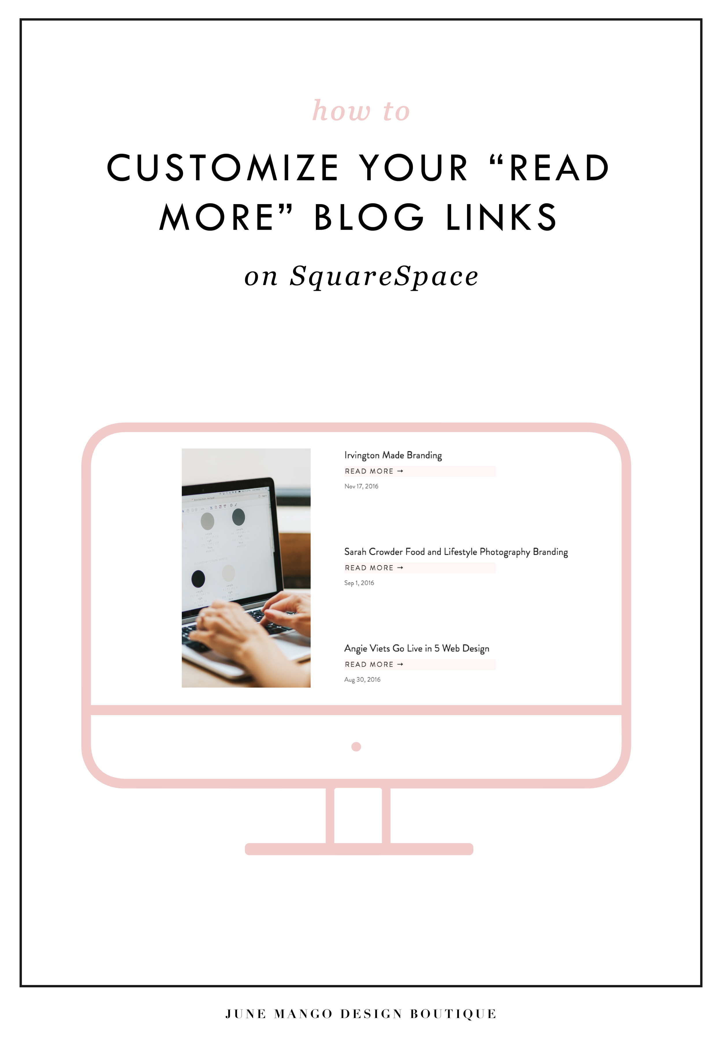
I've got another little snippet of code for all you Squarespace lovers today! This one is for that boring old "Read More" link that appears on a Summary Block. Especially if you are using Squarespace's Summary Block to showcase your blog posts, the "Read More" link is often a good spot to get your audience to engaged (ie: so that they read more!) with your featured posts. So how do you take it from boring black text to something that matches your brand? I've gotcher back.
There are a few little code changes you can make to jazz up the plain "Read More" to match your branding colors. Here are the steps:
In the main Squarespace menu, click DESIGN. Then CUSTOM CSS.
Copy and paste the following code:
/*** READ MORE LINK - TEXT ***/
.entry-more-link a:not(.sqs-block-button-element) {
color: #F2CBCB !important;
}
.entry-more-link a:not(.sqs-block-button-element):hover {
color: #444444 !important;
}
The pink highlighted text is where you can change your colors. Do not edit the other text. (You can also add this code to an individual page if you don’t want it to affect all “Read More” links on your site).
IMPORTANT ! !
Each template has a different method to define their "Read More" links. Please select the method for your template below, and then replace the red CSS code (.entry-more-link) with your template’s method. (If you’re template isn’t listed below, please try the links below, - many work for more than one template. If none of these work, feel free to email me with your specific template at hello@junemango.com).
Adirondack:.link
Five: .inline-read-more
Fulton: .summary-read-more-link
Horizon: .summary-read-more-link
Peak: .read-more
Mohave: .summary-read-more-link
Marquee: .entry-more-link
And that's it!
The following information was created for use with templates made with Squarespace 7.0.
Stay tuned for more tips and tricks for the new 7.1 platform!


need even more help with squarespace?
Skip the overwhelm and have your website
designed and launched in just 5 days!
HOW TO CREATE MULTIPLE LINKS ON A SINGLE IMAGE WITH SQUARESPACE
I've recently discovered a new Squarespace hack and it has me super excited! I've always wanted a way to create multiple links on one image, and now I've figured out a way. And the best part is that it's super easy - no custom code needed! I've outlined the steps below so that you can get in on this SquareSpace hack, too because I like you.
Step 1: Start with the full image of what you would like the final image to look like on the site. We will break the image up into sections in the next step.

Step 2: Separate the image into sections (You can crop the original image, or if you're using Illustrator, I just create new artboards on top of the full image - one artboard for each section). Each section should be associated with one link. For example, mine will be broken into 4 sections linking to Pinterest, Facebook, Instagram and my website.


Step 3: Insert a content block and select the Carousel gallery.
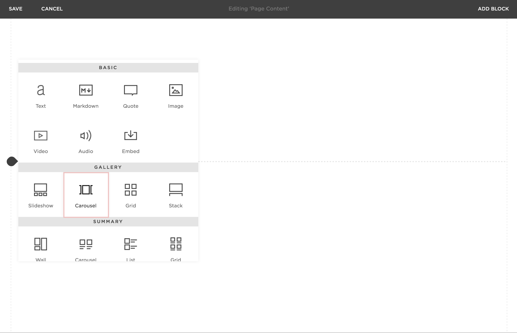
Step 4: Upload your sectioned-off images into the Carousel gallery block.
Step 5: After each image is uploaded, hover your mouse over the first image and click the gear icon.

Step 6: Add the website, page or file you would like to link the first section to and click save. Repeat for each additional section.
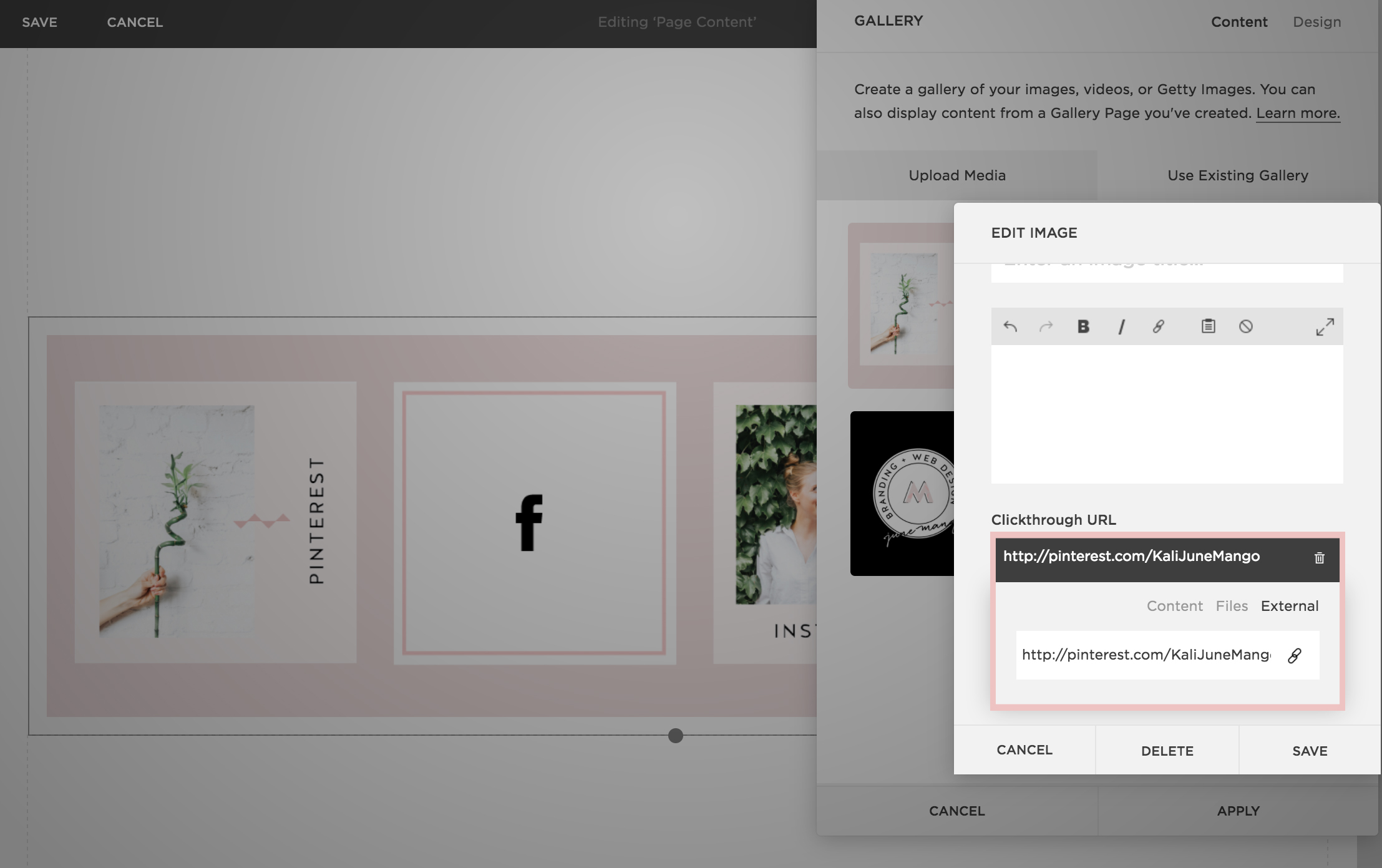
Step 7: Now that everything is linked, it's time to make sure the sections look like one cohesive image. You can adjust the Carousel block up or down until the sections are all showing up (not cropped) and everything looks good.

Step 7: Click save and that's it!
This little trick opens up so many possibilities from a design + layout standpoint. Another way that I use it is to add two images right next to each other without any space (like this). Or you could create a really cool collage with images/products that all link to each individual service or product page. Oh man, I could go on and on!!
The following information was created for use with templates made with Squarespace 7.0.
Stay tuned for more tips and tricks for the new 7.1 platform!

5 QUESTIONS TO ASK BEFORE SWITCHING FROM WORDPRESS TO SQUARESPACE
So you've been thinking about switching from WordPress to SquareSpace, but aren't sure if it's right for you or your business. So how do you know if you should switch things up or stay put? Here are a few questions to help you decide:

So you've been thinking about switching from WordPress to SquareSpace, but aren't sure if it's right for you or your business. So how do you know if you should switch things up or stay put? Here are a few questions to help you decide:
How much do you blog? If you are a regular blogger posting content more than once a week, you may want to stay with WordPress. Not only does WordPress have an amazing database for all that content, but it will also be quite a process to move all of that content over to SquareSpace without messing with the posts' formatting, plugins, etc. If you don't blog as regularly, this is less of an issue. I merge blogs over from WordPress to SquareSpace all the time, so it definitely can be done. You may end up tweaking each post to make sure it works in the new SquareSpace site, but if you don't have hundreds of posts, this isn't a huge issue.
How often will you be adding pages or tweaking your content? If you know you're going to be adding new forms, creating pages for an e-course or anything else that would require you to get in the backend and easily create your own content, SquareSpace is the clear winner. It's user interface is extremely easy to use and it even has pre-made page layouts for the novice web designer.
Do you need a lot of customization?Do you need to be able to tweak a lot of little things or have some crazy-cool functionality like a unicorn that flies across the screen? If so, stick with WordPress. WordPress allows you to create a custom-coded child theme and you can pretty much do anything you want with that (with the help of a developer). SquareSpace's customization is a little limited, mostly because they don't want the novice web designer to break his/her site! But even SquareSpace can be customized to a certain extent , like I've talked about this and this post.
Do you want to be hands-off for the website's maintenance? Then SquareSpace is the better choice. Since SquareSpace isn't open-source, unlike WordPress, they control everything. This means there are hardly any bugs, no need to manually backup your site, and if you ever have an issue, their support team is ah-mazing. I can't even count how many times I've used their live chat option when I have a question about something.
What's your price point? There's obviously no "set cost" for either of the platforms, it just depends on what you need. For WordPress, you have to pay for hosting as well as your domain name, plus any theme you purchase or web designer/developer you may hire to help create the site. If you're creating a custom site, you could be paying upwards of 20K! SquareSpace has a few plans that you can choose from, and most businesses can get away with the Personal plan, which is $12/month. Add that cost to your domain name and it's only a few hundred dollars if you set it up yourself. If you hire a web designer to help you, you will likely still walk away with a brand new site for less than a few thousand dollars.
So what do you think? It really just depends on your answers to these questions, but hopefully you find them helpful in determining which choice is right for you! And hey, if you want to chat through any of this more, I'm here! Just holla at me.
The following information was created for use with templates made with Squarespace 7.0.
Stay tuned for more tips and tricks for the new 7.1 platform!
Related Posts
need even more help with squarespace?
Skip the overwhelm and have your website designed and launched in just 5 days (or less)!
LEARN MORE

HOW TO CREATE A POP-UP FORM ON SQUARESPACE

When I discover a new trick on SquareSpace I get so excited because...
A) I have a new tool in my toolkit when building client websites.
B) I get to share it with you! Because if I didn't know this existed, chances are other people don't either.
I recently discovered a super helpful, and super simple way to create a pop-up form for your SquareSpace website. And you can do it without any custom code or tech-savvy-ness.
Just follow the 4 simple steps below.
Open your Content Block options, and click Add Form.

2) Create your form in the normal way, adding the fields you need. Then click the Advanced tab.
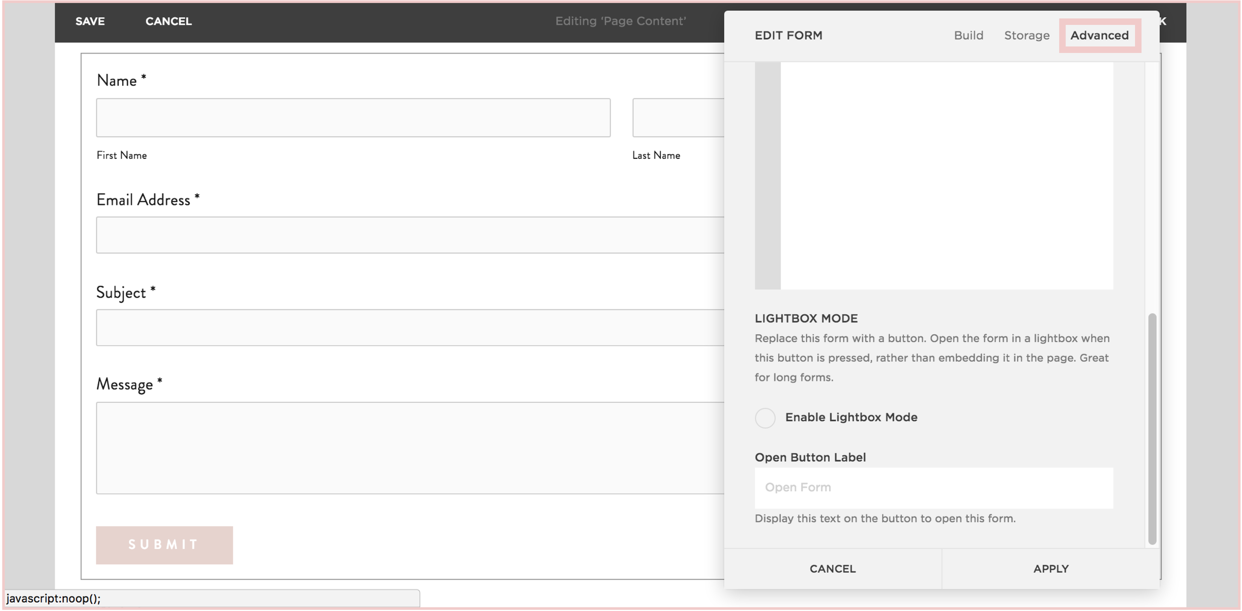
3) In the Advanced tab, click the circle next to "Enable Lightbox Mode". This is the key to making your form pop-up, verses just sit on your page as a regular form. You can also write the call-to-action text you want for your pop-up button in the "Open Button Label" field.

4) And TA - DA ! You just created a pop-up form on your SquareSpace site!


The following information was created for use with templates made with Squarespace 7.0.
Stay tuned for more tips and tricks for the new 7.1 platform!

CHANGING THE COLOR OF SOCIAL MEDIA ICONS IN SQUARESPACE
So you've created your brand-spankin' new SquareSpace website and styled it perfectly to match your brand with font pairings, gorgeous colors and a lovely layout. BUT, you can't get those pesky social media icons to match your pretty palette. Don't worry! I've gotcher back.
There's a tiny string of code that you can use to change the SquareSpace social media icons from black and blah to any color you want! Follow the steps below on your own site and voila, styled social icons!
Here are the details:
In the backend of your SquareSpace site, navigate to DESIGN.
Click on CUSTOM CSS.
Paste in this bit of code:
.sqs-use--icon { fill: #F65959 !important; } .sqs-svg-icon--wrapper:hover { .sqs-use--icon { fill: #444 !important; } }
The bolded HEX color is what you'll need to change to match your own color palette. If your not sure what HEX your color is, check out this handy converter.
That's it! You're set.
Don't you feel like a Squarespace genius?!
Note: This set of code works for the "Regular" style of icons.
The following information was created for use with templates made with Squarespace 7.0.
Stay tuned for more tips and tricks for the new 7.1 platform!
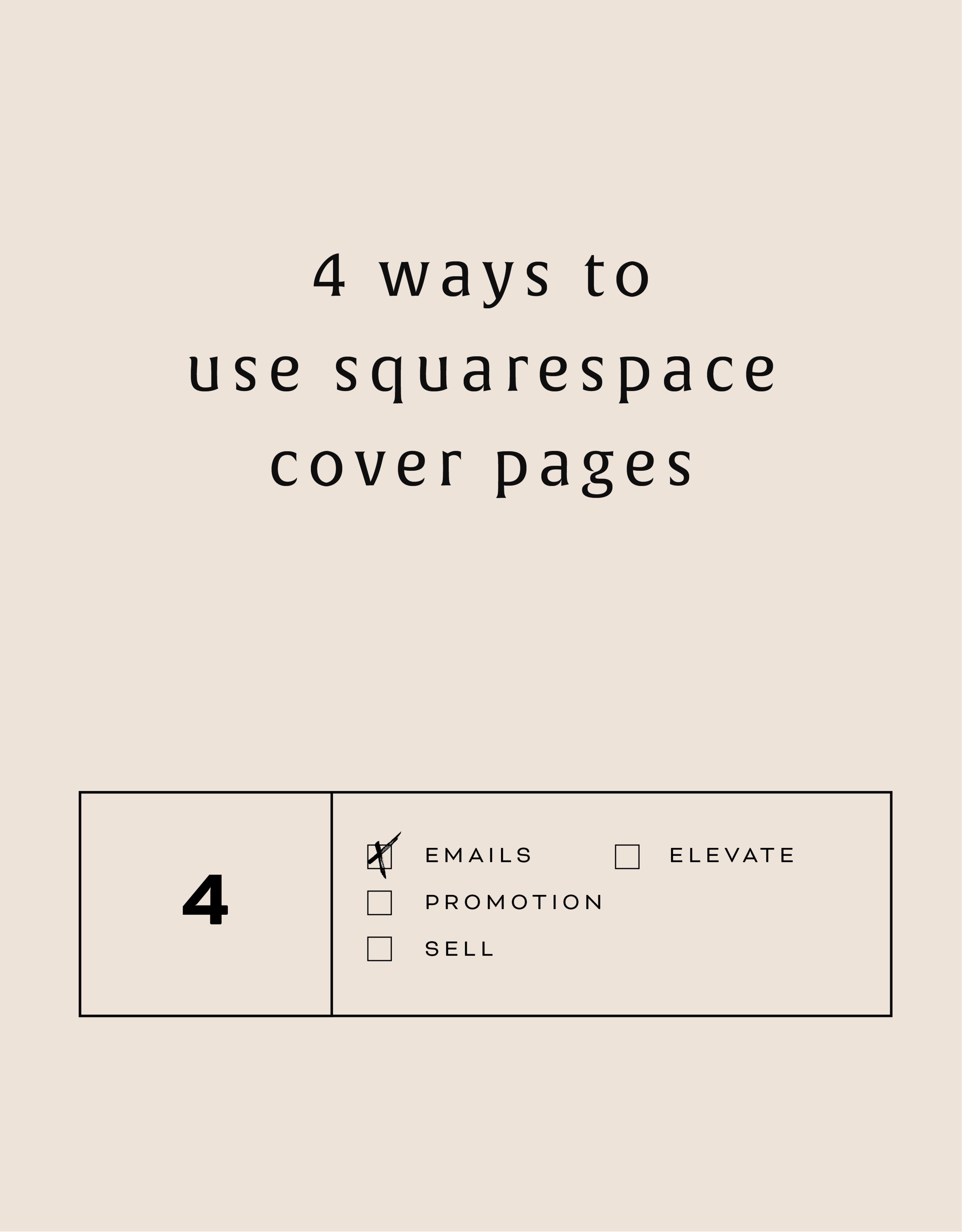
4 WAYS TO USE SQUARESPACE COVER PAGES

Have you heard of SquareSpace cover pages? These unique and versatile web pages are great way to add a bit of flair to your creative endeavors. Below are four unique ways to utilize these cover pages to make a powerful introduction.
Collecting email addresses. Whether your website is under construction (or not yet begun!), you're about to launch something new, or you just want to grow your email list, a SquareSpace cover page is the perfect solution.
Promoting anything. If you're launching a new product, podcast, or course, cover pages allow you to present and promote before people move on into your regular website.
Sell something. Cover pages can be a free, high-converting landing page for a digital product or service. Send people to your sales page or create the opt-in directly on the cover page.
Elevate your homepage. Cover pages can be a great pause for people before entering your site. By using a cover page as your homepage, you can also be very specific about where you send people on your website.
These are just a few options but I'd love to hear more! Comment below or holla at me if you've used SquareSpace cover pages in a unique way!
The following information was created for use with templates made with Squarespace 7.0.
Stay tuned for more tips and tricks for the new 7.1 platform!
Related Posts
need even more help with squarespace?
Skip the overwhelm and have your website designed and launched in just 5 days (or less)!
LEARN MORE

HOW TO REMOVE THE DATE FROM YOUR SQUARESPACE BLOG POSTS
If you would like to remove the blog date and time from Squarespace, there is an easy bit of CSS code you can use to make it work. The catch is that you have to do a bit of research first. I've listed the steps below, which are super simple, but they work best if you're working within a Chrome browser.

Squarespace is so great for its Drag and Drop abilities, but once in a while, SquareSpace gets a little stubborn and won't let you change the simplest things. One of those things is your blog post publish date.
If you would like to remove the blog date and time from SquareSpace, there is an easy bit of CSS code you can use to make it work. The catch is that you have to do a bit of research first. I've listed the steps below, which are super simple, but they work best if you're working within a Chrome browser.
How to remove the date from your Squarespace blog posts:
First, move your cursor over the date on your blog and right click.
Click "Inspector". This should bring up all the code from your SquareSpace site.
Find the "Class" that contains the date. The "class" name should look something like this: <time class="thisisthenameoftheclass">March 31, 2016</time>
Copy and paste the class name into your Custom CSS. To get here, go to DESIGN -> CUS TOM CSS and paste in the code below. (Make sure you change .insertclass to the name of your class from Step #3).
.insertclass{ display: none; }
And that's it! You should now have hidden all the dates from showing on your Squarespace blog.
The following information was created for use with templates made with Squarespace 7.0.
Stay tuned for more tips and tricks for the new 7.1 platform!

NEW WORK: AMY KURETSKY ACUPUNCTURE WEBSITE
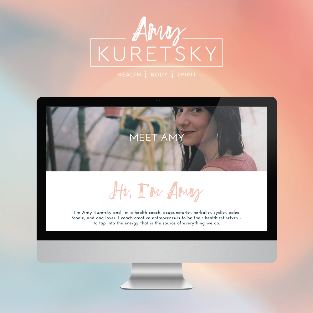
Amy Kuretsky is an acupuncturist and health coach who is killing it with awesome health tips and an awesome holistic approach to life and business. She shares some of her insights via Periscope on the daily, so definitely check her out there.
We created a website that really showcased her personal brand and expertise. Lots of (super informative) content get broken up by graphic elements and client testimonials. I am very slightly obsessed. Plus, we rocked it out in just 5 days.

See more of the website and give Amy some heart eyes this-a-way.

NEW WORK: STEMS AND SPRIGS SQUARESPACE WEB DESIGN
This SquareSpace web design project has me feeling all fuzzy inside. This lovely little site was created for a florist in Northern Michigan who A) Is one of the sweetest ladies I've ever virtually met, and B) Makes the most gorgeous floral designs EVAH.
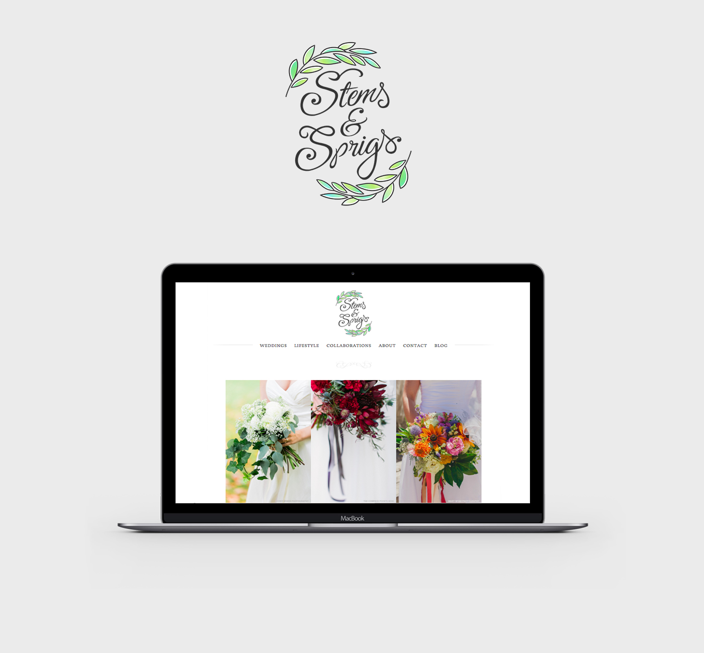
This SquareSpace web design project has me feeling all fuzzy inside. This lovely little site was created for a florist in Northern Michigan who A) Is one of the sweetest ladies I've ever virtually met, and B) Makes the most gorgeous floral designs EVAH.
Kalin, the owner of Stems and Sprigs, had a SquareSpace website set up but just couldn't seem to align the layout and design with her brand. We worked together to create a soft, feminine, and sophisticated feel for her website that now allows her to truly broadcast her brand in an authentic way.
Take a peek at the results below.
