LOGO PROCESS: BASH EVENT PLANNING
This little logo process is from the branding process for BASH Event Planning & Design. This was a challenging but FUN design process that included ideas like topography, layering and disco!
This little logo process is from the branding process for BASH Event Planning & Design. This was a challenging but FUN design process that included ideas like topography, layering and disco!
Below are several of the concepts and variations created before we nailed down the final logo.
Related Posts
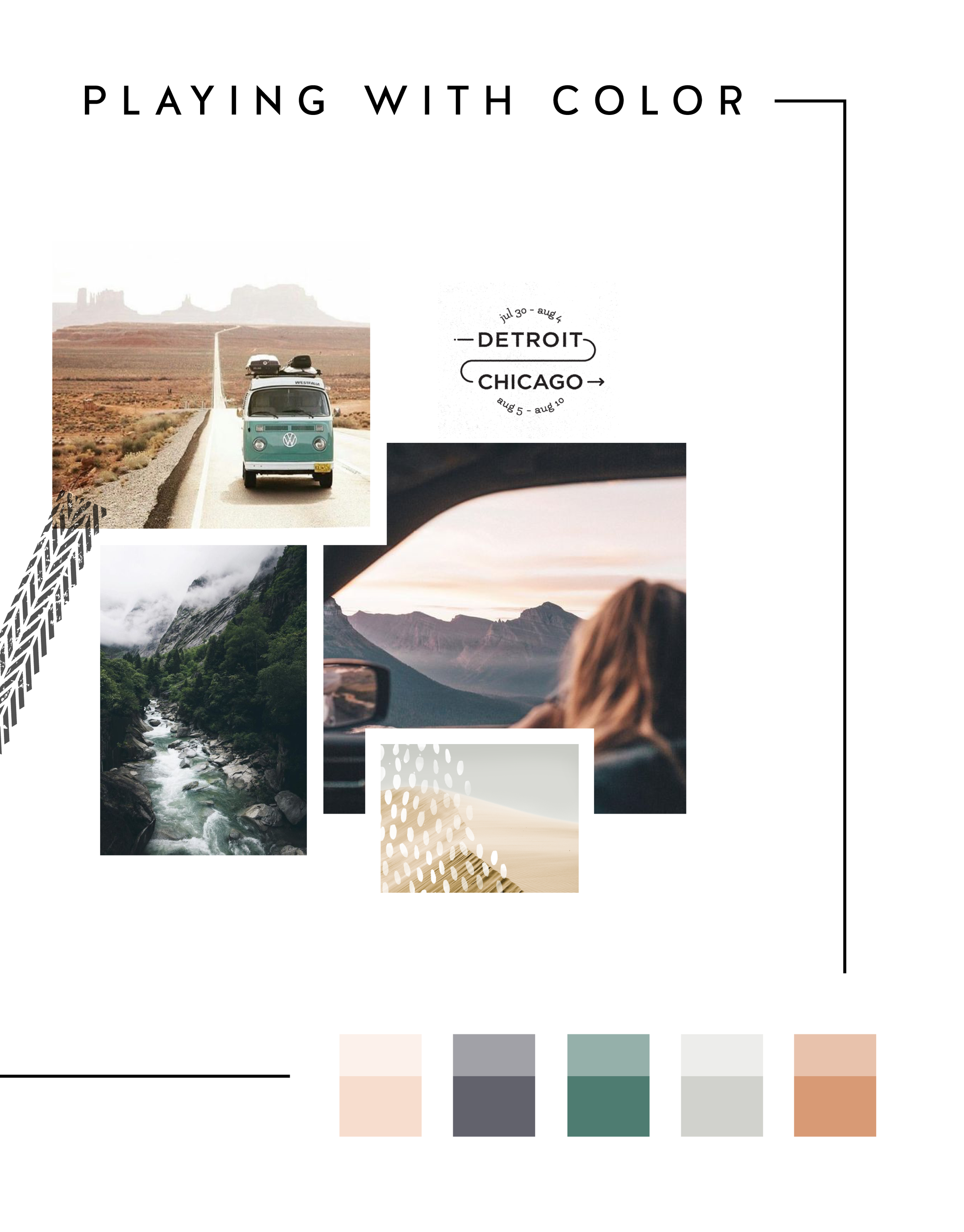
In the MOOD boards: Road Trippin'
Feeling excited for a little road trip in the works, so I created a mood board and color palette for inspiration. Deep green trees, windows down, sunsets fading into starry nights... serious design inspiration!
Related Posts
The 4 best places to add your newsletter opt-in
Growing your newsletter list is so important when you run an online business. It can help you keep in touch with your dream clients, build trust with your audience and promote new offerings. But the question my web clients always ask is: Where is the best place to add my newsletter opt-in or sign up form?
Growing your newsletter list is so important when you run an online business. It can help you keep in touch with your dream clients, build trust with your audience and promote new offerings. But the question my web clients always ask is: Where is the best place to add my newsletter opt-in or sign up form?
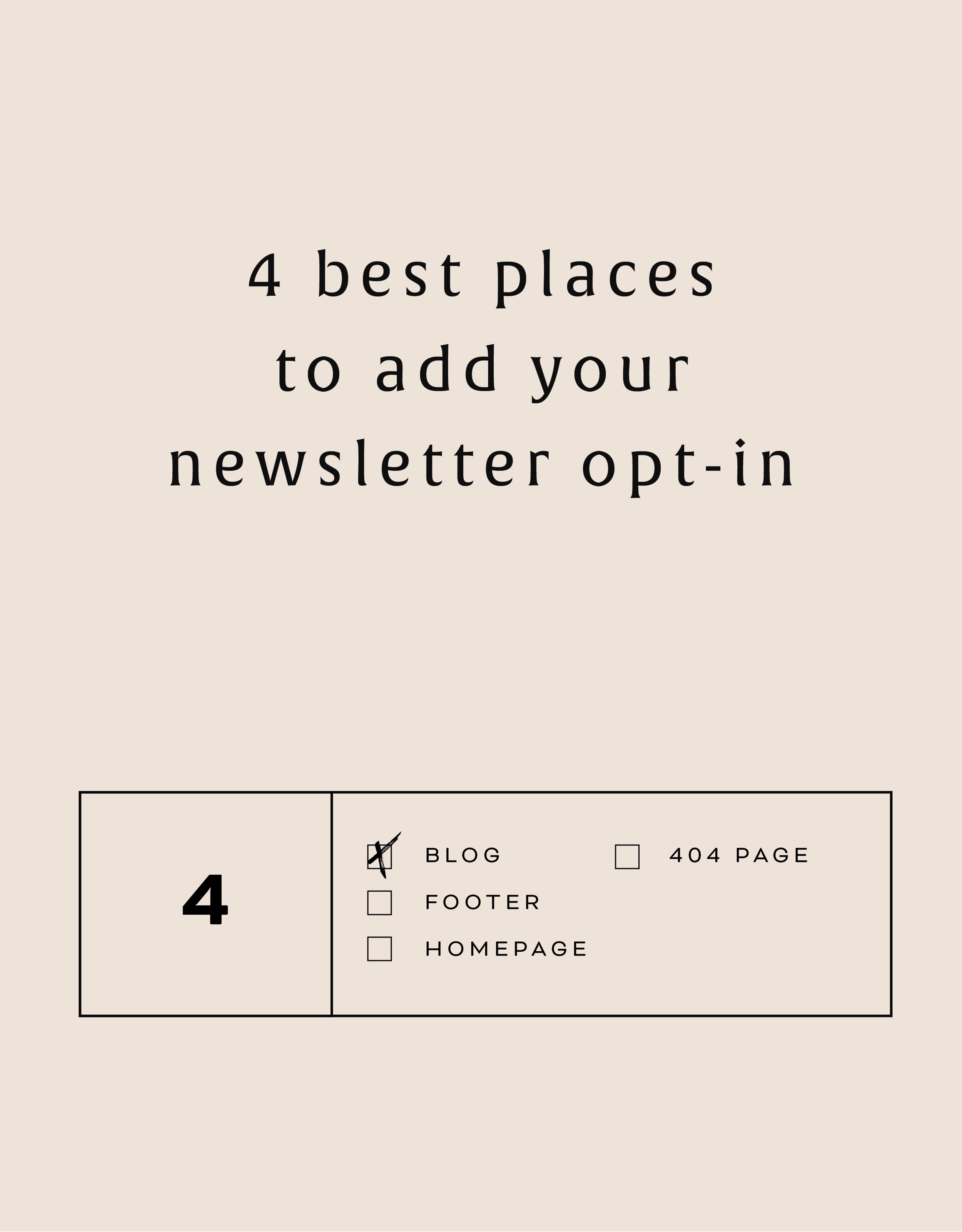
There are 4 places I ALWAYS add the newsletter opt-in forms on any website.
Blog
Adding the newsletter opt-in to your blog allows you to capture people who are already interested in what you have to say. They are on your blog reading all of your juicy content, so why not try to get them onto your newsletter list where you have even juicier content! I like to make sure this opt-in is specific, and maybe different from other sign up forms elsewhere on the site. For example, it should incentivize them to sign up with the promise of sharing your expertise for free with a worksheet, guide, etc. Adding this opt-in to the sidebar of your blog is one of my favorite places to engage newsletter subscribers on your site.
Footer
It's the one place people will see no matter what page of your website they land on (or click to!). So make it work for you by adding a newsletter sign up form. Repetition of views will also increase the chance that people will sign up. I like to keep this one more generic with a description of what you typically send out vs. a specific freebie or promo.
Homepage
You probably guessed this one, right? But do you know where on the homepage you should add your opt-in? The rule of thumb is above the fold
(aka: the amount of the webpage a user sees before needing to scroll down).
Ideally, you will still be able to communicate your mission statement (who you are, what you do, and who you do it for) before the newsletter. No one is going to sign up for a newsletter if they don't know who the heck you are yet! But grabbing their attention before they scroll down the page is a great way to ensure they get on your list.
404 Page
Have you given much thought to your 404 page? It's a handy little page that pops up when someone clicks a broken link or types a URL wrong. It has so much potential to be interesting and engaging, which is important for keeping your audience on your site! Besides giving them a link back to your homepage, you can also sneak in a newsletter opt-in here! It's an unexpected place to get that person to sign up.
You can add your newsletter opt-in to all four of these places or just pick and choose. Have another spot you think would be great? Let me know!
Related Posts
NEW WORK: SNOW SHIMAZU HOLISTIC WELLNESS AND YOGA
New work! This lovely web launch for Snow Shimazu, a holistic health pro and yoga expert, is a great example of a light, airy website. Lots of white space (her name is Snow after all!), gorgy parallax photos and beautiful branding.
Client: Snow Shimazu
Service: Go Live in 5® Web Design
Design Direction: Light, airy
#1 Goal: New service promotion
Timeline: 5 days
Branding: Braid Creative
URL: snowshimazu.com
Related Posts
Easily Add Custom Fonts To Your Squarespace Website Design (WITHOUT TYPEKIT)
So you've just been given a beautiful new branding package from your designer full of brand new fonts and everything else. But now you're stumped as to how to add these custom branded fonts to your Squarespace site. But I've gotcher back with a Squarespace hack for you that will bring those branded fonts to life online!
So you've just been given a beautiful new branding package from your designer full of brand new fonts and everything else. But now you're stumped as to how to add these custom fonts to Squarespace. But I've got your back with a Squarespace hack for you that will bring those branded fonts to life online! This little Squarespace hack took me a long time to discover (*covers eyes in shame*)... which is crazy because it's actually pretty simple! It just takes a few simple steps and a little custom code. But anyone can do it! I promise.
Read on for the full tutorials to learn how to add custom font to Squarespace 7.0 and 7.1.
HERE ARE THE STEPS for 7.0:
In the main Squarespace menu, click DESIGN. Then CUSTOM CSS.
Below the CSS editor, click MANAGE CUSTOM FILES.
Then upload your font file (this is a file with an extension of .ttf or .otf)
Copy and paste the following code into the CSS editor:
@font-face {
font-family: 'FONT NAME';
src: url('FONT GOES HERE');}
Change the text that says FONT NAME to the name of your custom font
Highlight the text that says FONT GOES HERE. Then click MANAGE CUSTOM FILES and click on the font you uploaded in the steps above. FONT GOES HERE should now be replaced with a url.
Repeat this step with all of your custom fonts.
Once you have all of your fonts uploaded and added to the CSS code, it's time to make them replace the default Squarespace fonts. To do this, copy and paste the code below into the CSS editor:
h1{ font-family: 'FONT NAME' !important;}
h2{font-family: 'FONT NAME' !important;}
h3{font-family: 'FONT NAME' !important;}
p{font-family: 'FONT NAME' !important;}
You can still adjust the settings of each font in the regular style editor (ie: font size, letter spacing, etc). Make sure to click Save at the top of the Custom CSS page. That’s how to add custom fonts to Squarespace 7.0.
Huzzah!
HERE ARE THE STEPS for 7.1:
Repeat the steps above with all of your custom fonts.
(Because Squarespace 7.1 has 8 different font and heading sizes, you have a couple of additional optional lines of CSS to add depending on which size font you want use to add your custom font to Squarespace.)
Once you have all of your fonts uploaded and added to the CSS code, it's time to make them replace the default Squarespace fonts. To do this, copy and paste the code below into the CSS editor:
h1{ font-family: 'FONT NAME' !important;}
h2{font-family: 'FONT NAME' !important;}
h3{font-family: 'FONT NAME' !important;}
h4{font-family: 'FONT NAME' !important;}
p1{font-family: 'FONT NAME' !important;}
p2{font-family: 'FONT NAME' !important;}
p3{font-family: 'FONT NAME' !important;}
p4{font-family: 'FONT NAME' !important;}
You can still adjust the settings of each font in the regular style editor (ie: font size, letter spacing, etc). Make sure to click Save at the top of the Custom CSS page. That’s how to add custom fonts to Squarespace 7.1.
Don’t forget to refresh your website design and test out the new fonts.
Once you have added the custom fonts to your Squarespace website design, you can begin to test out the new look. Refresh any areas of your site that feature text and check for font rendering issues – if everything looks good, then congratulations – you have successfully added custom fonts to your Squarespace site!
need even more help with squarespace?
Skip the overwhelm and have your website
designed and launched in just 5 days!
BRANDING FOR YOGA EXPERTS
Whether you’ve just launched your own yoga studio or are a seasoned veteran looking for a brand refresh, there are four main ideas to help you find your focus. I have 4 simple, actionable tips you can use for your own yoga brand.
Whether you’ve just launched your own yoga studio or are a seasoned veteran looking for a brand refresh, there are four main ideas to help you find your focus.
1. Be distinctive
What makes you unique? What is the thing that makes your yoga studio stand out from all the rest? What makes your clients love you and your approach? Are your classes challenging and invigorating? Do you specialize in restorative yoga and massage? Whatever makes you and your yoga studio stand out - embrace it!
2. Brand that thing!
How do you take your unique-ness (see above!), and turn it into the most beautiful yoga logo and branding ever?
Answer: Emotion. Find that emotional connection your yoga expertise has with your clients. A stressed out mom has been looking for that holistic and healthy time for herself. She needs that calm feeling she has after your class, which keeps her coming back. Allow your branding to reflect that calming effect you bring to your yoga classes. Show this client and any other that when they take your yoga class, your practice will will bring them clarity and connection to themselves.
You create an emotional connection through your branding based on the layout, colors and fonts you choose to marry into a uniquely perfect fit for your business. Done right, clients will have a sense of your yoga teaching style before they even step foot in the studio.
3. One step further
As the smart business owner you are, you know that the logo isn't the end of the proverbial deisgn road. Social media (header images, profile pictures, behind the scenes Instagram shoots), business cards and your website are all places to carry over your branding. Think about each client’s experience from beginning to end. From booking a class to store front signs, pull everything together and review what you have. Make sure to ask yourself every step of the way if it sends the signals to the right kind of clients. In the end, it should all be in line with your vision, mission and style.
Looking for examples of a yoga expert’s branding in action? Head on over here or here or here!
MAKING DESIGN TRENDS UNIQUE TO YOUR BRAND - PART 2
In my last post, I went over how to jazz up some common design trends and make them unique to your brand. I'm diving back into today with some common design trends that I see ALL OVER Pinterest. Especially for wedding pros and boss ladies, these trends are HOT. But I'll show you how to make them distinctive so that you and your brand stand out.
In my last post, I went over how to jazz up some common design trends and make them unique to your brand. I'm diving back into today with some common design trends that I see ALL OVER Pinterest. Especially for wedding pros and boss ladies, these trends are HOT. But I'll show you how to make them distinctive so that you and your brand stand out.
Design trend #1: Watercolor er'thing
Logos by KimberlyPaigeDesigns & Autumn Lane Paperie
There a few great creative brands that can utilize watercolor elements well like artists, wedding industry pros, and brands that cater to babies or kids. But what if you want to up-level the watercolor game for your own brand? Here's how.
A: Layer up! Adding some additional color and texture will help add more visual interest to the logo. You can even add a little details, like the trees in this logo by Happily Ever After Etsy above. Darker colors will also add more sophistication and maturity to the logo.
B: Define it's shape!Instead of creating a simplified watercolor swatch, try creating a watercolor elements in the form of an item related to your business or brand. West End Girl Studio does this well in the logo above with watercolor leaves.
Design trend #2: Floral er'thing
Logos by Arlyne Grace Design & Elle & Co.
Ahh... floral motifs. I have a real love-hate relationship with them. They can be so great and sometimes are so obviously appropriate (hello, wedding florist!). But sometimes, they seems to be a go-to design just because they're pretty. So here are some ways to use these gorgy florals in your branding, but up-level them to match your unique biz.
A: Add additional elements! Adding some additional design or drawn elements to the florals will make the logo more unique. You can even use real florals instead of drawn/painted flower elements, like this bouquet in the logo by One Plus One above.
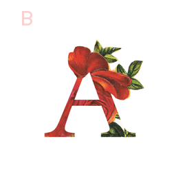
B: Break the rules! If you read Part 1 of this series, you may be sensing a theme. Breaking some design rules (keyword: some) is a great way to add visual interest to any design. In the logo/letter above by the aleph corporation, the flower petals break out of the border of the letter A's peak. It's just enough to add a bit of whimsy without overpowering the letter or structure.
CUSTOM BLOCK QUOTES FOR SQUARESPACE TESTIMONIALS
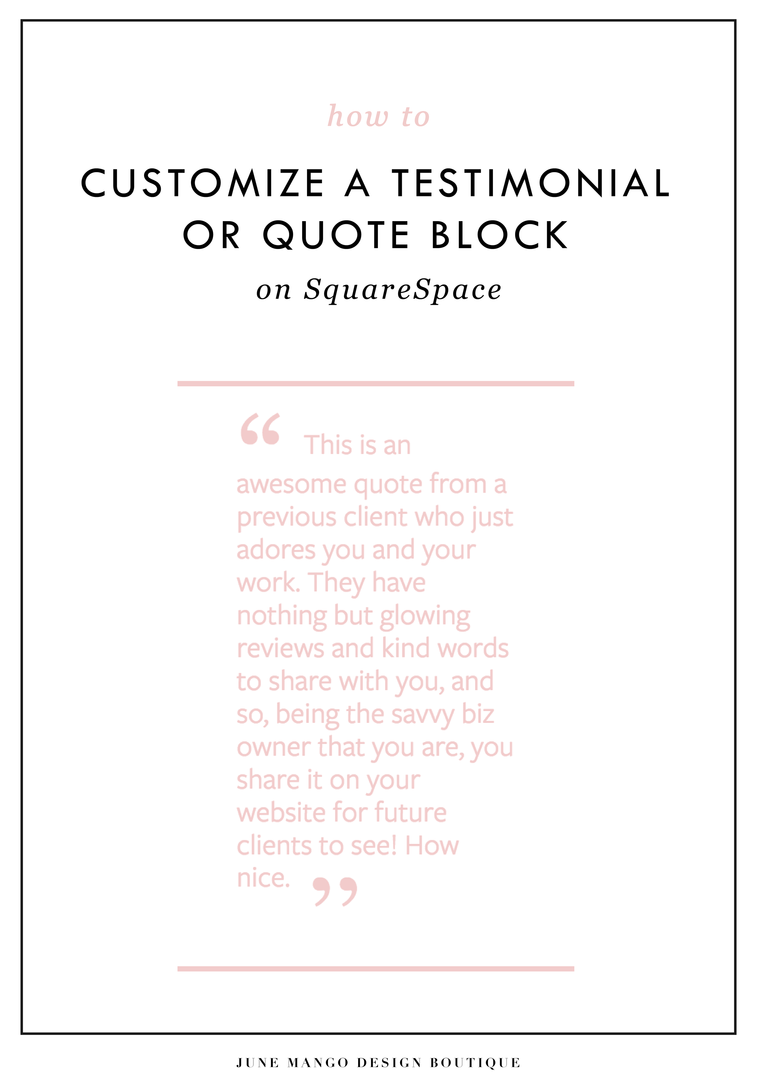
What's that? You want more #squarespacehacks? Ya? Well you are in luck my frand. I've got a really cool one today that I'm pumped to share: Custom Block Quotes! This is so perfect for featured testimonials or important tidbits you want to call attention to on a sales page. So let's fancy up those boring old Squarespace quotes, shall we?
What's that? You want more #squarespacehacks?
Well you are in luck my friend. I've got a really cool one today that I'm pumped to share: Custom Block Quotes! This is so perfect for featured testimonials or important tidbits you want to call attention to on a sales page. So let's fancy up those boring old Squarespace quotes, shall we?
HERE ARE THE STEPS:
In the main Squarespace menu, click DESIGN. Then CUSTOM CSS.
Copy and paste the following code:
.newblockquote { background: #fff; border-top: 5px solid #F2CBCB; border-bottom: 5px solid #F2CBCB; margin: 1.5em 0px; padding: 0.5em 10px; quotes: "\201C""\201D""\2018""\2019"; color: #F2CBCB; font-size: 25px; padding-top: 35px; padding-left: 50px; padding-right: 50px; padding-bottom: 35px; }
.newblockquote:before { color: #F2CBCB; content: open-quote; font-size: 4em; line-height: 0.1em; margin-right: 0.1em; vertical-align: -0.4em; font-family: Volkhov, Georgia, Serif; }
.newblockquote:after { display: none !important; color: #F2CBCB; content: close-quote; font-size: 4em; line-height: 0.1em; margin-left: 0.1em; vertical-align: -0.6em; font-family:Volkhov, Georgia, Serif; }
.newblockquote p { display: inline; }
The pink highlighted text is where you can change your colors. Do not edit the other text. (You can also add this code to an individual page if you only want to see the effects on one page of your Squarespace site).
On the Squarespace page you'd like to add a quote block to, insert a CODE content block.
Paste the following code, replace the text with your own and then click save:
<p class="newblockquote">
This is an awesome quote from a previous client who just adores you and your work. They have nothing but glowing reviews and kind words to share with you, and so, being the savvy biz owner that you are, you share it on your website for future clients to see! How nice.
</p>
The pink highlighted text is where you can change your text and add your quote. Do not edit the grey text.
And that's it!
The following information was created for use with templates made with Squarespace 7.0.
Stay tuned for more tips and tricks for the new 7.1 platform!
LOGO PROCESS: ACUPUNCTURE BRANDING
I've had lots of new branding projects lately that I've been meaning to share! Two of these were for holistic health providers specializing in acupuncture + herbal medicine or yoga + massage. Here are the logo processes for both!
I've had lots of new branding projects lately that I've been meaning to share! Two of these were for holistic health providers specializing in acupuncture + herbal medicine or yoga + massage. Here are the logo processes for both!
ADDING BORDERS AND BOXED TEXT IN SQUARESPACE
Another day, another Squarespace hack! This hack helps you add a cool border to your text to create a boxed text. This is great for when you want to call attention to certain text. Perfect for sales pages or even for testimonials or quotes! Read on for the full tutorial.
Another day, another Squarespace hack! This hack helps you add a cool border to your text to create a boxed text. This is great for when you want to call attention to certain text. Perfect for sales pages or even for testimonials or quotes! Read on for the full tutorial.
HERE ARE THE STEPS:
In the main Squarespace menu, click DESIGN. Then CUSTOM CSS.
Copy and paste the following code:
.fancyborder { border:4px solid #F2CBCB; padding: 10px; }
The pink highlighted text is where you can change your colors and width of the border. Do not edit the other text. (You can also add this code to an individual page if you only want to see the effects on one page of your Squarespace site).
Then on the page you're adding the boxed text to, insert a MARKDOWN block.
Add this code:
<div class="fancyborder">
All of your awesome text can go here! You can write as much or as little as you want! It's totally up to you, but no matter what you write, it will look super cool with your custom border! Boom.
</div>
Replace the brown text with your own. Click SAVE.
And that's it!! Easy peasy.
The following information was created for use with templates made with Squarespace 7.0.
Stay tuned for more tips and tricks for the new 7.1 platform!
NEW!
a templated guide to messaging magic
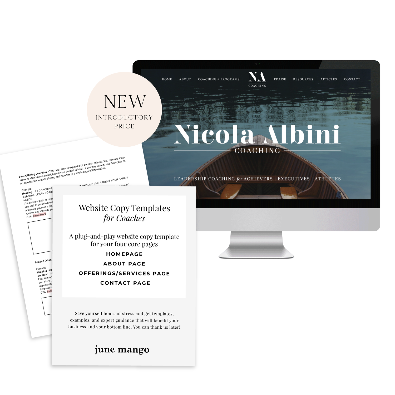
A plug-and-play website copy template for your four core pages (Home, About, Offerings, Contact). Save yourself hours of stress and get templates, examples, and expert guidance that will benefit your business and your bottom line.
learn more >
HOW TO CUSTOMIZE YOUR "READ MORE" LINK ON SQUARESPACE
I've got another little snippet of code for all you Squarespace lovers today! This one is for that boring old "Read More" link that appears on a Summary Block. Especially if you are using Squarespace's Summary Block to showcase your blog posts, the "Read More" link is often a good spot to get your audience to engaged (ie: so that they read more!) with your featured posts. So how do you take it from boring black text to something that matches your brand? I've gotcher back.
I've got another little snippet of code for all you Squarespace lovers today! This one is for that boring old "Read More" link that appears on a Summary Block. Especially if you are using Squarespace's Summary Block to showcase your blog posts, the "Read More" link is often a good spot to get your audience to engaged (ie: so that they read more!) with your featured posts. So how do you take it from boring black text to something that matches your brand? I've gotcher back.
There are a few little code changes you can make to jazz up the plain "Read More" to match your branding colors. Here are the steps:
In the main Squarespace menu, click DESIGN. Then CUSTOM CSS.
Copy and paste the following code:
/*** READ MORE LINK - TEXT ***/
.entry-more-link a:not(.sqs-block-button-element) {
color: #F2CBCB !important;
}
.entry-more-link a:not(.sqs-block-button-element):hover {
color: #444444 !important;
}
The pink highlighted text is where you can change your colors. Do not edit the other text. (You can also add this code to an individual page if you don’t want it to affect all “Read More” links on your site).
IMPORTANT ! !
Each template has a different method to define their "Read More" links. Please select the method for your template below, and then replace the red CSS code (.entry-more-link) with your template’s method. (If you’re template isn’t listed below, please try the links below, - many work for more than one template. If none of these work, feel free to email me with your specific template at hello@junemango.com).
Adirondack:.link
Five: .inline-read-more
Fulton: .summary-read-more-link
Horizon: .summary-read-more-link
Peak: .read-more
Mohave: .summary-read-more-link
Marquee: .entry-more-link
And that's it!
The following information was created for use with templates made with Squarespace 7.0.
Stay tuned for more tips and tricks for the new 7.1 platform!
need even more help with squarespace?
Skip the overwhelm and have your website
designed and launched in just 5 days!
MAKING DESIGN TRENDS UNIQUE TO YOUR BRAND - PART 1
Can we just have some real talk right now? Ya? Ok, the thing is, there's a lot of design trends that are just being recycled. Over and over and over. The problem with this (besides being boring), is that the logos aren't actually making their brands standout. You deserve to be on trend AND have a logo that won't be seen anywhere else.
Can we just have some real talk right now? Ya? Ok, the thing is, there's a lot of design trends that are just being recycled. Over and over and over. The problem with this (besides being boring), is that the logos aren't actually making their brands standout. You deserve to be on trend AND have a logo that won't be seen anywhere else.
So how can you take these design trends you're crushing on and make them unique to your brand? I have a few examples below to help you do just that.
Design trend #1: Circular Stamps / Submarks
These work so well for businesses who literally need a stamp created for their business. They're succinct, versatile and sophisticated. So now let's make it more unique to your brand.
A: Change the shape! This could be a simplified shape of the brand's distinctive identity, like the logo by Yossi Belkin above, or something as simple as a hexagon, triangle, or scalloped edge.
B: Break the rules! I am a big fan of breaking design rules. It just makes things a bit more interesting, like this logo by Salted Ink. So bust the design elements out of the circular text or make your circle wrap around only 3/4 of the way closed. Just shake shit up a little bit and see what you can come up with.
Design trend #2: Monograms
A: Combine letters! Simplify, simplify, simplify. That's my #1 rule of thumb for design. When it comes to monograms, using the strokes of each letter and combining them can help you create a totally unique mark.
B: Sneak in the second letter!Using negative space and the natural lines of the letters, you can 'imply' where the second letter is. In the logo for web dev Kyle Acker above, the K is prominent, but the A is inferred. It makes you take a second look, which if you ask me, is the mark of a strong logo.
These are just a few ways you can take something that's ay-ok and up-level it to be something really cool and unique to your brand! I'll have more on this and other common design trend in Part 2 of this series.
Related Posts
HOW TO CREATE MULTIPLE LINKS ON A SINGLE IMAGE WITH SQUARESPACE
I've recently discovered a new Squarespace hack and it has me super excited! I've always wanted a way to create multiple links on one image, and now I've figured out a way. And the best part is that it's super easy - no custom code needed! I've outlined the steps below so that you can get in on this SquareSpace hack, too because I like you.
Step 1: Start with the full image of what you would like the final image to look like on the site. We will break the image up into sections in the next step.
Step 2: Separate the image into sections (You can crop the original image, or if you're using Illustrator, I just create new artboards on top of the full image - one artboard for each section). Each section should be associated with one link. For example, mine will be broken into 4 sections linking to Pinterest, Facebook, Instagram and my website.
Step 3: Insert a content block and select the Carousel gallery.
Step 4: Upload your sectioned-off images into the Carousel gallery block.
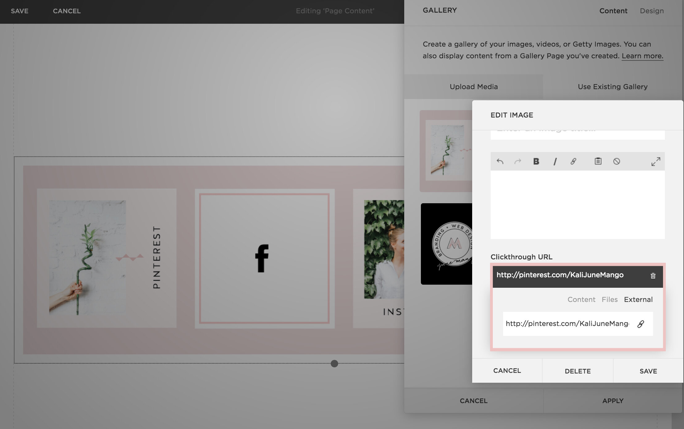
Step 5: After each image is uploaded, hover your mouse over the first image and click the gear icon.
Step 6: Add the website, page or file you would like to link the first section to and click save. Repeat for each additional section.
Step 7: Now that everything is linked, it's time to make sure the sections look like one cohesive image. You can adjust the Carousel block up or down until the sections are all showing up (not cropped) and everything looks good.
Step 7: Click save and that's it!
This little trick opens up so many possibilities from a design + layout standpoint. Another way that I use it is to add two images right next to each other without any space (like this). Or you could create a really cool collage with images/products that all link to each individual service or product page. Oh man, I could go on and on!!
The following information was created for use with templates made with Squarespace 7.0.
Stay tuned for more tips and tricks for the new 7.1 platform!
LOGO PROCESS: JANE O. COACHING
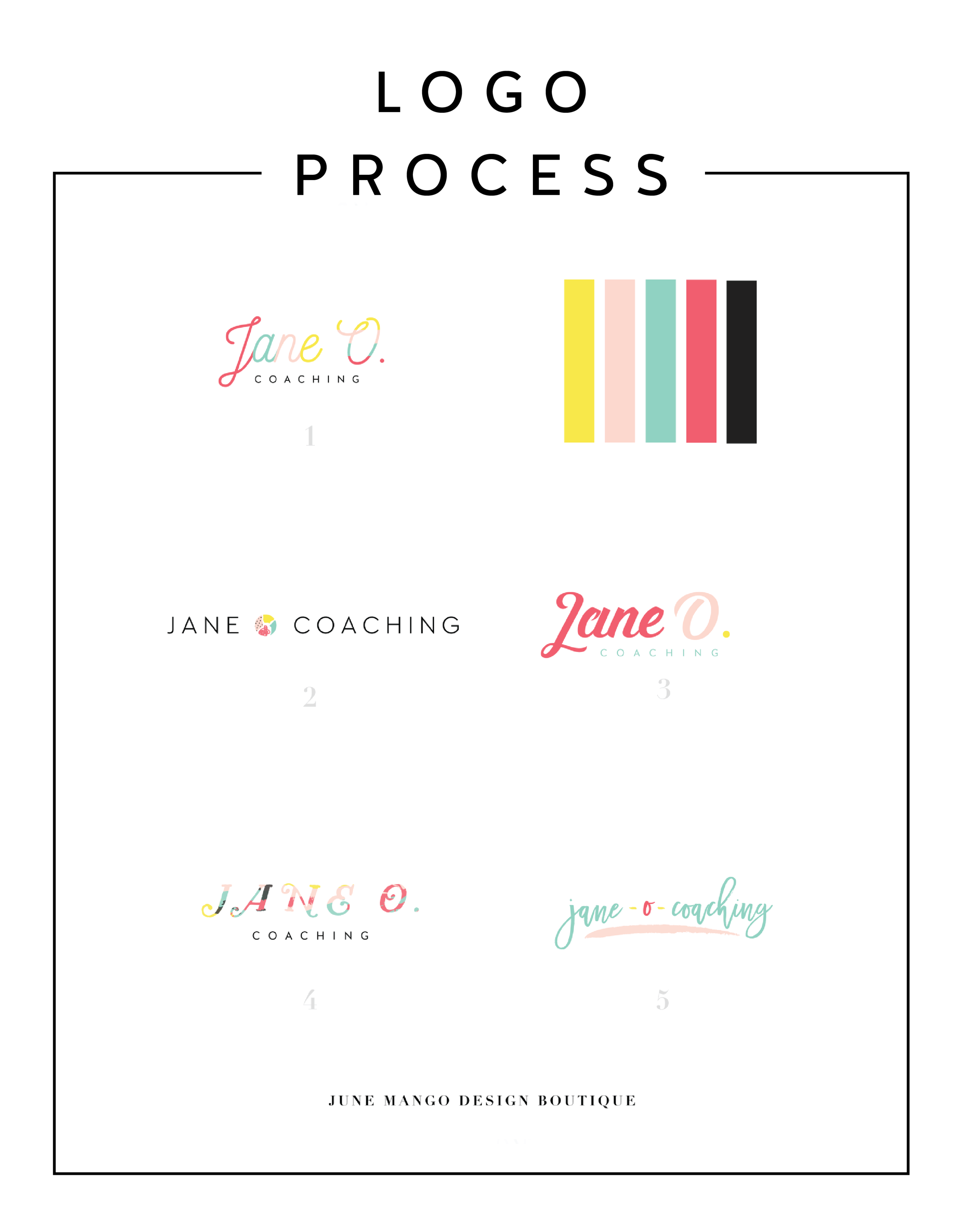
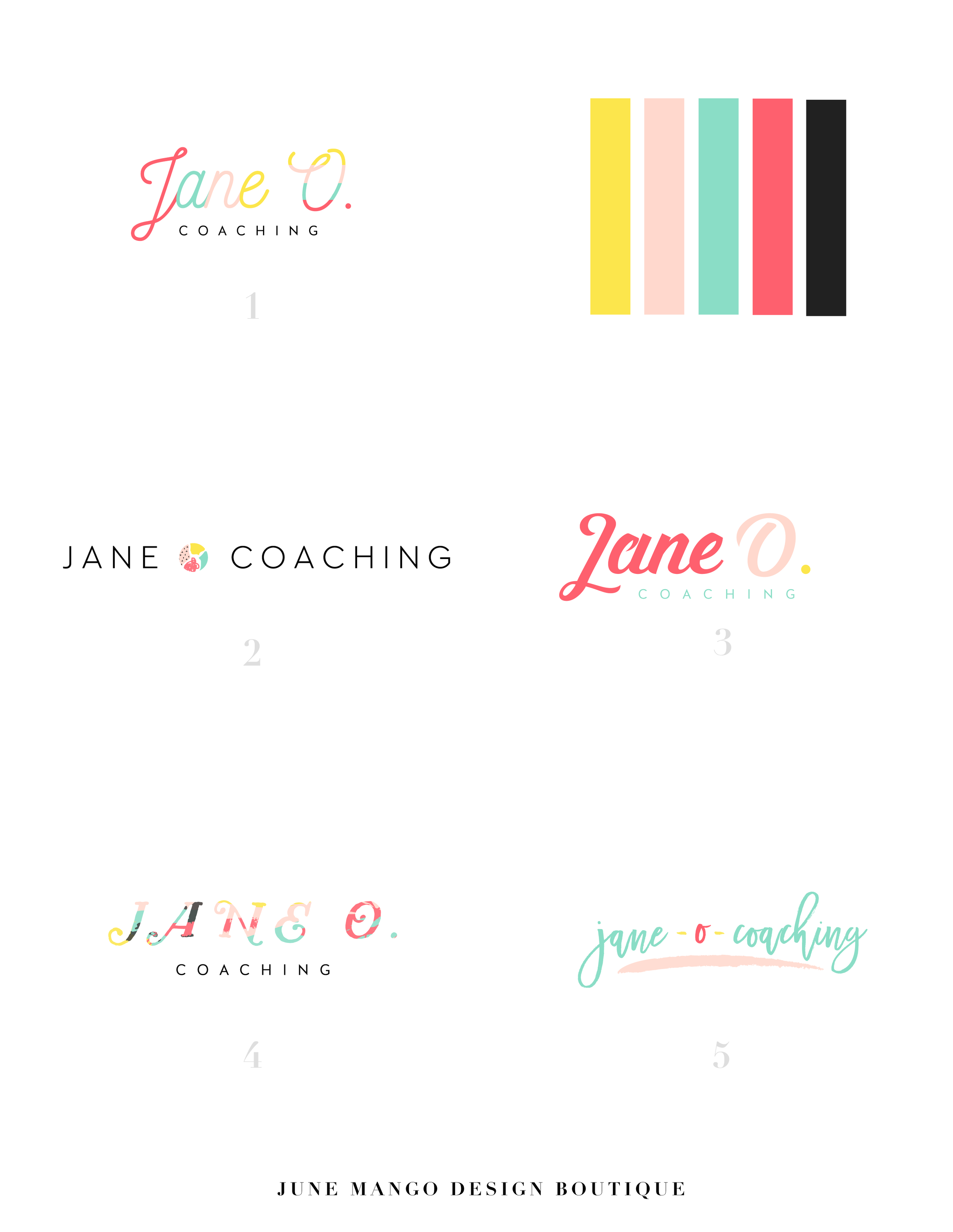
I haven't shared a logo process in a while. This logo process is from Jane O. Coaching, who is a love and style coach with an amazing colorful, bright vibe. So of course, she wanted her branding to be feminine, colorful and fun to show off her coaching niches.
I haven't shared a logo process in a while. This logo process is from Jane O. Coaching, who is a love and style coach with an amazing colorful, bright vibe. So of course, she wanted her branding to be feminine, colorful and fun to show off her coaching niches.
We ended up heading in the direction of #3, with some additional tweaks and customizations to make it fully unique to Jane. To see the full branding and web design that came from this logo process, head on over to janeocoaching.com.
And if you want to chat about your own logo or branding, holla at me!
Related Posts
HOW TO REBRAND STRATEGICALLY
There are a lot of moving parts to a business, and your brand is just one of them. Branding is about getting to the heart of what I do best, who I serve best, and how I can best represent that through my business. So how do you even begin to strategically rebrand your biz? I have laid out my process with a few tips below, so read on!
If you have been following June Mango for a while, you will obviously have noticed that it's just gotten a major facelift. I am so excited about it and it's been a long time coming.
What I mean by that is that I have been diving deep behind the scenes to strategically rebrand my biz. This is more than just a new logo and color palette, although that's definitely part of it. This is about really getting to the heart of what I do best, who I serve best, and how I can best represent that through my brand. So how do you even begin to strategically rebrand your biz? I have laid out my process with a few tips below, so read on!
There are a lot of moving parts to a business, and your brand is just one of them. For me, I knew it was time for a rebrand when I felt that my messaging and design weren't matching up with:
A) the level of clients I was working with
B) the types of clients I wanted to attract
C) the level of expertise that I have collected from running my business for a few years
D) the actual design work I want to be creating
So these pieces each were key elements that just weren't matching up with what I was putting out into the world. In short, I had grown a lot as a designer and business owner, and wanted my brand to reflect that.
So now that I as aware of what I wanted to be sharing with my ideal audience, it was time to create the messaging and design to match. Now, I am NOT a copywriter, but I do think that the copy in your brand is just as important for your consistent business voice as your design. There are a lot of amazing copywriters that can help you share your vision in your voice, so don't be afraid to hand over the reigns.
Design-wise, I tried to really get clear on what:
A) I'm really good at
B) I can do that not many other designer's can
C) type of design I like to create
D) what type of design my ideal audience is looking for
With these things in mind, it was easy to create a website and brand that showcased all of the above. And the key here is that the real reason it was easy, is because it was natural. This is another reason I knew it was time to rebrand - I was eager to stretch my legs into design that fit me better.
Finally, I always like to keep in mind the visuals of the previous logo and branding. You don't want to completely change your look or else no one will recognize you! (Think Jennifer Grey after the nose job). So I stuck closely to the layout of my old logo, kept some of the same colors, like the pink, and just updated the hues. I also added a new stamp as an alternative logo to help share my services + expertise in a clear way and round everything out.
Overall, I am so happy with it. It really represents me, my design style, and my ideal clients. And that is exactly what your brand should do. :)
The full branding + web design:
5 QUESTIONS TO ASK BEFORE SWITCHING FROM WORDPRESS TO SQUARESPACE
So you've been thinking about switching from WordPress to SquareSpace, but aren't sure if it's right for you or your business. So how do you know if you should switch things up or stay put? Here are a few questions to help you decide:
So you've been thinking about switching from WordPress to SquareSpace, but aren't sure if it's right for you or your business. So how do you know if you should switch things up or stay put? Here are a few questions to help you decide:
How much do you blog? If you are a regular blogger posting content more than once a week, you may want to stay with WordPress. Not only does WordPress have an amazing database for all that content, but it will also be quite a process to move all of that content over to SquareSpace without messing with the posts' formatting, plugins, etc. If you don't blog as regularly, this is less of an issue. I merge blogs over from WordPress to SquareSpace all the time, so it definitely can be done. You may end up tweaking each post to make sure it works in the new SquareSpace site, but if you don't have hundreds of posts, this isn't a huge issue.
How often will you be adding pages or tweaking your content? If you know you're going to be adding new forms, creating pages for an e-course or anything else that would require you to get in the backend and easily create your own content, SquareSpace is the clear winner. It's user interface is extremely easy to use and it even has pre-made page layouts for the novice web designer.
Do you need a lot of customization?Do you need to be able to tweak a lot of little things or have some crazy-cool functionality like a unicorn that flies across the screen? If so, stick with WordPress. WordPress allows you to create a custom-coded child theme and you can pretty much do anything you want with that (with the help of a developer). SquareSpace's customization is a little limited, mostly because they don't want the novice web designer to break his/her site! But even SquareSpace can be customized to a certain extent , like I've talked about this and this post.
Do you want to be hands-off for the website's maintenance? Then SquareSpace is the better choice. Since SquareSpace isn't open-source, unlike WordPress, they control everything. This means there are hardly any bugs, no need to manually backup your site, and if you ever have an issue, their support team is ah-mazing. I can't even count how many times I've used their live chat option when I have a question about something.
What's your price point? There's obviously no "set cost" for either of the platforms, it just depends on what you need. For WordPress, you have to pay for hosting as well as your domain name, plus any theme you purchase or web designer/developer you may hire to help create the site. If you're creating a custom site, you could be paying upwards of 20K! SquareSpace has a few plans that you can choose from, and most businesses can get away with the Personal plan, which is $12/month. Add that cost to your domain name and it's only a few hundred dollars if you set it up yourself. If you hire a web designer to help you, you will likely still walk away with a brand new site for less than a few thousand dollars.
So what do you think? It really just depends on your answers to these questions, but hopefully you find them helpful in determining which choice is right for you! And hey, if you want to chat through any of this more, I'm here! Just holla at me.
The following information was created for use with templates made with Squarespace 7.0.
Stay tuned for more tips and tricks for the new 7.1 platform!
Related Posts
need even more help with squarespace?
Skip the overwhelm and have your website designed and launched in just 5 days (or less)!
LEARN MORE
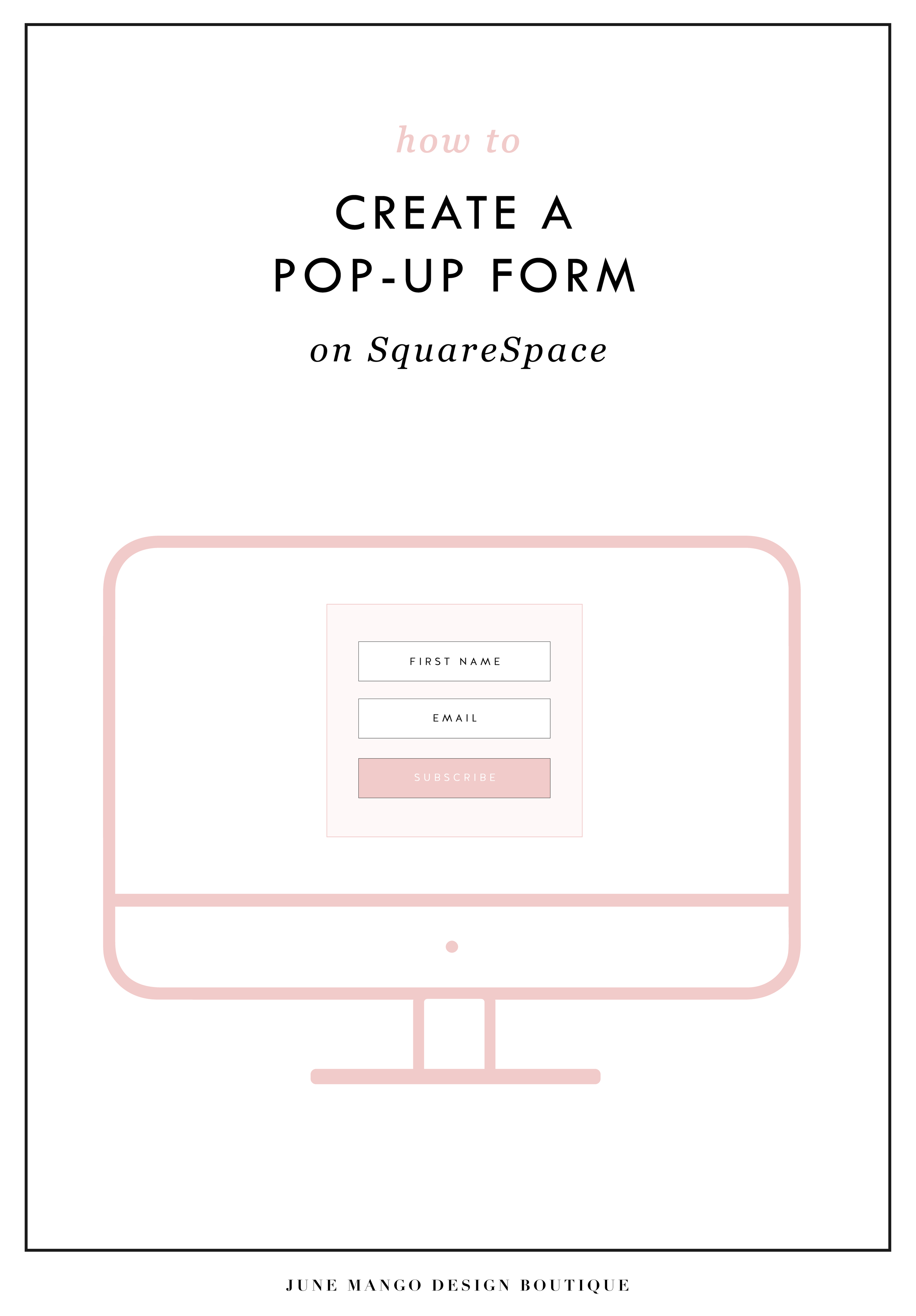
HOW TO CREATE A POP-UP FORM ON SQUARESPACE
When I discover a new trick on SquareSpace I get so excited because...
A) I have a new tool in my toolkit when building client websites.
B) I get to share it with you! Because if I didn't know this existed, chances are other people don't either.
I recently discovered a super helpful, and super simple way to create a pop-up form for your SquareSpace website. And you can do it without any custom code or tech-savvy-ness.
Just follow the 4 simple steps below.
Open your Content Block options, and click Add Form.
2) Create your form in the normal way, adding the fields you need. Then click the Advanced tab.
3) In the Advanced tab, click the circle next to "Enable Lightbox Mode". This is the key to making your form pop-up, verses just sit on your page as a regular form. You can also write the call-to-action text you want for your pop-up button in the "Open Button Label" field.
4) And TA - DA ! You just created a pop-up form on your SquareSpace site!
The following information was created for use with templates made with Squarespace 7.0.
Stay tuned for more tips and tricks for the new 7.1 platform!
LOGO PROCESS: JULIA KILKENNY
This little behind the scenes of the logo process is from the branding project for Julia Kilkenny, who is a coach for creative entrepreneurs. She described her ideal brand to me as "the first blue sky day of Spring." Amazing, right?! I took that and really ran with it and created these little nuggets for her.
This little behind the scenes of the logo process is from the branding project for Julia Kilkenny, who is a coach for creative entrepreneurs. She described her ideal brand to me as "the first blue sky day of Spring." Amazing, right?! I took that and really ran with it and created these little nuggets for her.
We ended up going with #2 and brought in more of that gorgy color palette. You can see the final branding and the web design to match this logo process over at juliakilkenny.com.
And if you feel like chatting with me about your own logo and branding, I'd love for you to holla at me
Related Posts
CHANGING THE COLOR OF SOCIAL MEDIA ICONS IN SQUARESPACE
So you've created your brand-spankin' new SquareSpace website and styled it perfectly to match your brand with font pairings, gorgeous colors and a lovely layout. BUT, you can't get those pesky social media icons to match your pretty palette. Don't worry! I've gotcher back.
There's a tiny string of code that you can use to change the SquareSpace social media icons from black and blah to any color you want! Follow the steps below on your own site and voila, styled social icons!
Here are the details:
In the backend of your SquareSpace site, navigate to DESIGN.
Click on CUSTOM CSS.
Paste in this bit of code:
.sqs-use--icon { fill: #F65959 !important; } .sqs-svg-icon--wrapper:hover { .sqs-use--icon { fill: #444 !important; } }
The bolded HEX color is what you'll need to change to match your own color palette. If your not sure what HEX your color is, check out this handy converter.
That's it! You're set.
Don't you feel like a Squarespace genius?!


