

MAKE YOUR 404 PAGE WORK FOR YOU

A 404 page is the often overlooked little page that exists on every website to help a user who's lost their way. You've surely ended up on a 404 page at some point over your years of surfing the web. It's main purpose two-fold:
It should first tell you that the page your looking for doesn't exist. This could be because it's been deleted or moved, or maybe you typed it wrong by accident.
The second purpose should be to direct you to something else. You were trying to get somewhere in the first place, so the 404 says, "Here, let me help you find your way back home." And usually, the homepage is the only place you have the option to go.
But what if your soon-to-be favorite client ends up on your 404 page? Wouldn't you like them to stick around, maybe even learn a bit about your services, or even end up contacting / buying from you??
The answer is yes. Of course!
So how can you out your 404 page to work for you?
Here are a few options you can include on your 404 page to keep your website open and in front of the eyes of your soon-to-be favorite client (and everyone else!):
Add a link to your most popular article(s)
Add a link to your About page
Add a link to your Services page
Add a link to your social media account(s)
Add a sign-up form for your newsletter
Add a link to your blog
Do you see where I'm going with this? Add a call-to-action that gets them interested and locked into another part of your website. Adding in a bit of fun text is a great way to ensure that they'll click.
This is a super simple trick that you should definitely consider adding to your own website. I promise, it's worth it!
Need help customizing your 404 page, want to know more or just want to chat? Holla at me!
Related Posts


need even more help with squarespace?
Skip the overwhelm and have your website designed and launched in just 5 days (or less)!
LEARN MORE

THE FIRST STEP TO GREAT DESIGN IS...
habits can cause you to miss an opportunity or see something new. A huge part of good design is focusing on the tiny little details to make each touchpoint seamless, easy, and in tune with people's needs. If you aren't aware, you can miss some of these design opportunities.
So how can you snap yourself out of your habitual views?
Conscious attention.
Most of the time, we walk around in our little worlds, moving through daily life habitually doing what we know how to do, unconsciously going through the motions. I do this, you do this, your mom does this. Sometimes, it's really helpful. If you're taking a shower, for example, it would be such a pain if you had to consciously think how to wash your hair or use a bar of soap.
But sometimes, habits can cause you to miss an opportunity or see something new. A huge part of good design is focusing on the tiny little details to make each touchpoint seamless, easy, and in tune with people's needs. If you aren't aware, you can miss some of these design opportunities.
So how can you snap yourself out of your habitual views?
Take a step back and ask questions. Ask yourself if the way you're doing something is really the best way. Could something be changed for the better? Could you add something to make life a bit easier (ie: a few easy-to-access links on your homepage, a bold and bright pop of color to make your business cards more noticeable, etc)?
Look closer. Design is in the details. It's hidden in the little conscious decisions that make something more user-friendly. Think about how someone who knows nothing about your brand will interact with your website or logo. Are there ways you can make them clearly understand your mission?
Think younger. "That's just the way the world works" is a phrase adults tell kids because it's the easiest way out. But kids haven't been around long enough to get used to 'the way the world works.' They see the world through fresh eyes. Getting into the mindset of a child can help you think outside of the normal, day-to-day habits.
If you want to practice these tips, go exploring. Try to ask questions about things you think you already know everything about. This applies to everything from the stars to your website.
Keep an open mind and see if you can't get those creative juices flowing!
Related Posts


need even more help with squarespace?
Skip the overwhelm and have your website designed and launched in just 5 days (or less)!
LEARN MORE

BRANDING FOR ETSY STORE OWNERS
Whether you've just launched your first Etsy store or are a seasoned veteran looking for a brand refresh, there are four main ideas to help you narrow down your vision.
Whether you've just launched your first Etsy store or are a seasoned veteran looking for a brand refresh, there are four main ideas to help you narrow down your vision.
1. Be distinctive
What makes you unique? What is the thing that makes your work stand out from all the rest. Do you knit quirky, colorful scarves? Do your greeting cards put Hallmark to shame? Are you selling witty handmade pillows to throw on a newlywed bed? Whatever it is, narrow in on that, because that is what makes you unique and will get your dream customers attention.
2. Brand it!
How do you take your unique-ness ( see above! ), and turn it into the most fantastic branding ever?
Answer: Emotion. Find that emotional connection your style has with your customers. A new mamma wants to feel cool and stylish, but is also covered in drool all day. Do you sell funky t-shirts that are comfy and totally trendy? Boom. Are your greeting cards tackling hard subjects with humor? YES! Capture that.
If you take these emotional pieces and translate them into visuals, you have your branding. Done right, clients will have a sense of your style before they even see the whole catalog of your products.
3. Work your website
Branding doesn't stop with your logo or color palette. Your brand needs to carry through to your website and online shop, if you have one. Now is the time to consider your dream client's journey through your site. Yes, I said journey. Think about where they will start (homepage, Etsy storefront?) and where you want them to end up (contact page, Checkout?).
You can continue to work in that emotional component by telling a story as you go. Here is an example:
Click ... Main shop / storefront A collection of creative, quality handmade items for the home.
Click ... product page from search A quirky state-shaped cheese platter made from Acacia wood, which would be the perfect gift.
Click ... Checkout How much are they going to love this gift!
Thinking about how a potential customer will wander through your website will allow you to create the right structure, content and navigation.
4. One step further
As the creative business owner you are, you know there's more to consider. Social media (product shots, header images, etc), advertisements and wholesale price sheets are all places to carry over your branding. Think about each customer's experience from beginning to end. From the logo to store front signs to packaging to thank you stationary, everything should be cohesive. Make sure to ask yourself if it sends the right signals and emotions. In the end, it should be in line with your unique creations.
Looking for examples of a maker's branding in action? Head on over this-a-way.
Related Posts


BRAND STYLE BOARDS 101

You may have seen these little guys floating around on Pinterest and not known exactly what they are or what their purpose is.
Every designer does their Brand Style Boards a little bit differently, but as a rule there are a few things that should be included.
Logo
This is the main logo that will be used on important touch points like the website, business cards, etc
Submark / Secondary Logo
This is a variation of the logo and usually much simpler. Often an icon, it can be used as an avatar on social media or as a stamp on images for bloggers and photographers
Color Palette
I always make sure to include not only the color swatches, but the various color values. This helps a client match their color palette from anything like a printed business card to their website
Fonts
The fonts are really important to the brand and are NOT an afterthought, so it's imp ortant to make sure to include them on the Brand Style Board to ensure that the fonts match up on all future branded collateral.
In the examples below, I also include design elements that can be used as icons or graphics on the website. Sometimes a branding package will include patterns or buttons / graphics for the client's website, which are also helpful to include on the Brand Style Board. I also always include the mood board that I created for the internal branding process. I think it helps tie everything together and give the client a good idea for the types of imagery they should look for when creating other items for the brand (ie: website, media kit, etc).


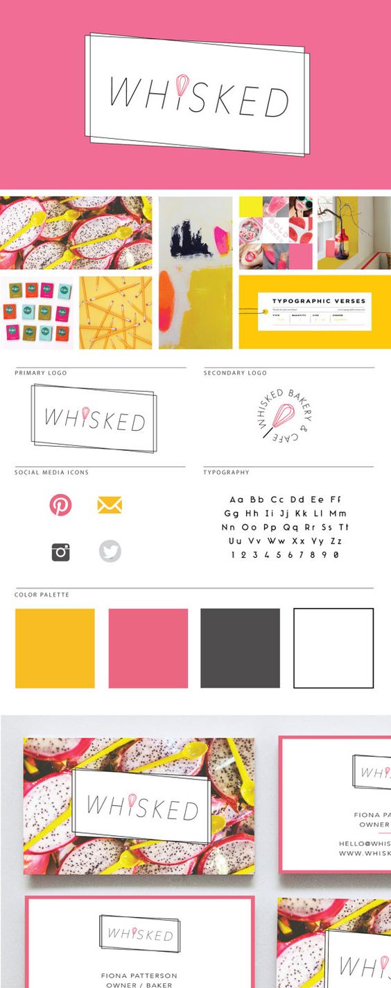
Ultimately, the Brand Style Board should contain the core of your brand. At a glance, it should be everything you need as a reference for you and anyone you hire down the line. It should guide every visual choice you make for your business.
To see more examples, head this-a-way or to chat with me about your brand head that-a-way!
need even more help with squarespace?
Skip the overwhelm and have your website designed and launched in just 5 days (or less)!
LEARN MORE
Related Posts

HOW TO MAKE A MOOD BOARD
Mood boards help align the aesthetic, color palette, and tone of a project. They get me on the same page with my clients. They can also help get the ideas out of my brain (or off of Pinterest, if I'm wedding planning) and into a clearly organized visual hierarchy.
Mood boards are so crucial to everything I do that's visual. Starting a logo project? MOOD BOARD! Re-decorating my living room? MOOD BOARD! Planning my wedding visuals? MOOD BOARD!
Mood boards force you to select the crucial images that best represent the style of whatever you're getting ready to create. I go a step further and make sure to pick images that include the following:
texture
design elements / inspiration
lifestyle images
color palette swatches
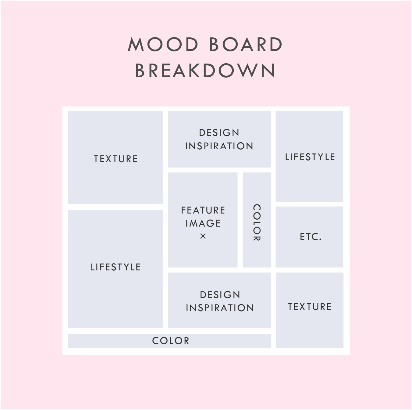
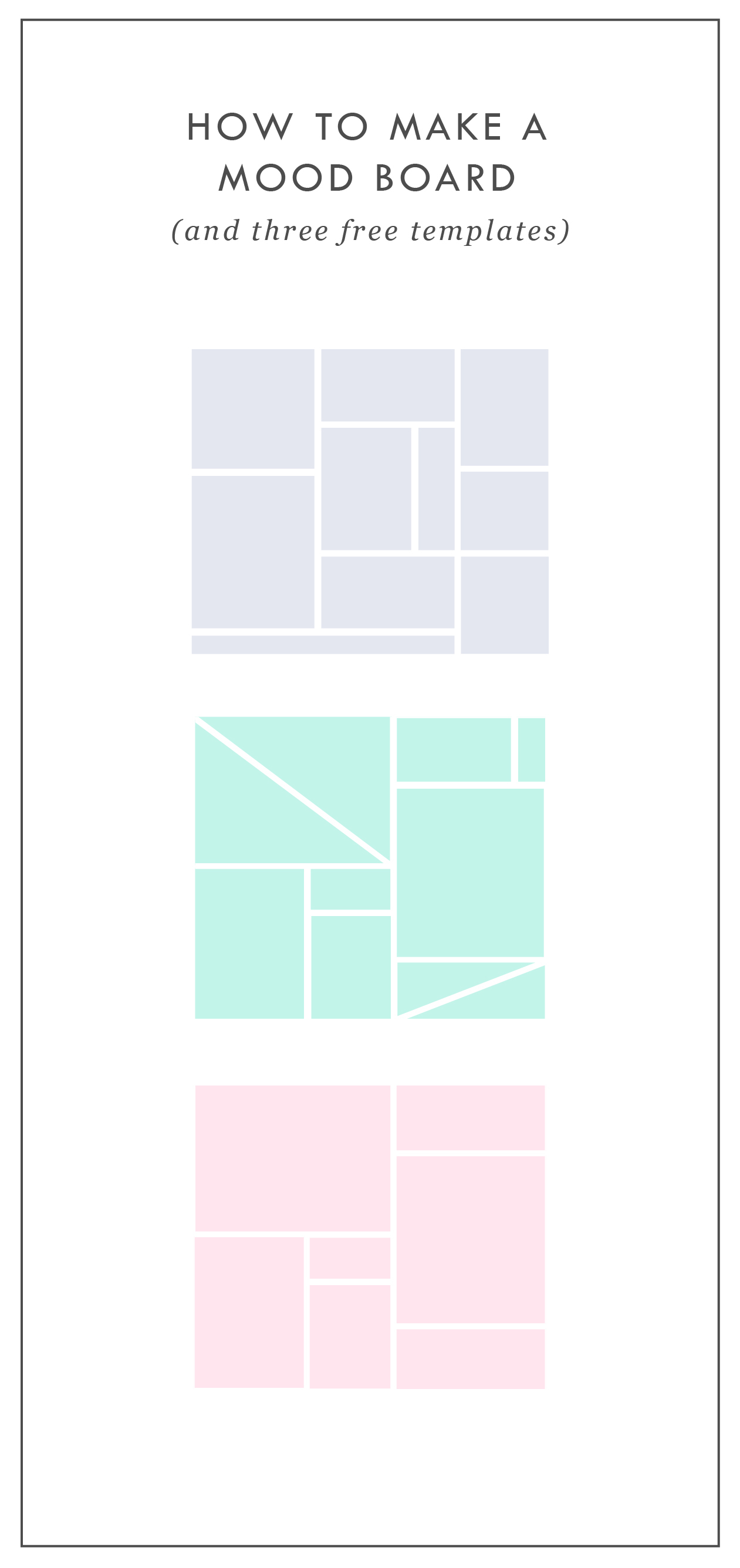
Above is a breakdown of how I organize a sample mood board which each of these elements.
In addition to the elements listed in this mood board layout, you can see that I also have a space for a "feature image" right in the middle. This should be the core mood / style / feeling of the project. It should be whatever resonates with you the most.
I also have a space for whatever else makes sense for the brand or project. I called this "Etc." This can be any image or detail that you find is inspirational but may not fit the other elements.
A good mood board should help keep you visually focused as you move into the next phases of the project.
If you'd like some inspiration, try this or this!
If you'd like to try your hand at creating your own mood board, I've got three free mood board templates you can download here! These are in PDF format, which means you can open them in most design programs.
NEW!
a templated guide to
messaging magic
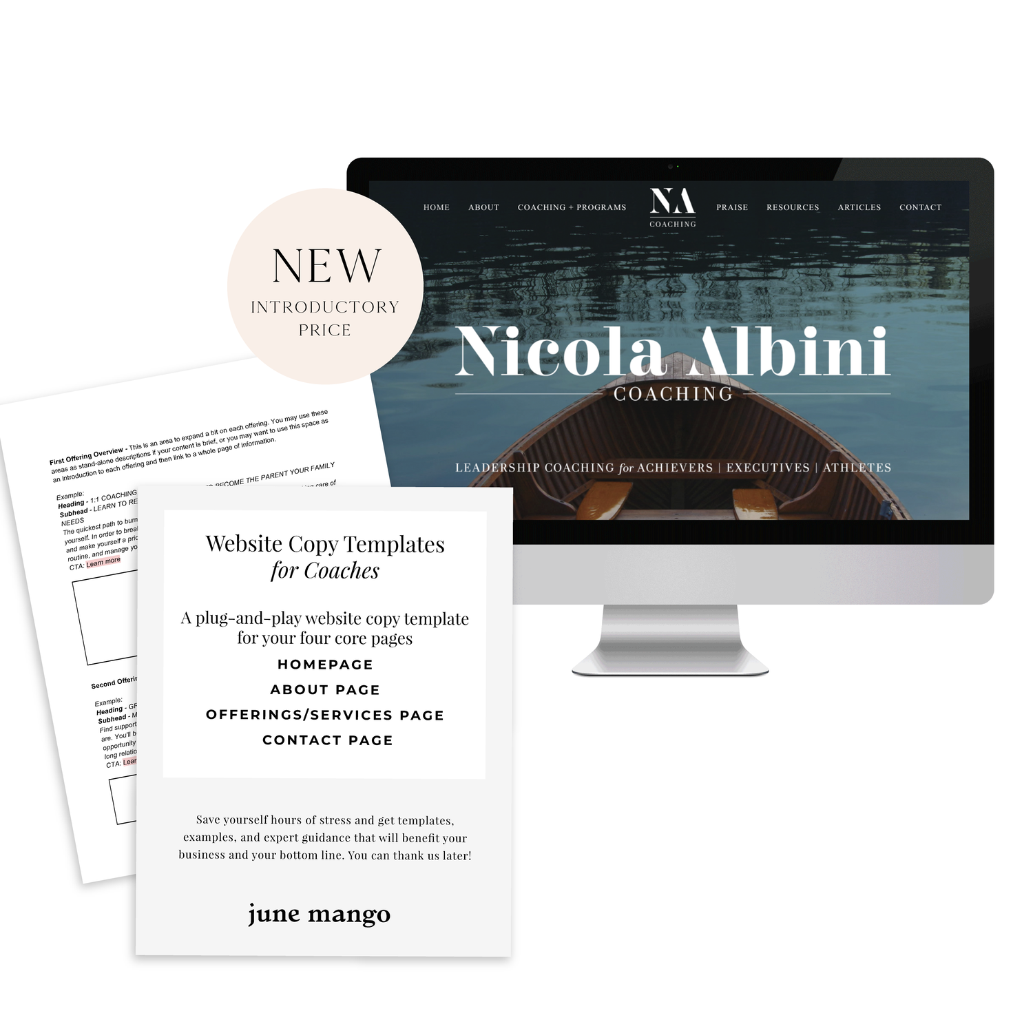
A plug-and-play website copy template for your four core pages (Home, About, Offerings, Contact). Save yourself hours of stress and get templates, examples, and expert guidance that will benefit your business and your bottom line.
get your template now >


STOCK PHOTO GUIDE · PART 1
Stock photos can be a fabulous asset to your marketing and web design projects. They can lend a helpful hand in creating a gorgeous project, but make sure that hand doesn't end up as a crutch where you just grab any old photo. These are my go-to tips for choosing the right stock photo for YOU.
Stock photos can be a fabulous asset to your marketing and web design projects. They can lend a helpful hand in creating a gorgeous project, but make sure that hand doesn't end up as a crutch where you just grab any old photo. Below are my go-to tips for choosing the right stock photo for YOU.
DON'T -
Go right to the old standards. Pictures of people in business suits jumping, a man pulling his hair out, anyone with a blank white sign.... just don't do it. It's overdone and makes you seems instantly outdated and unoriginal. Plus, they look unnatural, and there's a good chance that people have seen the same (or similar) images elsewhere, which may be bad for your brand depending on what associations they have with these images.
Disregard color. The photo shouldn't be really dark and moody if you're website is mostly pink and yellow. Look for stock photos that have a similar color palette or lightness/darkness to match your project.
Be afraid to edit. Throw that image into Photoshop to crop it, change a color or delete an element that doesn't fit. You don't have to feel limited to what you get when you press download.
DO -
Aim for creativity. You're stock photos should be a curated collection of high-quality photography that doesn't feel phony. Those stock photos with people smiling as they eat their Cheerios scream S-T-O-C-K. No thanks. People want to see modern, relevant, authentic images. Images people can relate to are worth the coveted space on your website or marketing materials.
Refine your search. Most stock photo sites allow you to filter your search results. Take advantage of these tools to search for the photo that will fit best for your project. Need to overlay text? Look for a photo with a composition that includes copy space. Looking for one person, a group or just an object? You can filter by number of people, too.
Accurately reflect your brand. Asking yourself if the photo makes sense for your brand is the most important element of choosing a good stock photo. If you are a marketing towards women, you likely won't benefit from using a photo of a tattoo-covered biker dude (unless these woman like that sorta thang). Make a rule to choose stock photos in the same style for consistency. Use rules like color palettes, similar lighting, white backgrounds only, etc. Whatever matches your brand style.
Hopefully you feel armed with a stock photo plan of action. Using these tips above, you'll be sure to have a gorgeous and consistent look to your project. Check back for Part 2 of this post series where I'll dive into all my favorite paid (and a few free!) stock photo sites!
Related Posts
need even more help with squarespace?
Skip the overwhelm and have your website designed and launched in just 5 days (or less)!
LEARN MORE

3 REASONS TO REFRESH YOUR WEBSITE
Sometimes the idea of building a brand new website can be a little scary. There are probably a few reasons for this. You may be afraid the process will take too long or that it's too expensive. You think of updating your website as a 'backburner' item that you will get to eventually.
Building your website doesn't have to be this big scary monster of a task. Here are three solutions to those three main fears.
Sometimes the idea of building a brand new website can be a little scary. There are probably a few reasons for this. You may be afraid the process will take too long or that it's too expensive. You think of updating your website as a 'backburner' item that you will get to eventually.
Building your website doesn't have to be this big scary monster of a task. Here are three solutions to those three main fears.

It doesn't have to take months. It can take days. Really.
When I worked as an agency designer, we had a process of building websites that caused the projects to take months. There was even one project that I started when I was hired and was still ongoing when I left. This is sooo unnecessary. The reason some web project take so long is the process. But with a process that allows me to collaborate with my clients, the project time is drastically reduced. By helping hone in on what we will need BEFORE we dive into the design process, the whole project can take just a few short weeks (or even days!).
It's NOT too expensive.
This can be true, but it really depends on what you want in a website. If you would like to see unicorns fly across the screen as the user scrolls, well, sure, that is a bit fancier and will cost a bit more money to custom code those details. But if you are looking for a website that reflects your personal brand and is cleanly coded and responsive, it's completely within reason to create this on a budget.
It's affects your bottom line.
Is your business a priority? Then your website should be, too. If you look at your website as your online business card, is it saying everything you need it to say? If not, creating your better online business presence should really be a priority, too.
Your website is your hardest working employee. It should tell people who you are, what you do, and how to buy you - when you aren't there to do that in person. Does yours?
Creating and updating your website doesn't have to be so scary. You may just need to rethink the type of web design project that's right for you. There are so many options and resources out on the internet that you can use to help you keep growing your biz online and off. :)
Related Posts
NEED EVEN MORE HELP WITH SQUARESPACE?
Skip the overwhelm and have your website designed and launched in just 5 days (or less)!
LEARN MORE

HOW TO BRAND YOUR INSTAGRAM GRID
There are several ways to brand yourself and ultimately grow your dream-following on Instagram. (A dream-following is made up of an audience who is genuinely interested in your content + your brand and will therefore be more likely to buy from you).

If you're like me, you probably love scrolling through Instagram and seeing the gorgy photos other creative entrepreneurs are posting. I definitely do. I can get sucked into an Instagram time warp and lose hours staring at styled posts and pretty feeds! And you know what I do after I find a beautiful Instagram account? I follow them! Obvi.
There are several ways to brand yourself and ultimately grow your dream-following on Instagram. (A dream-following is made up of an audience who is genuinely interested in your content + your brand and will therefore be more likely to buy from you).
When a new person stumbles upon your Instagram account, they will likely take a peek at your account's grid. (The grid is made up of all the images you've posted to date that fall below your account info). A cohesive grid will do wonders for converting passing 'grammers into steadfast followers. Below are a few things you can do to polish your Instagram grid.
Pick an aesthetic theme.
This can vary depending on what works best for you, but there should be some consistency to what your posting. Make a rule or two for yourself and STICK TO IT. A few good options include:
Picking a color palette. (ie: pastels, rustic neutrals, crisp whites + greys)
Picking a style. (ie: minimalism, bright + bold, dark + moody)
Picking a limited number of interests. (ie: beauty, interior decorating, your baby + your pup)
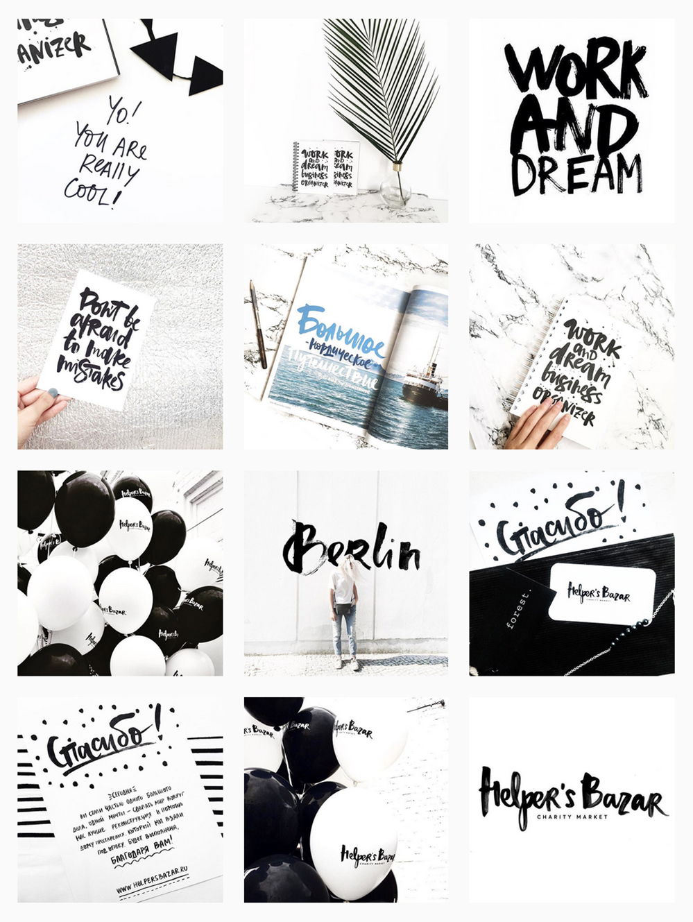
Here are some great examples of real people who have used a theme to create a gorgeous brand on Instagram:

Create a strategic grid.
Before I post anything, I take a look at my previous posts. How will the new photo look in my grid? Here are three questions to ask yourself before posting:
How does this image look next to the last photo I posted?
How does this post look above the photo that will be under it?
Do the colors of the new image coordinate with these two photos?
Does the layout coordinate with these two photos (ie: avoid photos with lots of detail from being side to side. It's hard on the eyes.)
Here are some great examples of real people who have created a strategic grid on Instagram:


Critique your current grid.
If you begin posting in a new style based on the tips above, don't be afraid to edit your previous photos. Deleting images that don't fit in can help visually clean up your feed and create a consistent look, which will help you appear more put together as a brand on Instagram.
Hopefully these tips help you craft a branded Instagram grid! If you have any additional tips that I missed, please let me know in the comments.



5 ITEMS YOU NEED ON YOUR HOMEPAGE
the first thing you see on any website is the homepage. It's like the internet's handshake. "Nice to meet you! Let me introduce myself." Needless to say, your homepage is important. With that in mind, there are some super simple things that you can do to improve your homepage and make sure it's giving that firm handshake.

I've seen too many websites to count. This is, in part, because I am a human living in the 21st century. But it's also because I'm a web designer, and it's my job to stare at, create, and edit websites day in and day out! After years of studying and perusing the web world, I've learned some pretty important items that make for a successful website. And the first thing you see on any website is the homepage. It's like the internet's handshake. "Nice to meet you! Let me introduce myself." Needless to say, your homepage is important. With that in mind, there are some super simple things that you can do to improve your homepage and make sure it's giving that firm handshake.
Clear Call-to-Actions• This is so important. Direct your audience to the places you'd like them to visit by including clear call-to-actions in the form of links or buttons. You control where they end up on your website!
Your Mission Statement • What do you even do?! You know your business inside and out, but a new visitor may know nothing about it. A short sentence front and center is essential.
Your Brand Name • Duh! But you'd be surprised how often I find myself on a website and have no idea where I am or whose website the page belongs to. Make sure your logo is easy to see. It should be at the top and bottom of your homepage.
Appropriate Imagery • Your homepage imagery should represent your business offering. If you're a florist, you should have photos of flowers or bouquets, not nessiciarily yourself.
Services Overview • You've added your mission, but what are your actual service offerings? If your a graphic design boutique (ahem), you may put that in your mission statement, but then list out what design services you offer (branding, web design, etc). Not every business in the same field offers the same services.
Related Posts
need even more help with squarespace?
Skip the overwhelm and have your website designed and launched in just 5 days (or less)!
LEARN MORE

STOCK PHOTO GUIDE · PART 2
Best stock photo sites for your blog or website
In my last post, I talked about how to pick the right stock photos for your blog or personal brand. In part 2 of this post series, I want to dive into where to find the best stock photos. There are so many sites out there that offer both free and paid photos. But a lot of them don't even come close to offering an authentic product. So where should you start your search for cool, creative photos? Dive down to my curated list of free stock photos below.
Best Free Stock Photos
Unsplash This website adds 10 new royalty-free photos every few days, and the photos consist of breathtaking landscapes and unique portraits.
Picjumbo This is a great one for food or nutrition bloggers since they have some awesome food photography. The photos also have a little less of a hipster vibe if you're looking for something traditional.
IM Creator This is such a well organized collection of photos. This site also has web templates and other goodies to assist with your website. The catch: attribution is required.
Death to Stock Photo With 10 free photos every month just for signing up, this site offers curated images that are really high quality. You can also purchase the premium membership for access to over 400 photos.
FancyCrave These are great for both commercial and personal projects. With two new photos added daily, there's a pretty giant selection to choose from!
Stocka If you're looking for 'product' photos or images with a clean, white background, Stocka is perfect.
Splitshare Another great resource with a lot of photos to choose from. It's also organized really well making it easy to search and find exactly what you're looking for.
Pexels This is one of my faves for it's colorful, creative selection. These photos are perfect for blogs and websites.
Startup Stock Photos These are more business-oriented, but are great if you're looking for a computer / desk shot.
Gratisography Looking for the opposite of corporate stock photos? Look no further. These quirky (sometimes creepy?) photos are anything but the same old stock photo.
stocksnap.io This site offers high-res, photos with a handful of unique layouts and compositions.
Jay Mantri This lady has some gorgy photos. Most consist of destinations and amazing texture shots. It's set up like a photo blog, so it's a bit hard to search, but they're worth getting lost in.
Designer Pics These photos have a faded, yet colorful feel. They're really unique and perfect for the right niche.
finda.photo This site is made for the phrase 'last but not least'. This site is brings together tons of free photos from a lot of the sites I've listed above. It has a robust search engine that lets you narrow down your choices through filters like color, collection (landscapes or close-ups) or source (unsplash or Jay Mantri). In short, it's awesome.
Related Posts
NEED EVEN MORE HELP WITH SQUARESPACE?
Skip the overwhelm and have your website designed and launched in just 5 days (or less)!
LEARN MORE

SYMMETRY VS ASYMMETRY
Sometimes people wonder how I layout my designs or if there are certain rules that I follow. The answer is yes! I studied Fine Arts in college and learned some basic, but crucial design principles that I apply to every project I create. A super standard design principle that everyone knows, is symmetry. But you may not know that asymmetry is an equally important tool. Read on!
Sometimes people wonder how I layout my designs or if there are certain rules that I follow. The answer is yes! I studied Fine Arts in college and learned some basic, but crucial design principles that I apply to every project I create. A super standard design principle that everyone knows, is symmetry. But you may not know that asymmetry is an equally important tool. Read on!
Symmetry has long been touted as the gold standard of design. By definition, symmetry allows a composition to be balanced on all sides. This is visually easy on the eye and therefore, great for organizing content in a logical way.
But don’t rush to choose symmetry as your default design tool. The downside to symmetry is that it can feel a bit boring, especially when used in excess. It becomes predictable and oversimplified.
Asymmetry, when used thoughtfully, can break up the uniformity to create a composition that is visually exciting and complex.
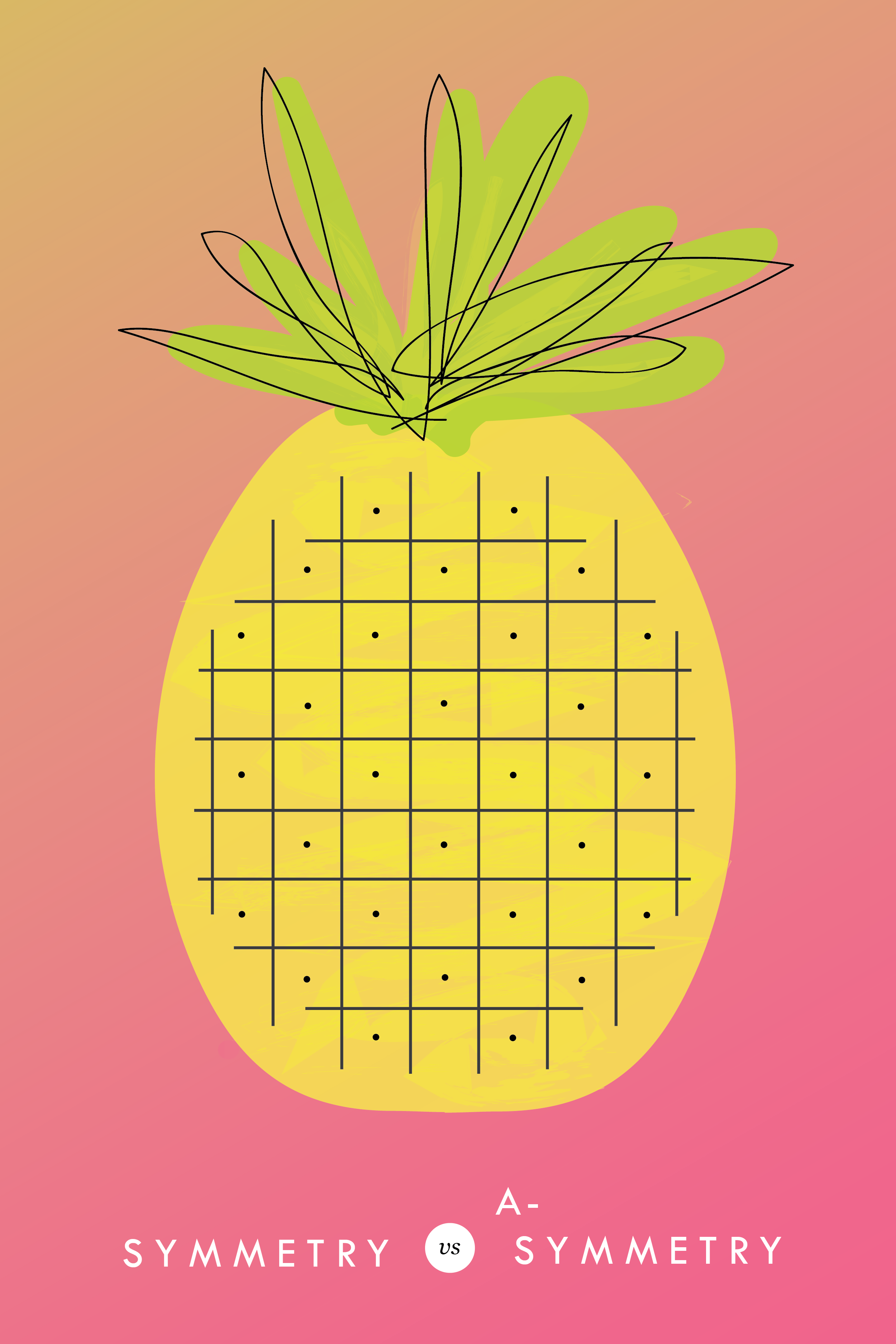
There is a still a need for balance between design elements in order to even out the visual weight, but when used deliberately, the effect feels modern and dynamic. Take this ombre pineapple for example (because, if we're going to have an example, isn't it better if it's an ombre pineapple?!). The body of the pineapple is completely symmetrical, but it's offset by the top of the pineapple's asymmetrical leaves. This creates visual interest AND balance.
Both symmetry and asymmetry can be used in a composition to create a balanced communication framework. And while these are important design principles to keep in mind, they are simply the groundwork for creativity. Maybe your ombre pineapple is completely symmetrical with a crazy patterned background. Use the design principles as a framework, but don't be afraid to get creative!
pssst... this is a great tip for web design, too!

5 SIGNS IT'S TIME TO LEVEL UP YOUR BRANDING
There are lots of reason to give your business a branding refresh. Depending on where you are with your business or blog, it may be time for you to rethink your current design identity. Here are five of the most common, and most necessary, signs that it's time to upgrade your branding.

There are lots of reason to give your business a branding refresh. Depending on where you are with your business or blog, it may be time for you to rethink your current design identity. Here are five of the most common, and most necessary, signs that it's time to level up your branding.
1 - You made a DIY logo because you have the philosophy that "Done!" is better than "Perfect"
You wanted to launch your business or product and didn't have time to invest in full-blown branding. Now that you've settled into steady business, you're looking for a more professional look that showcases your growing biz.
2 - You bought a pre-made logo
Etsy has some damn fine design, let me just say. If you are one of the many shoppers who purchased a pre-made logo from a creative market like Etsy, you may have a cute logo, but you may also share it with countless other businesses. Time to develop a logo that's unique to you.
3 - You've officially defined your niche
Maybe you are a photographer that started out snapping shots of everything from babies to interior design. Now that you've settled into your work, you've decided you'd like to focus on weddings and engagements. Make sure your logo reflects your niche market.
4 - It's outdated or you just don't like it
You may have created your branding materials years ago and feel that they just aren't working for you anymore. Perhaps you wanted your logo to follow a trend that now feels outdated. Put simply, you just don't love it.
5 - You're business has outgrown you
You started a one-woman shop but have grown into a small business with - yay! - employees. You may even want to change your business name from something that is personal ( ie: Kali Edwards Creative ) to a something a more over-arching name.
This isn't as daunting as it sounds. Finding a designer you jive with (heyyy!) and who will help you through the process will allow you to love your branding and continue to grow your business!
Any of these apply to you? More than one even? It may be time to consider giving your brand a simple refresh.
Related Posts

BRANDING FOR PHOTOGRAPHERS
Whether you’ve just launched your photography business or are a seasoned veteran looking for a brand refresh, there are four main ideas to help you find your focus.
1. Be distinctive
The kind of photography you focus on is the most important item to consider before you begin a logo or branding project. Are you a food and styling photographer, wedding and family photographer, or an urban street photographer? These are all such vastly different styles of capturing a moment that they will require completely different branding approaches. Now we can narrow it down from here.
2. Brand it, #boss
How do you take your unique photography niche and turn it into a beautiful brand?
Answer: Style. Find that emotional connection your style has with your customers. A bride-to-be has seen your most recent engagement shoot and just adores the way you captured the couples love. She wants that romantic feeling for her engagement shoot, too. Allow your branding to reflect that romance you bring to your photography. Show this bride-to-be and any other that when they hire you, your photography style will make her swoon. Maybe that means using calligraphy in your logo or creating a soft and feminine color palette. Keep asking yourself throughout the process, "Is this in line with my style?" This emotional tie into your branding elements will give clients a sense of your approach before they even chat with you.
3. Work your website
As a photographer, your website is so important. This is the best place to showcase your photos. Organizing them into galleries and recent shoots will help your future client visualize their own photos. Continue the emotional experience of your brand by telling a fluid story to your customer. A good example may look like this:
Click … HomepageIntroduction to Drizzle Food Photography and Styling, where I am inspired by ingredients and abundance in the kitchen.
Click … Gallery A collection of gorgy examples of past photo shoots for dreamy clients and delish dishes.
Click … Contact How to get in touch to book my unique and valuable photography services.
Let the photos do the talking. On your website, the branding should act and an important accent that underscores your photography style.
4. One step further
As the savvy photography business owner you are, you know there’s more to branding than just the logo and website. Social media (styled photos anyone?), photo flyers and media kits are all places to expose your branding and your business. Think about each client’s experience from beginning to end. From finding you on Instagram to thank you stationary, gather all your pieces and review what you have. Make sure it conveys the emotion and style of the photos you take.
In the end, it should all be in line with your vision, mission and fabulous photography.

BRANDING FOR FLORISTS
I'm starting a new blog series called "Branding for...". In these posts, I will highlight a creative industry and zero in on some key how-to's for:
• Communicating your mission
• Translating your passion into a unique brand identity
• Inspiring your dream clients to work with you
• Creating a winning website
• Finding the "joy" job (you know, the client and project that ignites your passion!)
Let's dive in, shall we?!

I'm starting a new blog series called "Branding for...". In these posts, I will highlight a creative industry and zero in on some key how-to's for:
Communicating your mission
Translating your passion into a unique brand identity
Inspiring your dream clients to work with you
Creating a winning website
Finding the "joy" job (you know, the client and project that ignites your passion!)
Let's dive in, shall we?!
Branding for Florists
Whether you've just launched your business or are a seasoned veteran looking for a brand refresh, there are four main ideas to help you find your focus.
1. Be distinctive
What makes you unique? What is the thing that makes your floral business stand out from all the rest. Is that you grew up in Hawaii and have a deep-rooted love for all things bright and tropical? Is it that you are a hopeless romantic at heart and derive deep joy from bringing a wedding to life through floristry? What makes your clients love you and your work?
2. Brand it, #bossbabe
How do you take your unique-ness ( see above! ), and turn it into the most fantastic florist branding ever?
Answer: Emotion. Find that emotional connection your style has with your customers. A bride-to-be has seen your whimsical hanging eucalyptus installation on Pinterest and has fallen in love. She wants that romantic feeling for her big day, too. Allow your branding to reflect that romance you bring to your floral design. Show this bride-to-be and any other that when they hire you, your floral arrangements will make her swoon.
You create an emotional connection through your branding based on the patterns, colors and fonts you choose to marry into a uniquely perfect fit for your business. Done right, clients will have a sense of your style before they even chat with you.
3. Work your website
Branding doesn't stop with your business cards. Your brand needs to carry through to your website, too. Now is the time to consider your dream client's journey through your site. Yes, I said journey. Think about where they will start (homepage, blog?) and where you want them to end up (contact page, portfolio?). Continue the emotional experience by telling a fluid story to your customer. A good example may look like this:
Click ... Homepage Introduction to Sweet Pea Floral Design, where my mission is to create seasonal arrangements that are whimsical and romantic.
Click ... Portfolio A collection of gorgy examples of past work for dreamy clients.
Click ... Contact How to get in touch to book my unique and valuable services.
Thinking about how a potential customer will wander through your website will allow you to create the right structure, content and navigation.
4. One step further
As the savvy floral business owner you are, you know there's more to consider. Social media ( header images, profile pictures, behind the scenes Instagram shoots ), advertisements and media kits are all places to carry over your branding. Think about each client's experience from beginning to end. From ribbons to store front signs to thank you stationary, pull everything together and review what you have. Make sure to ask yourself if it sends the signals to the right kind of clients. In the end, it should all be in line with your vision, mission and style.
Looking for examples of a florist's branding in action?
Head on over this-a-way.


#MOBILEGEDDON
#mobilegeddon is here. Are you ready?!
Ok, fine. That's a little over-dramatic. But for many websites, today marks a day a lot like a mobile Armageddon for their search rankings on our good friend Google. Why? Google will start a new overhaul of it's famous algorithm to determine if a website is mobile-friendly. And if yours is not... well, you might want to rethink your web design.
Is your website mobile friendly enough for google? Here's the break down of the good, the bad and what it means for your website.
THE GOOD
For you, the mobile-friendly consumer, this is great! Online retailers and larger companies with complex websites will be easy to navigate on a smartphone or tablet. Same goes for online magazine websites like Refinery29 and EOnline. This will ensure that all your have to do is click, click and read everything you ever wanted to know about Kim Kardashian's bleach blonde hair and pregnancy woes.
THE BAD
If you are a small business with a site made even one or two years ago, you may not be ready for #mobilegeddon. According to the Economist, 40% of the leading sites failed Google's "mobile-friendly" test. Ouch. And the result is that those site's search rankings will be dropped. So if your website was on page one of Google when a user searched for "DC area photographer", you may have just been bumped to page two or three. Now you're less likely to get clicked on by your dream client.
NOW WHAT?
So now that you're officially freaking out and creating a algorithm-safe bunker with canned foods and a pile of US Weekly, what can you do? First, determine if you're website is in the clear or not with this test. It will determine if your text is too small or your links and contact information aren't easy to use. If you find your site doesn't pass the Google test, it might be time to rethink your web design. This may mean something as simple are creating a mobile-friendly version of what you already have. It doesn't have to be a full overhaul.
Overall, it's better to know about these Google changes and take it in stride, than to wonder why in the world you suddenly have less page visitors than last week. But if you find your website isn't ready for #mobilegeddon and you just need to be cheered up, you can always turn to these mobile-friendly Kim Kardashian selfies.
Related Posts
need even more help with squarespace?
Skip the overwhelm and have your website designed and launched in just 5 days (or less)!
LEARN MORE

NEW YEARS CHECKLIST - 15 QUESTIONS FOR YOUR BEST YEAR YET
It's easier for me to think about what I've already done or accomplished, and then build goals from there. So I thought I'd share a little list of questions that you can use to do the same. At the end, review your answers and you may find that the goal or resolution that would be the most beneficial for the new year is not so hard to conjure after all.
I find it can be hard to create goals and resolutions when the new year comes lurking around the corner. How am I supposed to alter my life for the better when I'm still recovering from my holiday food-coma? It's slightly unfair, if you ask me. What I've done instead, is think about what happened in the past year. It's easier for me to think about what I've already done or accomplished, and then build goals from there. So I thought I'd share a little list of questions that you can use to do the same. At the end, review your answers and you may find that the goal or resolution that would be the most beneficial for the new year is not so hard to conjure after all. Enjoy!

1. ARE THERE ANY SIGNIFICANT PLACES I TRAVELED?
2. WHAT DID I SEE, DISCOVER OR EXPLORE?
3. WHAT DID I SPEND THE MOST TIME WORKING ON THIS YEAR?
4. WHAT SKILLS DID I LEARN, IMPROVE OR MASTER?
5. WHICH PERSONAL QUALITY DID I DEVELOP OR STRENGTHEN?
6. I FELT MOST ALIVE WHEN __________ ?
7. WHICH HABITS DID I CHANGE, CULTIVATE OR GET RID OF?
8. WHAT DID I ACHIEVE CAREER-WISE?
9. WHAT BROUGHT ME HAPPINESS IN THIS PAST YEAR?
10. WHAT AM I MOST PROUD OF THIS YEAR?
11. WHAT DO I WANT MY EVERYDAY LIFE TO BE LIKE IN THIS NEW YEAR?
12. HOW WOULD I LIKE THIS NEW YEAR TO BE DIFFERENT FROM THIS PAST YEAR?
13. WHAT DO I WANT MY OVERARCHING THEME TO BE THIS NEW YEAR?
14. HOW DO I WANT TO REMEMBER THIS NEW YEAR WHEN I LOOK BACK ON IT NEXT YEAR?
15. WHAT IS MY NUMBER ONE GOAL FOR THE NEW YEAR?
Sed purus sem, scelerisque ac rhoncus eget, porttitor nec odio. Lorem ipsum dolor sit amet.