
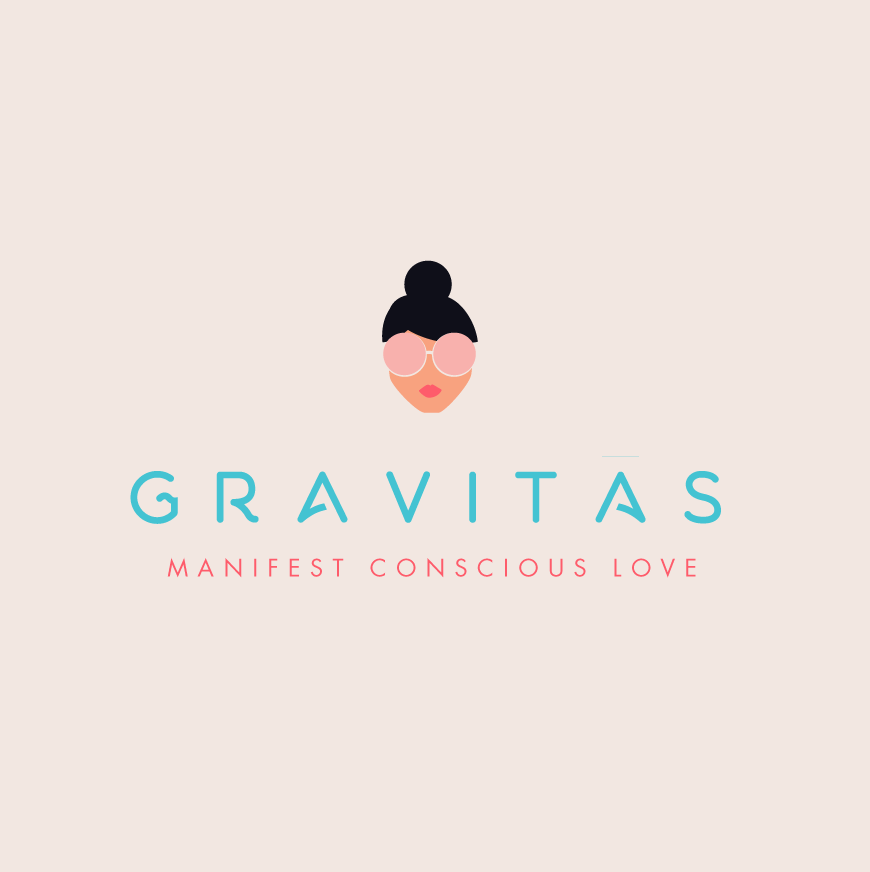
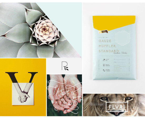
Favorite Logos of 2022
A recap of some of my favorite unchosen logos and submarks from 2022 branding projects including one of a geometric hummingbird logo and one for a health and wellness coach logo.

There were so many fun branding projects in 2022 and so many amazing clients! Since each branding process gets 2-3 fully designed brand identity options, not all logos make the cut. Even if they don’t become the final version of a logo design, the creation and refinement is still an important part of the process. The health and wellness coaching logo on the bottom left even got featured on designrush best-designs. And I’m still a little in love with the geometric hummingbird logo. 😍
pst…
Like a logo above and think it’s the perfect fit for your business?
Feel free to reach out for details on how to purchase!


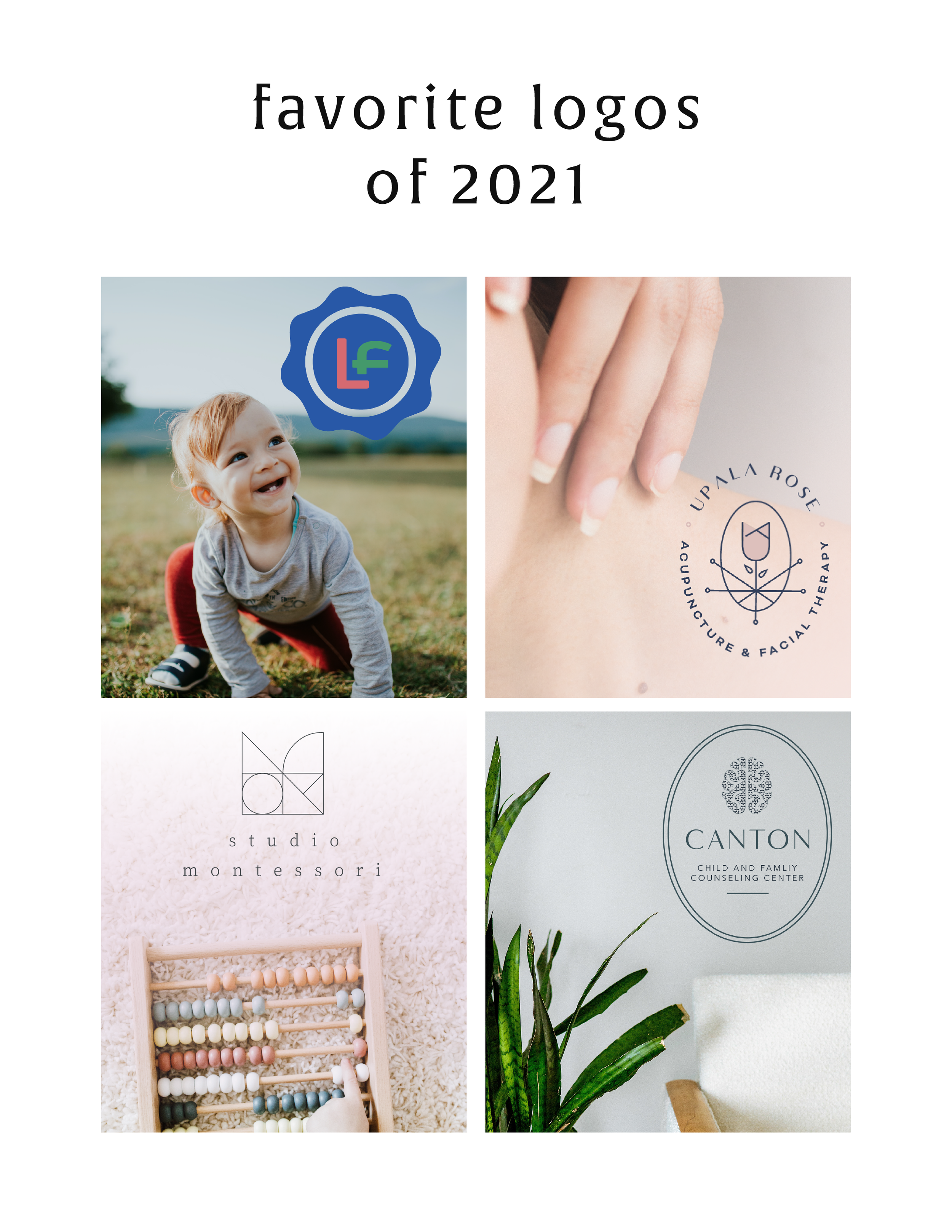
Favorite Logos of 2021
A recap of some of my favorite unchosen logos and submarks from 2021 branding projects including one for an acupuncturist and a child and family counseling logo.
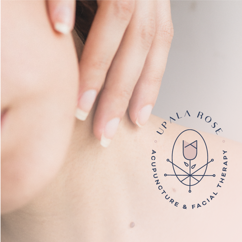
There were so many fun branding projects in 2021 and so many amazing clients! Since each branding process gets 3-4 fully designed brand identity options, not all logos get the green light. Some aren't quite right for the client or maybe just didn't fit as well as another option, but I have a little love for all of my logos (and maybe get a little too attached?? Eh, whatever!).
These are some of my favorite branding concepts and their variations created that didn't make the final cut.
pst…
Like a logo above and think it’s the perfect fit for your business?
Feel free to reach out for details on how to purchase!

Favorite Logos of 2019
A recap of some of my favorite unchosen logos and submarks from 2019 branding projects.
There were so many fun branding projects in 2019 and so many amazing clients! Since each branding process gets 3-4 fully designed brand identity options, not all logos get the green light. Some aren't quite right for the client or maybe just didn't fit as well as another option, but I have a little love for all of my logos (and maybe get a little too attached?).
Below are some of my favorite branding concepts and their variations created that didn't make the final cut.
WANT to CREATE
a custom LOGO?

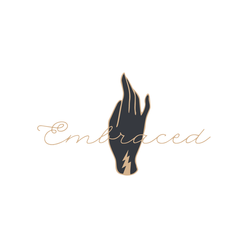
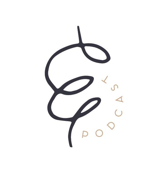
LOGO PROCESS: EMBRACED PODCAST
This little logo process is from the branding process for Embraced Podcast, a podcast about women empowering women.
This little logo process is from the branding process for Embraced Podcast, a podcast about women empowering women. Having dabbled in the podcasting world for a hot second, I was excited to brand someone else's podcast! The branding to needed to embody women who share their strength, courage, perseverance, and self-love. Um... hell yes! Feminine strength was the design direction.
Below are several of the concepts and variations created before we nailed down the final logo.
WANT to CREATE
a custom LOGO?


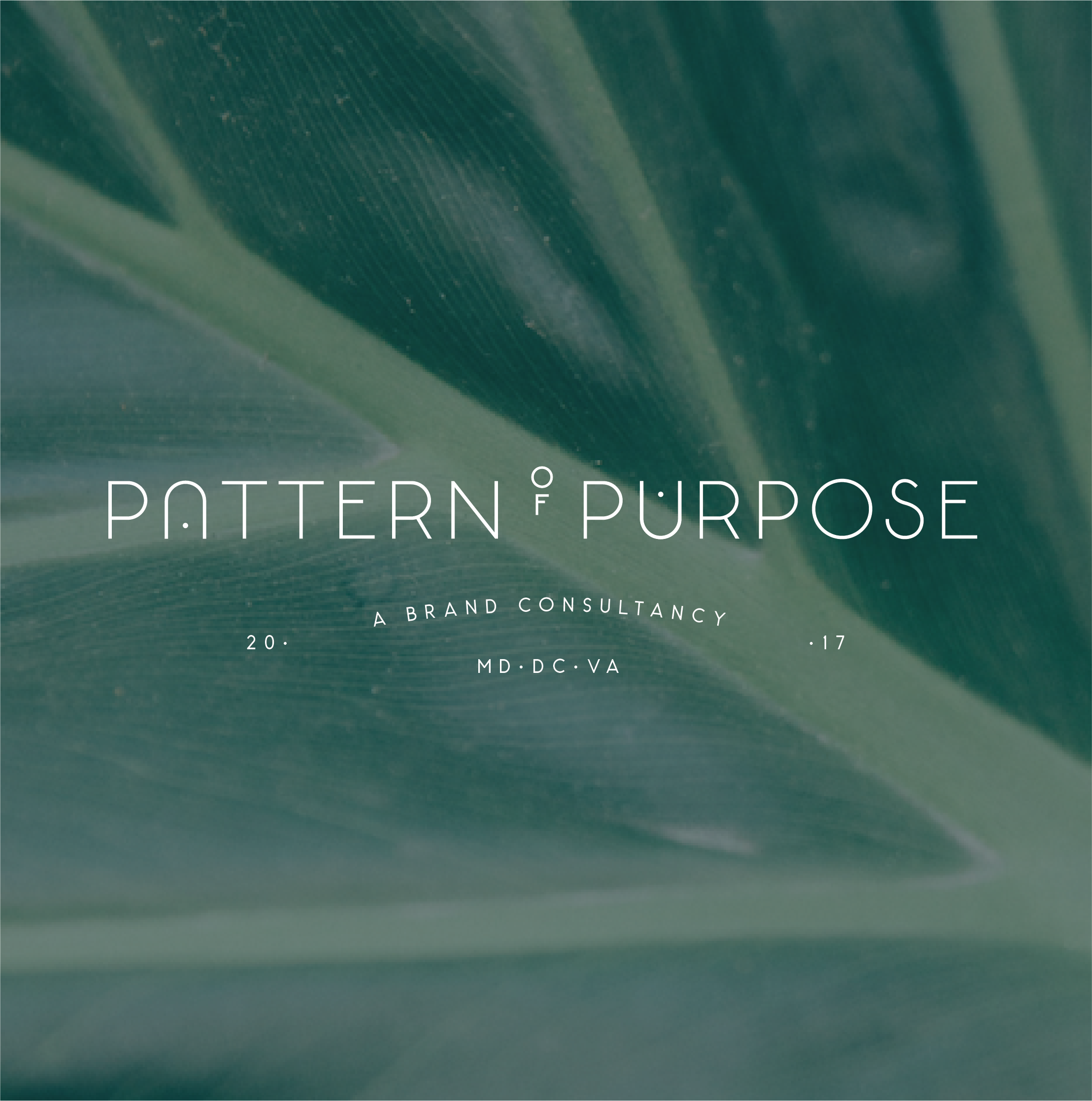
Favorite Logos of 2017
A recap of some of my favorite unchosen logos and submarks from 2017 branding projects.
There were so many fun branding projects in 2017 and so many amazing clients! Since each branding process gets 3-4 fully designed brand identity options, not all logos get the green light. Some aren't quite right for the client or maybe just didn't fit as well as another option, but I have a little love for all of my logos (and maybe get a little too attached?? Eh, whatever!).
Below are some of my favorite branding concepts and their variations created that didn't make the final cut.

Related Posts


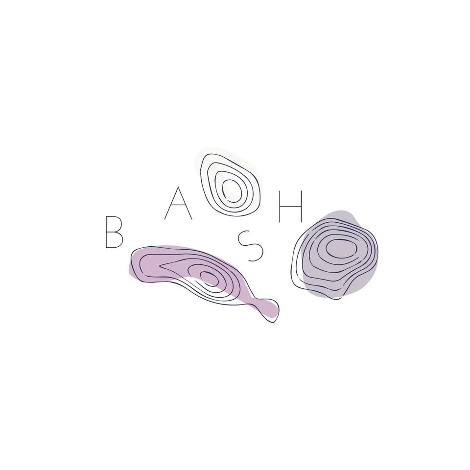
LOGO PROCESS: BASH EVENT PLANNING
This little logo process is from the branding process for BASH Event Planning & Design. This was a challenging but FUN design process that included ideas like topography, layering and disco!
This little logo process is from the branding process for BASH Event Planning & Design. This was a challenging but FUN design process that included ideas like topography, layering and disco!
Below are several of the concepts and variations created before we nailed down the final logo.
Related Posts

LOGO PROCESS: ACUPUNCTURE BRANDING
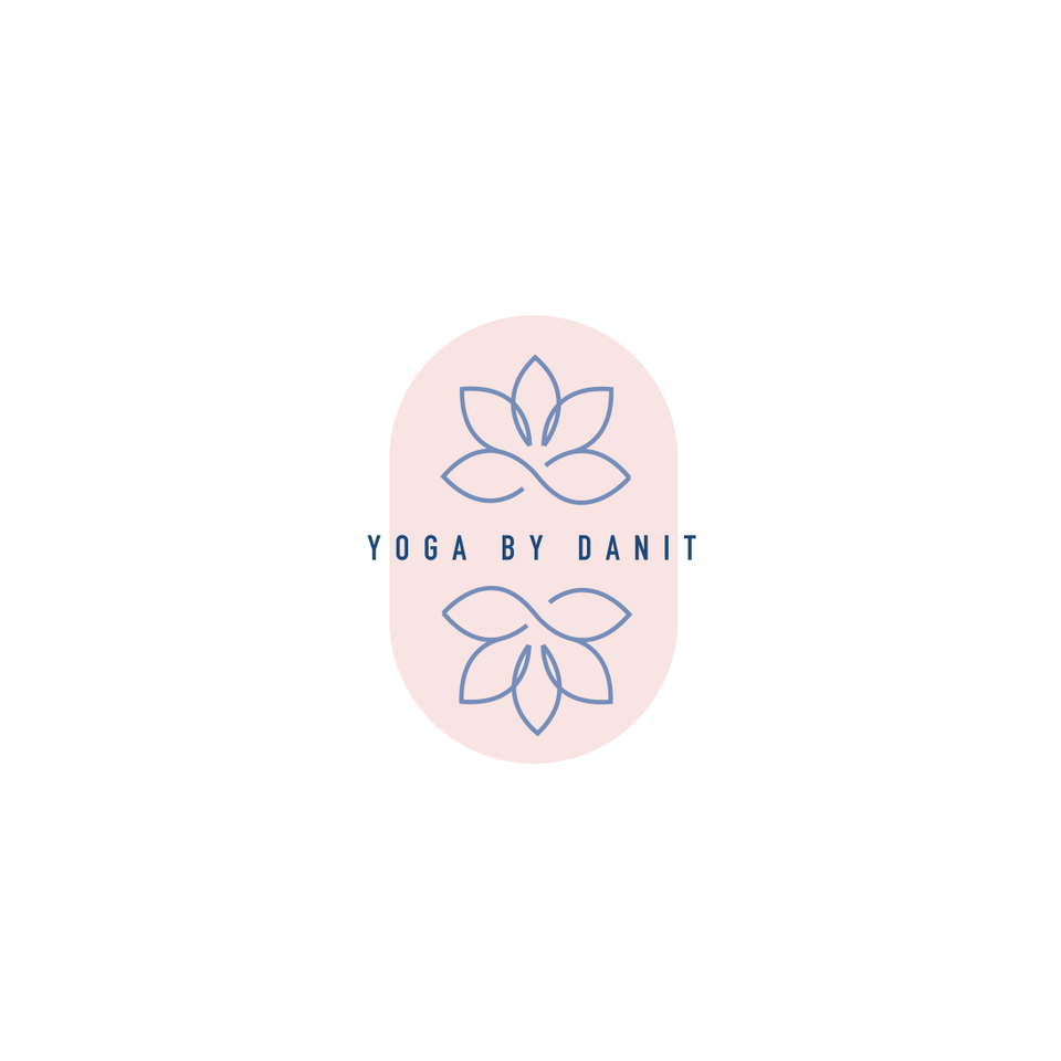
I've had lots of new branding projects lately that I've been meaning to share! Two of these were for holistic health providers specializing in acupuncture + herbal medicine or yoga + massage. Here are the logo processes for both!
I've had lots of new branding projects lately that I've been meaning to share! Two of these were for holistic health providers specializing in acupuncture + herbal medicine or yoga + massage. Here are the logo processes for both!
Logo Process for Wildcrafted Acupuncture & Herbs - Submarks
Logo Process for Wildcrafted Acupuncture & Herbs - Logo
Logo Process for Align Massage and Yoga - Submark
Logo Process for Align Massage and Yoga - Logo
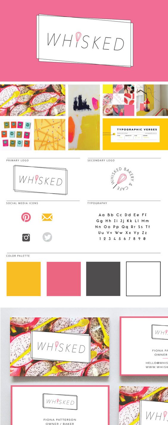
LOGO PROCESS: JANE O. COACHING
I haven't shared a logo process in a while. This logo process is from Jane O. Coaching, who is a love and style coach with an amazing colorful, bright vibe. So of course, she wanted her branding to be feminine, colorful and fun to show off her coaching niches.
I haven't shared a logo process in a while. This logo process is from Jane O. Coaching, who is a love and style coach with an amazing colorful, bright vibe. So of course, she wanted her branding to be feminine, colorful and fun to show off her coaching niches.
We ended up heading in the direction of #3, with some additional tweaks and customizations to make it fully unique to Jane. To see the full branding and web design that came from this logo process, head on over to janeocoaching.com.
And if you want to chat about your own logo or branding, holla at me!
Related Posts


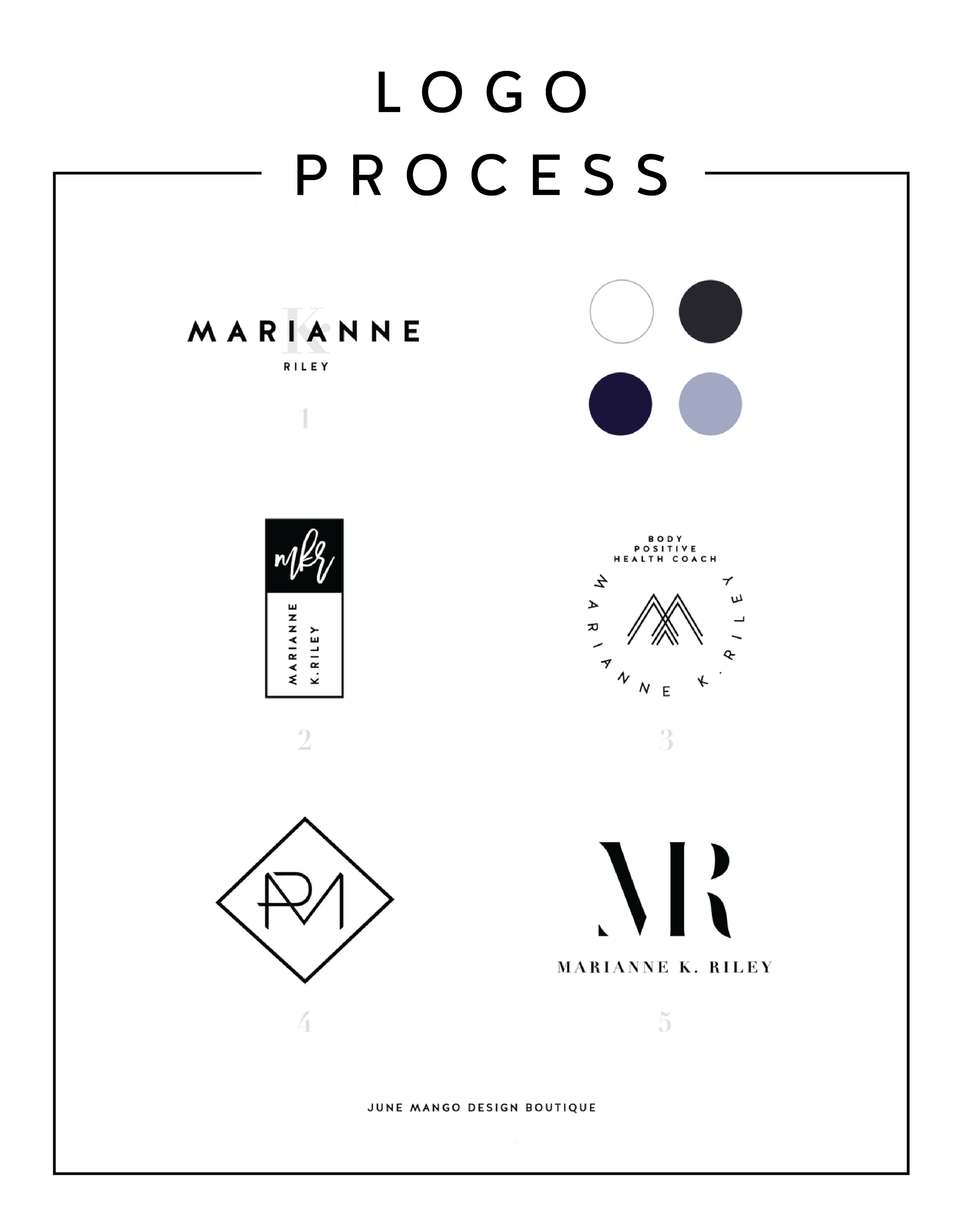
LOGO PROCESS: MARIANNE K. RILEY
Just a little peek inside the process of a logo project I've recently completed. This logo is for a health coach who was looking for a super-sophisticated, font-based mark with a heavy nod toward monograms. I tried to get a little creative with that and so the concepts are pretty varied.
Just a little peek inside the process of a logo project I've recently completed. This logo is for a health coach who was looking for a super-sophisticated, font-based mark with a heavy nod toward monograms. I tried to get a little creative with that and so the concepts are pretty varied.
I'll have more on the final logo and branding deets soon!
Related Posts


BRAND STYLE BOARDS 101

You may have seen these little guys floating around on Pinterest and not known exactly what they are or what their purpose is.
Every designer does their Brand Style Boards a little bit differently, but as a rule there are a few things that should be included.
Logo
This is the main logo that will be used on important touch points like the website, business cards, etc
Submark / Secondary Logo
This is a variation of the logo and usually much simpler. Often an icon, it can be used as an avatar on social media or as a stamp on images for bloggers and photographers
Color Palette
I always make sure to include not only the color swatches, but the various color values. This helps a client match their color palette from anything like a printed business card to their website
Fonts
The fonts are really important to the brand and are NOT an afterthought, so it's imp ortant to make sure to include them on the Brand Style Board to ensure that the fonts match up on all future branded collateral.
In the examples below, I also include design elements that can be used as icons or graphics on the website. Sometimes a branding package will include patterns or buttons / graphics for the client's website, which are also helpful to include on the Brand Style Board. I also always include the mood board that I created for the internal branding process. I think it helps tie everything together and give the client a good idea for the types of imagery they should look for when creating other items for the brand (ie: website, media kit, etc).


Ultimately, the Brand Style Board should contain the core of your brand. At a glance, it should be everything you need as a reference for you and anyone you hire down the line. It should guide every visual choice you make for your business.
To see more examples, head this-a-way or to chat with me about your brand head that-a-way!
need even more help with squarespace?
Skip the overwhelm and have your website designed and launched in just 5 days (or less)!
LEARN MORE
Related Posts

KYLEE ACKER BRANDING PROCESS
This is a behind the scenes peek at the branding process. The goal was to really showcase her initials since this is her personal brand. The trick was to make both the K & A recognizable because each letter is of equal importance. Th color palette combines classic neutrals with a slightly feminine, but not overpowering pop of pink.

Every designer has a slightly different process. Some designers like to share just 2-3 design concepts, and some like to share 10+. I'm somewhere in the middle and tend to share 4-6. I think that gives enough variety without overwhelming my clients. Too many choices can be paralyzing and ineffective.
Remember that hella stylish mood board I shared recently? This is a behind the scenes peek at the branding process. The goal was to really showcase her initials since this is her personal brand. The trick was to make both the K & A recognizable because each letter is of equal importance. Th color palette combines classic neutrals with a slightly feminine, but not overpowering pop of pink.
Which one would you choose?