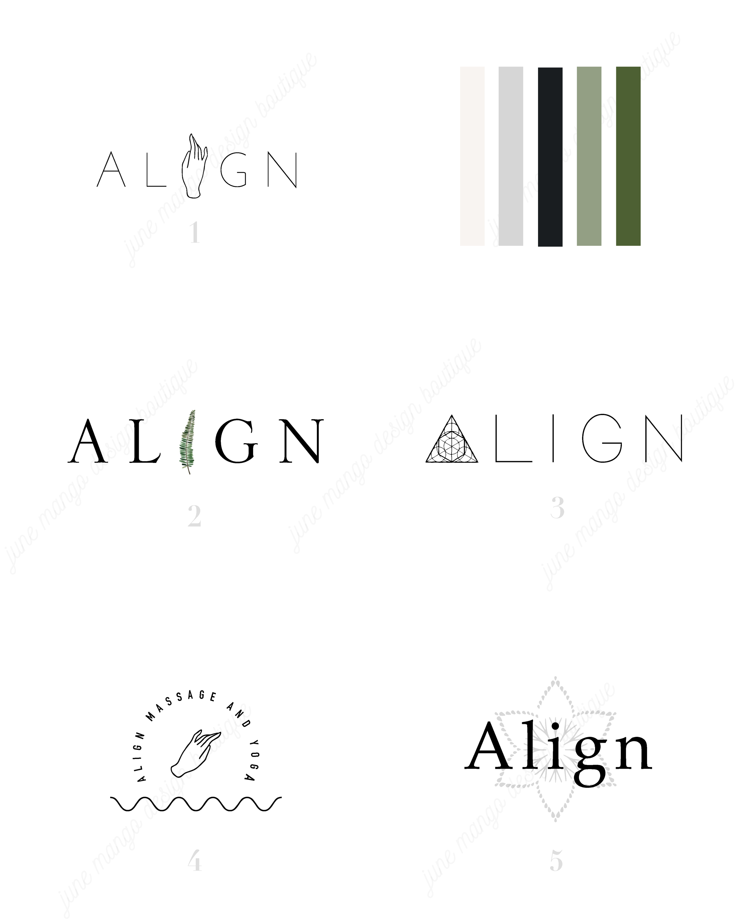
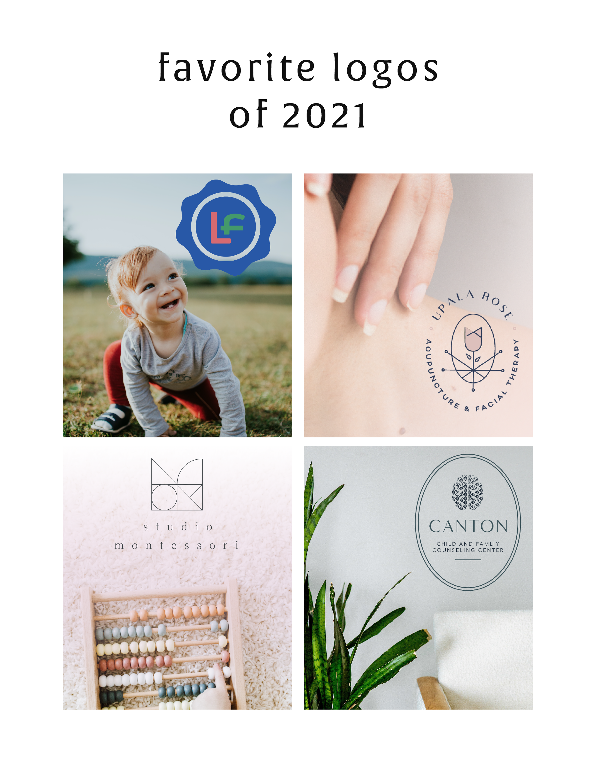
LOGO PROCESS: ACUPUNCTURE BRANDING
I've had lots of new branding projects lately that I've been meaning to share! Two of these were for holistic health providers specializing in acupuncture + herbal medicine or yoga + massage. Here are the logo processes for both!
I've had lots of new branding projects lately that I've been meaning to share! Two of these were for holistic health providers specializing in acupuncture + herbal medicine or yoga + massage. Here are the logo processes for both!
HOW TO REBRAND STRATEGICALLY
There are a lot of moving parts to a business, and your brand is just one of them. Branding is about getting to the heart of what I do best, who I serve best, and how I can best represent that through my business. So how do you even begin to strategically rebrand your biz? I have laid out my process with a few tips below, so read on!
If you have been following June Mango for a while, you will obviously have noticed that it's just gotten a major facelift. I am so excited about it and it's been a long time coming.
What I mean by that is that I have been diving deep behind the scenes to strategically rebrand my biz. This is more than just a new logo and color palette, although that's definitely part of it. This is about really getting to the heart of what I do best, who I serve best, and how I can best represent that through my brand. So how do you even begin to strategically rebrand your biz? I have laid out my process with a few tips below, so read on!
There are a lot of moving parts to a business, and your brand is just one of them. For me, I knew it was time for a rebrand when I felt that my messaging and design weren't matching up with:
A) the level of clients I was working with
B) the types of clients I wanted to attract
C) the level of expertise that I have collected from running my business for a few years
D) the actual design work I want to be creating
So these pieces each were key elements that just weren't matching up with what I was putting out into the world. In short, I had grown a lot as a designer and business owner, and wanted my brand to reflect that.
So now that I as aware of what I wanted to be sharing with my ideal audience, it was time to create the messaging and design to match. Now, I am NOT a copywriter, but I do think that the copy in your brand is just as important for your consistent business voice as your design. There are a lot of amazing copywriters that can help you share your vision in your voice, so don't be afraid to hand over the reigns.
Design-wise, I tried to really get clear on what:
A) I'm really good at
B) I can do that not many other designer's can
C) type of design I like to create
D) what type of design my ideal audience is looking for
With these things in mind, it was easy to create a website and brand that showcased all of the above. And the key here is that the real reason it was easy, is because it was natural. This is another reason I knew it was time to rebrand - I was eager to stretch my legs into design that fit me better.
Finally, I always like to keep in mind the visuals of the previous logo and branding. You don't want to completely change your look or else no one will recognize you! (Think Jennifer Grey after the nose job). So I stuck closely to the layout of my old logo, kept some of the same colors, like the pink, and just updated the hues. I also added a new stamp as an alternative logo to help share my services + expertise in a clear way and round everything out.
Overall, I am so happy with it. It really represents me, my design style, and my ideal clients. And that is exactly what your brand should do. :)
The full branding + web design:
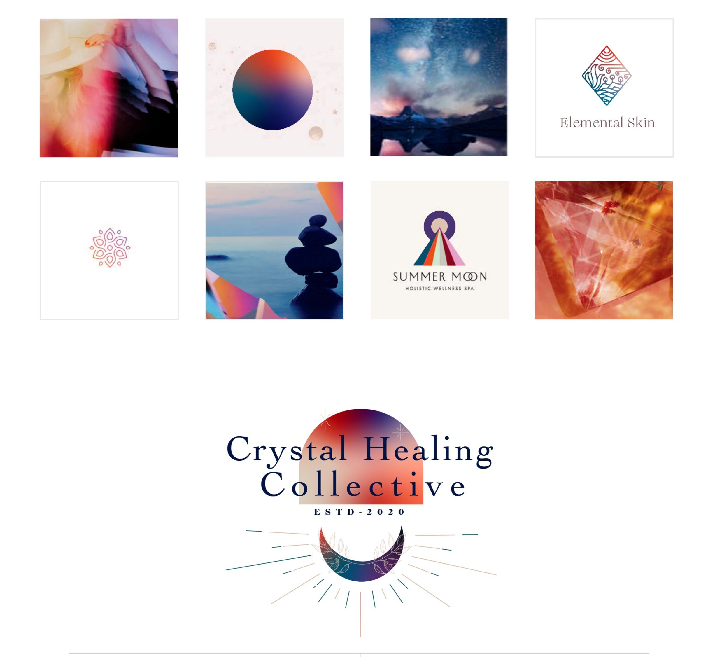
LOGO PROCESS: DEVAN DANIELLE
I had such a crazy-good time creating this little logo, and the logo process above was only step one. We took these logos, refined them and added in some really cool photo elements until we got to a really versatile final logo and matching branding elements.
Devan contacted me to create her logo and branding with some super interesting and unique ideas. She basically said, "I want you to go wild and do whatever you want."
Um, HELL YAS!
The only requirement was that she wanted the logo to feel light, airy and open. Done and done.
I had such a crazy-good time creating this little logo, and the logo process above was only step one. We took these logos, refined them and added in some really cool photo elements until we got to a really versatile final logo and matching branding elements. You should probably head over here to check out the finished project, because, well, it's just so damn lovely!
And if you feel like chatting with me about your own logo and branding, I'd love for you to holla at me!
Related Posts
GET THE MOST OUT OF YOUR MOOD BOARD
Have I told you how much I love mood boards? They are crazy-crucial for my design process to make sure I'm on the same page with my clients. They probably take the most time out everything I work on in a branding project. I spend so much time curating images to make sure it's just right.
Why?
Have I told you how much I love mood boards? They are crazy-crucial for my design process to make sure I'm on the same page with my clients. They probably take the most time out everything I work on in a branding project. I spend so much time curating images to make sure it's just right.
Why? Because it sets the tone for the rest of the project.
I show these mood boards to a client and invite criticism because it should be dead-on with their brand vision.
If it's not, discussing what works and what doesn't gives me valuable feedback that I use to dictate what comes next: the logo design. The mood board is like the essence of the brand, boiled down into one big ol' beautiful soup-o-squares.
So how can you make sure you
get the most out of your mood board?
Think about how you feel when you look at the mood board as a whole. This is honestly the most important item. What mood does it convey? What emotions do you feel? What actions do you want to take? These should be in line with what you want others to feel when they see you brand or website. It should be dead on. And if it isn't...
Think about what doesn't fit that mood. Is there an element that's giving off the wrong vibe? Maybe some of the graphic elements or colors aren't quite right. You can even try covering the offending element to see if the mood board works without it.
Consider the big picture. Sure, it's on trend and the colors are pretty, but does it really work for all the visual platforms you'll be using to tell your brand story? Make sure the mood board will allow your brand to live online, in print and anywhere else you will run your biz.
Are you proud of this de sign? Do you want to show your mom, you're biz bestie or even your cat? AWESOME! You should love it and be excited to show it off to your future clients. It will be the direction for your beautiful business, after all.
If you look for these key items when critiquing the mood board for your brand's direction, you should easily get the most out of the mood board process.
Ready to get the mood board party started?
Head this-a-way to try your hand at a DIY mood board.
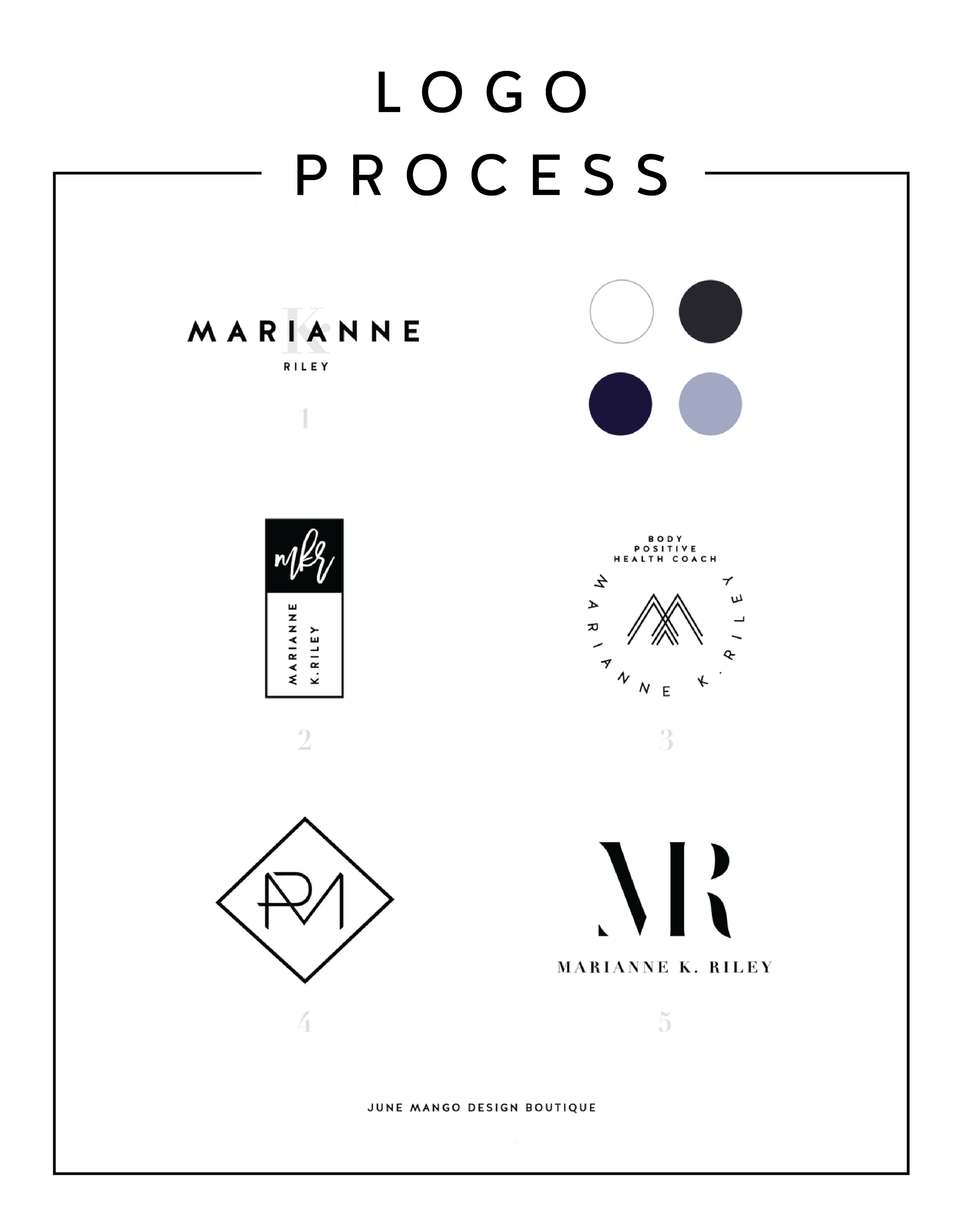
LOGO PROCESS: MARIANNE K. RILEY
Just a little peek inside the process of a logo project I've recently completed. This logo is for a health coach who was looking for a super-sophisticated, font-based mark with a heavy nod toward monograms. I tried to get a little creative with that and so the concepts are pretty varied.
Just a little peek inside the process of a logo project I've recently completed. This logo is for a health coach who was looking for a super-sophisticated, font-based mark with a heavy nod toward monograms. I tried to get a little creative with that and so the concepts are pretty varied.
I'll have more on the final logo and branding deets soon!
Related Posts
BRANDING FOR ETSY STORE OWNERS
Whether you've just launched your first Etsy store or are a seasoned veteran looking for a brand refresh, there are four main ideas to help you narrow down your vision.
Whether you've just launched your first Etsy store or are a seasoned veteran looking for a brand refresh, there are four main ideas to help you narrow down your vision.
1. Be distinctive
What makes you unique? What is the thing that makes your work stand out from all the rest. Do you knit quirky, colorful scarves? Do your greeting cards put Hallmark to shame? Are you selling witty handmade pillows to throw on a newlywed bed? Whatever it is, narrow in on that, because that is what makes you unique and will get your dream customers attention.
2. Brand it!
How do you take your unique-ness ( see above! ), and turn it into the most fantastic branding ever?
Answer: Emotion. Find that emotional connection your style has with your customers. A new mamma wants to feel cool and stylish, but is also covered in drool all day. Do you sell funky t-shirts that are comfy and totally trendy? Boom. Are your greeting cards tackling hard subjects with humor? YES! Capture that.
If you take these emotional pieces and translate them into visuals, you have your branding. Done right, clients will have a sense of your style before they even see the whole catalog of your products.
3. Work your website
Branding doesn't stop with your logo or color palette. Your brand needs to carry through to your website and online shop, if you have one. Now is the time to consider your dream client's journey through your site. Yes, I said journey. Think about where they will start (homepage, Etsy storefront?) and where you want them to end up (contact page, Checkout?).
You can continue to work in that emotional component by telling a story as you go. Here is an example:
Click ... Main shop / storefront A collection of creative, quality handmade items for the home.
Click ... product page from search A quirky state-shaped cheese platter made from Acacia wood, which would be the perfect gift.
Click ... Checkout How much are they going to love this gift!
Thinking about how a potential customer will wander through your website will allow you to create the right structure, content and navigation.
4. One step further
As the creative business owner you are, you know there's more to consider. Social media (product shots, header images, etc), advertisements and wholesale price sheets are all places to carry over your branding. Think about each customer's experience from beginning to end. From the logo to store front signs to packaging to thank you stationary, everything should be cohesive. Make sure to ask yourself if it sends the right signals and emotions. In the end, it should be in line with your unique creations.
Looking for examples of a maker's branding in action? Head on over this-a-way.
Related Posts
BRANDING FOR FLORISTS
I'm starting a new blog series called "Branding for...". In these posts, I will highlight a creative industry and zero in on some key how-to's for:
• Communicating your mission
• Translating your passion into a unique brand identity
• Inspiring your dream clients to work with you
• Creating a winning website
• Finding the "joy" job (you know, the client and project that ignites your passion!)
Let's dive in, shall we?!
I'm starting a new blog series called "Branding for...". In these posts, I will highlight a creative industry and zero in on some key how-to's for:
Communicating your mission
Translating your passion into a unique brand identity
Inspiring your dream clients to work with you
Creating a winning website
Finding the "joy" job (you know, the client and project that ignites your passion!)
Let's dive in, shall we?!
Branding for Florists
Whether you've just launched your business or are a seasoned veteran looking for a brand refresh, there are four main ideas to help you find your focus.
1. Be distinctive
What makes you unique? What is the thing that makes your floral business stand out from all the rest. Is that you grew up in Hawaii and have a deep-rooted love for all things bright and tropical? Is it that you are a hopeless romantic at heart and derive deep joy from bringing a wedding to life through floristry? What makes your clients love you and your work?
2. Brand it, #bossbabe
How do you take your unique-ness ( see above! ), and turn it into the most fantastic florist branding ever?
Answer: Emotion. Find that emotional connection your style has with your customers. A bride-to-be has seen your whimsical hanging eucalyptus installation on Pinterest and has fallen in love. She wants that romantic feeling for her big day, too. Allow your branding to reflect that romance you bring to your floral design. Show this bride-to-be and any other that when they hire you, your floral arrangements will make her swoon.
You create an emotional connection through your branding based on the patterns, colors and fonts you choose to marry into a uniquely perfect fit for your business. Done right, clients will have a sense of your style before they even chat with you.
3. Work your website
Branding doesn't stop with your business cards. Your brand needs to carry through to your website, too. Now is the time to consider your dream client's journey through your site. Yes, I said journey. Think about where they will start (homepage, blog?) and where you want them to end up (contact page, portfolio?). Continue the emotional experience by telling a fluid story to your customer. A good example may look like this:
Click ... Homepage Introduction to Sweet Pea Floral Design, where my mission is to create seasonal arrangements that are whimsical and romantic.
Click ... Portfolio A collection of gorgy examples of past work for dreamy clients.
Click ... Contact How to get in touch to book my unique and valuable services.
Thinking about how a potential customer will wander through your website will allow you to create the right structure, content and navigation.
4. One step further
As the savvy floral business owner you are, you know there's more to consider. Social media ( header images, profile pictures, behind the scenes Instagram shoots ), advertisements and media kits are all places to carry over your branding. Think about each client's experience from beginning to end. From ribbons to store front signs to thank you stationary, pull everything together and review what you have. Make sure to ask yourself if it sends the signals to the right kind of clients. In the end, it should all be in line with your vision, mission and style.
Looking for examples of a florist's branding in action?
Head on over this-a-way.
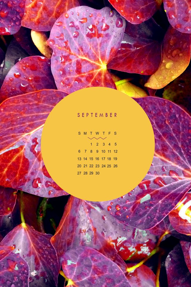
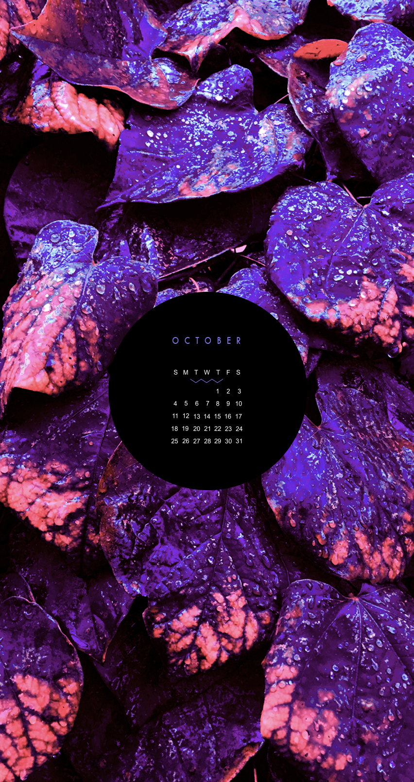
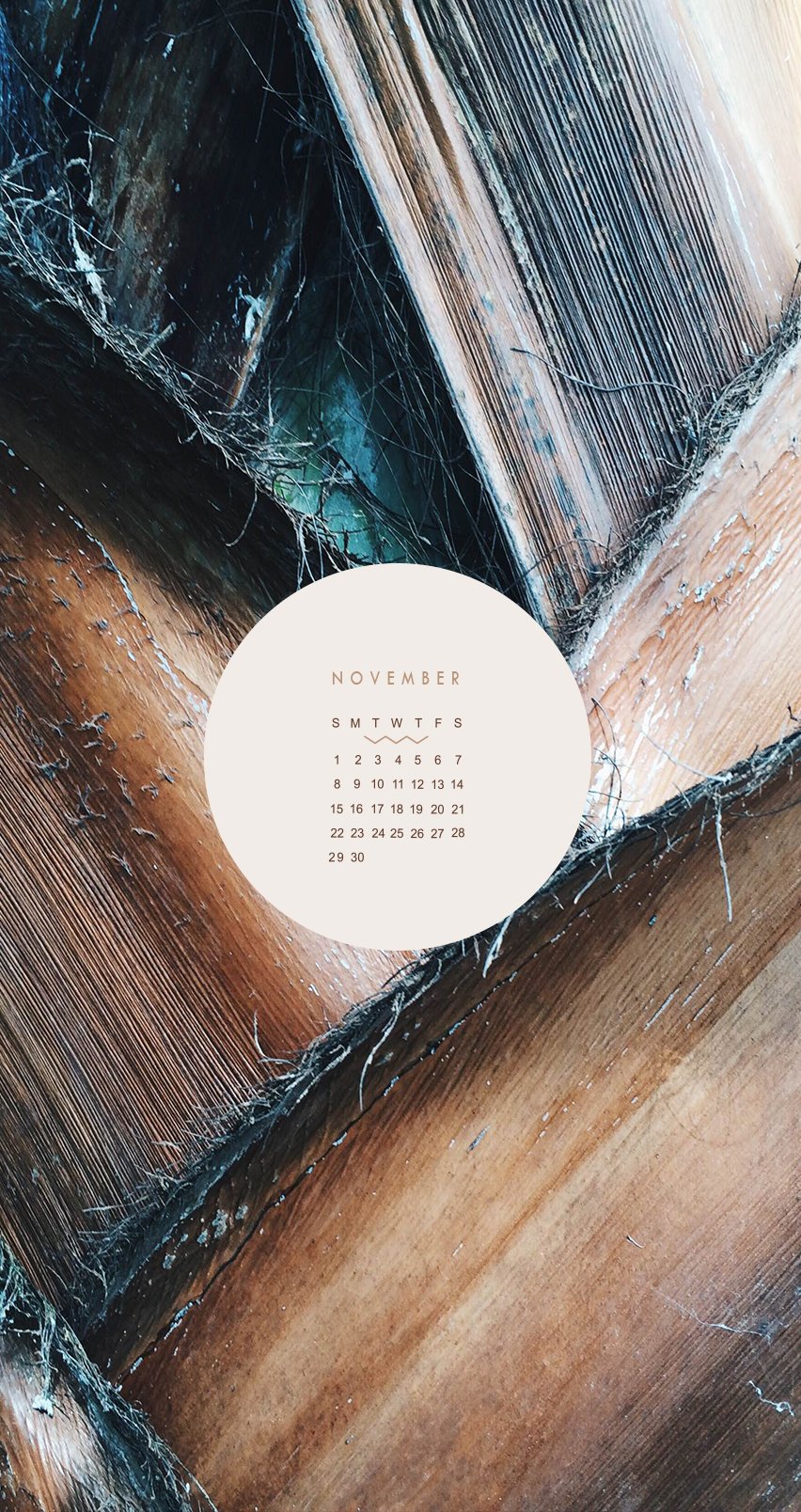
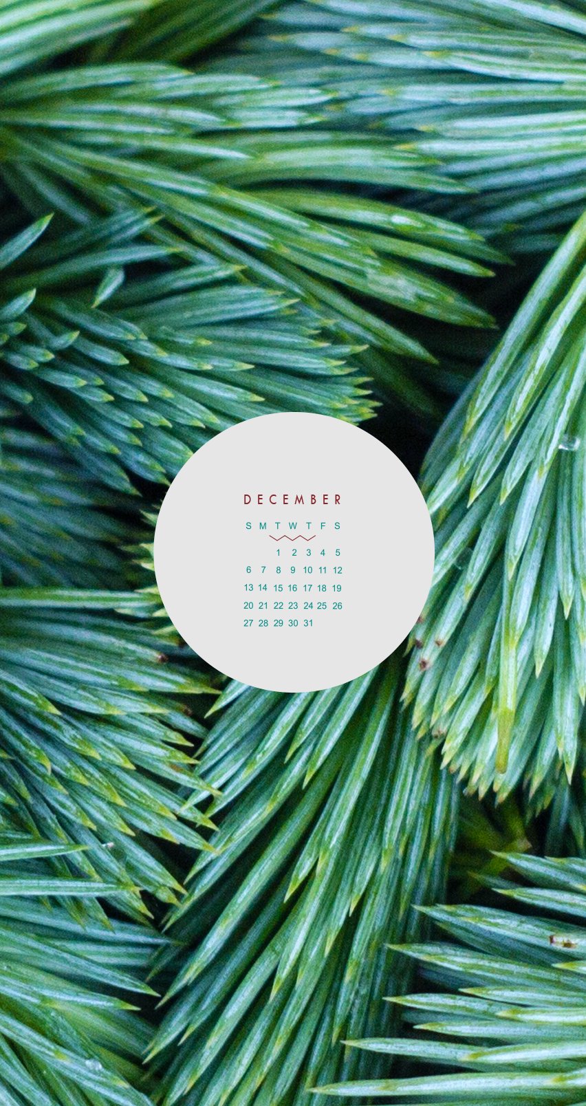
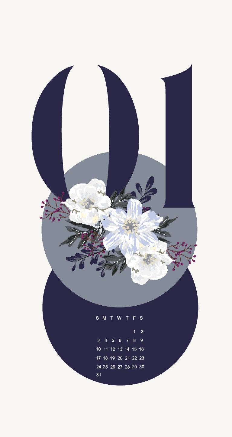
CALENDARS FOR IPHONE + IPAD
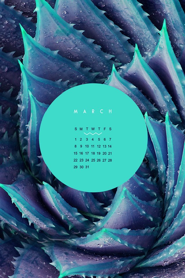
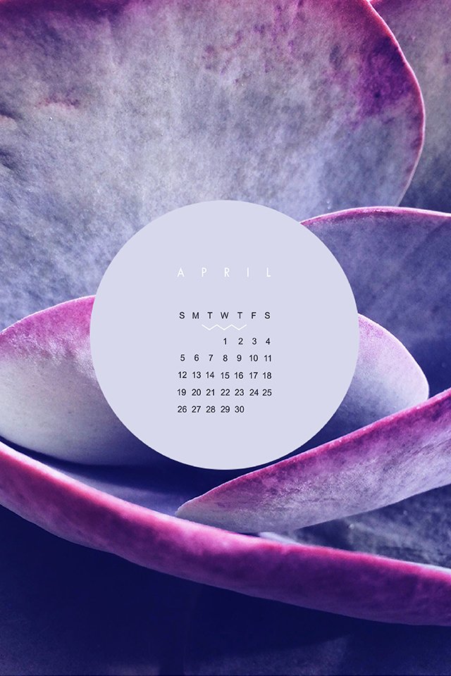
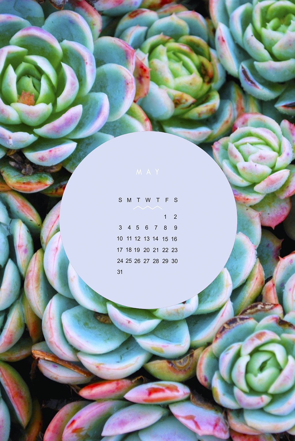
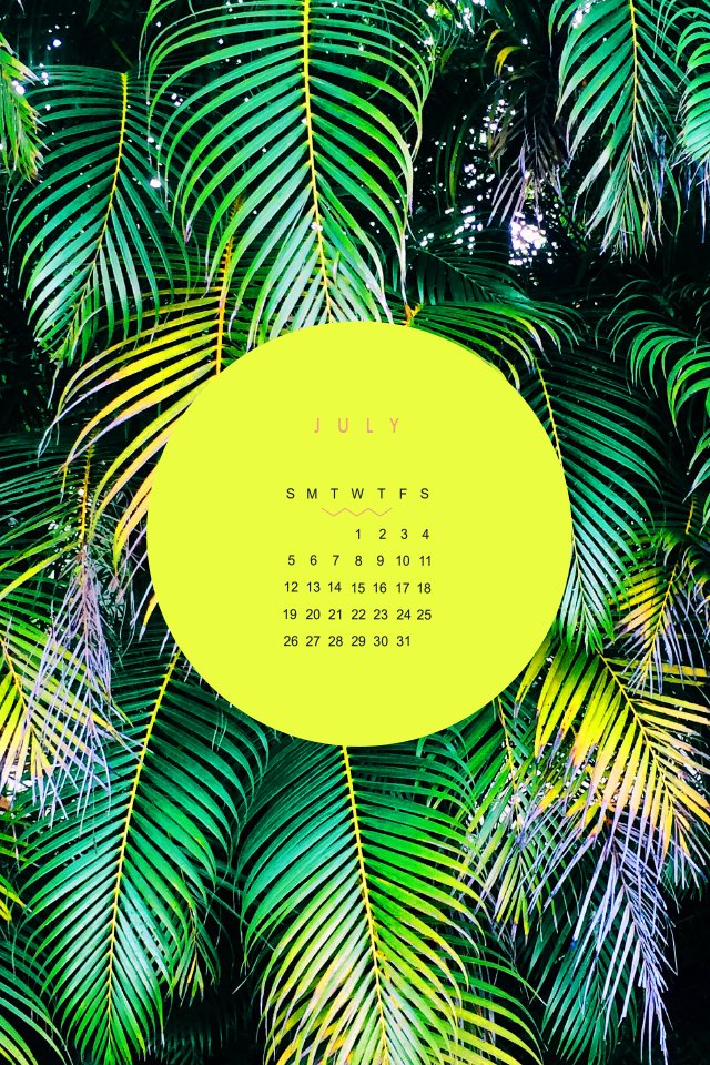
These babes were made for the 2015 calendar year as background for a phone or tablet. I didn't want them to get lost, so they can live for ever in design-land here on the blog!
Click through to see each month and feel free to reach out if you like this idea and would like to see more for 2018!
These babes were made as background for my phone and tablet many years ago. I didn't want them to get lost, so they can live for ever in design-land here on the blog.
Click through to see each month and feel free to reach out if you like this idea and would like to see more like this!


