Favorite Logos of 2022
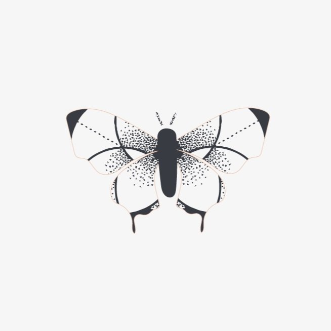
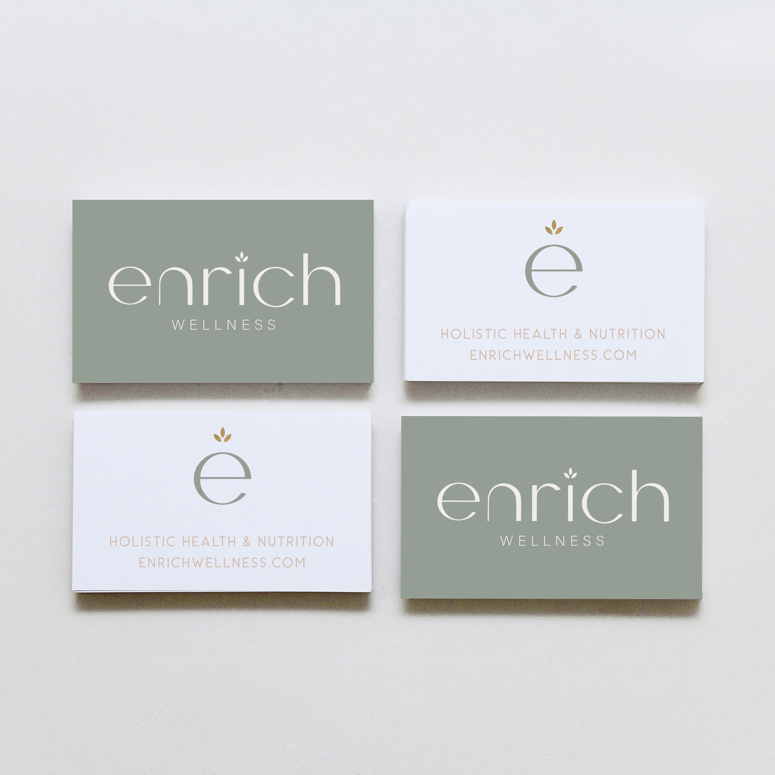
A recap of some of my favorite unchosen logos and submarks from 2022 branding projects including one of a geometric hummingbird logo and one for a health and wellness coach logo.
There were so many fun branding projects in 2022 and so many amazing clients! Since each branding process gets 2-3 fully designed brand identity options, not all logos make the cut. Even if they don’t become the final version of a logo design, the creation and refinement is still an important part of the process. The health and wellness coaching logo on the bottom left even got featured on designrush best-designs. And I’m still a little in love with the geometric hummingbird logo. 😍
pst…
Like a logo above and think it’s the perfect fit for your business?
Feel free to reach out for details on how to purchase!
Favorite Logos of 2021
A recap of some of my favorite unchosen logos and submarks from 2021 branding projects including one for an acupuncturist and a child and family counseling logo.
There were so many fun branding projects in 2021 and so many amazing clients! Since each branding process gets 3-4 fully designed brand identity options, not all logos get the green light. Some aren't quite right for the client or maybe just didn't fit as well as another option, but I have a little love for all of my logos (and maybe get a little too attached?? Eh, whatever!).
These are some of my favorite branding concepts and their variations created that didn't make the final cut.
pst…
Like a logo above and think it’s the perfect fit for your business?
Feel free to reach out for details on how to purchase!
Favorite Logos of 2019
A recap of some of my favorite unchosen logos and submarks from 2019 branding projects.
There were so many fun branding projects in 2019 and so many amazing clients! Since each branding process gets 3-4 fully designed brand identity options, not all logos get the green light. Some aren't quite right for the client or maybe just didn't fit as well as another option, but I have a little love for all of my logos (and maybe get a little too attached?).
Below are some of my favorite branding concepts and their variations created that didn't make the final cut.
WANT to CREATE
a custom LOGO?
LOGO PROCESS: EMBRACED PODCAST
This little logo process is from the branding process for Embraced Podcast, a podcast about women empowering women.
This little logo process is from the branding process for Embraced Podcast, a podcast about women empowering women. Having dabbled in the podcasting world for a hot second, I was excited to brand someone else's podcast! The branding to needed to embody women who share their strength, courage, perseverance, and self-love. Um... hell yes! Feminine strength was the design direction.
Below are several of the concepts and variations created before we nailed down the final logo.
WANT to CREATE
a custom LOGO?
Favorite Logos of 2017
A recap of some of my favorite unchosen logos and submarks from 2017 branding projects.
There were so many fun branding projects in 2017 and so many amazing clients! Since each branding process gets 3-4 fully designed brand identity options, not all logos get the green light. Some aren't quite right for the client or maybe just didn't fit as well as another option, but I have a little love for all of my logos (and maybe get a little too attached?? Eh, whatever!).
Below are some of my favorite branding concepts and their variations created that didn't make the final cut.
Related Posts
LOGO PROCESS: BASH EVENT PLANNING
This little logo process is from the branding process for BASH Event Planning & Design. This was a challenging but FUN design process that included ideas like topography, layering and disco!
This little logo process is from the branding process for BASH Event Planning & Design. This was a challenging but FUN design process that included ideas like topography, layering and disco!
Below are several of the concepts and variations created before we nailed down the final logo.
Related Posts
LOGO PROCESS: JANE O. COACHING
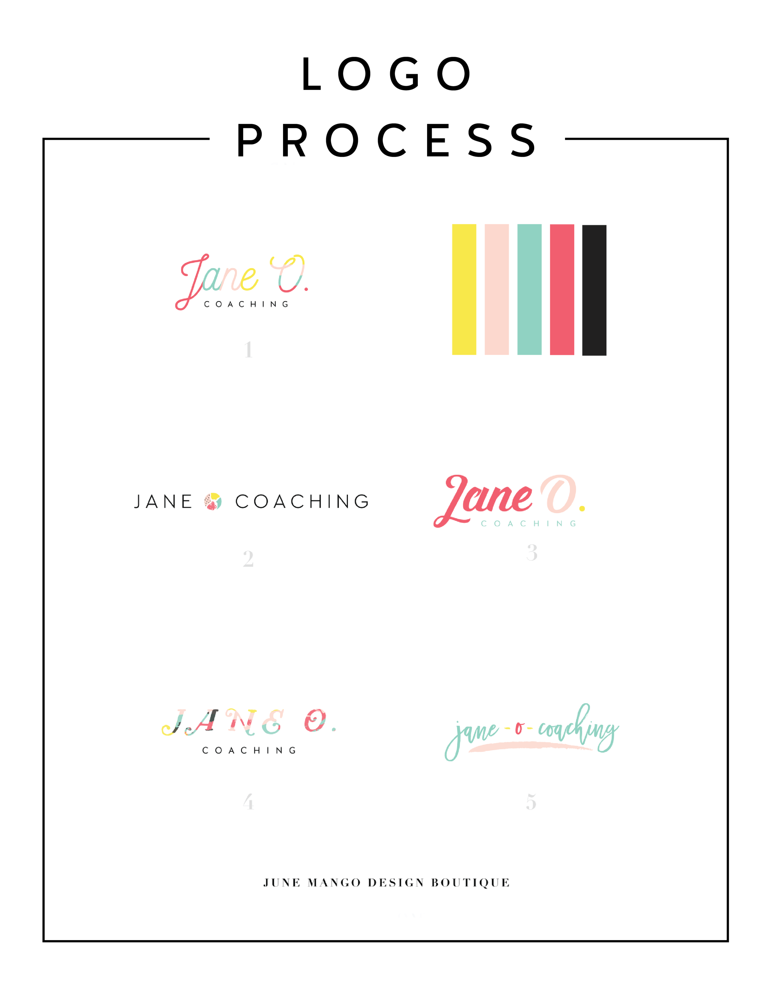
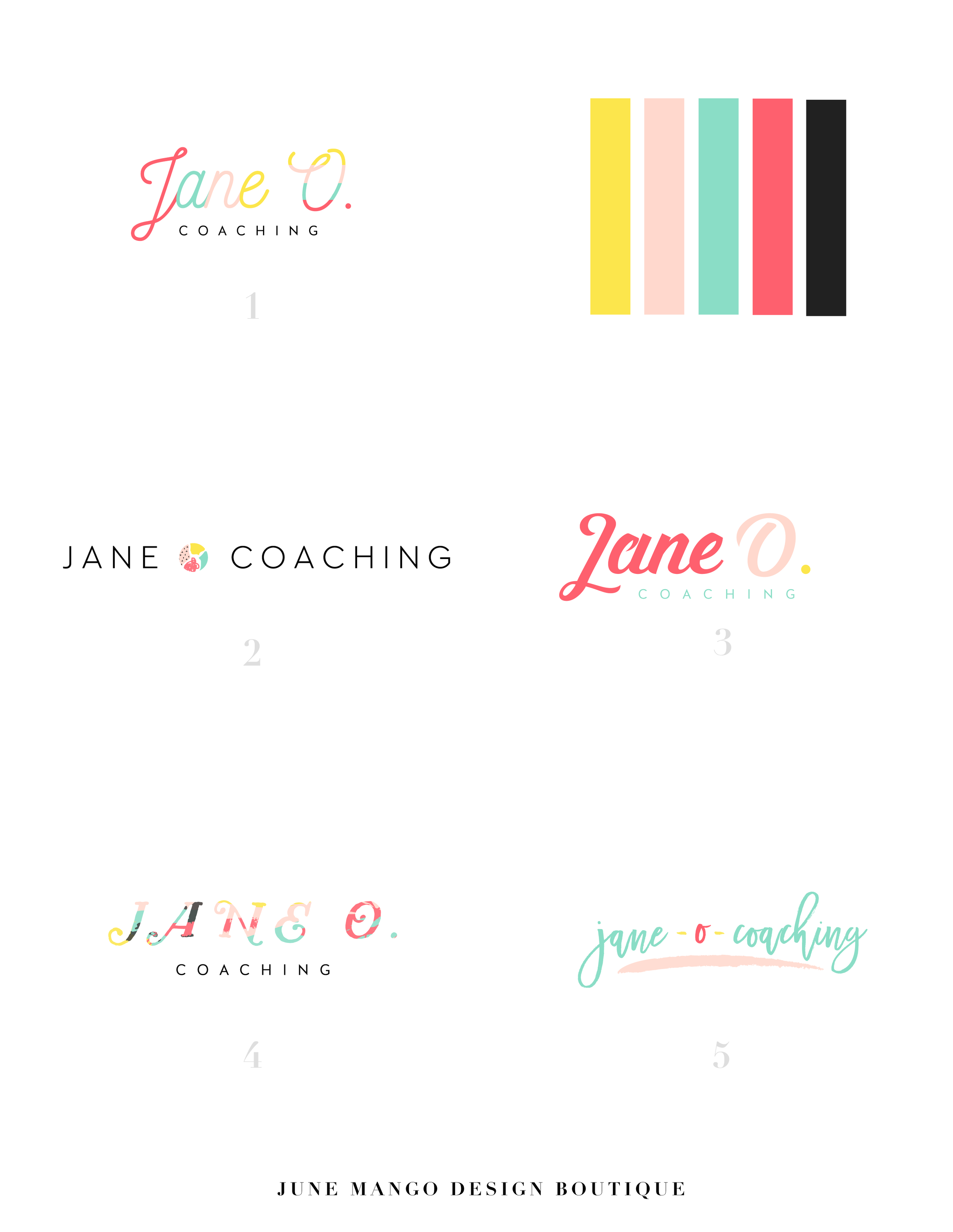
I haven't shared a logo process in a while. This logo process is from Jane O. Coaching, who is a love and style coach with an amazing colorful, bright vibe. So of course, she wanted her branding to be feminine, colorful and fun to show off her coaching niches.
I haven't shared a logo process in a while. This logo process is from Jane O. Coaching, who is a love and style coach with an amazing colorful, bright vibe. So of course, she wanted her branding to be feminine, colorful and fun to show off her coaching niches.
We ended up heading in the direction of #3, with some additional tweaks and customizations to make it fully unique to Jane. To see the full branding and web design that came from this logo process, head on over to janeocoaching.com.
And if you want to chat about your own logo or branding, holla at me!
Related Posts
LOGO PROCESS: DEVAN DANIELLE
I had such a crazy-good time creating this little logo, and the logo process above was only step one. We took these logos, refined them and added in some really cool photo elements until we got to a really versatile final logo and matching branding elements.
Devan contacted me to create her logo and branding with some super interesting and unique ideas. She basically said, "I want you to go wild and do whatever you want."
Um, HELL YAS!
The only requirement was that she wanted the logo to feel light, airy and open. Done and done.
I had such a crazy-good time creating this little logo, and the logo process above was only step one. We took these logos, refined them and added in some really cool photo elements until we got to a really versatile final logo and matching branding elements. You should probably head over here to check out the finished project, because, well, it's just so damn lovely!
And if you feel like chatting with me about your own logo and branding, I'd love for you to holla at me!
Related Posts
HOW TO ATTRACT YOUR IDEAL CLIENTS
Your brand's logo has some serious power to help you attract your ideal client. You just need to know how to use it. Your logo is one of the first things people see when they meet your biz, whether it's online or on your business card. Make your logo work for you by attracting your ideal clients ... like a magnet!
Your brand's logo has some serious power to help you attract your ideal client. You just need to know how to use it. Your logo is one of the first things people see when they meet your biz, whether it's online or on your business card. Make your logo work for you by attracting your ideal clients ... like a magnet!
So here's the trick:
Take out a notebook and really think about who your ideal client is. Write down as much information about them as you can (gender, hobbies, where do they hang out online, what do they do on weekends, what's their age, etc.). From there, try to understand EXACTLY what visually inspires them.
Next, pretend you're them. I'd head to Pinterest for this part of the exercise. Create a pinboard and GO TO TOWN. Pin everything you think they would like. Get that visual inspiration all in one place. And VOILA! What you now have is a great resource of visuals that you can use to apply to your logo. Look for common colors, patterns, styles and apply it all to your branding design. And that, my friends, is how to make your logo attract your ideal clients like a magnet.
Want to see these tips in action? Here’s an example or two of a client magnet.
Related Posts
LOGO PROCESS • RLS FASTPITCH
I like to give six logo concepts to my clients, because this feels like the perfect number. It's the Goldilocks of branding ( not too overwhelming and more than just a few options ). I know everyone's process is a bit different. Some designers only give three logos. Some give 15+. But I feel like I can nail down enough concepts to get the ball rolling and have each be creative and unique with six. Too many more than six and my creative juice stop flowing. Plus, I have found that my clients often feel paralyzed by the decision if there are too many to choose from.
I thought it might be nice to show some behind the scenes details for those curious about my branding process. These are six logo concepts that I designed for RLS Fastpitch. Although we ended up going through a few more iterations before we nailed down the final logo, these were a great starting point.
I like to give six logo concepts to my clients, because this feels like the perfect number. It's the Goldilocks of branding ( not too overwhelming and more than just a few options ). I know everyone's process is a bit different. Some designers only give three logos. Some give 15+. But I feel like I can nail down enough concepts to get the ball rolling and have each be creative and unique with six. Too many more than six and my creative juice stop flowing. Plus, I have found that my clients often feel paralyzed by the decision if there are too many to choose from.
The other thing about my logo process is that all of these logos are black and white. I find that color can be distracting, especially in the beginning. Once a client nails down one or two logo concepts, I implement color in the next round. I sometimes include the color palette direction along side the black and white logos, which is what I did here. This helps give them an idea of the logos as a whole ( design + color ).


