In the MOOD boards: Nursery Plans
Every experience, every step of this pregnancy has been a little adventure. Besides buying onesies and enjoying those little kicks getting stronger everyday, I'm also planning for the nursery!
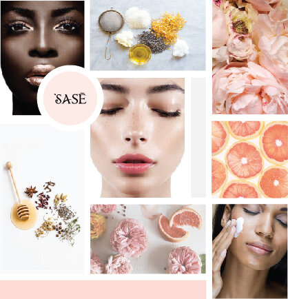
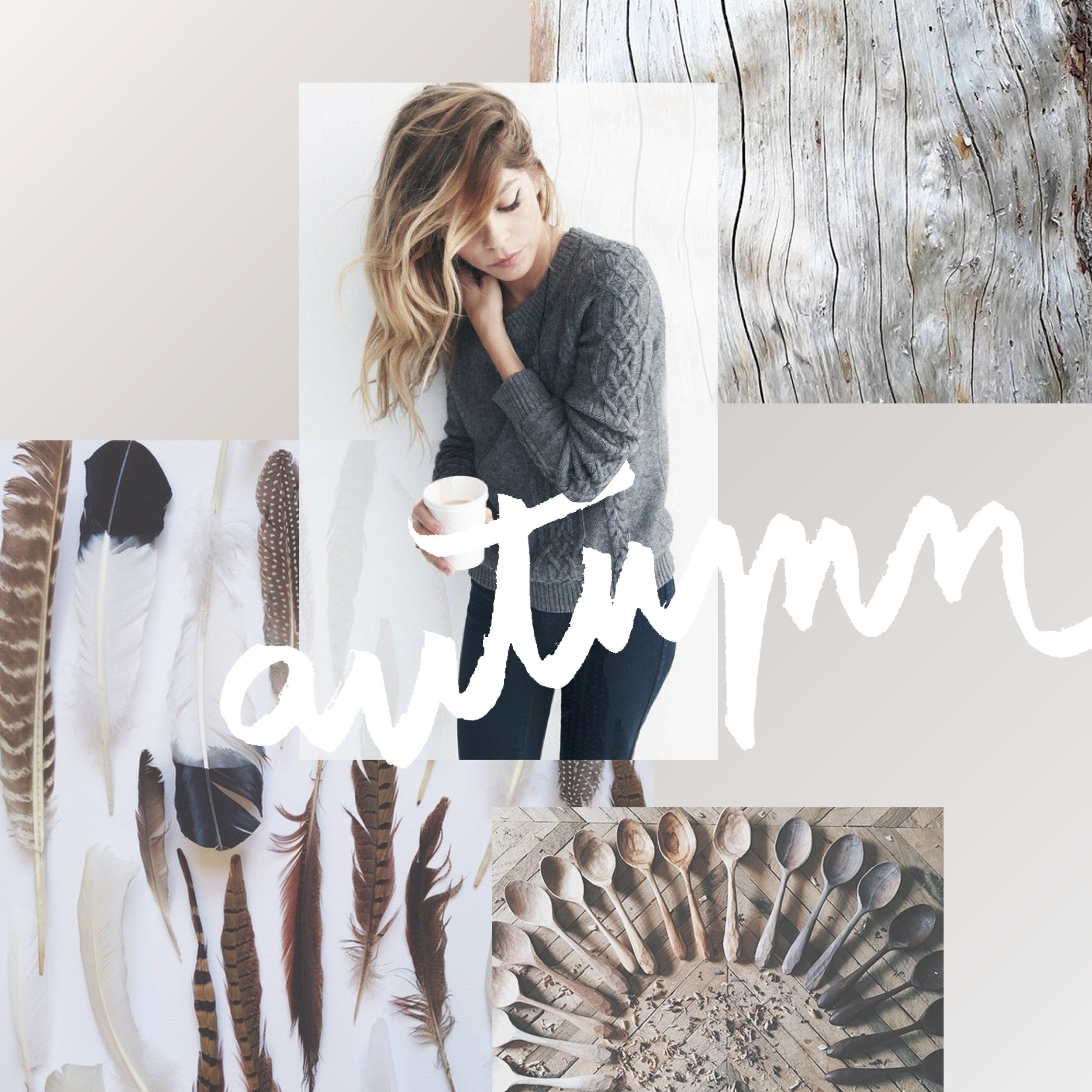
As many of you have probably seen if you hang with me on social media, I'm expecting my first little one mid-August. Every experience, every step of this pregnancy has been a little adventure. Besides buying onesies and enjoying those little kicks getting stronger everyday, I'm also planning for the nursery! And since anytime I plan anything design-related, I make a mood board, I thought I'd share it here with y'all!
A cute little combo of celestial elements with natural wood and wicker elements and (of course!) plants. We are keeping the gender a surprise so this design let's us make the room a cozy fit for a newborn without the "traditional" unisex colors (who decided green and yellow were the go-to anyway??).
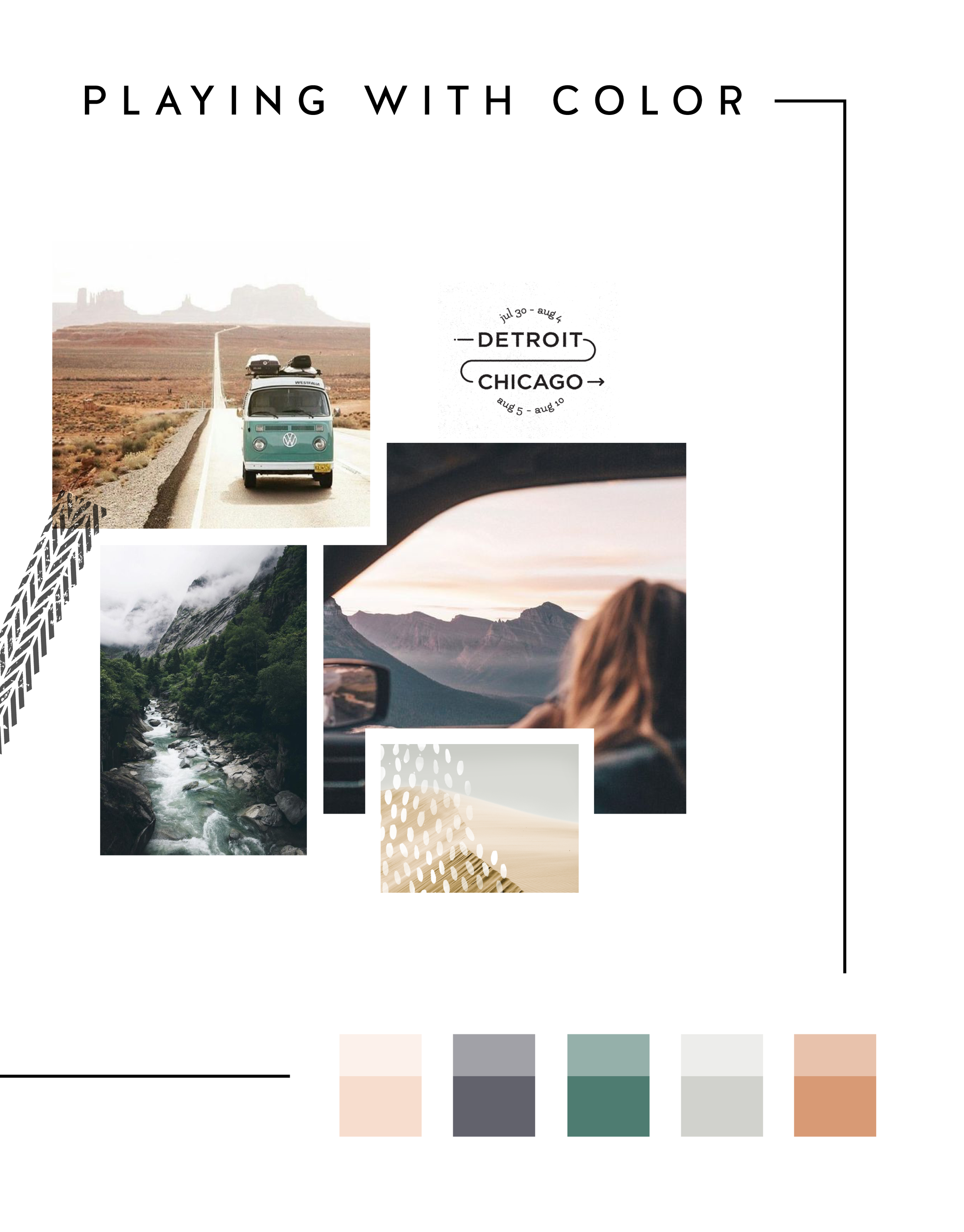
In the MOOD boards: Road Trippin'
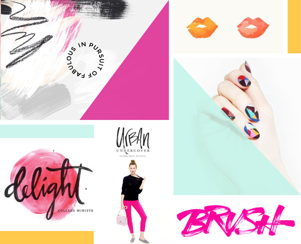
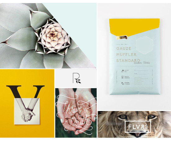
Feeling excited for a little road trip in the works, so I created a mood board and color palette for inspiration. Deep green trees, windows down, sunsets fading into starry nights... serious design inspiration!
Related Posts
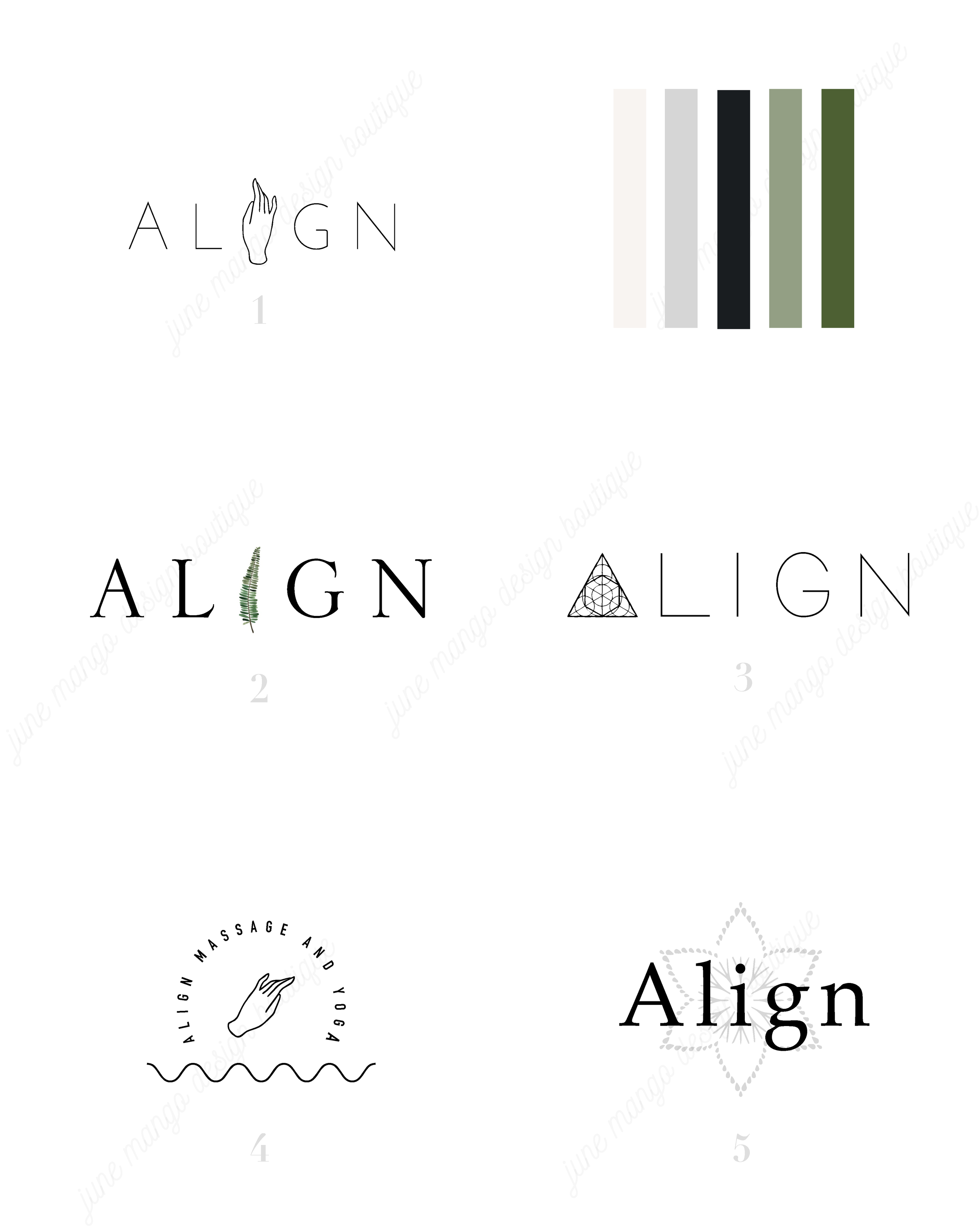
LOGO PROCESS: ACUPUNCTURE BRANDING
I've had lots of new branding projects lately that I've been meaning to share! Two of these were for holistic health providers specializing in acupuncture + herbal medicine or yoga + massage. Here are the logo processes for both!
I've had lots of new branding projects lately that I've been meaning to share! Two of these were for holistic health providers specializing in acupuncture + herbal medicine or yoga + massage. Here are the logo processes for both!
LOGO PROCESS: JANE O. COACHING
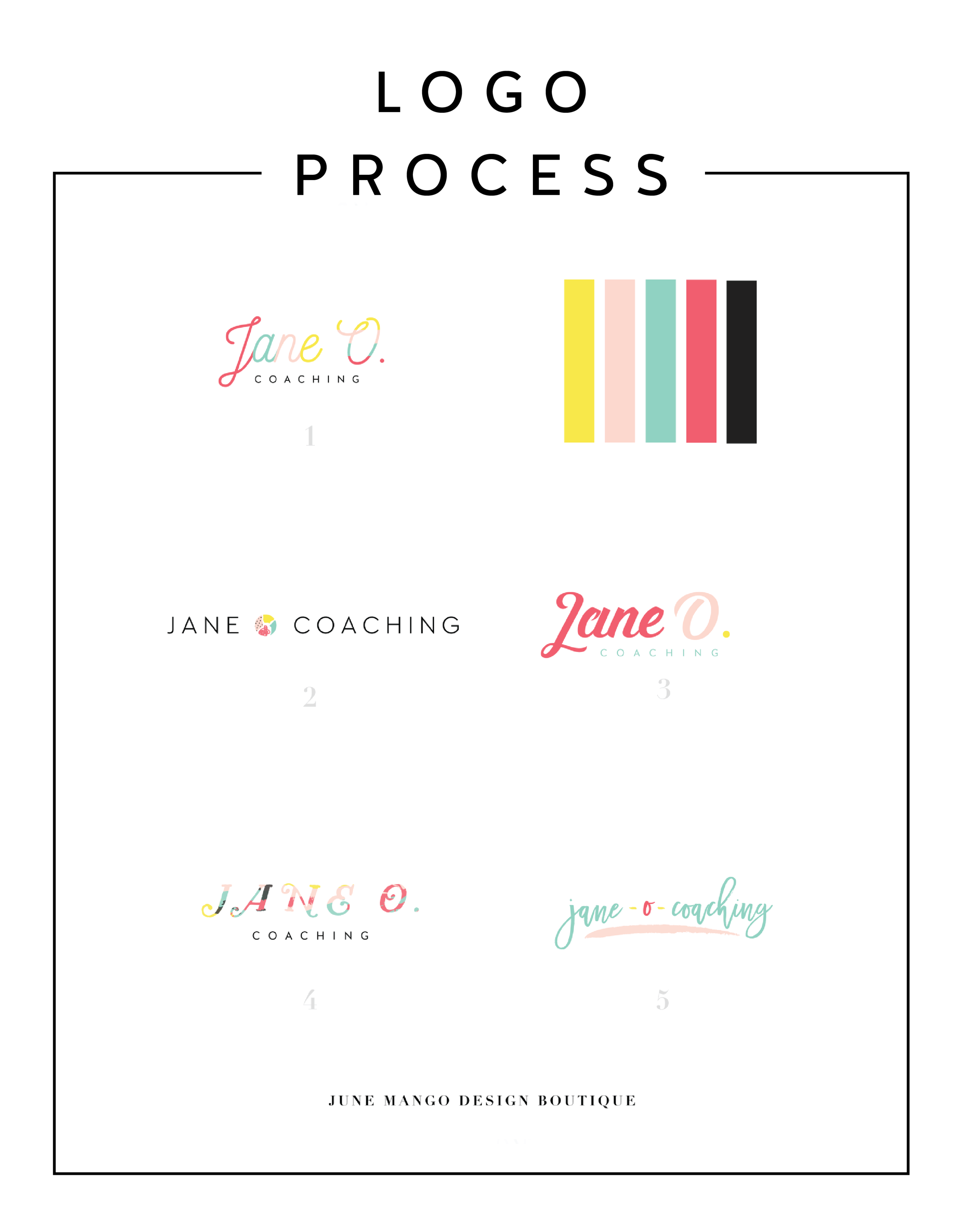
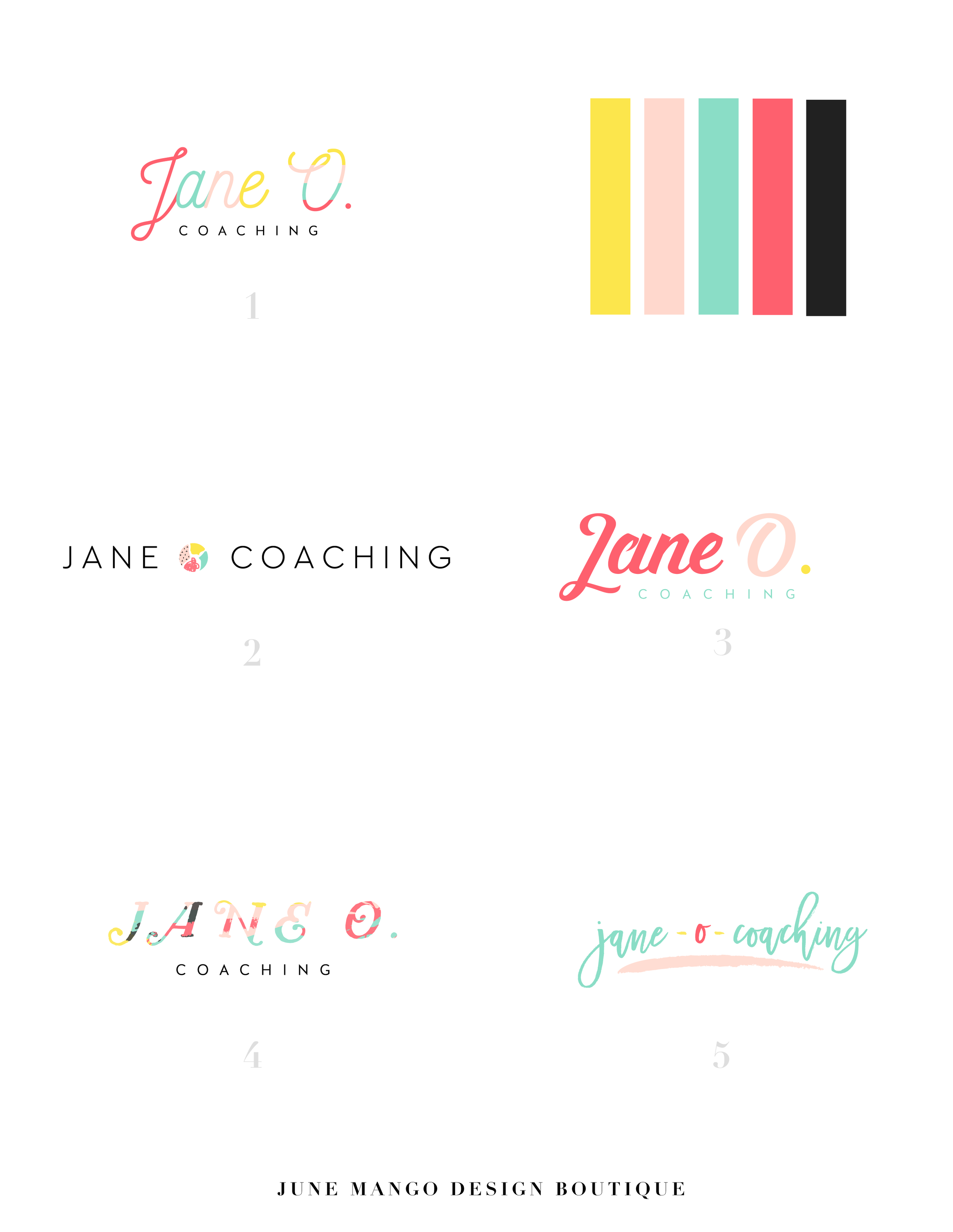
I haven't shared a logo process in a while. This logo process is from Jane O. Coaching, who is a love and style coach with an amazing colorful, bright vibe. So of course, she wanted her branding to be feminine, colorful and fun to show off her coaching niches.
I haven't shared a logo process in a while. This logo process is from Jane O. Coaching, who is a love and style coach with an amazing colorful, bright vibe. So of course, she wanted her branding to be feminine, colorful and fun to show off her coaching niches.
We ended up heading in the direction of #3, with some additional tweaks and customizations to make it fully unique to Jane. To see the full branding and web design that came from this logo process, head on over to janeocoaching.com.
And if you want to chat about your own logo or branding, holla at me!
Related Posts
LOGO PROCESS • RLS FASTPITCH
I like to give six logo concepts to my clients, because this feels like the perfect number. It's the Goldilocks of branding ( not too overwhelming and more than just a few options ). I know everyone's process is a bit different. Some designers only give three logos. Some give 15+. But I feel like I can nail down enough concepts to get the ball rolling and have each be creative and unique with six. Too many more than six and my creative juice stop flowing. Plus, I have found that my clients often feel paralyzed by the decision if there are too many to choose from.
I thought it might be nice to show some behind the scenes details for those curious about my branding process. These are six logo concepts that I designed for RLS Fastpitch. Although we ended up going through a few more iterations before we nailed down the final logo, these were a great starting point.
I like to give six logo concepts to my clients, because this feels like the perfect number. It's the Goldilocks of branding ( not too overwhelming and more than just a few options ). I know everyone's process is a bit different. Some designers only give three logos. Some give 15+. But I feel like I can nail down enough concepts to get the ball rolling and have each be creative and unique with six. Too many more than six and my creative juice stop flowing. Plus, I have found that my clients often feel paralyzed by the decision if there are too many to choose from.
The other thing about my logo process is that all of these logos are black and white. I find that color can be distracting, especially in the beginning. Once a client nails down one or two logo concepts, I implement color in the next round. I sometimes include the color palette direction along side the black and white logos, which is what I did here. This helps give them an idea of the logos as a whole ( design + color ).


