BREAKING THE BOUNDARIES OF MOOD BOARD MOSAICS
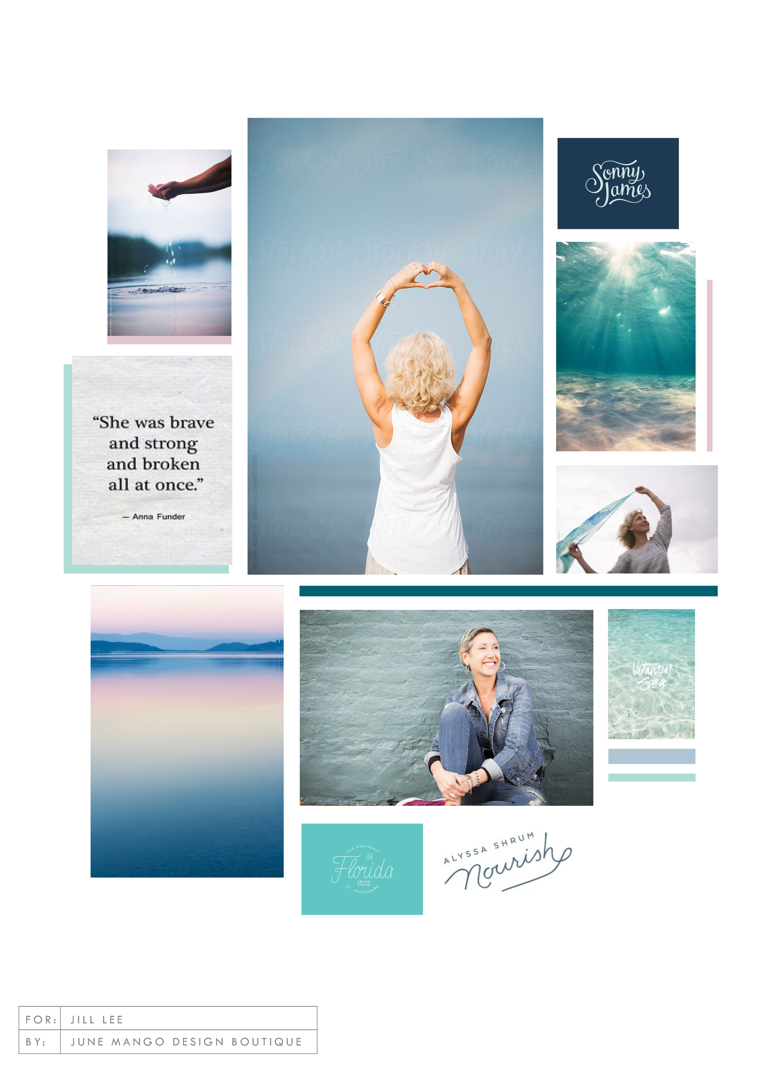
Totally deconstructed. More white space, more breathing room. More color blocks, but all integrated into the collage vs. being stacked together. Still a brand-focused lifestyle image at the center grounding the collage as well as the brand. And little, layered type elements.
I think all designers have a touch of Creative ADD. All of my favorite designers are constantly changing and pushing their brands + the creative processes to be better, cooler, or more unique.
I have this ADD too, and recently I've been itching to bust out of the standard mood board mosaic design. It's just EVERYWHERE, and frankly, I'm bored. And here's a little secret: boredom = creativity's best friend. Being bored makes me want to shake it up! Create something new and funky! Get weird and wild! Design-wise, that is. :)
So here's where I ended up on a the new make-up of my mood boards.
Totally deconstructed. More white space, more breathing room. More color blocks, but all integrated into the collage vs. being stacked together. Still a brand-focused lifestyle image at the center grounding the collage as well as the brand. And little, layered type elements.
I think mood board collages + color are my love language. ❤️
So what do you think? Love it? Hate it? Wanna live in it (I do!!). I'd love to hear your thoughts on the new mood board so feel free to holla at me!
Related Posts
THE SIMPLEST GUIDE TO COLOR PSYCHOLOGY
If you know anything about me at all, you know how much I love color. It is one of my favorite things - right up there with my family and chocolate. So it’s no wonder that adding color to a project is my favorite part of the process. It's also a crucial part of the process because it can change the feeling and appeal of a brand or website.
There are literally college courses (I took many!), books and a ton of in-depth resources devoted to the study of color and color psychology. But since you are probably not a #colornerd like me, I have broken down how to work with your color palette without having to dive deep into all that is Color Psychology.
Quick Color Psychology Overview
Whether you realize it or not, colors evoke emotions, feelings, and memories, and you can utilize this to create a brand or business presence that works to attract your dream client or customer. But since this can quickly become a rabbit hole of color-nerdiness, I have laid out the Quick and Dirty Guide to Color Psychology above. This little chart will show you how you can apply this knowledge to your logo, branding, website and anything else that incorporates color. Feel free to click the image to download a PDF version for yourself to reference in your future projects.
As John Ruskin said, "The purest and most thoughtful minds are those which love color the most.” And I couldn't agree more. 😉


