How to Make Your Podcast Cover Design Stand Out and Get Clicks
In the ever-growing sea of podcasts, it’s hard to get new listeners. Here are a few thoughts on how to create that moment of engagement when a potential new listener clicks on YOUR podcast cover verses someone else’s.
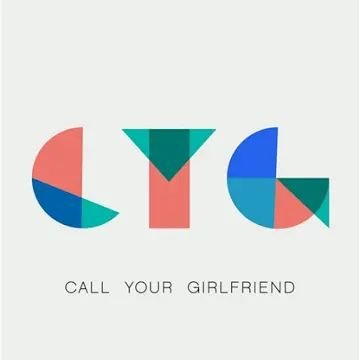
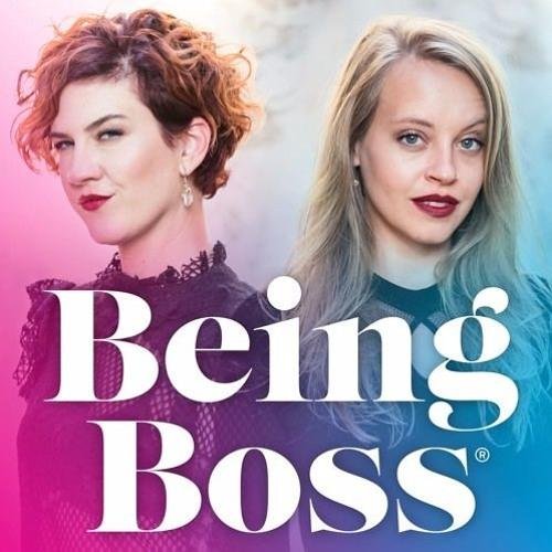
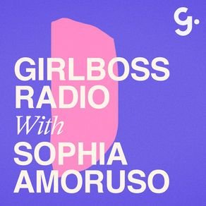
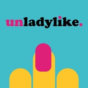
In the ever-growing sea of podcasts, it’s hard to get new listeners. Imagine this: you head to iTunes ready to plug into a podcast, but not sure what you want to listen to. Maybe you type in a search for “business” or “murder-mystery” just to see what comes up. Now… which podcast is the one your eye goes to first? Which engages you enough to make you give this new podcast your attention?
Are you wondering which it is? Here are a few thoughts on how to create that moment of engagement when a potential new listener clicks on YOUR podcast cover verses someone else’s.
Start with the basics
Use JPEG or PNG file format (no PDFs or GIFs)
Use RGB colors (no CYMK or Pantones)
Minimum size should be 1400 x 1400 pixels
Do not use any official Apple’s imagery (not even a photo of iPhone)
Make sure art clear and text is readable even at thumbnail sizes
Keep the design simple
If you’re looking through all of the podcasts, it can be overwhelming for your eye. Your likely to find yourself intuitively stopping on a podcast cover design that’s simple, without lots of text or graphics. That’s because your eye is searching for a place to rest as it washes over a sea of content. It’s overwhelming! So keep your layout simple with a simple 1-color background, 1-2 fonts, and maybe 1-2 easy-to-see graphics.
Share what it’s about
Obvious, but you should have your podcast title on there. If you’re title is long or has a subtitle, just include the main info. You can also share what your podcast is about by adding a simple graphic or photo that showcases your theme. You definitely don’t have to do this, and an alternative is to choose a font that represents the tone of your show. Fun and funky? Use a a unique, playful font. All about wedding planning? Maybe a script or whimsical handwritten font. But be careful here - your font choice should be readable (especially at small sizes) and shouldn’t be too gimmicky or distracting.
Choose imagery thoughtfully
Don’t use images of a microphone or headphones to represent podcasting… we already know it’s a podcast! In the same vein, avoid generic imagery that doesn’t describe what makes your podcast different. For example, a podcast for yoga studio owners would be better served by an image that showcases your unique thoughts than a generic yogi meditating or lotus flower.
Layout + Color
Since you are trying to keep the podcast cover design fairly simple, color can be tricky. Try to choose one main color to work with, maybe for use as the background. Then use 1-2 more colors as accents. When it comes to layout, get creative here! Maybe your title creates a unique shape or has a unique text-treatment like an outline. By breaking the rules of a typical layout a little, you create visual interest without adding any clutter.
MOST IMPORTANTLY!
The most important tip I can share to help make your podcast cover design stand out is to stay true to your brand. You already have something unique to share, and your branding should reflect that. Being consistent with your branding includes your podcast cover design. It should make your branding colors, website and all other collateral so that your audience recognizes your brand no matter where they’re engaging with you!
NEW!
a templated guide to
messaging magic
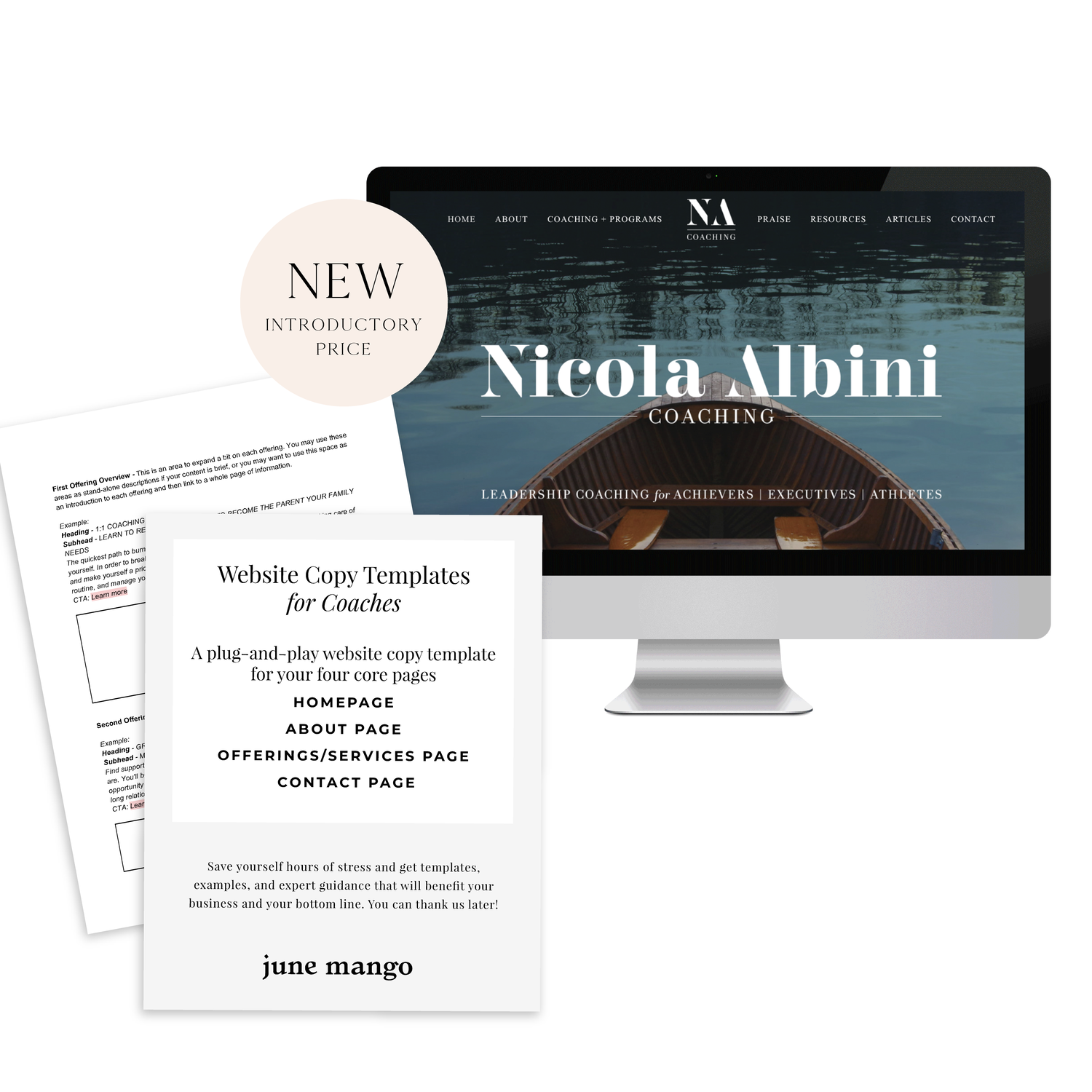
A plug-and-play website copy template for your four core pages (Home, About, Offerings, Contact). Save yourself hours of stress and get templates, examples, and expert guidance that will benefit your business and your bottom line.
get your template now >
ENGAGED, A WEDDING PODCAST
I can't believe it's taken me this long to post about the branding and web design for my podcast, Engaged! This is one of my fave projects to date. I started this podcast because I was feeling a lack of authenticity out there in the wedding industry. It often feels like a lot of fluff (bouquets and sequins and napkins, oh my!) and not a lot of real talk. What if you're planning the wedding while you two live in separate places? Or how do you plan a wedding if you just want to have a barefooted love party in your backyard? (Hint: Here's how). What do you do if you start planning a wedding and then find out your pregnant! Yep, that's a future episode.
It's been great to get advice and hear real stories from couple who've done the wedding planning dance. But of course, I can't do anything without branding it! #designerd
This is just a peek at the website's design. If you want to see more of the website or listen to some of the episodes, head on over this-a-way. We'd love to have you listen!!
Related Posts
need even more help with squarespace?
Skip the overwhelm and have your website designed and launched in just 5 days (or less)!


