MAKING DESIGN TRENDS UNIQUE TO YOUR BRAND - PART 2
In my last post, I went over how to jazz up some common design trends and make them unique to your brand. I'm diving back into today with some common design trends that I see ALL OVER Pinterest. Especially for wedding pros and boss ladies, these trends are HOT. But I'll show you how to make them distinctive so that you and your brand stand out.
In my last post, I went over how to jazz up some common design trends and make them unique to your brand. I'm diving back into today with some common design trends that I see ALL OVER Pinterest. Especially for wedding pros and boss ladies, these trends are HOT. But I'll show you how to make them distinctive so that you and your brand stand out.
Design trend #1: Watercolor er'thing
Logos by KimberlyPaigeDesigns & Autumn Lane Paperie
There a few great creative brands that can utilize watercolor elements well like artists, wedding industry pros, and brands that cater to babies or kids. But what if you want to up-level the watercolor game for your own brand? Here's how.
A: Layer up! Adding some additional color and texture will help add more visual interest to the logo. You can even add a little details, like the trees in this logo by Happily Ever After Etsy above. Darker colors will also add more sophistication and maturity to the logo.
B: Define it's shape!Instead of creating a simplified watercolor swatch, try creating a watercolor elements in the form of an item related to your business or brand. West End Girl Studio does this well in the logo above with watercolor leaves.
Design trend #2: Floral er'thing
Logos by Arlyne Grace Design & Elle & Co.
Ahh... floral motifs. I have a real love-hate relationship with them. They can be so great and sometimes are so obviously appropriate (hello, wedding florist!). But sometimes, they seems to be a go-to design just because they're pretty. So here are some ways to use these gorgy florals in your branding, but up-level them to match your unique biz.
A: Add additional elements! Adding some additional design or drawn elements to the florals will make the logo more unique. You can even use real florals instead of drawn/painted flower elements, like this bouquet in the logo by One Plus One above.
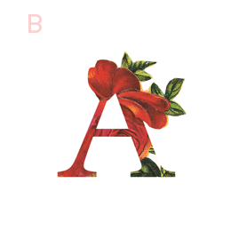
B: Break the rules! If you read Part 1 of this series, you may be sensing a theme. Breaking some design rules (keyword: some) is a great way to add visual interest to any design. In the logo/letter above by the aleph corporation, the flower petals break out of the border of the letter A's peak. It's just enough to add a bit of whimsy without overpowering the letter or structure.
NEW WORK: STEMS AND SPRIGS SQUARESPACE WEB DESIGN
This SquareSpace web design project has me feeling all fuzzy inside. This lovely little site was created for a florist in Northern Michigan who A) Is one of the sweetest ladies I've ever virtually met, and B) Makes the most gorgeous floral designs EVAH.
This SquareSpace web design project has me feeling all fuzzy inside. This lovely little site was created for a florist in Northern Michigan who A) Is one of the sweetest ladies I've ever virtually met, and B) Makes the most gorgeous floral designs EVAH.
Kalin, the owner of Stems and Sprigs, had a SquareSpace website set up but just couldn't seem to align the layout and design with her brand. We worked together to create a soft, feminine, and sophisticated feel for her website that now allows her to truly broadcast her brand in an authentic way.
Take a peek at the results below.


