MAKING DESIGN TRENDS UNIQUE TO YOUR BRAND - PART 2
In my last post, I went over how to jazz up some common design trends and make them unique to your brand. I'm diving back into today with some common design trends that I see ALL OVER Pinterest. Especially for wedding pros and boss ladies, these trends are HOT. But I'll show you how to make them distinctive so that you and your brand stand out.
In my last post, I went over how to jazz up some common design trends and make them unique to your brand. I'm diving back into today with some common design trends that I see ALL OVER Pinterest. Especially for wedding pros and boss ladies, these trends are HOT. But I'll show you how to make them distinctive so that you and your brand stand out.
Design trend #1: Watercolor er'thing
Logos by KimberlyPaigeDesigns & Autumn Lane Paperie
There a few great creative brands that can utilize watercolor elements well like artists, wedding industry pros, and brands that cater to babies or kids. But what if you want to up-level the watercolor game for your own brand? Here's how.
A: Layer up! Adding some additional color and texture will help add more visual interest to the logo. You can even add a little details, like the trees in this logo by Happily Ever After Etsy above. Darker colors will also add more sophistication and maturity to the logo.
B: Define it's shape!Instead of creating a simplified watercolor swatch, try creating a watercolor elements in the form of an item related to your business or brand. West End Girl Studio does this well in the logo above with watercolor leaves.
Design trend #2: Floral er'thing
Logos by Arlyne Grace Design & Elle & Co.
Ahh... floral motifs. I have a real love-hate relationship with them. They can be so great and sometimes are so obviously appropriate (hello, wedding florist!). But sometimes, they seems to be a go-to design just because they're pretty. So here are some ways to use these gorgy florals in your branding, but up-level them to match your unique biz.
A: Add additional elements! Adding some additional design or drawn elements to the florals will make the logo more unique. You can even use real florals instead of drawn/painted flower elements, like this bouquet in the logo by One Plus One above.
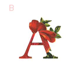
B: Break the rules! If you read Part 1 of this series, you may be sensing a theme. Breaking some design rules (keyword: some) is a great way to add visual interest to any design. In the logo/letter above by the aleph corporation, the flower petals break out of the border of the letter A's peak. It's just enough to add a bit of whimsy without overpowering the letter or structure.
BRANDING FOR FLORISTS
I'm starting a new blog series called "Branding for...". In these posts, I will highlight a creative industry and zero in on some key how-to's for:
• Communicating your mission
• Translating your passion into a unique brand identity
• Inspiring your dream clients to work with you
• Creating a winning website
• Finding the "joy" job (you know, the client and project that ignites your passion!)
Let's dive in, shall we?!
I'm starting a new blog series called "Branding for...". In these posts, I will highlight a creative industry and zero in on some key how-to's for:
Communicating your mission
Translating your passion into a unique brand identity
Inspiring your dream clients to work with you
Creating a winning website
Finding the "joy" job (you know, the client and project that ignites your passion!)
Let's dive in, shall we?!
Branding for Florists
Whether you've just launched your business or are a seasoned veteran looking for a brand refresh, there are four main ideas to help you find your focus.
1. Be distinctive
What makes you unique? What is the thing that makes your floral business stand out from all the rest. Is that you grew up in Hawaii and have a deep-rooted love for all things bright and tropical? Is it that you are a hopeless romantic at heart and derive deep joy from bringing a wedding to life through floristry? What makes your clients love you and your work?
2. Brand it, #bossbabe
How do you take your unique-ness ( see above! ), and turn it into the most fantastic florist branding ever?
Answer: Emotion. Find that emotional connection your style has with your customers. A bride-to-be has seen your whimsical hanging eucalyptus installation on Pinterest and has fallen in love. She wants that romantic feeling for her big day, too. Allow your branding to reflect that romance you bring to your floral design. Show this bride-to-be and any other that when they hire you, your floral arrangements will make her swoon.
You create an emotional connection through your branding based on the patterns, colors and fonts you choose to marry into a uniquely perfect fit for your business. Done right, clients will have a sense of your style before they even chat with you.
3. Work your website
Branding doesn't stop with your business cards. Your brand needs to carry through to your website, too. Now is the time to consider your dream client's journey through your site. Yes, I said journey. Think about where they will start (homepage, blog?) and where you want them to end up (contact page, portfolio?). Continue the emotional experience by telling a fluid story to your customer. A good example may look like this:
Click ... Homepage Introduction to Sweet Pea Floral Design, where my mission is to create seasonal arrangements that are whimsical and romantic.
Click ... Portfolio A collection of gorgy examples of past work for dreamy clients.
Click ... Contact How to get in touch to book my unique and valuable services.
Thinking about how a potential customer will wander through your website will allow you to create the right structure, content and navigation.
4. One step further
As the savvy floral business owner you are, you know there's more to consider. Social media ( header images, profile pictures, behind the scenes Instagram shoots ), advertisements and media kits are all places to carry over your branding. Think about each client's experience from beginning to end. From ribbons to store front signs to thank you stationary, pull everything together and review what you have. Make sure to ask yourself if it sends the signals to the right kind of clients. In the end, it should all be in line with your vision, mission and style.


