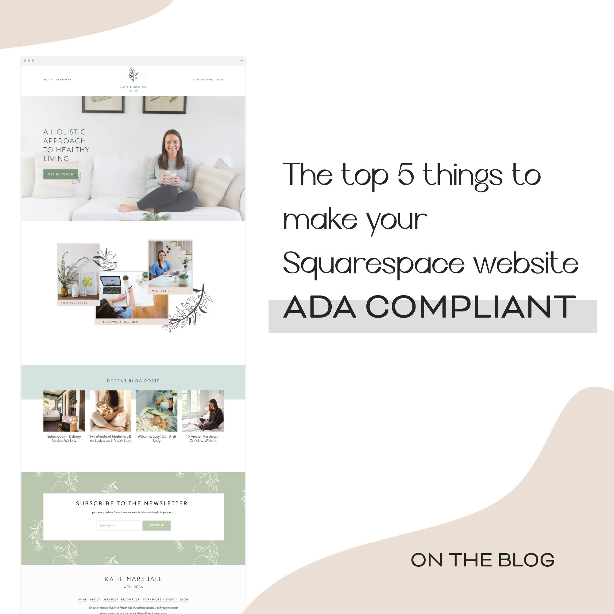
The Top 5 Things to Make Your Squarespace Website ADA Compliant
Creating a website that is not only beautiful but also accessible for all is an easy process that can make a big impact on your audience. There are a few simple steps that you can take to make your website ADA compliant. Take a look at the breakdown below!
Tag Images With Alt Text That Describes the Image
When naming your image files, or updating your file names within Squarespace, be sure to describe the image clearly. In the past, you may have focused on keywords for your image names, update these files with descriptions of the actual image. For example, instead of local-vet-practice.png, name the image accurately - such as black-lab-in-animal-hospital.png.
Contrasting Colors
Be aware of your color usage throughout your website. Make sure that you have enough contrast between colors when they are close to one another. Especially when they are overlapped, such as buttons or collage image blocks.
Text Size
Your text sizing should be large enough in its regular format, but also clearly legible when resized and enlarged. Be mindful of this step during the design process from the get-go to avoid having to backtrack and reevaluate your webpage.
Clear Page Names and Navigation
Make your navigation clear to understand and visible throughout your website. Plus, keep your page names clear and concise - more straightforward. This will help avoid confusion for anyone clicking throughout your website.
Buttons That Say What They Do
Instead of your standard “click here” on your button text, label buttons accurately and clearly (ie: send a request).


