USING GIFS IN WEB DESIGN
It's simply an animated photo / graphic made by placing several layers together that play in a loop. And it's a fantastic tool for your website. Here's why:
It's the gif that keeps on giving!! #hilarious
But actually, that's kind of what a gif is. It's simply an animated photo / graphic made by placing several layers together that play in a loop. And it's a fantastic tool for your website. Here's why:
This animation grabs the users attention. The changing visuals catch the eye and cause the user to take notice.
Your message or image stands out. This make a gif a great option for a featured item in an e-commerce site. Kate Spade has some great examples of this.
You can use it to direct the user to a particular page. Since the image is eye catching, use it as a button or link it to a place you want your audience to go, like your Contact or Services page.
They get a lot of love. Gifs are more likely to be shared on social media platforms and garner more user engagement.
These animated visuals are processed faster in your brain! That means that your message is received sooner and is likely clearer. It's science, yo.
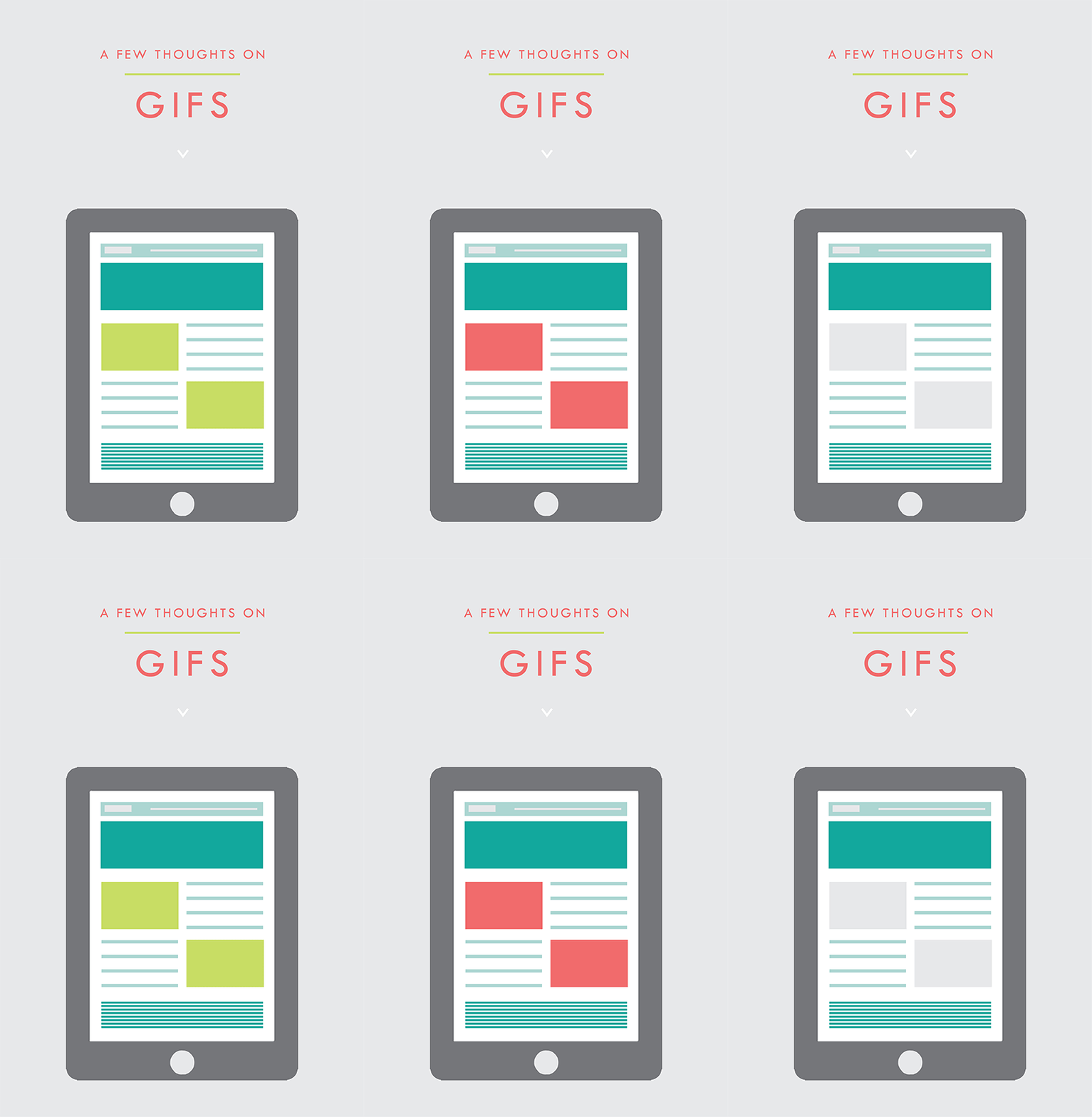
You can showcase different styles for different tastes. This is another great use for an e-commerce site that may sell an item in various colors, for example.
• They're fun. This is maybe the best reason. Because, hey, why not?
PRO TIP: You can use these little guys in your email marketing, too! It's another great way to pack a lot into a small space.
Related Posts
need even more help with squarespace?
Skip the overwhelm and have your website designed and launched in just 5 days (or less)!


