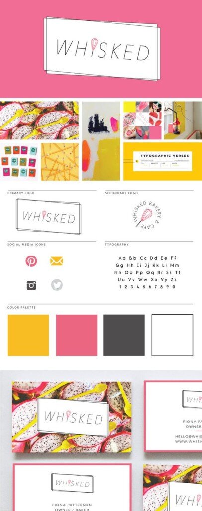
BRAND STYLE BOARDS 101
You may have seen these little guys floating around on Pinterest and not known exactly what they are or what their purpose is.
Every designer does their Brand Style Boards a little bit differently, but as a rule there are a few things that should be included.
Logo
This is the main logo that will be used on important touch points like the website, business cards, etc
Submark / Secondary Logo
This is a variation of the logo and usually much simpler. Often an icon, it can be used as an avatar on social media or as a stamp on images for bloggers and photographers
Color Palette
I always make sure to include not only the color swatches, but the various color values. This helps a client match their color palette from anything like a printed business card to their website
Fonts
The fonts are really important to the brand and are NOT an afterthought, so it's imp ortant to make sure to include them on the Brand Style Board to ensure that the fonts match up on all future branded collateral.
In the examples below, I also include design elements that can be used as icons or graphics on the website. Sometimes a branding package will include patterns or buttons / graphics for the client's website, which are also helpful to include on the Brand Style Board. I also always include the mood board that I created for the internal branding process. I think it helps tie everything together and give the client a good idea for the types of imagery they should look for when creating other items for the brand (ie: website, media kit, etc).
Ultimately, the Brand Style Board should contain the core of your brand. At a glance, it should be everything you need as a reference for you and anyone you hire down the line. It should guide every visual choice you make for your business.
To see more examples, head this-a-way or to chat with me about your brand head that-a-way!
need even more help with squarespace?
Skip the overwhelm and have your website designed and launched in just 5 days (or less)!


