"I bought a web design template. Now what?"
So you just bought that beautiful new website template from a trusted designer and you’re ready to get to work! But now you’ve been trying to change layouts, add your own brand colors and fonts and it just doesn’t look right. It definitely doesn’t look as professional as the original template you hoped you were duplicating. So what gives?
This is so tough. And first, let me just say, it’s not your fault. It’s really hard to get a pre-made template and make it look exactly like the original design once you implement your own content. Unless you are following the design and layout exactly (meaning no changes or additions!), things can get wonky.
The problem is not you.
The problem is that you’re trying to fit yourself and your brand into something that was never made to fit your exact needs. Does that mean you have to go hire a web designer 1:1 for a custom project? Nope. That’s certainly the best way to get a custom-made website, but for those who are not ready, have a small budget or just want to do it themselves, templates are still a good option.
So what’s missing? And how can you fix it?
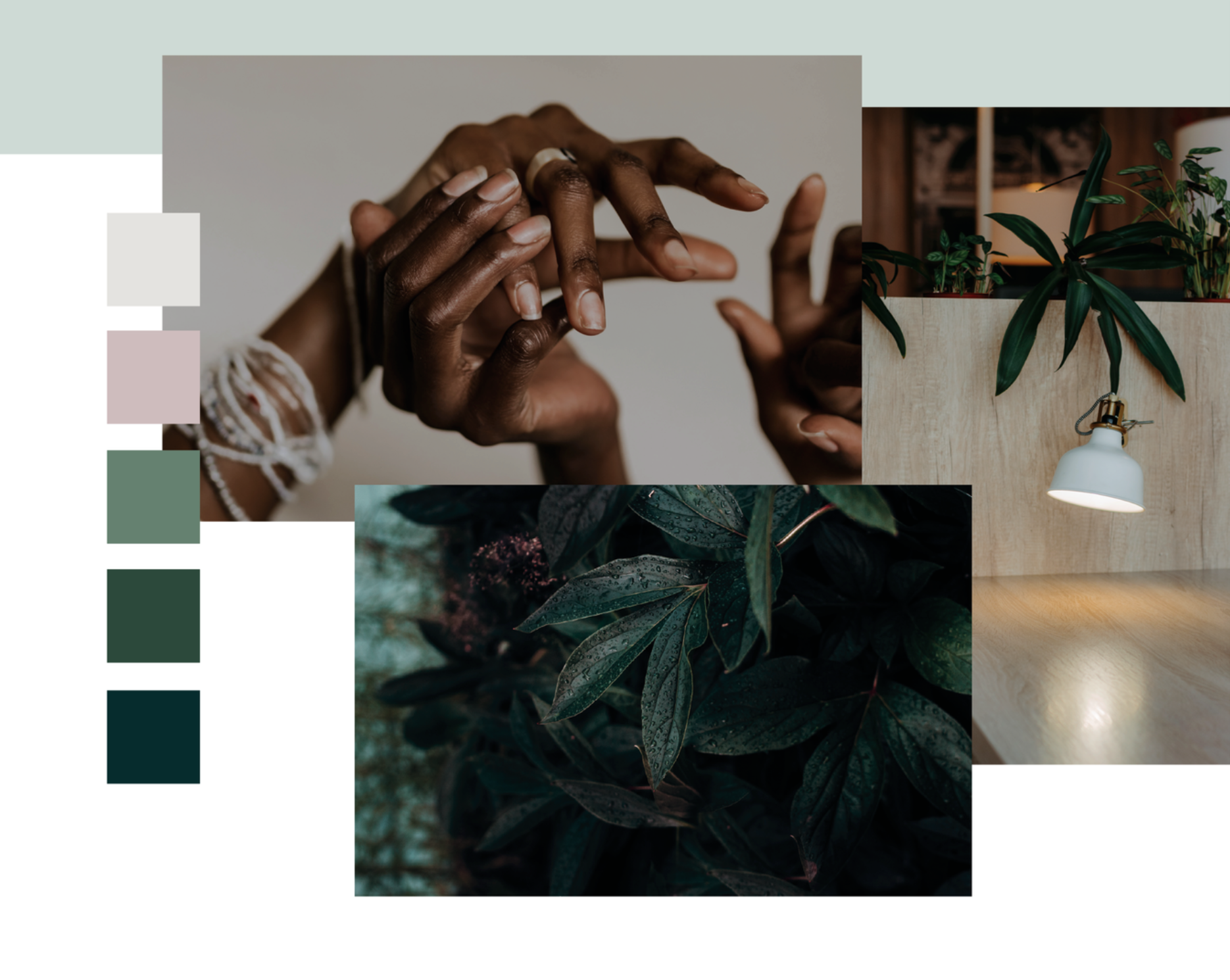
The problem is that you are given only one piece of the puzzle. Admittedly, it’s a really crucial piece, but it doesn’t create the whole picture. When you have a designer template, the designer has also hand-picked photos, custom color palettes, font pairings and even thought through the copy and structure of the website. BUT - they don’t give you that. And you wouldn’t want that because again, it’s not one-size-fits-all.
Imagine you want to make Molly Yeh’s Kransekake for a holiday party. You look at the photos of her beautiful cake and swoon over the idea of creating such a perfect cake. So you read her recipe and gather all of your ingredients. Only… you don’t have rosewater so you sub vanilla extract and you don’t have sprinkles but you have some sanding sugar, and you even make a paper chain to hang on it, but yours is much wider and clunkier and by the time your done, you certainly have some version of a kransekake, but it’s nothing like Molly Yeh’s.
This is exactly what happens with a web template. Because you are not a designer (or a food network star!). And that’s okay.
Just like Molly Yeh’s cake needs cute, thoughtful design touches, so does your DIY website. You need curated photos that match and work together with your brand colors and actually fit the layout of a website and also don’t look weird with text over them…. OR font pairings that feel sophisticated, but also approachable if that’s your thing. These are elements a designer knows how to find, create or curate.
The route to alleviating all this frustration is by having the proper tools and assets ready to implement into the process and project.
These elements have the ability to elevate your website design or completely unglue it - no matter how well-designed a template is. As an online business, your website is often the first place potential clients turn to find out more about you. Your website should convey you, your personality, and why people should work with you. The photos you use have the ability to enforce that personality and show off who you are in a more visual way than copy can. The layout needs to flow and work together.
Before beginning your search for the perfect web design template, get intentional with your photo choices, font pairings, and color schemes. Write your copy and then see if it will really fit in that web templates layout. Better yet, write your copy TO FIT once you’ve picked your dream template. Your website and your clients will instantly feel more attracted to your business when each element is thoughtful and carefully curated!
You can do this.


