HOW TO USE & ABUSE GRIDS FOR WEB DESIGN
A little design secret is that any good design is probably breaking a rule. Not ALL the rules, because otherwise, things get a little confusing. But breaking a rule here and there allows you to create something that catches your eye. And eye-catching design is noteworthy. And noteworthy sites are remembered. You see where I'm going with this, right??

Every website is designed using a grid. This is so helpful when you are thinking about layout and placement of content. If you're just starting out in web design, or are DIY-ing your site, this is basically the number one rule to keep in mind. JUST FOLLOW THE GRID.
But! You can also use the grid to your advantage to create unique layouts. A little design secret is that any good design is probably breaking a rule. Not ALL the rules, because otherwise, things get a little confusing. But breaking a rule here and there allows you to create something that catches your eye. And eye-catching design is noteworthy. And noteworthy sites are remembered. You see where I'm going with this, right?? :)
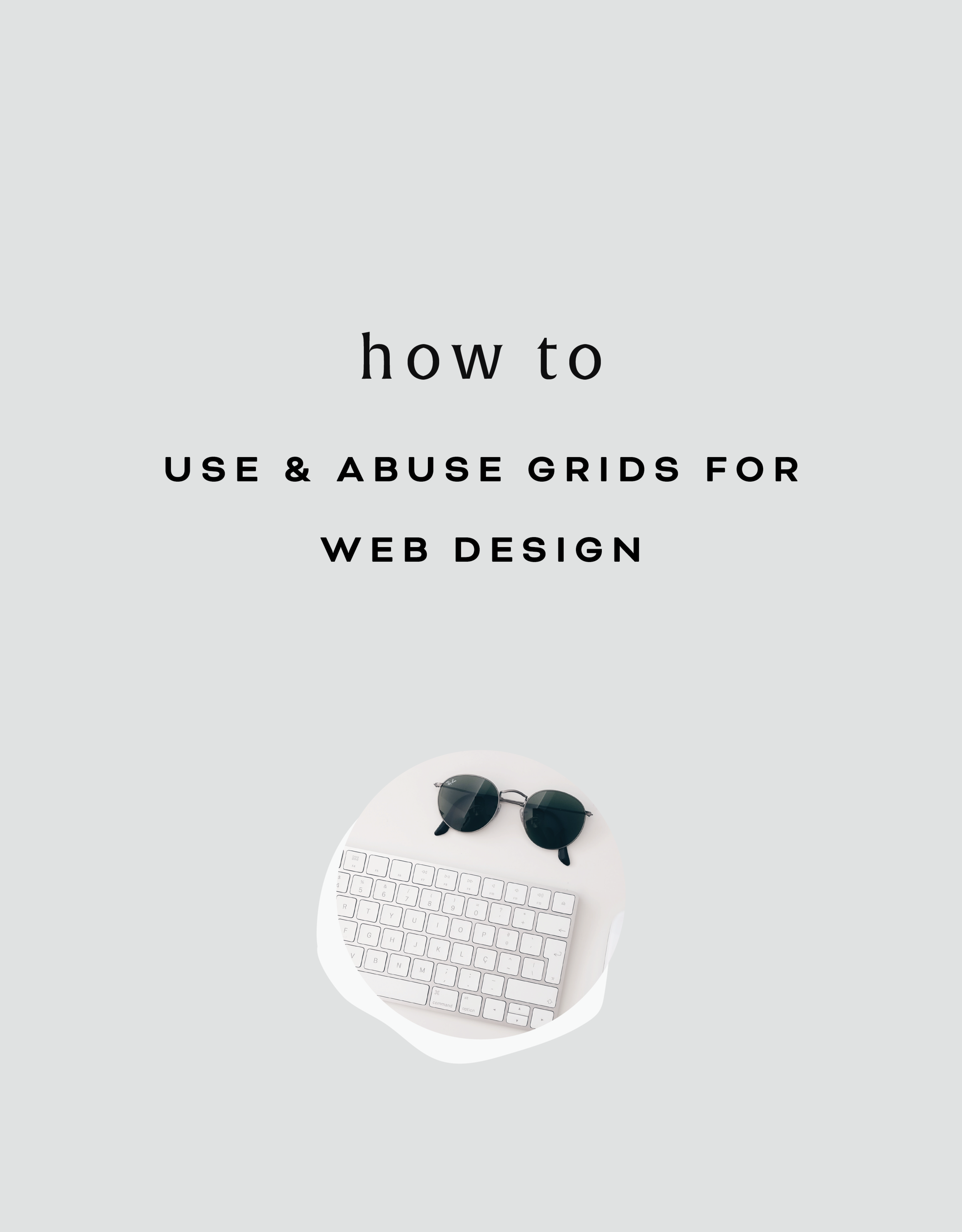
So using this website as an example, you can see that there is a grid as a guide, but the elements in the layout don't all fit perfectly within the rules of the grid. Some elements are perfectly centered, like the mission statement at the top and the newsletter opt-in at the bottom.
Other elements use the grid, but in unexpected ways, like the "Next Step" graphic and text. While the white space that holds the text is along the line of the grid, the pattern that encompasses the white space + text is above the line of the grid. But you'll also notice that the black pattern does follow the rules of the grid from left to right and fits nice and snug into the right-hand side of the site. The images on the left do the same thing. They break the grid vertically, but fit centered from left to right.
So you can see that this website breaks the rules a little, but each element still follows the grid in another way, which keeps it clean and cohesive, but also a little interesting and eye-catching.
If you want to take a look through the full website used in this example to see how I carried this organized rule-breaking throughout the rest of the site, head on over this-a-way!
For even more web design craziness, check out this, this, and this site.
Related Posts


need even more help with squarespace?
Skip the overwhelm and have your website designed and launched in just 5 days (or less)!